Email design can be a tricky egg to crack. These days, if you aren’t using an email builder, your campaigns may be prone to getting stale, not keeping up with your brand guidelines, and being difficult to update. With so many user-friendly options available, modernizing and updating your emails for 2025 is no longer such a monumental task requiring major stakeholders from across the company.

In this detailed guide we’ll go over where to start, what to prioritize, and how to future-proof your email redesign process. Coupling this process with adopting an email production platform like Dyspatch will ensure that your team is creating engaging, on brand email experiences in no time.
Part 1: Where to get started in the email redesign process
![]()
Analyze your data:
Before firing up Figma and dropping a bunch of rounded rectangles on the canvas, it’s crucial to understand your current campaigns’ performance. Look at your email analytics to get an understanding of which email clients your audience uses. This information will provide insight into the technical limitations and opportunities you need to consider.
For instance, if a significant portion of your audience uses Gmail or Outlook, you’ll need to ensure compatibility with these clients to avoid rendering issues. Alternatively, if they’re using Apple Mail, you’ll be rejoicing at the unprecedented design freedom, and you can rest assured that your email designs will degrade gracefully when opened with older email clients. For a list of common design challenges, check out our article here on top email clients and devices to test for seamless communication.
![]()
Evaluate your engagement:
If you have a library of pre-sent emails in your CRM or ESP, identifying which email designs and campaigns are performing well might offer valuable learnings and help shape the modules you’ll be implementing in your new email design system. Keep context in mind when you are reviewing your email design to make sure you’re developing designs that align with your viewers’ expectations.
Here’s what to keep in mind:
- Placement: where are your CTA buttons landing when rendered on desktop versus mobile? Does your audience require more text, or an immediate call to action to get them to engage? Using built-in device testing will help you determine where the major breakpoints are in your email, and help you optimize for all screen types
- Imagery: what types of images are your audience engaging with? Do they prefer real world examples of your product in action, or are they more engaged with abstract icons and imagery? Keep in mind that the images you use in your emails should be optimized for delivery over slower mobile networks, since some locations may have limited speeds, which will slow down loading of your emails.
- Skim rate: Popular CRMs like Hubspot will provide you with a skim rate metric that will let you know if your users are only engaging with your content for a short time (2-8 seconds). This metric will be pivotal in determining whether you need to adjust your email designs to get your key point across.
![]()
Re-review & dream big:
Before completing your analytics review, it’s important to take a step back and assess how your current email design aligns with your existing brand guidelines. If you found yourself making concessions to adapt your brand guidelines when implementing your original designs, now is the time to take another look at these limitations.
HTML email elements like as buttons, typography and other advanced styling might be worth re-implementing now. You can be confident that there is a graceful fallback when your email is rendered in older email clients. Modern design elements made possible by CSS3 and HTML5 can still be implemented, as long as you are testing them across all popular email clients, and are confident that they will not hinder readability of your emails when they are opened in an older email client.
And last of all, you can rest easy, knowing that anyone still opening their emails in Outlook 2011, or Lotus Notes 8.5 are already used to a sub-optimal email experience and likely won’t even notice any major issues with your email design.
Now that you’ve compiled all of your major analytics and reports, it’s time to get on to the fun (at least for me) part. Your email design system!
Part 2: Thinking modular
Identifying common elements
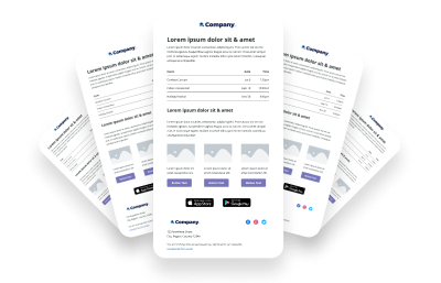
Now is the time to determine which common elements are shared across your email templates. Let’s consider both your marketing emails as well as your transactional emails. If you haven’t already seen it, the Dyspatch email builder design system Figma community file is a great place to start. Our email builder design system covers all of the common blocks you can use to build out your baseline email templates, including:
- Headers & footers
- Headlines
- Text blocks
- Images
- Tables
- Button & CTAs
- 1, 2, & 3 column layouts with images text and CTAs
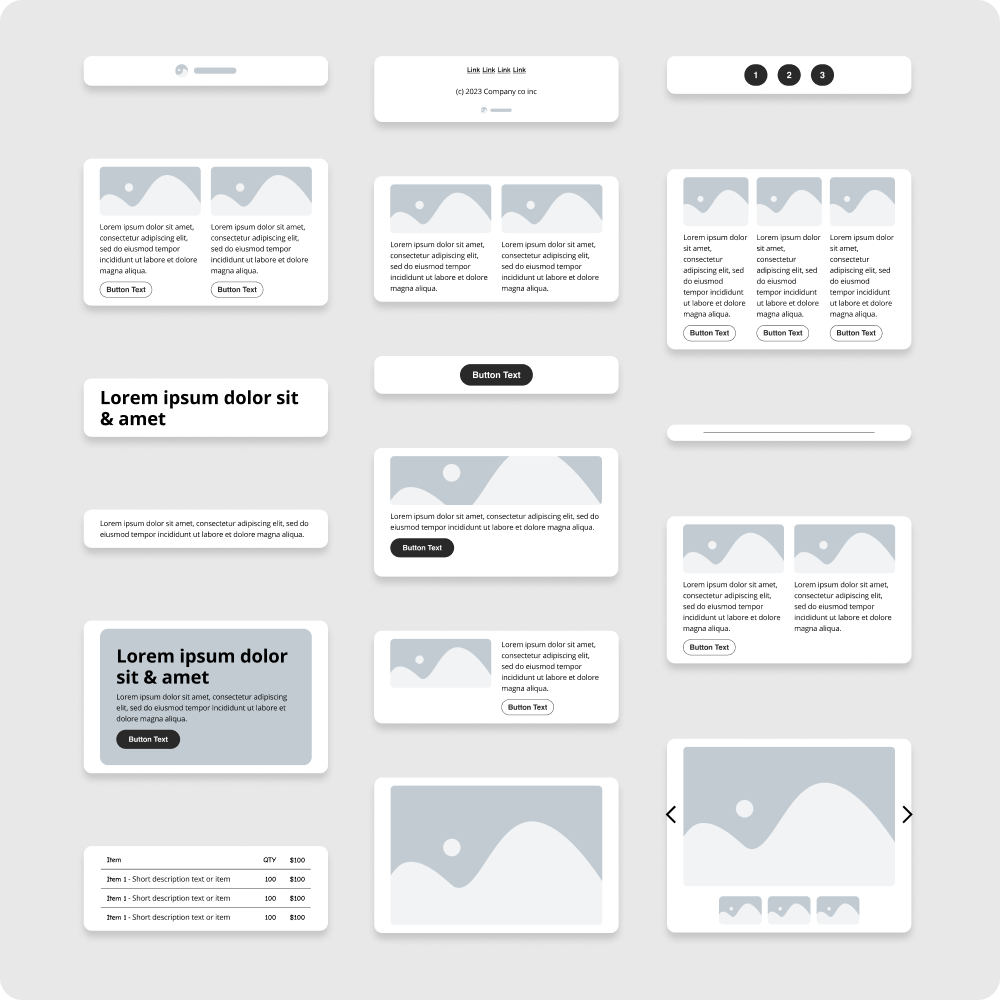
Using the shared components of our Figma community files, you’ll be able to set your baseline text styling and size, your button styling and image treatments. When these components are updated, you’ll see their changes reflected across the sample email mockups
Building your email design system
Now that you’re using an email builder and your design horizons are expanding, there are a number of decisions you’re going to have to make to ensure your email designs are consistent and the right fit for your audience.
- Light or dark theme? Depending on your existing brand guidelines, this question might be answered for you. But if they’re more flexible, this is going to be an important decision to make. A light theme might feel more positive and minimal, but you run the risk of the design being haphazardly inverted in dark mode email clients. Alternatively, you can design your theme to be dark mode first, and not have to worry about major inversions happening to your color schemes.
- Email width: Will you stick with the standard 600px width established across HTML email designs to date? Or will you go with a wider design at 700px or 800px wide? Keep in mind that the wider your email gets, the more of a gap there will be between your desktop and mobile designs. Large blocks of text images might look good on desktop, but will quickly become overwhelmingly large when rendered on mobile devices.
- Image treatments: Strengthen your brand by carrying iconic brand images over to your email designs. Add in rounded corners, borders, and even drop shadows where you see fit, knowing that they will render correctly in supported clients.
- Typography: Using the correct branded fonts is crucial when designing your HTML emails. Implementing custom fonts provided by Typekit or Google Fonts is recommended. But always provide web safe fallbacks for your custom fonts to keep your emails legible on older clients.
- Theme: The theme is where all of the major design decisions of your email brand guidelines will take place. Use the theme to set your email width, headline and body copy styling, padding and background images used in your email templates. Modules should remain as theme agnostic as possible to ensure they can be used in a variety of different emails.
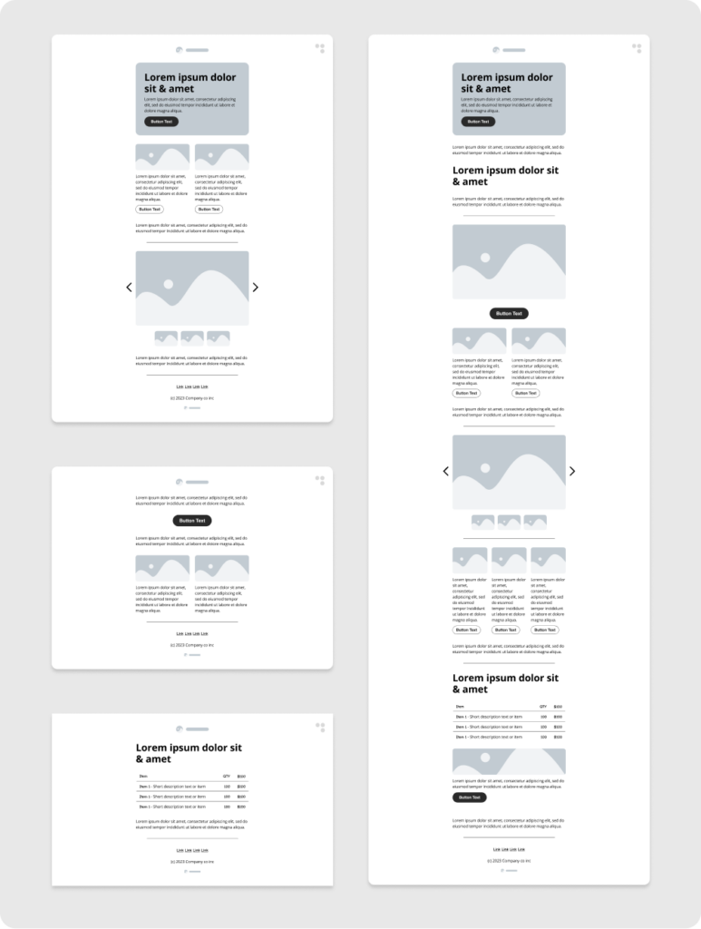
Prioritize mobile first design
Depending on your customer base, a large portion of your users might be accessing your emails via their mobile devices, you’ll need to ensure that your emails are mobile friendly. On average, over 40% of emails are opened on a mobile device first.
Optimizing your email design system for ease of use
Workspaces
Workspaces can be split up by campaign or email type depending on how many emails your team is managing. Utilizing workspaces in Dyspatch will allow you to not only specify integrations by email type, but you’ll also be able to ensure that the emails you’re creating are always shared with the right people internally. This guarantees that the most important eyes are always viewing the emails they need to.
Internally we sort by type:
- Transactional emails
- Newsletters
- Product announcements
- Release notes
- Onboarding drip campaigns
- Internal company communication emails
- Webinars
- Promotional
- Registrations
- Alerts / follow up
Themes
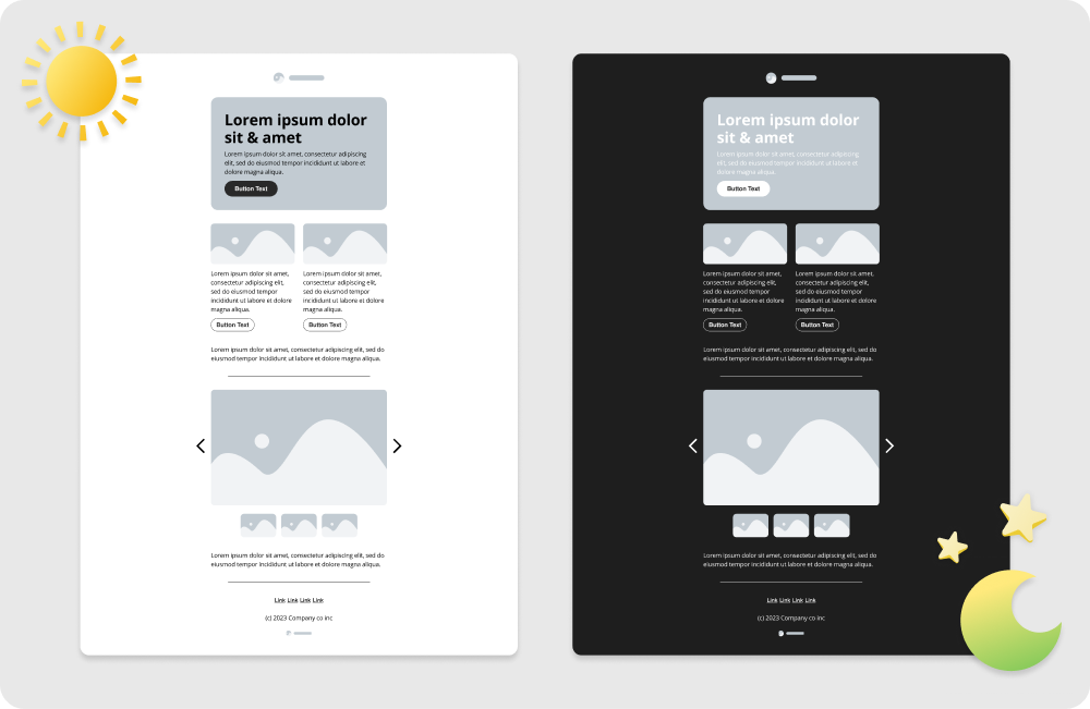
Themes are created to be shared across workspaces, ensuring that our transactional emails match our newsletters and onboarding drip campaigns.
- Light theme - this theme is built to render nicely in dark mode as well, but is primarily used for our standard communications, product updates, newsletters, etc.
- Dark theme - Our dark theme is used as a highlight, and we’ll use it for special announcements.
Blocks
Blocks are grouped by type and complexity. You’ll want to keep your shared and most-used modules easy to find and work with. With the inclusion of our easy to use block search, you’ll always be able access any block of your choosing with just a click.
- Headers/footers
- Body copy
- Text
- Images
- CTAs
- Layouts
- 2 column - image / text / CTA
- 3 column - image / text / CTA
- Featured posts
- Call to action blocks
- Image carousels
Conclusion
Redesigning your email in 2025 is most successful with a blend of data analysis, modular design, mobile optimization and the adoption of an email production platform. Getting started with a thorough understanding of your current campaigns’ performance and utilizing modern design principles will help you create engaging, effective, on brand emails that will stand the test of time. For more detailed insights and tools to aid your email redesign process, chat with someone from our team now.

