While email trends come and go (remember the reign of e-cards?), the principles of quality design are timeless.
That’s because they’re grounded in human psychology: what we notice, how we process information, and why we act. A well-designed email captures the user’s attention and leads them to a compelling decision.
Ready to learn the science behind engagement? Here are the principles for designing an email that maximizes conversions and engagement.
8 engagement-boosting email design tips
1. Design with purpose
Once your email is opened, you have about eight seconds before your customer loses interest. So make sure the intent is obvious immediately, with a design that flows from the purpose of the email.
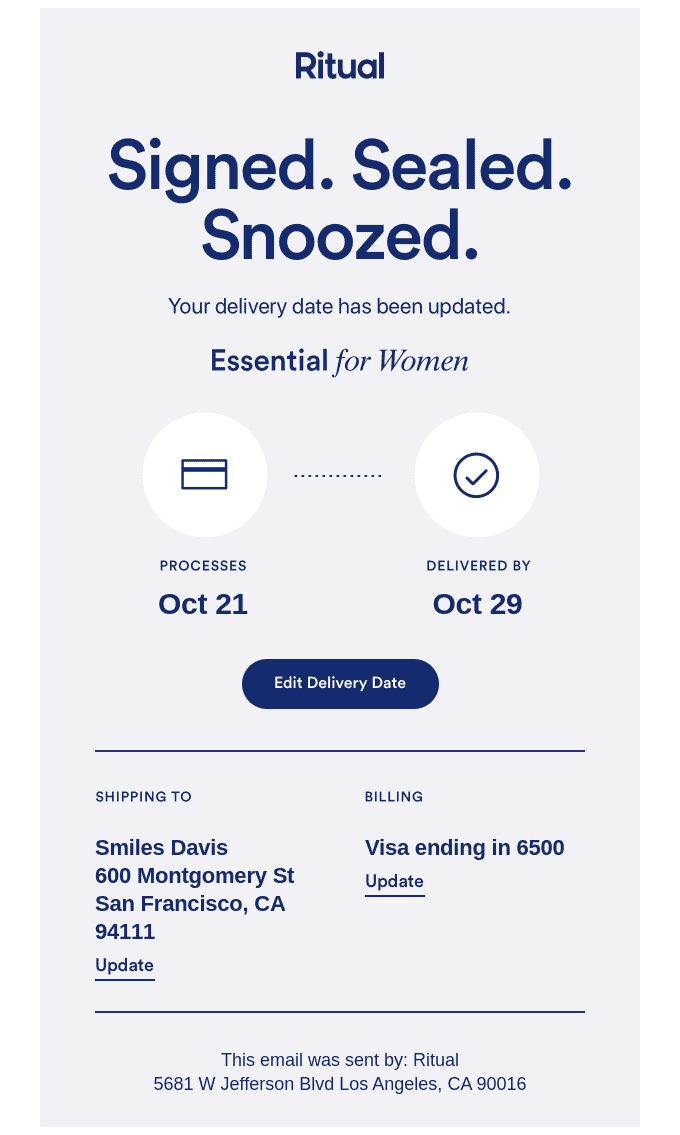
When sending a transactional email, you want to stick to the point. Readers are looking for specific information (“Your order has shipped”, “Your password has been reset”), so cut to the chase. Here’s a great example from Ritual, with a clear purpose and helpful illustrations:
With a marketing email, you want to pique the reader’s interest enough that they click through to your website or landing page. It’s the difference between a telegram and a postcard: you’re just not delivering a message, you’re staging a scene.
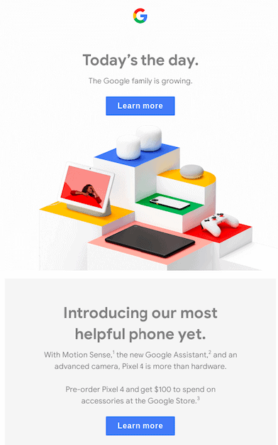
You can see the difference in this marketing email from Google, for the release of their Pixel 4 phone, which is full of enticing details and images.
2. Make it mobile-friendly
More than half of all emails are read on mobile. If you’re not designing for small screens, you’re making life harder for most of your customers. 80% of them will actually delete an email if it doesn’t look good on mobile.
We’ve got some best practices for mobile-first designing, for emails that look good everywhere. But you should still test to see how your email looks across devices and email clients before hitting send.
3. Be generous with white space
Overcrowded emails are like that viral image of a heap of unidentifiable objects. They’re hard to make sense of because you don’t know where to focus— what’s the point? Where’s the offer? Are you breaking out in a cold sweat? Me too.
White space helps your brain scan and process information, and can increase reading comprehension. Visual space around your content also drives engagement, by keeping the user’s eye focused on the important stuff.
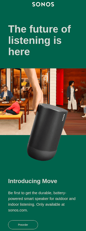
This email from Sonos is a good example, with plenty of breathing room around each element: logo, headline, image, and call-to-action.
It’s simple and straightforward, especially in comparison to this email from Target where the design could benefit from more white space to draw the customer’s attention to the most important elements.
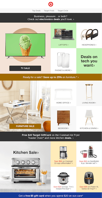
I need to lie down after looking at it. So many images, so much text— and yet it’s hard to retain anything. It’s also confusing due to the lack of consistency – notice the last block includes a text CTA versus the two above that include a button CTA.
4. Add color for impact
If you’ve ever watched a nature documentary, you know that animals use bright colors to draw attention. And just like birds and monkeys, humans are drawn to vibrant, eye-catching hues.
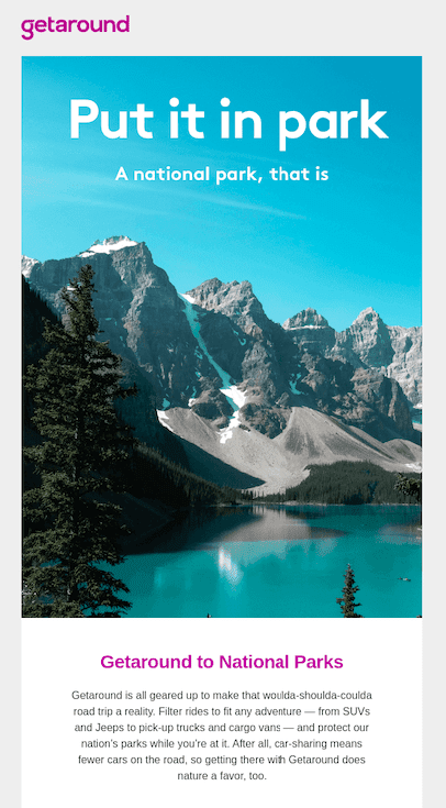
In fact, research has found that colored images hold our attention for longer than black-and-white ones. This email from Getaround is a good example: you just want to linger on that cool blue vista.
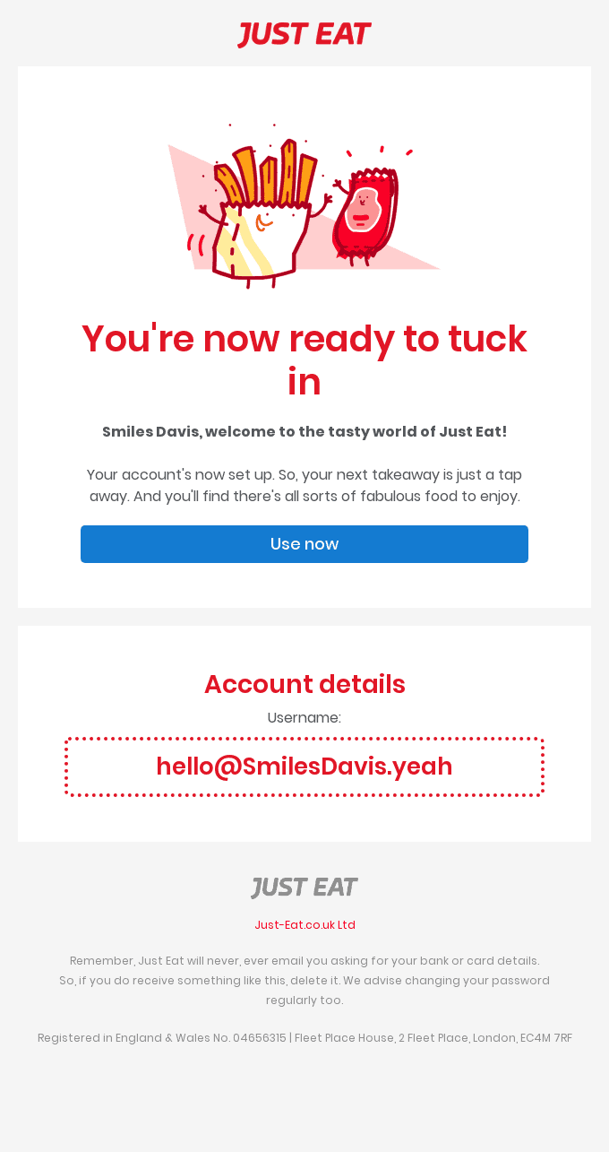
Use this insight to your advantage, by using color to direct your reader’s focus. Take this email from JustEat: the blue CTA button is practically waving at you like a peacock tail.
Does the color you choose matter, or does it just need to pop? Hubspot found a red CTA button outperformed a green one on otherwise identical landing pages.
However, ReallyGoodEmails found that blue was the most popular color for CTA buttons. This is the perfect subject for an A/B test, if you want to find out what your audience likes best.
Brighten up your email, but don’t forget about accessibility. Eight percent of men are colorblind, so keep your color palette minimal and avoid problematic color combinations.
5. Follow visual hierarchies
The arrangement of content in your email can actually boost engagement by directing the user’s attention. These visual hierarchies mirror the way our eyes instinctively move over a page, offering an intuitive flow of information.
You’re probably familiar with these visual hierarchies, even if you don’t know them by name. The “inverted pyramid” is one popular example. It funnels the reader’s attention through narrowing content blocks, leading to a CTA.
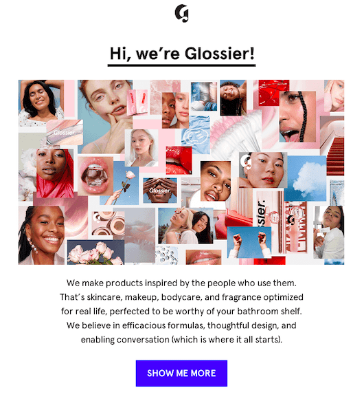
You can see the inverted pyramid in this Glossier email. First it grabs attention with a big image, followed by a narrower block of copy, and then ends with a CTA button.
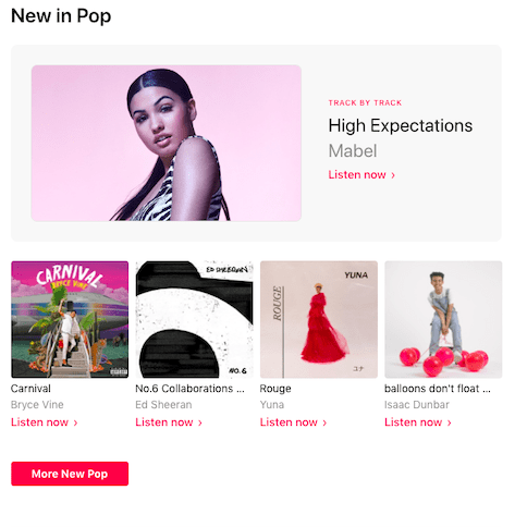
Another hierarchy is the Z model, which follows the way we read short blocks of text: left to right, then diagonally from the end of one paragraph to the beginning of the next. You can see it in this Apple Music email, which draws the eye in a zigzag pattern.
6. Use dynamic images
The brain processes visuals 60,000 times faster than text. That means you should be using videos, GIFs and image carousels to catch attention and communicate effectively.
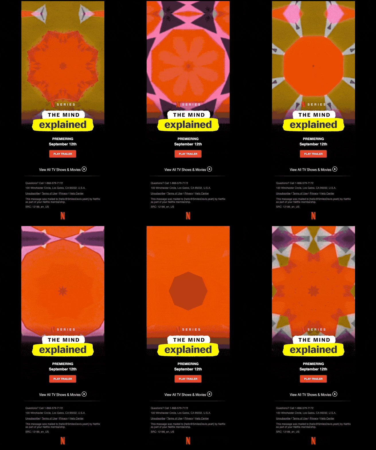
These interactive elements also increase open and click rates by up to 73%. You don’t want to overdo it: too many images will slow your email’s load time. Litmus found 51% of customers will delete an email within two seconds of opening it, which means you need to prioritize loading speed. Focus on visual quality over quantity, like this mesmerizing single GIF email:
Adding interactive elements doesn’t have to be complicated. With Dyspatch, you can add videos, carousels and other dynamic content without writing a single line of code.
7. Optimize your CTAs
As mentioned above, CTAs should be bright and eye-catching. But there’s more to an effective CTA than the color.
This sounds obvious, but your CTA button should look like a button. Don’t get creative here: a traditional button design converts best. And make it easy to click on for mobile users, by ensuring it’s big enough to tap with a thumb. No one likes the pinch-and-zoom routine, and any frustration will lead to a drop off in engagement.
Placement matters too. If your email is long enough to scroll through, you should have more than one CTA button. They’re like appetizers at a party: you want them to be in reach at all times.
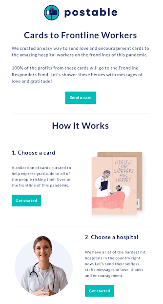
This email from Postables is a good example of button distribution and design. The buttons are consistent in appearance, which helps you instinctively understand that they’re all pointing to the same landing page.
8. Design for everyone
Every email client is a little bit different when it comes to displaying emails. And if your email doesn’t render properly in all of them, you’re missing the chance to impress your customers.
If a user opens an email with illegible text or a broken interactive element, they’re going to delete it— there goes all your hard work! And if every customer that uses Outlook or Gmail has the same problem, then you’re really taking a hit on engagement.
So, how can you make sure your emails are responsive and accessible on every device?
This is where an email builder like Dyspatch can help. It uses a code-free modular design system, so you can build your email from pre-approved, pre-tested content blocks. Plus, Dyspatch offers built-in Litmus testing, to guarantee your emails will render perfectly on every device and inbox.
Excited to make beautiful emails that get results? Sign up for Dyspatch with a 7-day free trial!
Originally published: July, 2020. Last updated: February, 2022.
