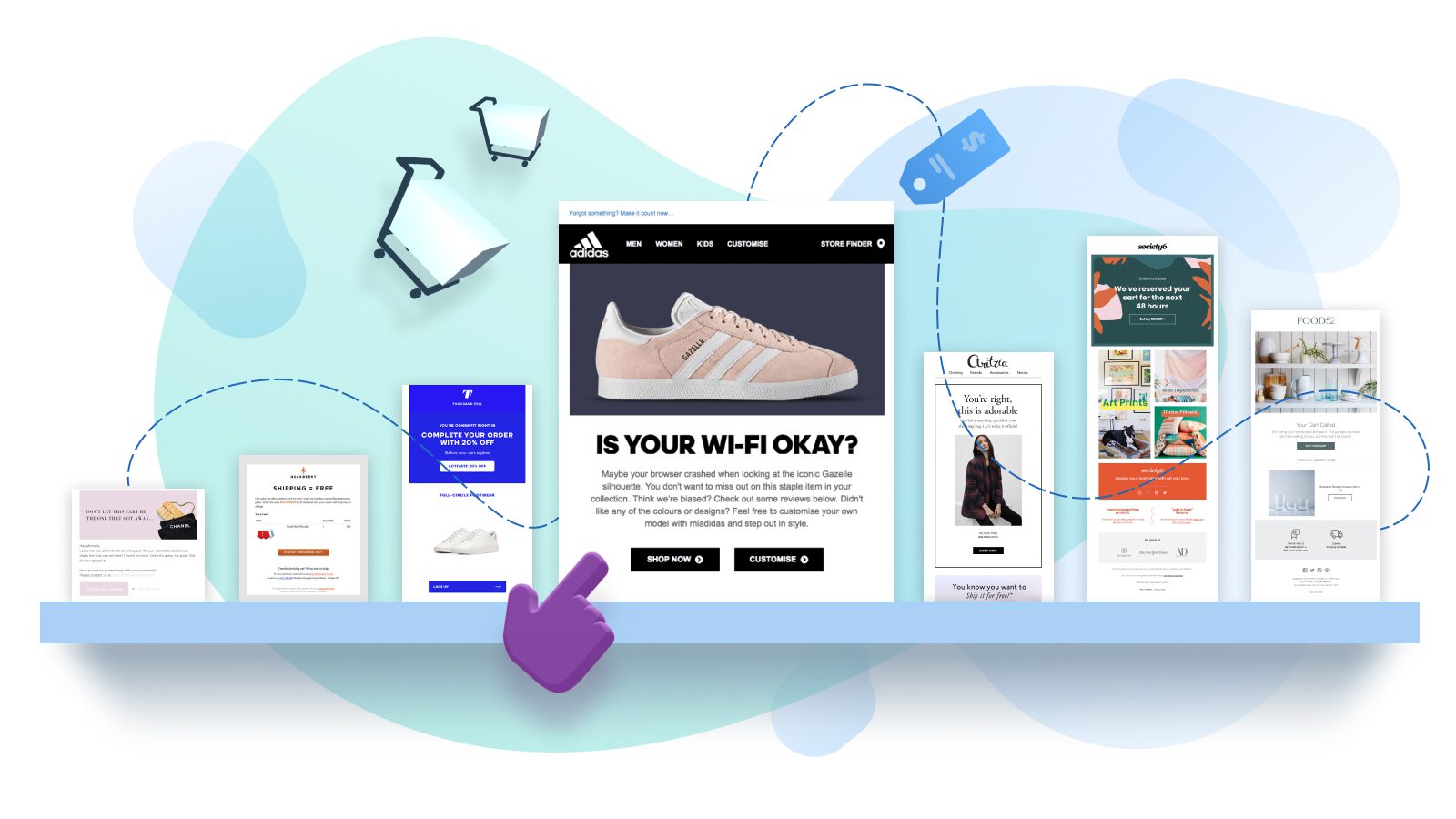
No matter how impeccable your digital ads, welcome campaigns, and product pages are, some of your customers are just browsing. In fact, a hefty 77% of them will leave without completing their purchase.
That’s why abandoned cart emails have become a cornerstone of any successful e-commerce strategy. These triggered emails are automatically sent to customers who made it only partway through the checkout process.
And they often succeed at drawing customers back: Klaviyo analyzed more than 9.3 million abandoned cart emails and found they generate an average of $5.81 in revenue per recipient.
But of course, that’s an average representing a wide range of results. As we’ve all experienced, some abandoned cart emails are much more persuasive than others. Klaviyo also found the top 10% of ecommerce companies are winning back three times as many customers. Wouldn’t you like to be one of them?
We’ve done our own analysis (admittedly, not on 9.3 million samples — but we look at a lot of emails!), and identified the qualities of an irresistible abandoned cart email.
Read on to learn the secret for yourself…
But First, Why Do People Abandon Their Carts?
There are all kinds of reasons why people abandon their cart. Many are just browsing, idly filling up a cart the same way you might stand in front of a bakery window admiring the pastries, even if you’re not hungry.
But once someone initiates the check-out process, entering their email address and shipping information, they’re already in the bakery. At that point, they’re leaving for more specific reasons.
According to Baymard Research, the likely culprits are expensive shipping and not properly calculating shipping costs, arduous account creation, and technical issues. Faced with an annoyance or an unexpectedly high fee, they decide to just close the tab — for now.
Fortunately, you’ve already won their interest. And the high engagement rates of abandoned cart emails — (with open rates of 43% — prove that your shoppers are tempted. Whether or not you can win them over will come down to how good your abandoned cart email is. (For more examples of how to win customers back via email, check out our post: 12 Proven Ways to Use Email for Customer Retention and Loyalty.)
10 Best Practices for Abandoned Cart Emails (With Examples!)
1. Make it interactive
Abandoned cart emails are an ideal use case for interactive features. Why? Because you can include everything your customer needs to complete the checkout process, right in the inbox.
With AMP for Email, every email you send can function like a mini website — customized for each unique recipient. And AMP emails are fully interactive, allowing recipients to engage with dynamic features like image carousels, expandable product descriptions, and even checkout.
Making the checkout process seamless and convenient addresses a common customer complaint. Nearly one in five shoppers has abandoned their cart because the checkout process was too long.
Putting it right in their inbox instead removes that friction. And it works: Ecwid found using AMP for Email in abandoned cart emails boosted sales by 82%.
If your interest is piqued, check out this blog post on how to use AMP for Email in your abandoned cart emails.
2. Use compelling language
An abandoned cart email should be short and sweet: You want to remind your customer of the products they left behind, provide a clear CTA button, and persuade them with just a few sentences of impeccable copy. Don Draper didn’t win accounts by being long-winded — think quality over quantity.
Your subject line is just as important as the copy in your email, so make it count! Klaviyo found the best-performing emails had subject lines that mentioned the recipient had left something behind. This makes sense: You want to immediately remind your recipient of the object of their desire.
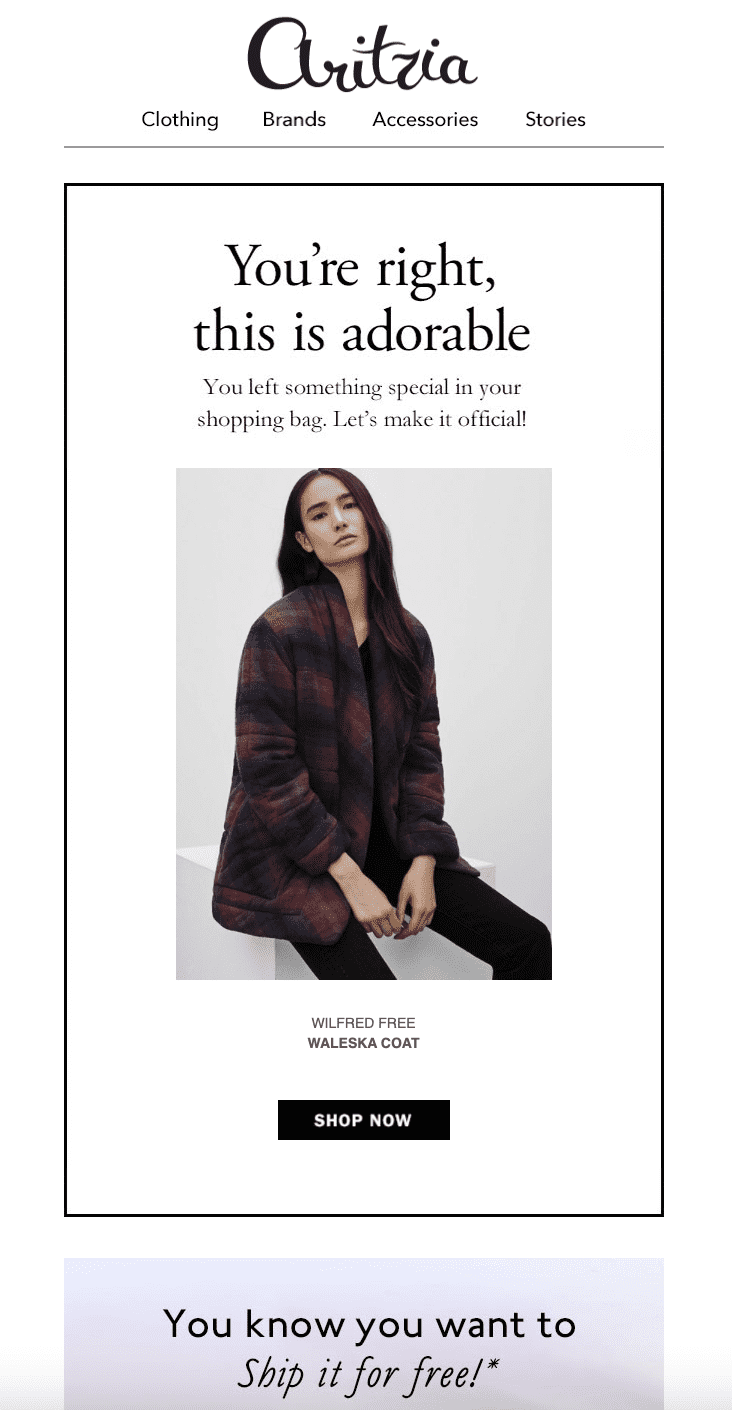
Here’s a good example from retail brand Aritzia: Brief but charming, direct and just a little cheeky.
If your copy could use a little polishing, these five techniques can help.
3. Streamline your design
Keep the focus on the products, and limit distracting or superfluous elements in your email. White space and simplicity work best. A minimal design will also draw attention to the CTA button — a key piece of your email!
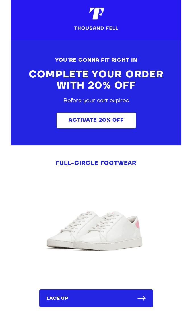
Thousand Fell does it right with this sleek blue-and-white design. The CTA buttons pop against the white background, and the products look clean and sharp.
4. Personalize it
Email marketing is a complex science, but if there’s one surefire technique that gets people to open your emails: Personalization. Just like you can always hear your name in a loud room, a personalized subject line jumps out from the noise of your inbox.
Recipients are 50% more likely to open emails with personalized subject lines. But the contents of your email can be personalized as well, including the specific items they left behind. Or you can try this approach from Perigold, which includes a list of personalized recommendations based on the item in the cart:
This is also a great opportunity to use AMP for Email. By including dynamic information about discounts or promotions associated with the products, or a live countdown of items left in stock, you can create a sense of urgency (more on this in a sec).
See how Dyspatch can help you take personalization beyond first name here.
5. Sweeten the deal
The number-one reason shoppers abandon their carts? The additional costs of shipping, taxes, and other fees were too high. This reason alone accounts for almost half of all abandoned carts.
A straightforward way to address this hesitation is with a discount in your abandoned cart email. By making it exclusively available in the email, or offering it for a limited-time only, you can also nudge the recipient to act soon.
Free shipping is also an enticing offer. Seventy-three percent of shoppers report free shipping is their number one priority when making an online purchase. People really do love free shipping— so much that 25% of them would give up coffee for it.
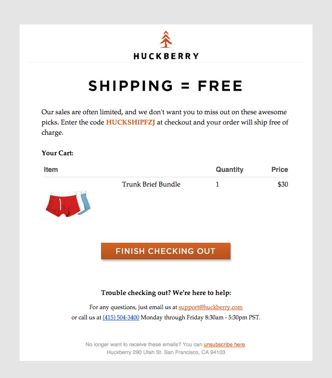
Here’s an example from Huckberry that conveys this benefit loud and clear:
You could also try a discount, as either a dollar amount or a percentage. This is an ideal opportunity to run an A/B test and find out what works best for your customers.
Curiously, Klaviyo found putting the discount in the subject line actually lowered the open rate of abandoned cart emails slightly. So you may want to save it for the body of the message!
6. Be responsive
If you’re only designing your emails for desktop, you’re excluding a lot of customers. The stats vary, but on the high end they suggest 86% of people check emails on their phone.
In other words, there’s a high probability folks will see your abandoned cart email on a mobile device. And if it’s not optimized for mobile, then it might as well be a junk mail flyer, because 62% of your recipients will simply delete it.
You can’t make assumptions based on where they were initially browsing, either. Rejoinder found 50% of customers abandon a cart on one device, and then read their abandoned cart email on a different one altogether! So you want your emails to look good on screens of every shape and size.
The best way to do that is to design mobile-first. Learn why, along with the five principles for mobile-first design here.
P.S. If you use the Dyspatch email builder, all your templates will be responsive by default and worry-free.
7. Add a little urgency
A strong abandoned cart email reminds the customer of an important fact: Nothing lasts forever. Harsh, but true. Also, pretty persuasive! There are a few ways to add a sense of urgency to your abandoned cart emails. These include:
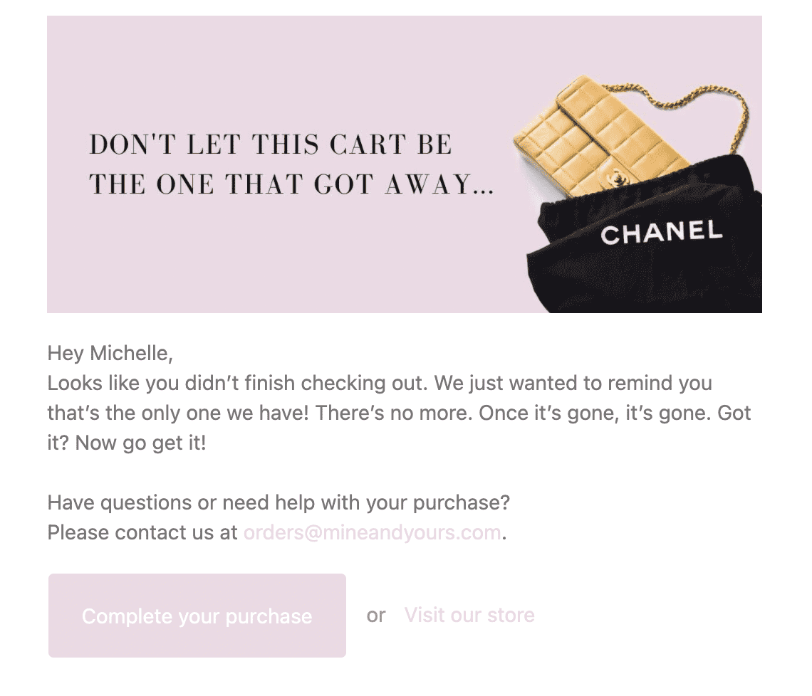
- Limited quantities. Shops that sell vintage or handcrafted pieces can point out there’s only one of each, like in this email from consignment boutique Mine & Yours.
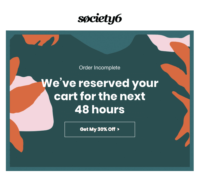
- Limited reservation. For instance, Society6 emphasizes the cart is reserved only for the next 48 hours.
- Limited offer. As mentioned above, a discount can be a strong incentive — especially if it’s only available for a short period of time.
You can also convey urgency in your subject line. Copy like “Don’t let this one get away!” or “Your cart is about to expire…” may prompt higher open rates.
8. Include social proof
Sometimes customers abandon a cart because they’re on the fence about the product. Maybe they don’t think it will live up to the hype, or they want to do more research. When that happens, social proof can tip the scales. This type of proof includes product reviews, ratings, and testimonials.
Here’s an example from Adidas, which is also exceptionally well-written. The personalization is seamless and completely specific to the product. Not to mention, clever and original.
I’d be remiss if I didn’t mention, this is another great opportunity to use AMP for Email. With this tech, you could pull recent reviews directly off product pages into your emails. (And with Dyspatch, you get access to a library of pre-coded interactive AMP modules — meaning you can implement a reviews section with just a few quick clicks!)
This tactic is especially effective, as recent reviews carry more weight with customers. In fact, 73% only pay attention to reviews from the last month.
Need more product reviews, so you can include them in your emails? Check out these seven strategies to get the good reviews flowing.
9. Make it serial
As the saying goes: If at first you don’t succeed, try and try again. Instead of thinking of abandoned cart emails as a one-and-done process, consider creating an abandoned cart drip campaign.
How many emails should be in an abandoned cart drip? It turns out there’s a magic number: Three. While the first email has the highest conversion rate, the second and third can also recapture interest. One case study from Rejoinder found a three-email abandoned cart series led to a conversion rate of more than 32%.
These three emails can work together to address the various reasons why a customer might have abandoned their cart:
- Remind. Maybe they’re still thinking about it, or they meant to buy it, but got busy with dinner. The first email can simply remind them they forgot something, and prompt them to reconsider it.
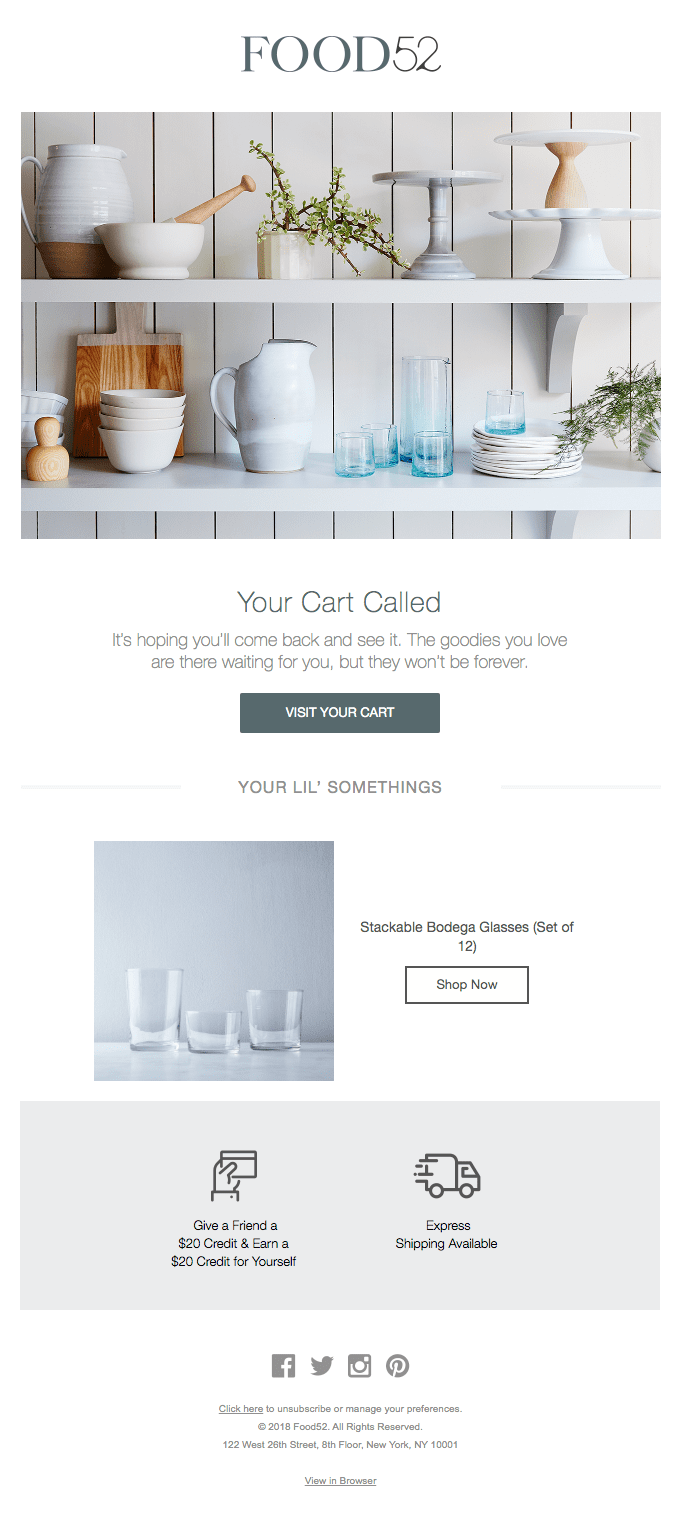
- Help. In this email, you can address other reasons why they might have walked away. Here’s where you might want to include social proof, additional product information, or personalized suggestions for other products. You can also let them know how much longer you’ll hold the items in their cart.
- Incentivize. If the first two emails haven’t worked, try going bigger: A free shipping offer or deeper discount, for instance. This is also the right moment to use “now or never” copy, to add a little more urgency.
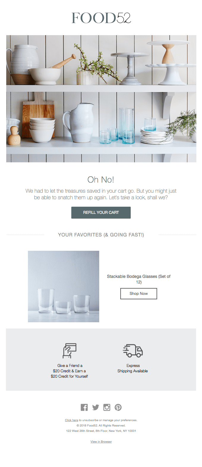
A note of caution: You want to give each email some breathing room. Sending all three in a single afternoon may come off as spammy. Which brings us to our last tip: Timing.
10. Time it perfectly
By now, you understand how to put together an excellent abandoned cart email. But when, exactly, should you send it? And when do you send the one after that?
Rejoinder dug deep into the data from millions of abandoned cart emails, and they came up with an answer: After one hour. If your customer walks away at noon, the email should hit their inbox at 1:00pm.
According to Rejoinder’s data, an email sent one hour after cart abandonment is 41.6% more effective than one sent a day later. So catch them while they’re still daydreaming about your product!
For best results, they recommend sending your second email a day later, with the final email two days after that. TargetBay suggests a longer break between the second and third emails, suggesting the last one be sent a week after the cart abandonment.
How you space out your emails may depend on different factors, like your product inventory, the time of year, and your customer profiles. But as a rule of thumb, the interval between the second and third email should be longer than the time between the first and the second.
Start Sending Conversion-Worthy Abandoned Cart Emails
I know, 10 best practices are a lot to absorb at once…
But I have one last tip for you: Dyspatch makes it easy to put all of the above into practice and increase your conversions as a result.
With fully responsive templates, advanced personalization options, and pre-coded interactive AMP modules, you can quickly create abandoned cart email campaigns that get results using our next generation email builder.
Get a free demo and see for yourself. Your shopping carts will never be lonely again!
