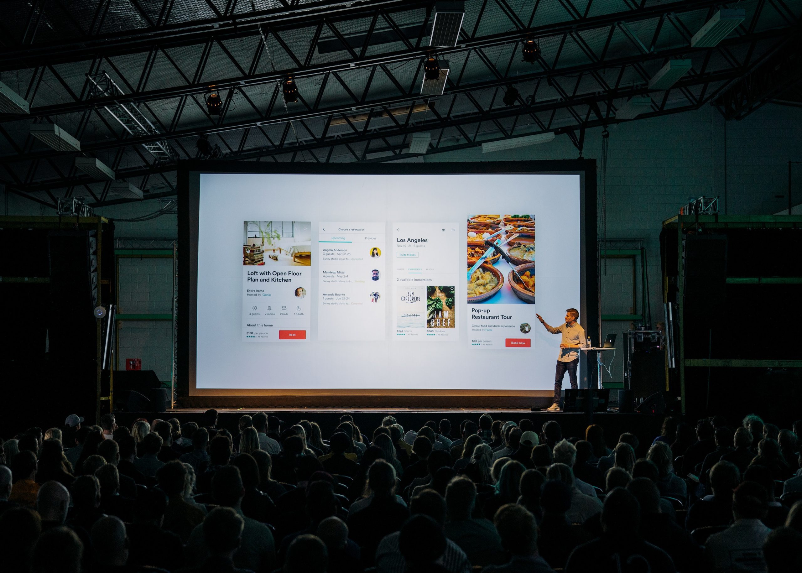
The Email Design Conference, or Litmus ConpHerence, as it would have been called if I were in charge (yes, we’re all thankful I wasn’t) was the first conference I’ve been to in my professional career that was legitimately fun without forcing said fun upon you. There were times specifically dedicated to “networking” as it were, but they were unintrusive and seemed to mostly center around sharing stories of how we got into the world of email.
Having these conversations, two things became apparent, one immediately, and the other over the course of the three-day event. The first thing was that there were very few people representing Silicon Valley and, in stark contrast to more general, startup-y conferences, there was very little sales going on. Most speakers clearly made adding value to the community their top priority, and few people were coming at you business-card-first. In fact, there seemed to be a bit of a running joke that almost nobody had even brought business cards.
The other commonality that came up was that everyone I talked to seemed to come from some sort of fine or liberal arts background and had a mostly self-taught tech toolkit. With the word “hacker” being pummeled into meaninglessness, it was incredibly refreshing to be around a group of people that had truly learned their skills in pursuit of filling an immediate need, and pushing the constraints of outdated systems to do it artfully and with care.
So What Were People Talking About?
Workflow and Process Management
This one gets top billing because I’m kind of rolling up a lot of things. At the heart of it is the non-academic tech backgrounds of many designers. In a computer science education you get trained to intuitively look for opportunities to automate. A lot of email designers think of themselves more as craftsmen, personally sculpting each email they design. This attitude leads to a lot of copy-and-pasting of code blocks and general repetitive tasks gumming up the production cycle.
I’ve got 99 problems, and my lack of workflow may well be one of them. #ILikeTheMisery #TEDC15
— Mike Ragan (@Mike_Ragan) August 28, 2015
That said, there seems to be a growing interest in automating the more painful tasks like css inlining as well as developing better systems for managing code blocks, like Litmus’ Snippets. This also shows up in more powerful editors really favoring a sort of modular design process. In a way that drag n’ drop web editors can never seem to manage, modular design can actually produce really clean email code… in theory. We in the email tech business still have a ways to go on that one.
Personalization and Segmentation
From hyper-targeted segments to highly dynamic content, there was a lot of focus on turning what you know about your recipient into actionable information. There are tons of studies measuring the effectiveness of this in the wild, but it’s interesting that it’s also being focused on in the design community.
The power of segmentation: it improves your email performance. 13% higher opens, 52% more clicks, -28% unsubscribe rates @juniorhee #TEDC15
— Litmus (@litmusapp) August 28, 2015
When considered from a design perspective, though, you get a much more humane consideration of what it means to translate that data into a person opening, reading, and clicking on your email. Suffice it to say I look forward to the day when the pressure from both sides breaks through and we get to see what creative uses of dynamic data clever designers can come up with.
Gmail is the Wooooorst! Important
Okay, Outlook is the worst. Wellll, Lotus Notes is the worst, but everyone who uses Lotus Notes knows that, so you don’t have to feel bad if it breaks your email. But there seems to be a serious frustration that, despite being so powerful as an inbox, Gmail leaves a lot to be desired as a renderer.
Google can make self-driving cars but still doesn’t support CSS properly in email yet, says @flcarneiro. #TEDC15 — Chad White (@chadswhite) August 26, 2015
Honorable mention: You Can Do What In An Email?
Of course there were incredible demonstrations of creativity and ingenuity from some of the more boutique design shops. They were coupled with the caveat that most audiences won’t actually benefit – as they’re tailored to high-end consumer brands. In fact, if your audience contains people that live primarily on data-restricted mobile plans, you could be hurting them.
So really it all comes down to really knowing your audience, knowing your organization, and finding a way to get the most out of both of them.
“Punched card coding – JS functionality with CSS” – see how @M_J_Robbins brought down the house at #TEDC15 – http://t.co/8FGOtD2GXB
— Ros Hodgekiss (@yarrcat) August 31, 2015
