What if I told you you could see a 70% boost in open rate while increasing the frequency of your emails? This is a story of someone doing exactly that.
Most newsletters seem to exist simply for lack of a better idea. Someone says, “We need to use email… more,” and someone else says, “Mm-kay, I’ll start a newsletter.” No-sletter is a series of real life ideas and inspiration to help you image better ways. That’s not to say a newsletter is never the answer, but it should at least be multiple choice.
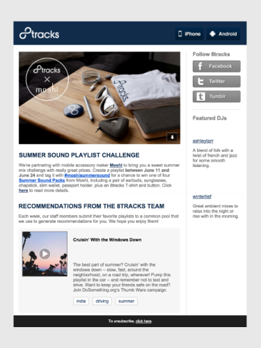
Today we’re going on a journey into the magical world of modular design. For our starting point, I’ve dug up an old copy of this newsletter from our good friends at 8tracks. Back in the days of yore, they had a newsletter much like any other; it had a standard, web-like template, nice looking images, and clever copy. But it had some problems.
Digests vs. Newsletters
The biggest problem here is that, most of the time, nobody actually wants a newsletter. If they really like your brand, they might open it to see what’s up, but they’re probably not chomping at the bit to see what you’ve been up to over the last month. So how do you overcome that? That’s precisely what we asked Andrea Slobodien, the Product Lead at 8tracks.
Through trial and error, we were able to refine a lot of the features in our newsletter, but the biggest change we made was moving away from a monthly newsletter to a weekly digest. The newsletter took a lot of effort to compile every month, because there was so much editorial content to curate–this was where you may have seen the featured DJs, prominent social links, and custom header images. For all this effort, the open and click-through rates were still among the lowest of all our emails. We started testing a weekly digest with minimal copy and a big focus on personalized playlists, and the results were pretty incredible: a 70% lift in open rate compared to the monthly newsletter.
Some of the content from our newsletter (for example, featured DJs) found a much better audience on our social media accounts, but for something as personal as email, the highest-performing content is always whatever is most relevant to the recipient. Anything that wasn’t relevant–or that helped us more than it helped our listeners–had to be moved to a less prominent part of the template.
That’s a huge shift in user buy-in. With this one change, their email newsletter went from essentially checking off a box to becoming a core piece of the 8tracks experience.
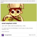
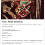
Another really cool thing about the new digest is the shuffling of personal recommendations, popular-in-your-network recommendations, chart toppers, top mixes from your favorite tags, and staff favorites.
Modular Design = More Personalized Content
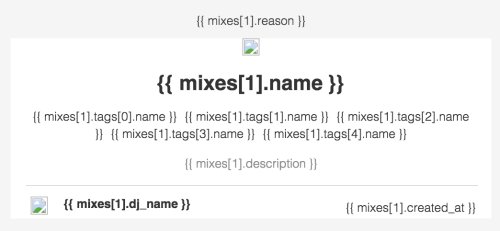
The cool thing here is that all that decision-making is done in the backend, so the code in the template just looks like this:
I asked Andrea about the implementation.
Snippets became necessary when we reached a point of satisfaction with our templates–they enabled us to create many more campaigns without worrying about stylistic consistency. As for our internal recommendation engine, we developed it specifically for the weekly digest. The success of our weekly digest inspired us to create a larger recommendation system that we use to power our Feed — the primary feature of our Web 4.0 redesign.
What I love most here is that, as you use 8tracks more and more, you get better and better email digests with more precise recommendations. Barring your increased usage, the engineering team at 8tracks can also work on improvements to the recommendation engine without having to worry about how they’ll affect the emails.
So beyond the initial bump, how has the performance sustained and what’s next for 8tracks emails?
The more we introduced personalized content, the better the emails performed. We even started learning what type of personalized content performed better, so we could always favor the highest performing playlists. However, we also needed a backup plan for users who didn’t express a lot of preferences. It’s incredibly important to do this, because all new users start out with no preferences. For these listeners, we hoped that the staff-curated playlists or the top playlists on our site would perform the best. I still think we can do better here, so we’ve begun to experiment with different kinds of engagement emails for our first-time users.
The lesson here is that more personalized content results in better user engagement, meaning your users actually want to hear from you. Isn’t that the whole point of creating email in the first place?

