Three months on and we continue to be impressed by the extraordinary emails that hit our inboxes.
So welcome to this month’s Hall of Fame. We hope you enjoy them — and learn from them — as much as we do.
Hall of Fame:

Who:
OpenTable, the online restaurant reservation service
What’s Good:
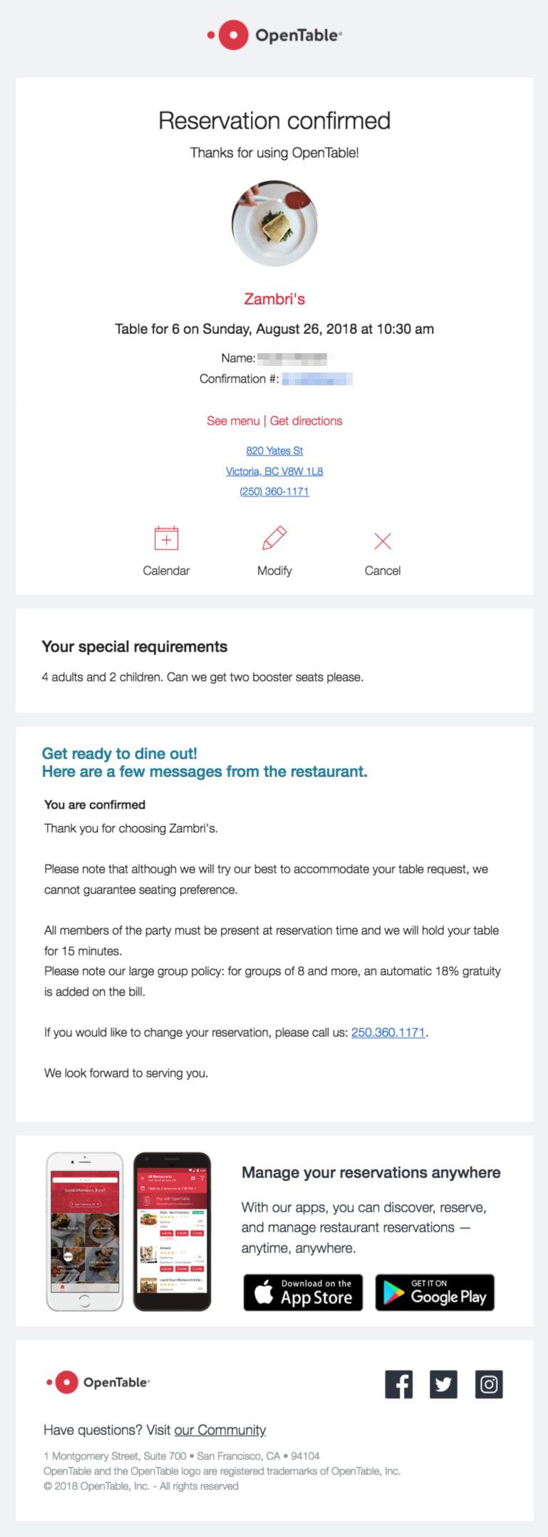
This confirmation email from OpenTable provides everything the customer needs to know about their reservation right up front: who, what, where, when, and how many. The copy is simply laid out, making the pertinent details easy to find.
What’s Exceptional:
This email breaks the ‘just one CTA’ rule but to great effect. The three they include address every possible action the customer might need — add to calendar, modify the reservation, or cancel the reservation. This means the customer can accomplish any of those things directly from within the email, rather than having to click a single CTA and then hunt for the option they need.

Who:
Waze Carpool, the carpooling app
What’s Good:
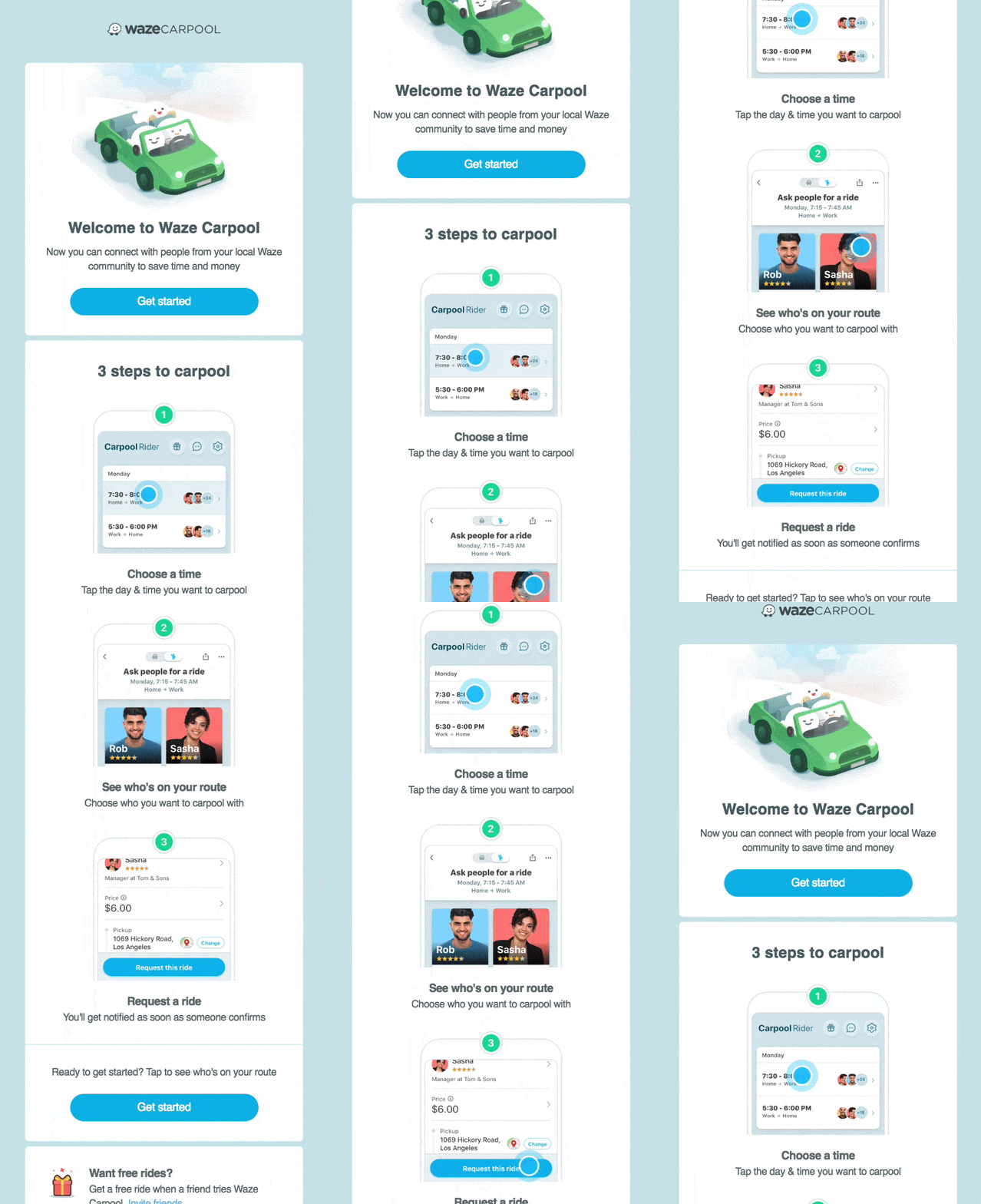
Now, this is how you do a Welcome email. Three super-clear steps to getting started, with a single CTA, all in a beautifully simple format that’s on-brand from top to bottom, reflecting both the Waze website and in-app experience. The CTA could be just a tidge more obvious but it’s forgivable.
What’s Exceptional:
Those animations. Seriously. They’re engaging and fun, and even if they don’t work in a user’s email client, the static images are still darned good. And bonus points for the referral offer.

Who:
Eventbrite, the event management and ticketing app
What’s Good:
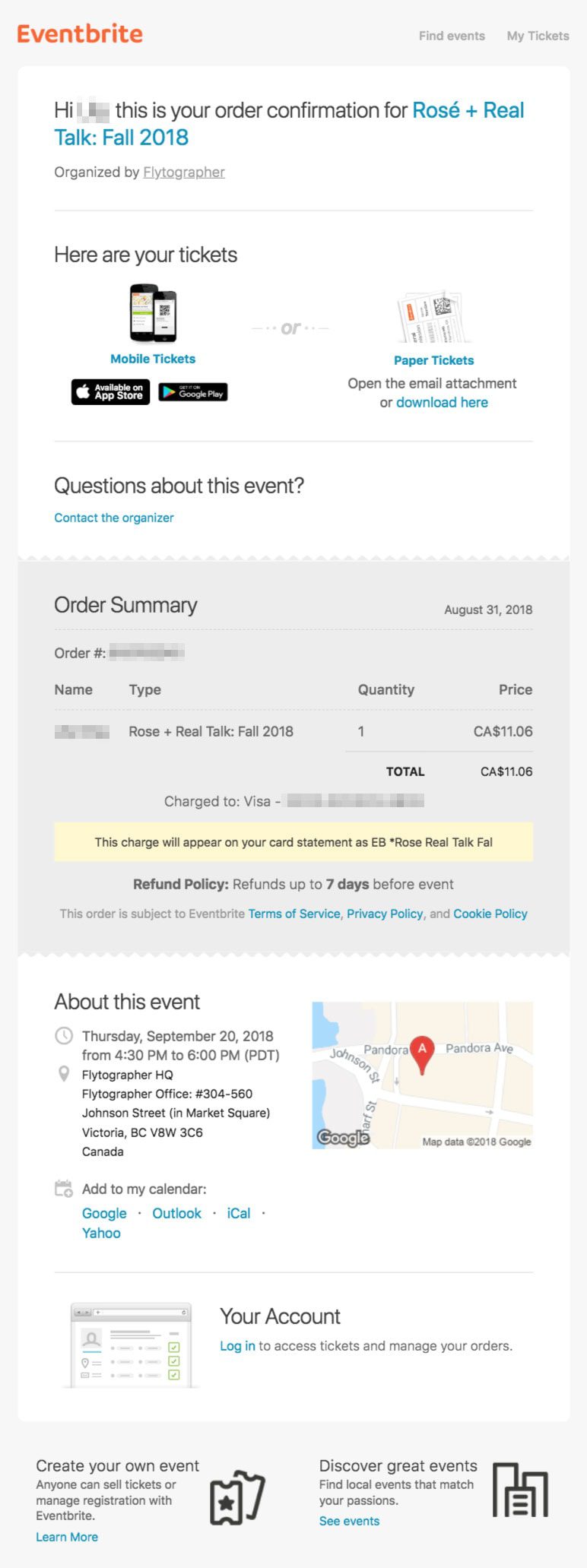
Clear and simple, just as an order confirmation should be. Eventbrite provides two options for retrieving tickets — their mobile app or download & print — in addition to full purchase details and event information, including a handy map of the location.
What’s Exceptional:
The email has a clear purpose and provides all the important information within the email itself.
