In short, yes.
A 2019 Data & Marketing Association survey found that email marketing delivers a $42 return for every $1 spent. This is a significant jump from the $38 to $1 return just a year earlier. A 10.5% acceleration in only one year highlights the power of email marketing. Having a strong mobile first presence goes a long way for consumer-driven businesses.
But what about the complex nature of a B2B sales cycle: do these companies need a mobile first email strategy? Or should they be the exception because customer journeys are longer and more detailed? Not necessarily: B2Bers need to understand the power of getting on the mobile train, and fast.
![Source: 10 Email Marketing Stats You Need to Know in 2020 [Infographic], Oberlo](https://www.dyspatch.io/wp-content/uploads/2020/09/image1.png)
Source: 10 Email Marketing Stats You Need to Know in 2020 [Infographic], Oberlo
The B2B Customer Misconception
Many people think that because they’re in a B2B company they only have to worry about how their emails look on desktop. But that’s just not the case. Practically everyone has a mobile phone these days and 40% of online transactions are on mobile. It seems clear that having a mobile friendly presence is vital for any company — B2B or B2C.
Sure, B2B buyers differ from B2C buyers when it comes to the customer journey. Typically synonymous with a complex buying process, the B2B buyer’s journey involves lots of comparison research. It’s not the relatively simple ‘click and buy’ process represented by standard consumer behavior. However, B2B buyers have become much more consumer-like in their behavior in recent years. Sixty percent of B2B buyers report that mobile played a significant role in a recent purchase.
The numbers are telling. Targeting customers with a mobile friendly email can accelerate purchase decisions by 20%. It can also reduce your sales cycle by 35 days on average. So, yes — going mobile first is key for B2B companies in order to convert customers and make money.
Why Should B2B Companies Go Mobile First?
Mobile email optimization is a key factor for increasing opens, click-throughs, and revenue. With more than half of consumers using a smartphone to check email, even B2B company emails should work well on small, portrait screens. Here are some compelling reasons why B2B companies should seriously consider employing a mobile friendly email approach.
1. Timing
Although interactive technology such as AMP for email can tailor content around when an email is opened, timing still matters. A Smart Insights compilation shows a consumer tendency to use mobile devices more outside of traditional working hours. PCs and laptops dominate the daytime hours. If you want to engage people while they’re scrolling in the evenings or on weekends, ramp up your mobile-viewing friendliness.
2. Better conversions
You should think about mobile friendly emails as just one (major) part of the customer buyer journey as a whole. For B2B companies, the journey tends to take a little longer than your average B2C. With the right timing and channel mix, a customer will be more likely to sign up for your product or service. Channels include social, websites (a staggering 71% of buyers stated that blogs helped them make a final purchasing decision), and email. As these touchpoints play a big role in attracting a customer, they need to be properly and cleverly displayed on mobile. Convince and ye shall convert.
3. Increased revenue growth
Now we’ve come to the most compelling reason to get your mobile act together: increasing sales targets and recurring revenue. In fact, B2B leaders are ultimately seeing a greater share of revenue — 42% on average — that’s mobile-driven or influenced. We also learned earlier in this post that mobile friendly email can also greatly speed up a customer purchase. Finally, designing for mobile consumption drives a 15% increase in clicks, and mobile audiences bring in almost double the revenue of desktop.
![Source: The case for mobile-ready B2B email marketing [Infographic], Vantage Point](https://www.dyspatch.io/wp-content/uploads/2020/09/image3.png)
Source: The case for mobile-ready B2B email marketing [Infographic], Vantage Point
What if a B2B Company Doesn’t Optimize Its Emails For Mobile?
Have you ever opened a site on a mobile device that takes forever to load? And then when it finally does, it’s misaligned, there are display errors, and the links don’t work. Of course you have. We all have — even in 2020! Sending clever, interactive, and highly scannable emails is a powerful tactic. But it can be a huge waste of time if customers can’t easily consume, understand, or appreciate the value offered on mobile.
1. Bad emails equals no customers
When it comes to mobile friendly email, a recent Dyspatch survey found a worrying 20% of respondents don’t receive well-presented emails. The result? 60% say they will delete or ignore an email if it’s difficult to read on their phone. That’s extremely concerning, as nearly half of mobile users will switch to a competitor after a bad mobile experience. This represents a huge hit to your key goals of increasing revenue and customer lifetime value.
2. Do it right and they will keep coming back
A separate study reported that more than 90% of B2B buyers with a superior mobile experience will buy again from that vendor. It’s hard enough to convert potential leads even when you’re doing everything right. So why not fully optimize, armed with a strong mobile first strategy? Ensure mobile design is dialled in for optimal readability and you’ll be golden (and get the gold).
OK, I’m Convinced. So, How Do I Optimize My Emails For Mobile?
As we’ve seen, most mobile users will immediately delete any email that has display errors or isn’t optimized. To avoid that, B2B marketers need to take both a responsive and an interactive approach to their email strategy. A combination of helpful software tools, some intuitive design work, and what-if-it-were-me-opening-this-email thinking can be the answer for mobile-challenged companies. So, check out the following tactics to help get you in front of customers and start engaging with them more deeply.
1. Use a responsive email design template
Responsive email design templates are a must, but they aren’t always easy to build. Out of the box email builders found in commonly used email service providers aren’t always reliable, and simply testing an email on your own mobile phone before sending it isn’t good enough Using an email builder such as Dyspatch can support responsive design for all devices. Keep things simple with a single-column design approach to ensure that it displays properly on different devices. You also need to be aware of how it renders on different email programs (Gmail, Outlook, Apple Mail, Yahoo Mail, and so on). This way your email will stay consistent no matter where and how the recipient opens it.
2. Simplify the content
When you put yourself in the place of an email recipient, it quickly becomes apparent what you want (and don’t want). You want scannable headings, short paragraphs, and obvious CTAs and links. You definitely don’t want long blocks of text that make it difficult to understand why you should care! Having a responsive design is now table stakes — B2B marketers must also design email layout and content that’s friendly and approachable. Customers should never have to crack open their laptop to properly digest an email because of how it looks on their phone. Here are a couple of B2B companies that did it right.
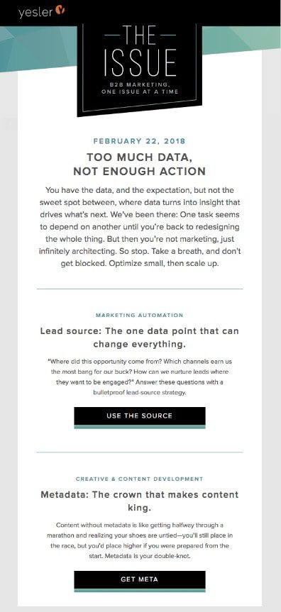
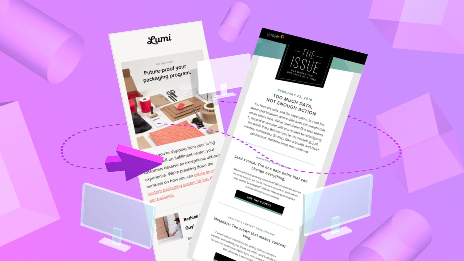
Marketing firm Yesler’s monthly email newsletter comes in a scrollable, one-column design:

Source: 8 stellar examples of B2B email marketing, myemma.com
Note the compact use of copy and space and easy-to-spot CTA visuals. Catchy taglines on prominent buttons and recognizable social icons engage customers without overwhelming readers with too much information.
Here’s what an email campaign from brand packaging company Lumi looks like on mobile:

Source: 8 stellar examples of B2B email marketing, myemma.com
This shows that Lumi’s marketers understand mobile audiences and their habits. They’ve included great visuals, lots of clear and concise headings, and a liberal use of whitespace for approachability. Instead of trying to cram too much into one display, Lumi provides teasers to content that lives on their website.
Test frequently. Perhaps one of the most important considerations when getting your email campaigns ready for mobile is to constantly test them. This is why using an email builder such as Dyspatch is so important. Dyspatch offers built-in Litmus testing that allows you to test your final email on multiple devices and screen sizes. Testing serves as a vital exercise to see how your email looks on different devices. It can also help you tweak personalized subject lines and verify timing. An email creation platform that supports this kind of instant testing will keep your content looking great for every recipient.
It’s surprising that in today’s digital world, over half of marketers say they never test their personalized emails. Never! We’re not sure how this is even still happening. Seeing your emails in real time on multiple devices as well as on email apps seems like a no-brainer. Going the extra (and necessary!) mile can make or break your marketing efforts — and your reputation as a progressive B2B company.
The Do’s and Don’ts of Good B2B Email Marketing For Mobile
Once you’ve employed a responsive design template for your emails, it’s time to learn how to structure content for optimal display. Don’t worry — we’ve got you covered. The following table provides some handy guidance to make your content mobile friendly:
Do the Do’s and Beware the Don’ts
You might have noticed that the key theme of these Do’s and Don’ts is to create shorter, more actionable content. This includes text, visuals and interactive elements to make your content more concise and easy to engage with. Even something seemingly minor like too much scrolling can turn off your target audience, so it’s worth sweating the details. When you do, consider the length of the average human attention span: eight seconds — less than a goldfish! So, make it easy for them to understand the value of what you’re offering.
First Mobile, Then World Domination
Seventy percent of B2B customers are now using mobile for search queries, a jump from 50% in 2017. B2B companies that fail to optimize email content for mobile will miss out on a ton of lead generation and conversion opportunities. However, creating a truly mobile friendly email experience requires more than just employing responsive templates from an email builder. Yes, your website needs to display properly and look great, but it’s more complex than that. Content has to be succinct, scannable, easy to read, actionable, and engaging. Everything you send, communicate, or post out to the world needs to look amazing on mobile.
And, even that only gets you so far. In our 24/7 world, users need to review, digest, and respond to content anywhere, anytime, and on any device. These factors are vital for an incredible user experience that’s much more likely to convert potential leads into loyal customers. It takes some end-user knowledge, intuitiveness, and lots of testing to get it right. Once you master the art of responsive email, then — and only then — can you move on to world domination.
| Do’s | Don’ts |
|---|---|
| Offer digestible content that’s formatted to read on mobile, such as ebooks | Slap a huge white paper into your email that overwhelms your busy audience |
| Use easy-to-click drop-down lists, radio buttons, and check boxes on forms to encourage engagement | Use long text fields and many links nested within the text |
| Offer a short registration form that’s browser autofill-friendly and quick and easy to fill out on mobile | Use a long, onerous non-standard registration form that makes it challenging and tedious to fill out on a small screen |
| Use larger CTA buttons that are simple to tap (and avoid fat finger syndrome) | Make people squint, scroll, and search just to see and access your CTAs |
| Shorten email copy — use subheaders and bullets thoughtfully for quick scannability | Include long tightly-spaced paragraphs that make finding relevant content frustrating |
| Limit subject lines to no more than 30 characters (vs 40 characters on desktop) | Ignore the mobile rule-of-thumb so your subject lines get truncated (and potentially confusing!) |
| Consider a way for users to download content at any time, such as a “Remind Me Later” CTA button | Make downloading content hard or non-existent for users |
| Make key conversion elements highly visible. Display anchor links so a user can quickly click and return to a form or CTA buttons | Make people hunt around for key conversion elements, potentially causing them to give up in frustration |
| Always, always sum up the key message, offer, and CTA in the preheader text for higher conversion rates | Underestimate the power of the preheader text. If you do, you’ll convert fewer customers |
