Everything is in its right place. Your email marketing campaign looks great. Your mailing list is updated. You press ‘send’, your phone has an email notification, you open it up, and…
Now everything is in the wrong place–
- Those beautiful visuals your designer crafted? Flattened.
- Those rounded corners and custom fonts? They’re not rendering.
- The background images that gave depth? Removed, and some text is unreadable.
- The padding and alignment that was dialed in just so? Now they’re off, and the layout has shifted.
If emails aren’t designed and tested for mobile devices, then a significant share of readership will be lost. Mailchimp’s research found that responsive email templates get 15% higher click rates on all devices. But, according to a SuperOffice survey, nearly 1 in 5 B2B email campaigns weren’t optimized for mobile devices.
What gives? Why isn't it enough to send yourself a test email?
Yes and no. Yes in the sense that testing how an email renders remains essential. No in that you simply can’t run one test anymore, unless you use Dyspatch. One of our key features is modular pre-designed blocks. These pre-designed blocks mean you only need to test once, reducing the need to re-test emails in your ESP before you send them.
However, if you’re set on testing your email designs manually, let’s discuss the many factors that add up to emails rendering unpredictably.
Why Emails Display Differently Across Email Clients and Devices
There are endless smartphone models, operating systems, email service providers, and security settings, and they all have customizations to offer. This is a double-edged sword: the end user can create a singular, tailored setup, but a lack of standardization plagues all of these facets. What looks good on Gmail within Safari browser on the latest iOS will likely look putrid on Outlook operated by Windows 7.
These complexities aren’t going away any time soon, so let’s look at what’s creating these differences:
- Operating Systems. Operating systems like Windows 10, iOS, and Android will influence the email you’ve designed. Some people haven’t updated their smartphone’s latest OS, while others keep theirs updated. There is a lot of variance to wrangle within operating systems.
- App and Web-based Email Clients. App-based clients, such as Outlook and Gmail, tend to display emails within their mobile environments. However, web-based clients bring complexity because they run on different browsers, such as Opera or Safari, which changes how the email will display. For example, Gmail will render emails differently depending on the browser.
- Email Service Provider. Your ESP, like Sendgrid, may alter parts of your HTML code, causing your email to render differently. So, even if you use the same email template, the emails could render differently.
- Security restrictions. Some users block media from their emails due to security concerns. For such users, the email can fail to convey its core message to the subscriber and appear incomplete or unappealing.
- Updates. Change is frequent. According to Litmus, an email client updates roughly every 1.2 days. Each of these updates could impact your renders – compound that with the reality that updates aren’t uniformly adopted.
Now that we’ve established why email rendering differences exist, let’s discuss how to set up more effective testing with these differences in mind.
Picking the Right Email Clients and Devices To Test
It’s one thing knowing that you need more than one test; selecting which ones to test is another challenge altogether. There are a lot of clients and devices to choose from, so knowing what your customers are likely using can help you prioritize.
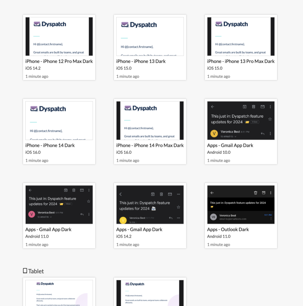
Litmus is a great place to quickly identify the clients with the most market share, and this list is readily accessible in Dyspatch. Dyspatch has built-in Litmus testing, which spares you from needing a separate account to use their email testing software. When you’re building new modules in Dyspatch, you’ll be able to instantly preview your campaigns in all popular email clients with a click.
When building out campaigns, it’s important for marketers to look at their analytics to prioritize the clients and devices used by their customers and leads. We recommend sending a minimum of four different tests to ensure that you don't have any surprises after you hit SEND. Make sure your emails pass through this gauntlet, and ensure that your customers have a great inbox experience. Here are our top 4 recommended email clients and devices that you should be testing before each campaign.
1. Outlook: Navigating the Corporate Landscape
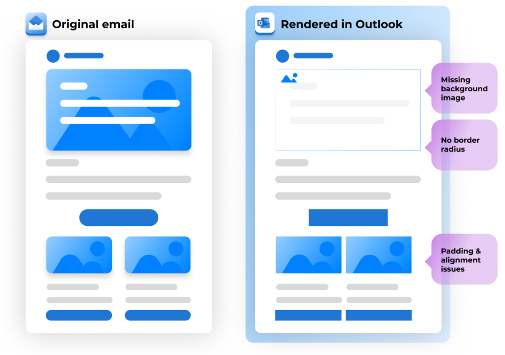
Outlook has long been a staple in corporate environments. Its prevalence in business settings makes it a must-test platform for anyone sending professional emails. Outlook is notorious for unique rendering quirks, such as:
- Ignoring style tags
- Not supporting CSS styles for widths and heights
- No background image support in several versions
Outlook has a rigorous process for ensuring that emails that hit your inbox aren't spam, and provides helpful guidelines to ensure high deliverability. It uses several safeguards to verify emails, such as:
Matching the sender’s name to their outgoing email, checking for the sender appearing in your Contacts list, penalizing the sender for putting all their email recipients in BCC, removing HTML scripting languages that may be unsafe, and many others.
2. Gmail: The Everyday Essential
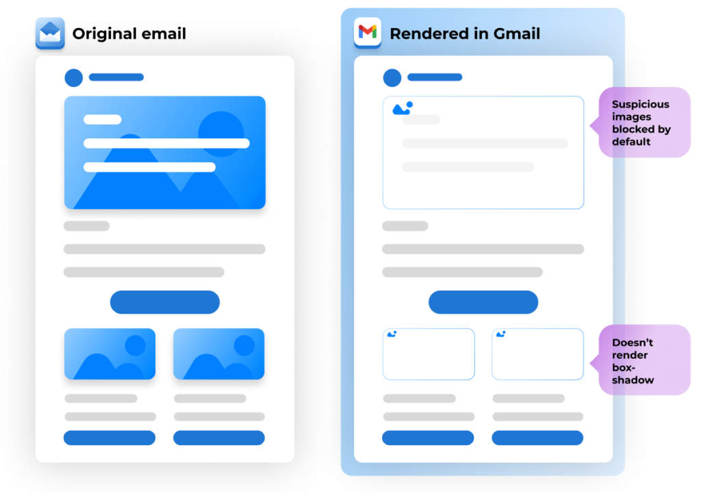
As one of the most widely used email clients, Gmail is a must on any testing checklist. It has the 2nd highest market share in the US. Despite its popularity, Gmail has notable rendering issues:
- Gmail blocks suspicious images by default
- Doesn’t render commonly used properties like text-shadow and box-shadow
- Doesn’t support most positioning rules for CSS, including top, right, bottom, and left
From personal emails to professional communication, Gmail's popularity means your audience is likely using it. Testing here ensures your messages maintain their impact, readability, and visual appeal for both personal and business contexts.
3. Apple Mail: Bringing Apple Users the Best Email Experience
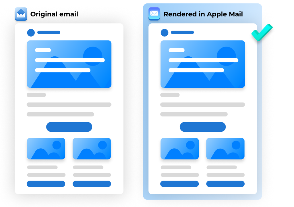
For users in the Apple ecosystem, Apple Mail is the go-to email client: Apple Mail holds a whopping 58% of the market share. It’s worth focusing on getting right and, thankfully, it’s one of the best in regards to rendering: Apple Mail offers robust support for all commonly used HTML and CSS, including most CSS3 properties. It also supports the use of both SVG and CSS Animations, which can lead to some amazing emails. However, despite this design support, one common issue with Apple Mail is that it doesn’t support the use of canvas within emails.
With the rise of iPhones, iPads, and Macs, ensuring your emails look flawless in Apple Mail is paramount. Dive into the nuances of this client to capture the attention of the growing community of Apple device users.
4. Android Devices: Navigating the Android Ecosystem
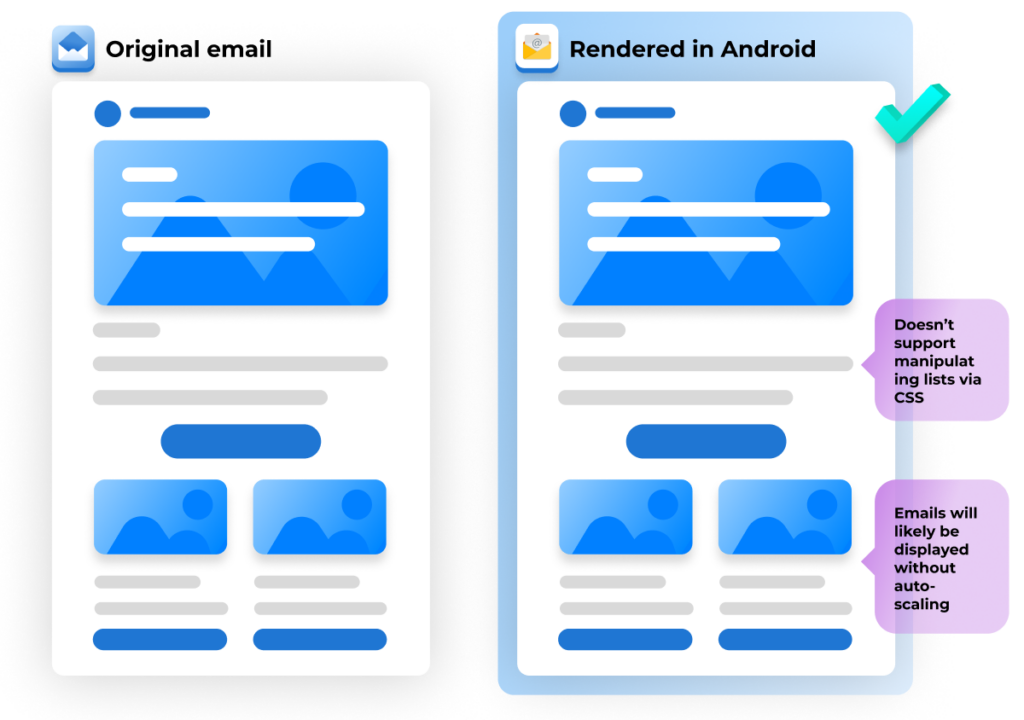
Given the expansive range of Android devices, ensuring your emails display correctly across the diverse spectrum of screens and resolutions is important. Whether on a Samsung Galaxy, Google Pixel, or any other Android device, a seamless experience on Android is vital for reaching the world’s most popular mobile operating system.
- Doesn’t support manipulating lists via CSS
- Emails will likely be displayed without auto-scaling
- Mobile displays tend to ignore “display:none;” to hide elements
Running Email Tests With Confidence
In the ever-evolving landscape of digital communication, ensuring your emails are displayed correctly across various devices and email clients is crucial, and key to delivering a consistent experience and delighting your users.
By focusing on Outlook, Gmail, Apple Mail, and Android devices, you'll cover the major players in the digital communication landscape. One thing to bear in mind is that the landscape is never static –– these rankings will change based on the audience breakdown. The more clarity you have into your clients’ demographics, as well as their email preferences, the better of a chance your campaign has of meeting them where they’re at.
Remember, a well-tested email not only looks great but also strengthens your connection with your audience. According to Litmus, research shows a 28% higher ROI for those who test their emails. The better you can meet all the customizations of your audience, the more likely it is your campaign will drive results.
Need help with email guardrails to make sure every email you send looks great across all clients? Get a demo today!

