New in Dyspatch this quarter…
Hi everyone, I’m Vero Best, VP Product at Dyspatch, and I’m excited to share some recent updates we’ve shipped. We’ve listened to your feedback, and delivered on some massive new and improved features this quarter. I can’t wait to hear what you think!
As always, our team’s priority is to upgrade our email builder to make it even more convenient, powerful, and easy to use. In this post, I’ll explore some of the changes we’ve made lately to do just that.
Some are updates Dyspatch users will have noticed immediately, and a few are tips and tricks I might be introducing for the first time. Email marketing is an ever-shifting arena. To create exceptional email experiences, it’s essential we embrace new developments, trends, and tactics to the fullest. Queue our latest updates.
Let’s get into it…
Want content to only appear on mobile or desktop? We’ve got you covered
Want to adjust what shows up in your emails, depending on the size of your subscriber’s screen?
Using the Dyspatch Markup Language (DML), you can now easily target desktop or mobile resolutions. It’s easy: use the dys-mobile or dys-desktop tags to indicate which of your content blocks will display on different devices.
No need to use unreliable media queries or write a lot of complicated code. This simplifies a common use case and gives you greater control over how your blocks will display — so you can deliver an exceptional experience, on every device.
Some of my favorite uses cases for this include tactics showing a phone number to recipients on a mobile device, or an email address to folks on desktop. The use cases are endless, though! Check out our product short video above for some clever ways to improve the overall look and feel of your email with better image layouts on mobile versus desktop.
Get more design flexibility and control with editable style elements

Looking to make minor design changes to your template elements without building new content blocks or implementing custom code?
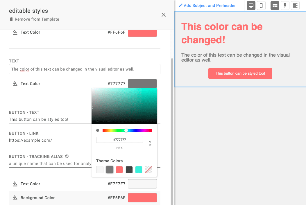
You asked, and we listened. You can now define the customizability of each element inside your content blocks with editable styles attributes. This improves the flexibility and reusability of your blocks — since you can easily make changes to the text, color, and buttons as you go — while setting guardrails for elements that shouldn’t be altered lest they break your layout.
To get started, define which elements you’d like to make customizable with the editable, editable-fields, and editable-styles attributes. Next, you’ll be able to enjoy more design control, so you can make changes more efficiently than ever.
Sync email templates to HubSpot, now in Dyspatch

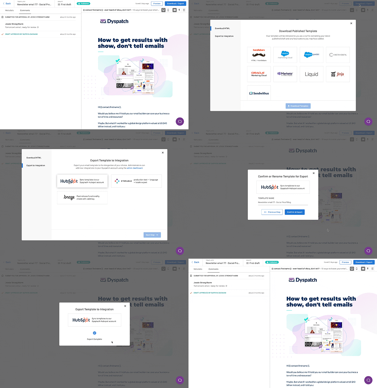
Synergistic news! Dyspatch now offers a direct integration with HubSpot. With this click and connect integration, it’s easier than ever for Dyspatch users to sync their email templates to HubSpot in a matter of seconds.
We have a team dedicated to adding new integrations to Dyspatch, so expect to see a few more highly requested direct connectors in the next few months.
Learn more in the documentation.
Deeper improvements to the developer experience in Dyspatch
We’ve made DML even more powerful for developers and other code-savvy Dyspatch users. Stay tuned as we have more to come in Q2. Here are a few highlights from the past few months:
dys-row background colors
Looking to change the color of only certain elements within your blocks, so you can better highlight your messaging? Now you can change dys-row colors directly in the visual editor! This gives you much more flexibility when it comes to template styling, reducing the need to create additional themes or blocks. Plus, you’ll never have to worry about going off-brand, since the color palette is determined and locked in the theme editor.
dys-style in blocks
Fine-tuning your templates with custom styling just got easier. Now, you can add dys-style tags directly in blocks. Rather than having to apply changes at the theme level, this update lets you hone in on only the blocks you want to customize with CSS, saving you time and making for more streamlined templates in the future.
dys-buttons letter-spacing
Does your brand have strict rules for letter spacing (i.e. tracking) that you want to keep consistent — even for buttons? No problem. With this latest update, you can change the letter spacing in dys-buttons, and ensure every email matches your branding guidelines to a T. This was a common request and I’m to announce that this is live in Dyspatch.
Change a block’s theme from the visual editor
And finally, a huge time saver. When you need to quickly add or remove a block from a theme, you can skip the extra clicks it takes to get to the theme editor. Now, Dyspatch offers a quick way assign a block directly to a theme while you’re working on it in the visual editor. This update helps you get the technical details right, so you can finish your template’s design faster.
Sync email templates to Salesforce Marketing Cloud, now in Dyspatch

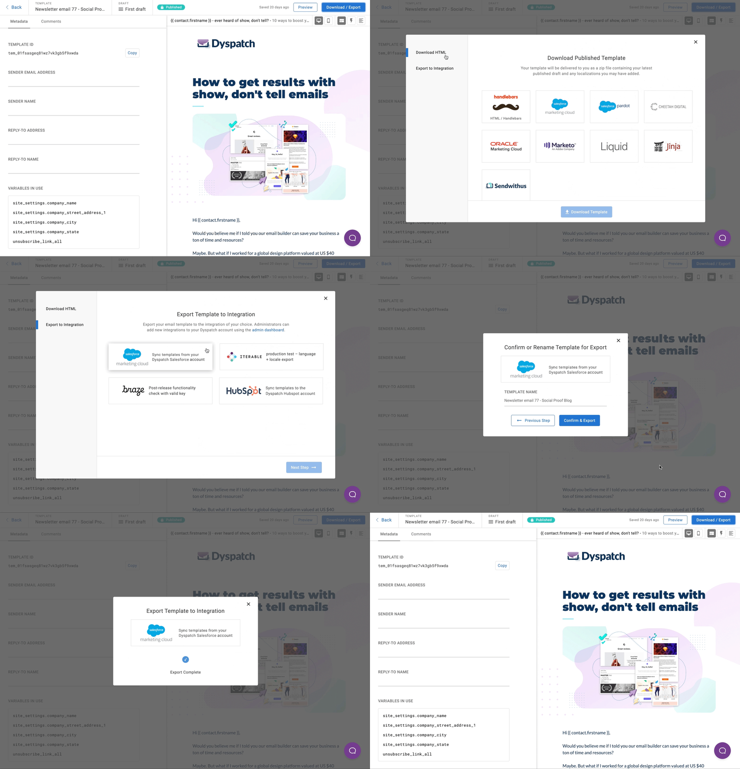
This integration is pivotal for teams working in Dyspatch and SFMC. It fosters a truly seamless email workflow, eliminating extra steps and allowing teams to move faster – at scale.
Build beautiful, responsive email templates in Dyspatch using the drag-and-drop visual editor. Include your Dyspatch apps-in-email and AMP for Email content, since they’re supported by SFMC. Include your localizations. Then, once a template is ready to go, sync it to SFMC with a click. This is a hugely valuable workflow improvement for Dyspatch teams that leverage SFMC’s powerful tracking and reporting capabilities.
Finally, there’s a way to move fast with Dyspatch’s flexible, no-code modular email design system, reuse and iterate on top-performing templates, and connect it all with your SFMC account.
And with AMP for Email support, the possibilities are endless.
See you in the next dispatch in Q2!
Cheers,
Vero Best
