Marketers love examples of marketing.
Examples inspire us. They teach us. And they give us ideas for our next campaign.
So the Dyspatch team and I had an idea. Let’s ask a bunch of email pros to share examples of their favorite emails from 2021.
We told them it could be an email they sent, or one they received.
Here’s what they shared with us…

1. Andy Crestodina, Co-Founder of Orbit Media
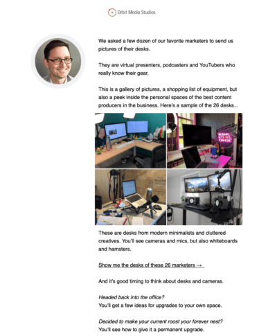
- It’s the best email I’ve sent in years. It checks all the boxes:
- The subject line indicates the content is visual (always helps the open rate).
- It promises something exclusive (see the desks of your favorite marketers).
- It promises something useful (get a list of the gear on each marketer’s desk).
The open and click through rates were off the charts.
![]()

2. Jay Acunzo, host of Unthinkable, writer of Playing Favorites
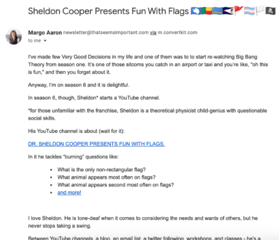
Margo Aaron writes her face off. Every time she sends an email, I open it and marvel at a few things. The tone of voice. The humor. The brutal honesty about the marketing industry (aka you and me when we aren’t doing our best — she lights a fire under our butts).
Everything we’re told to be as a writer, she is. Everything we’re told to be as an email marketer, she is NOT. And that’s why I love her approach. She doesn’t write about timely or attention-grabbing things. She finds small moments and observations and finds deeper meaning.
Gone is any sign of crazy design or pleading calls-to-action. It’s like she’s saying, "Here, this is all I’ve got this week. No fancy wrapper. This is the best I can do." And then, of course, you can hear her voice saying at the end, "Your turn."

3. Ann Handley, Chief Content Officer at MarketingProfs, author of Everybody Writes and the Total Annarchy newsletter
Not sure it’s my favorite of the entire year. But Penzey’s approach to marketing is memorable and here’s an example of that. I like it because:
- It acknowledges world realities from a specific POV (Point of View);
- It’s written by the CEO in his own voice;
- It name-checks the spice world’s biggest distributor in a cheeky way.
Penzey’s weekly emails feel like an ongoing conversation — never a one-off sales email. It’s hard to speak to just one in isolation. But that was the ask from Liz. So. ????


4. Matthew L Smith (AKA @whale), CEO of Really Good Emails
Everything Everlane. I’m such a STAN for the company and their design.
Everlane has the ability to use text and imagery to convey the ethics of quality, integrity, simplicity, and authenticity. They use whitespace to allow for a pause between communication that helps me know what’s important.
Everlane uses so few different types of type and design elements that they absolutely dominate the design golf pro tournaments (Design golf is using scoring a point for every point of difference in a design, when every point of difference needs to DO a job, lowest score wins).
I am smitten with all these designs. Feast your eyes.
Related: See more emails from Everlane here


5. Jay Baer, founder of Convince & Convert, author of six books + TheBaerFacts.com email newsletter
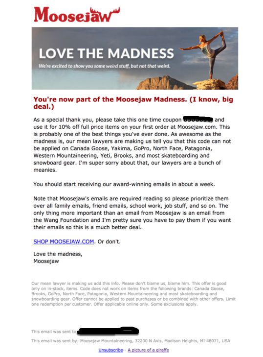
I love all emails from outdoors e-commerce retailer Moosejaw and I’m an avid indoorsman! This is a fantastic example of a brand using effective irreverence.
This is the welcome send and it sets the tone for the entire relationship. It’s funny without trying too hard, and I love how Moosejaw consistently references people and departments in their organization (in this case, the lawyers). They do it in email, in social media, and throughout the website.
Certainly, using humor can be a challenge in email because each of our “funny radar” is tuned a little differently. But Moosejaw nails it, and creates effective communication even in a message that’s bleh from a graphics standpoint.


6. Matthew Harris, Co-Founder and CEO at Dyspatch
I super love this email from the team at Nest.
It’s a marketing email for their newest wireless camera. From a design perspective, I love how the camera is “hanging” off of the background of the email. It looks really clean, and they carry that grey on white design through the rest of the email.
I do think there’s an opportunity to do a little more with something like AMP for Email — let me explore the different features of the new cam directly in the email. Overall, it’s a great looking email that has all the right information above the fold.
![]()


7. Anne Tomlin, Founder of Emails Y’all and Email Loot
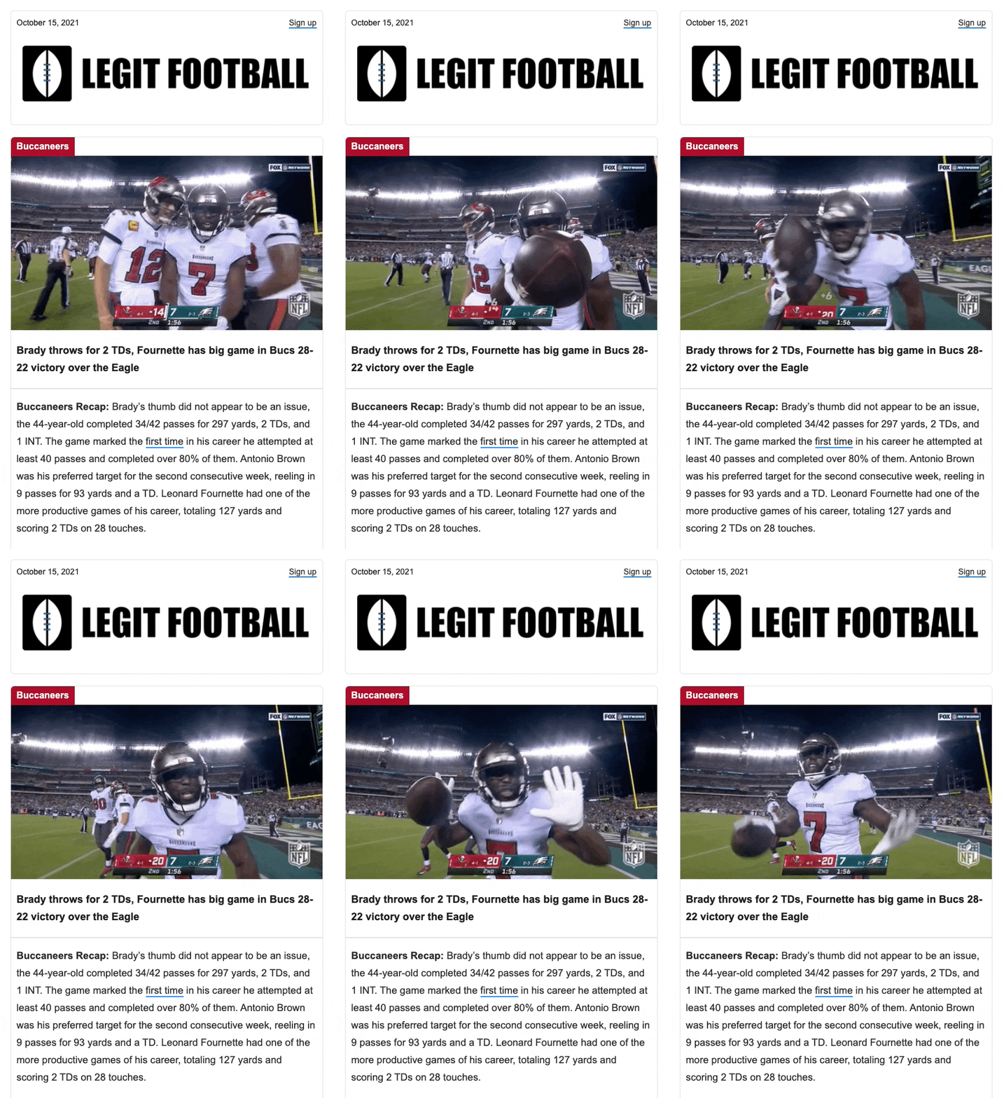
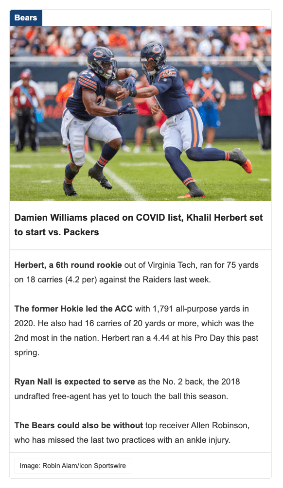
I like this email [from Legit Football] because it has a very clean layout with the information organized in a very easy way to digest. The email is coded with accessibility and dark mode in mind, so everyone can read it without any obstacles — like it underlines links in a different color so that you can tell immediately that it is a link.
The image use of both gifs and static images really show the action that fans love. This is a new newsletter on the scene and they have hit the ground running by ensuring the best rendering they can get for their many subscribers.

8. Jaina Mistry, Senior Manager of Email Marketing at Litmus
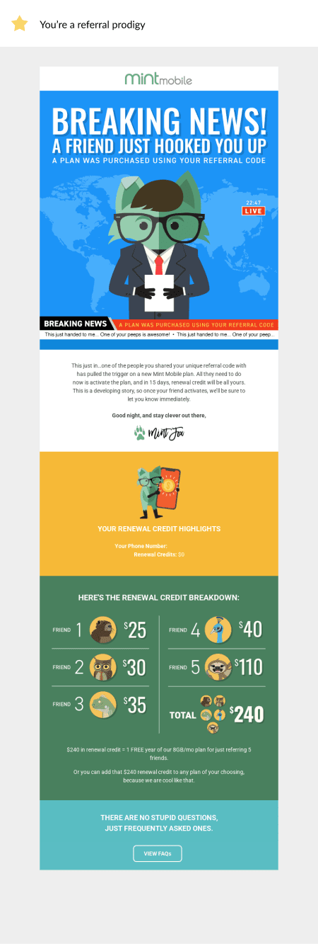
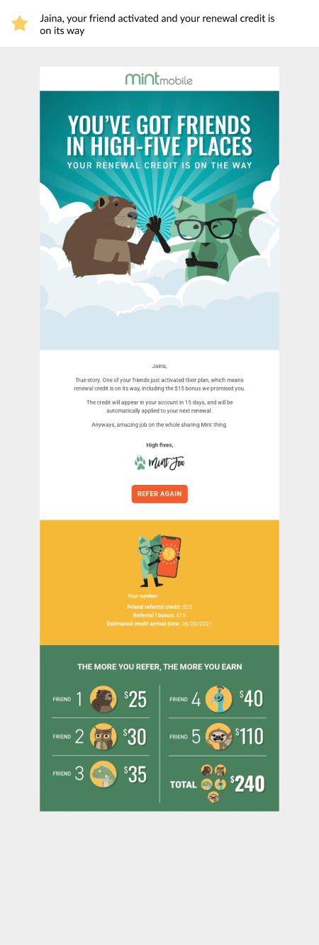
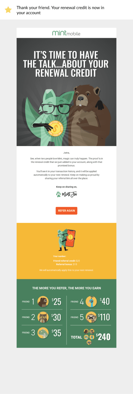
Below are three emails I received from Mint Mobile this year when I referred a friend to their service.
What did I love about this campaign?
- The timeliness. Every step of the referral process I was given timely communication about my referral credit.
- My expectations were set from the beginning. Mint Mobile laid out all the details very clearly about when I’ll receive my referral credit from the first email all the way to when I received the credit.
- These emails are so much fun and on-brand! The cute animal characters, the fun and playful copy. It illustrates that even with a fairly important customer journey like this, you can still have fun and inject your brand personality into the email campaign.
- Each email is personalized with my account information and how much referral credit/bonus I’d be getting — I don’t have to log in and hunt around for this information, it’s right there in the email.

9. Veronica Best, VP Product at Dyspatch
SSENSE is a renowned Canadian luxury fashion retailer and self-professed “tech leader and cultural resource”. And the moniker is accurate: I always open their emails! I’m always impressed with their editorial point of view, styling, and brand vision.
This year, they’ve taken risks with their editorial content, created some dramatic (and controversial) styling combinations to really showcase their wares, and their email campaigns reflect their willingness to take risks with both fashion, their blog, and their customer communications — while maintaining an unmistakable brand identity.
Their emails, in particular, include eye catching gifs, brand showcases with funky visual elements, and iconic design. They never get clipped by Gmail, they always render perfectly (even when they have dynamic elements), and they always get me thinking about how to take risks with my outfits.
![]()


10. Liz Willits, Conversion Copywriter and Founder of Content Phenom
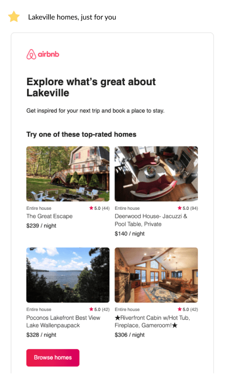
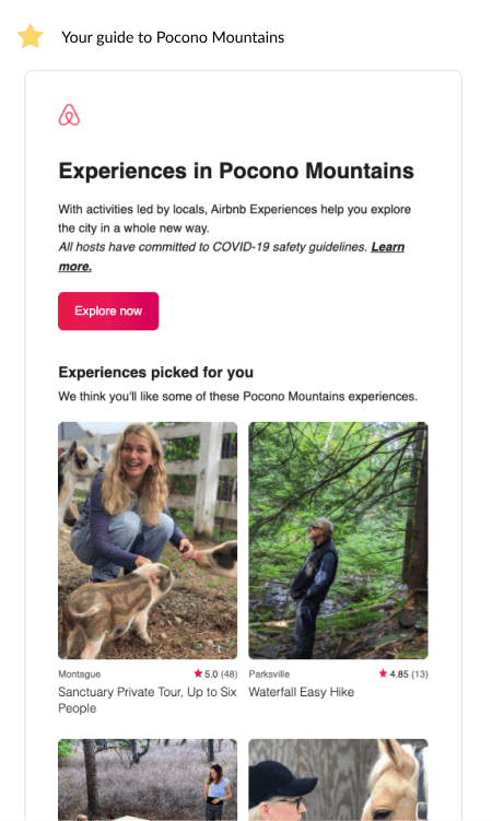
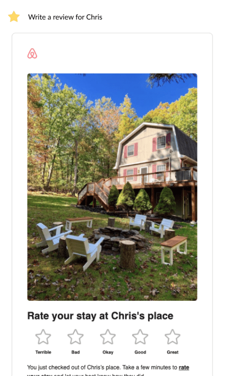
From the moment you begin searching their site, Airbnb starts sending highly personalized, helpful, and contextual emails.
Over the summer, I wanted to take a short trip to Lakeville in the Pocono Mountains. When I started looking on Airbnb’s website and hadn’t yet booked a place, Airbnb sent me an email showing top-rated homes within my search area.
After I’d booked, they sent me a guide to the Pocono Mountains with links to local experiences.
Finally, once my trip was over, they sent me an interactive survey email, so I could easily rate my experience by just clicking within the email.
I love how they use email marketing to hold your hand through the entire purchase journey and beyond.
That’s a wrap! (And more Really Good Emails…)
While we shared examples from diverse companies with unique products and industries, our experts brought to light a few themes that great emails have in common. Great emails are:
- Clear and helpful to the target audience. They go above and beyond for their audience and solve real-life problems.
- Contain email copy that’s real, human, humorous, and/or honest. Not corporate. Or jargon filled. Or robotic. The copy has a unique tone too.
- Well designed. Whitespace shows hierarchy and what’s important. Fonts and imagery convey messages about what the brand stands for.
- Accessible. Everyone is able to view and read the emails without issues — whether they’re using a screen reader or viewing the email in dark mode.
- Timely and personalized to the reader. When you open them, it’s exactly the email you need in that very moment.
- Refreshing, unique, and a bit risky. Great emails take risks — with copy and design — that make them stand out from the deluge of boring, similar emails crowding our inboxes. They’re a breath of fresh air.
If you like the examples in this post and you’d like to see more, our friends at Really Good Emails are happy to oblige. Check out their site for a curated collection of thousands of … really good emails.
