“There are three responses to a piece of design — yes, no, and wow,” graphic designer Milton Glaser once said. “Wow is the one to aim for.”
Glaser — famous for creating iconic designs, like the “I Love New York” logo, the psychedelic Bob Dylan album poster, and the logos for DC Comics — knew the power of great design.
In a crowded inbox, a design that is a wow can have a big impact for your brand. It’s worth investing in!
We asked 10 email design experts to share the trends and best practices you should follow in 2025.
Here’s what they said…
10 Email Design Tips from Industry Experts
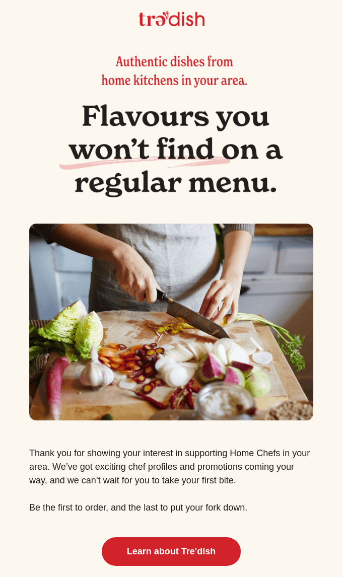
1. Pastel email backgrounds

Matt Helbig (Community at Really Good Emails)
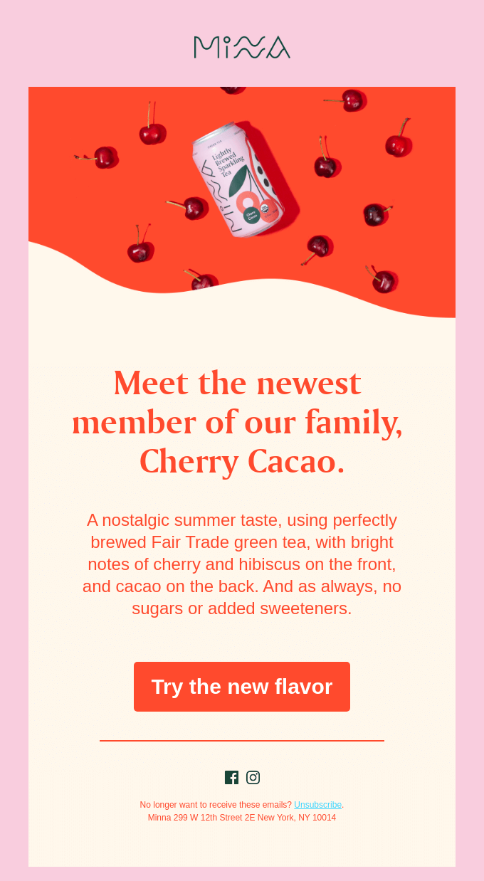
Brands should adopt a design that sparks feelings of softness, comfort, human connection, and retro nostalgia.
One design hack is implementing a pastel background color for a friendly and approachable base. Pastel colors also support other trends that we expect to see, like bold typography, wavy lines, doodle illustrations, arches, glowing neon, and a monochromatic color scheme.
Using pastel background colors in your email marketing is an excellent way to play into the 90s/Y2k nostalgia and add a punch of color to the inbox view. It stands out from plain white backgrounds and adds personality to your campaigns.
2. Design scannable emails

Lily Worth (Senior Email Designer at Litmus)
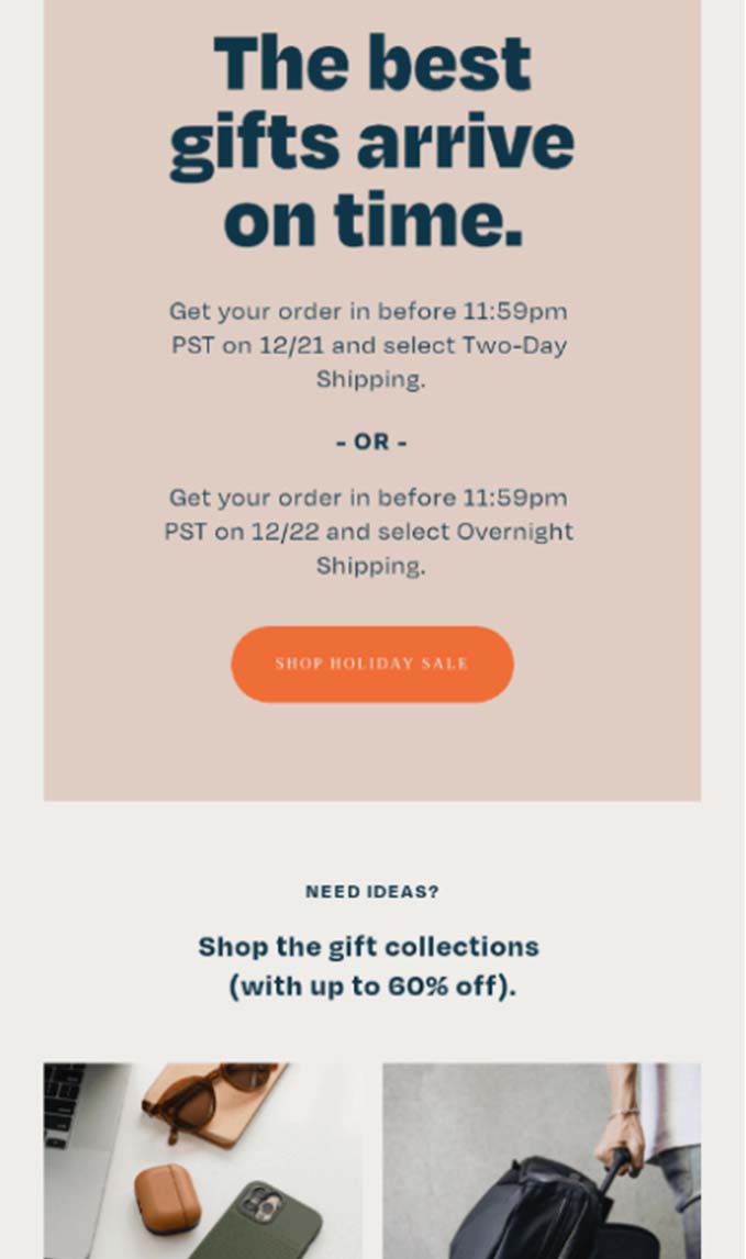
Design emails to be scannable.
With marketing email send volumes increasing year on year, the demand on subscriber attention is growing. Designing emails to be scannable can help audiences get value and take action without the need to read every word of copy.
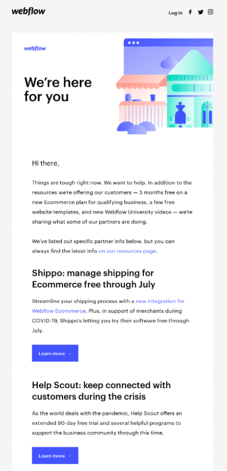
Considerations for making email designs scannable include breaking up content with headlines to pull out key messaging, these should then be styled to stand out with larger font sizes and bolding.
When coded semantically headlines are also a win for accessibility, making it possible for people using assistive technology to scan through them. A semantically coded headline is wrapped in a HTML header tag, such as <h1> for a primary headline and <h2> for secondary headlines.
Placing key information and takeaways into lists and ensuring CTAs stand out against other elements in your design will also improve scannability and help subscribers to take action.
3. Dark mode

Anne Tomlin (Founder Emails Y’all and Email Loot)
Dark mode is gaining more traction every year. Your emails need to look good and be legible whether the subscriber is using dark mode or not.
When designing your email, change the background to black and body text to white. If you can’t see your logo, social icons, et al, change their color(s) or put a white stroke or glow behind them. They need to be visible particularly in Outlook and Gmail, because dark mode changes are automatic and can’t be controlled via code.
4. Keep comprehension and connection at the forefront in the design process

Meghan Sokolnicki (Senior Email Designer/Developer at Emma & Campaign Monitor)
When we think about email design, I always recommend keeping the themes of Comprehension and Connection at the forefront in the design process. Every design decision you make should feel purposeful and fall into one of these two categories. When you’re designing an email, continue to ask yourself “Am I making the content easier to understand?” or “Am I helping to create a positive personal connection between my brand and consumer?” If the answer is neither, it may be time to find a different solution.
We’re seeing a big emphasis being placed on creating a human connection with our subscribers. For instance, using soft colors and rounded edges can make your emails feel more friendly and approachable. Using photography that shows people or creates familiar situations can help designs feel more relatable and increase this personal connection even more.
To help increase comprehension, you can never go wrong with using basic design principles like establishing a clear hierarchy and focused call to action. While every brand is different, the ultimate goal in 2025 is to invest in our relationships with our subscribers and continue to create a positive association within our communications.
5. F-pattern layouts

Jaina Mistry (Sr. Email Manager at Litmus)
There’s a big resurgence of what’s called F-pattern layouts, or left-aligned emails, where all the content of the email is left aligned. Including the brand logo that’s featured in the header of the logo.
And for good reason. This sort of layout is incredibly easy to read and follow. Your eyes are anchored to the leftmost point of the email as you read each line. Unlike the center-aligned copy where your eye often has to struggle to see where the next line is to read.
Couple this design technique with your typical email hierarchy — headline, hero image, copy, and CTA button — and you’ve got a highly scannable and easy-to-action email that will drive conversions.
6. Break up written content with visuals

Guilda Hilaire (Director of Product Marketing at Salesforce)
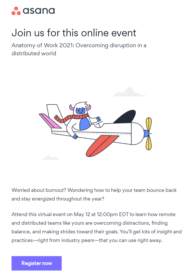
If a recipient opens an email and only sees paragraphs on paragraphs of information, it’s likely going to be difficult to hold their attention and keep them interested in your message. It’s going to make for a pretty boring email.
Whether your company operates in B2B or B2C, your recipient will find value in engaging visuals. Visuals are eye-catching, fun, present more information than just words, and generally stick with people long after the words have faded away. So, don’t be afraid to break up the written content and create a memorable and engaging experience. Pull that email design out from the past!
7. Accessibility and a contrast ratio of 4.5:1

Jordan Smith (Creative Director at Tapptiv)
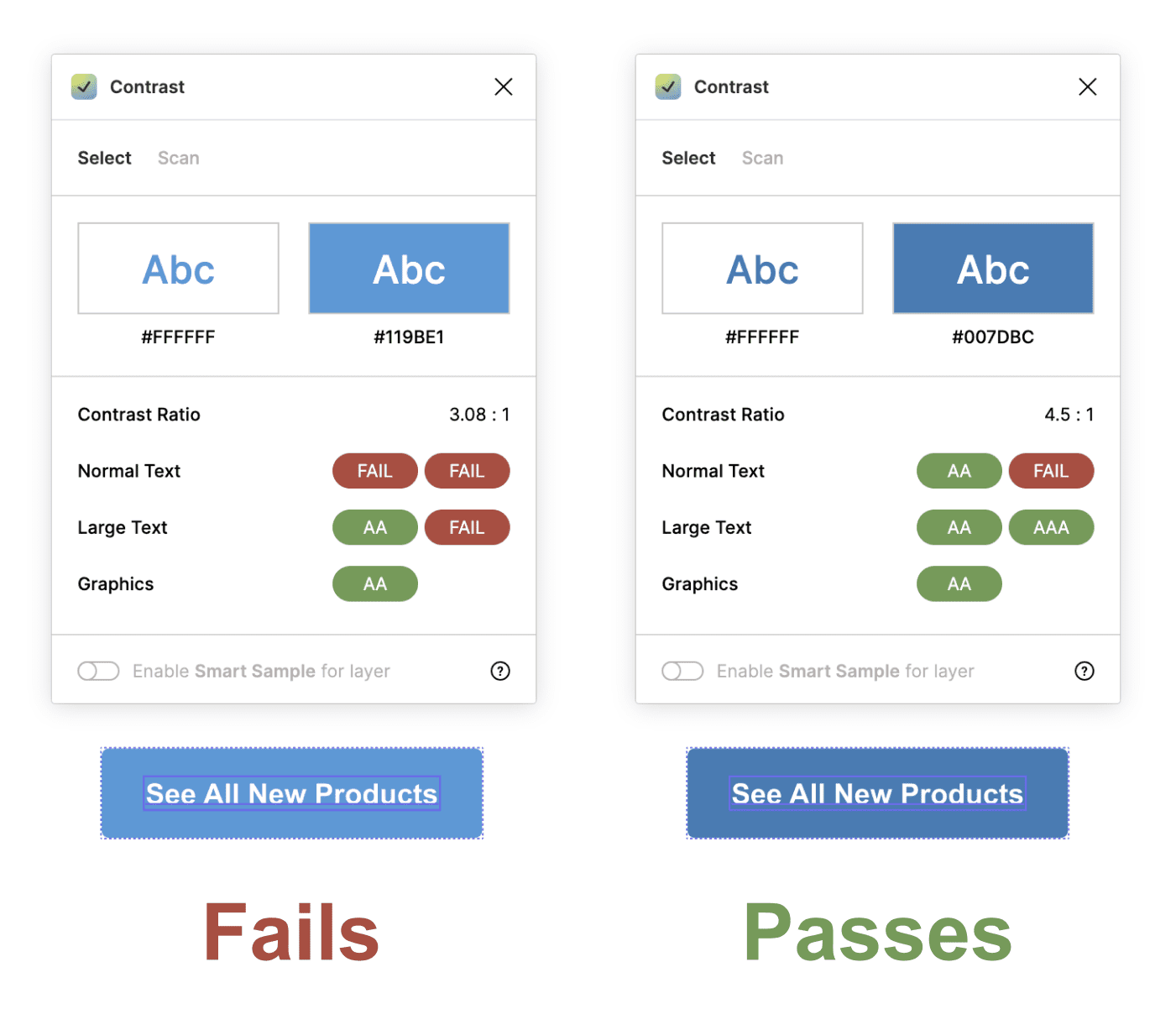
Accessibility should be the main focus in 2025. Contrast ratio and text size are important details that are often overlooked in email. Make sure your CTA's, text, and brand colors meet a minimum contrast ratio of 4.5:1. You can check this via contrast checking sites or if you design in Figma, try the 'Contrast' plugin.
66% of emails are opened on mobile. Make sure your paragraph text is large enough to read on that iPhone 6s our moms are still using. If your company builds emails from image slices, it's doubly important to write descriptive alt text for each slice so screen readers can describe the email to those with disabilities.
8. Design for dark mode

Aileen O’Brien (Services Lead at Dyspatch)
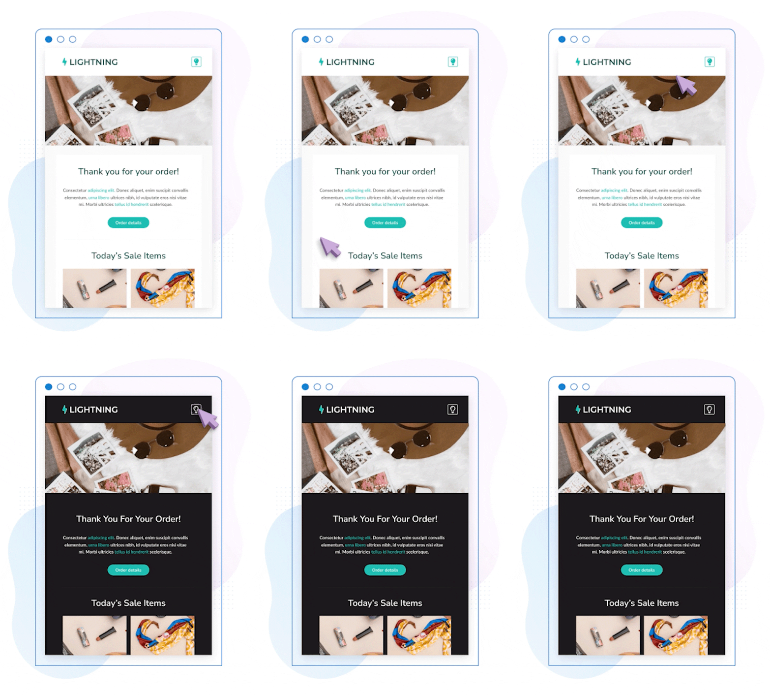
If I’ve got one tip that is top of mind, it would be to factor in how email clients with dark mode enabled will change your designs early and then continue to test dark mode often. Make sure everything is visible and contrasts are an acceptable range for readability. Join the Darkside! Don't try to force push your light designs on dark mode users.
Working backwards to support the changes dark mode makes to your designs is significantly harder than incorporating dark mode changes into your design at the outset.
Okay so yes, there is a media query that can target dark mode and yes, there are some really impressive tricks that email geeks have found to target dark mode on email clients that don't support the dark mode media query — but that still only covers a limited number of email clients and can mean a lot of refactoring to implement.
All the tricks we've got will still leave you inverted in some big email clients. (Looking at you, Gmail).
Instead of trying to fight against dark mode, plan for it. Test out the colors and designs you are considering in dark mode and then choose colors and build assets that look good in an inverted or muted palette. If you work with dark mode rather than against it you can save your team a lot of fussing, time, and effort, and your dark mode users will look forward to your emails.
9. Accessibility with color contrast and coding for screen readers

Alice Li (Staff Engineer at Squarespace)
The most important email design tip I can give anyone is to plan for Accessibility. The "why" is in the name — you want as many people as possible to be able to "access" your email, receive your message, and interact and/or click through.
For example, if your email design doesn't have good color contrast or isn’t tested for colorblind readers, then you automatically exclude a large visually-impaired portion of the population from becoming potential customers.
Or if your email isn't coded in a way that's optimized for screen readers and other assistive devices, then your readers might hear a jumble of code before they even get to your message and may just skip your email, trash it, or send it to the SPAM folder. And that's before even going into the legal liability aspect!
Not only is planning for Accessibility in your email design the right thing to do in terms of creating a more inclusive digital experience, but it's the right thing to do for your bottom line and metrics.

10. Interactivity

Avi Goldman (CEO of Parcel)
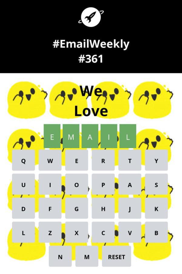
Delighting your subscribers with interactivity. It can be as simple as adding hover effects with only a few lines of code or as complex as Wordle in the inbox.
With email being the channel of conversation, you can build lasting impressions and spark online buzz amongst your subscribers with just one stand-out email. And with AMP you can even convert in the inbox.
There is some really exciting movement in this space. Now is the time to start exploring ways to do more with your emails!
Design emails that make people think, “Wow!”
In 2025,
as many companies continue to phone in their email design, you can stand out in the inbox with great design.
Use these email design tips to wow your subscribers:
- Try pastel backgrounds
- Make sure your emails are scannable
- Design for dark mode
- Design for comprehension and connection
- Try F-pattern layouts
- Use visuals to break up text
- Design accessible emails
- Add interactive AMP elements to your emails
And if you need help easily designing stand-out emails, try Dyspatch’s drag-and-drop email builder. It’ll give you tools to level up your designs — like modularity, AMP for Email templates, and more.
