As an email marketer, there’s always that moment of trepidation when you hit send on a campaign. Will it render well on small screens? Are all the links functional? And of course, what will Outlook do with it?
Having the right tools and email testing framework in place can help quiet this internal dialogue. Not to mention, ensure every email you send is top-notch!
Check out this quick video for 5 simple email testing tips — though a few are specific to Dyspatch, the concepts apply no matter what email platform you’re using. Or, if you’re more of a reader, check out the written recap below.
5 email testing tips
1. Use a modular email design system
You might be wondering, “What does this have to do with email testing?” I’ll explain…
Having a robust email testing framework is great. If you’re working on email, you need a process and tools in place to help you test emails. That’s a given.
But the next level is having an email design system you can trust, so you’re not constantly worrying about responsive quirks and rendering issues. This is where a modular email design system comes into play.
If you’re not familiar with modular email design, here’s the five second explanation: It’s a system where you separate your templates into modules that you can reuse to create new emails for a bunch of different purposes. The metaphor everyone uses is “email lego blocks”.
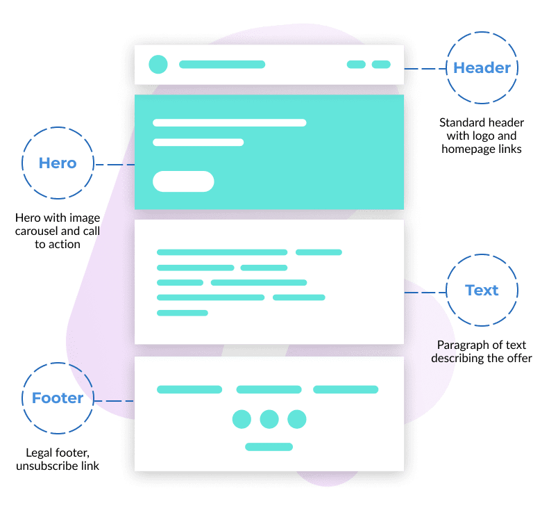
With this kind of system, every module is pre-coded and pre-approved. That means, you can drop any module (or block, as we call them in Dyspatch) into a template, and you know it’s responsive. It’s going to look great on all devices and in all email clients. As you can imagine, a modular system like this allows you to move really fast. But it also means you can trust more.
So we always say the real benefit of a tool like Dyspatch, isn’t that you’re testing more. It’s that through a modular email design system built with the Dyspatch Markup Language (DML) — a simplified, guaranteed responsive version of HTML — you get that peace of mind.
Of course, you should still test your emails, but you know your template is going to look good. And testing doesn’t turn into troubleshooting. It’s always just a quick check to be safe.
2. Preview your templates on popular device and email client combos
Which brings us to tip number two: Preview your templates on popular device and email client combos.
In Dyspatch, you can do this through built-in Litmus testing. Once you’re happy with an email template, you have the option to preview it on all the possible device and email client combos your subscribers might be using.
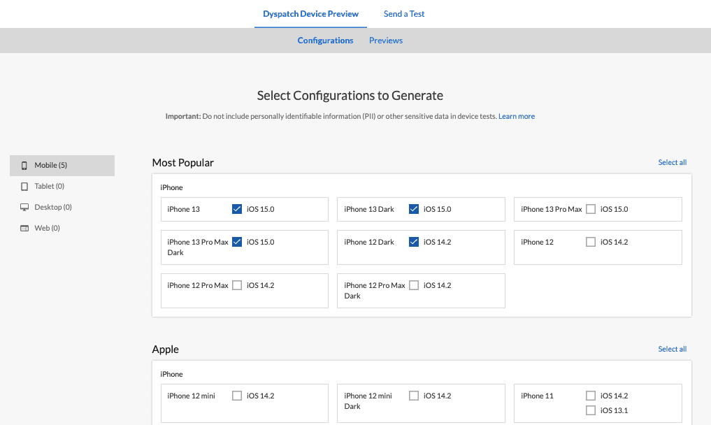
Bonus tip: It’s a good idea to check what email clients and devices the majority of your subscribers are using to open your emails. You can usually get this data from your email service provider (ESP). And it can help you decide which email clients and devices are really important to check.
3. Don’t forget about dark mode!
If you think you don’t need to worry about dark mode, you may want to reconsider. The latest report found 36% of Apple IOS mail users prefer dark mode. And in a one poll, 81.9% of people said they use dark mode whenever it’s available. Suffice to say, people like dark mode, and it should be a consideration when you’re testing your emails.
Thankfully, that’s really easy to do with Dyspatch’s built-in Litmus testing. You can preview your email in dark mode on IOS15 or whatever device and email client combo makes sense for your audience. If you need some guidance on how to design emails for dark mode, check out our last video for five pro tips.

4. Send yourself a test email and double check all your links
This one might seem obvious, but it’s crucial. It’s so easy to copy and paste the wrong link, or cut off part of a link while you’re copy pasting. So your last step should always be to send yourself a test email and check all the links.
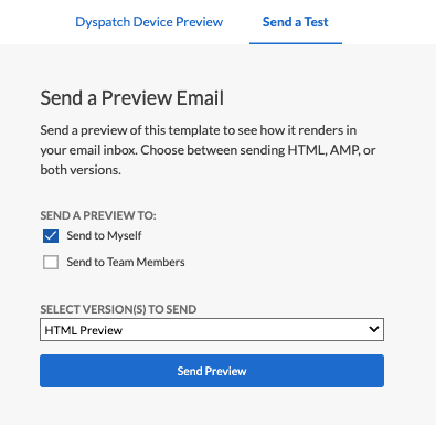
Again, you can do this right in Dyspatch, and you have the option to send a test email to your team members as well. You can also choose what version of a test email you’d like to send yourself: The HTML preview, the AMP preview, or both. That’s because Dyspatch offers a library of interactive Apps in Email, powered by AMP for Email, that you can drag-and-drop into your templates. But that’s a whole other topic!
5. Think beyond responsiveness
I’ll leave you with one last tip: Think beyond responsiveness.
An email can be responsive, but still not optimized for mobile. For example, your beautiful landscape image might look great on desktop, but get really small and unimpressive on mobile. Or, your carefully thought out headline could read well on desktop, but on mobile, it becomes hard to read because it’s too long and stacking strangely.
My point is, you want to take mobile design into consideration, in addition to responsiveness. The Dyspatch visual editor makes this easy because you can switch to a mobile view while you’re actually building an email template.
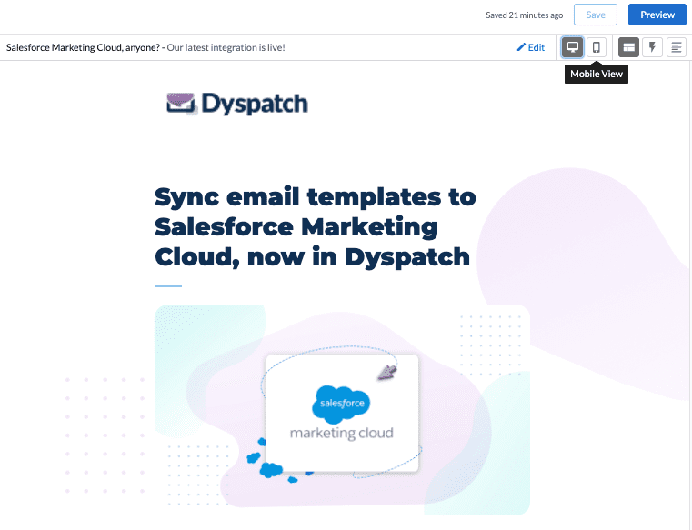
Then, you can toggle between desktop and mobile view to ensure all your design elements look good on both resolutions. Or, if you want to get fancy, you can use dys-desktop and dys-mobile to specify what shows up in your email based on device. But again, that’s a whole other topic! If you’re interested, check out our video on how to target desktop vs. mobile with DML.
Follow these testing tips for a winning email every time
If you really want peace of mind, invest in a modular email design system. With this type of system, you can trust that your emails will always be responsive.
Even so, it’s a good idea to preview your templates on the email clients and devices the majority of your subscribers are using. Not the most popular ones. Check your ESP to see what your subscribers prefer. And don’t forget to preview your templates in dark mode, too! Because if your email isn’t prepared for dark mode, it’ll look like it’s broken.
Last but not least, check your links. And take mobile design into consideration early on in the design process. With that, you should have a winning email every time.
Questions about these tips? Hit the chat button or send us your Qs!
