In a poll by Android Authority, 81.9% of respondents said they use dark mode on their phones, in apps, and wherever it’s available. I know I do!
There are a lot more stats to back up the prevalence of dark mode, but the point is, it’s popular. It’s here to stay. And it should be a consideration when you’re designing your emails.
Why? For starters, some email clients will automatically convert your whites to blacks when a recipient views your message in dark mode. Elements like images and CTA buttons can also get lost in a black background. This is bad news for accessibility.
In other words, dark mode users may miss your carefully crafted CTAs and beautifully designed graphics altogether. Thankfully, by keeping dark mode in mind when designing your emails, you can avoid these pitfalls.
Watch the video below for my top five dark mode email design tips:
Dark mode email, demystified
1. Make your logo stand out
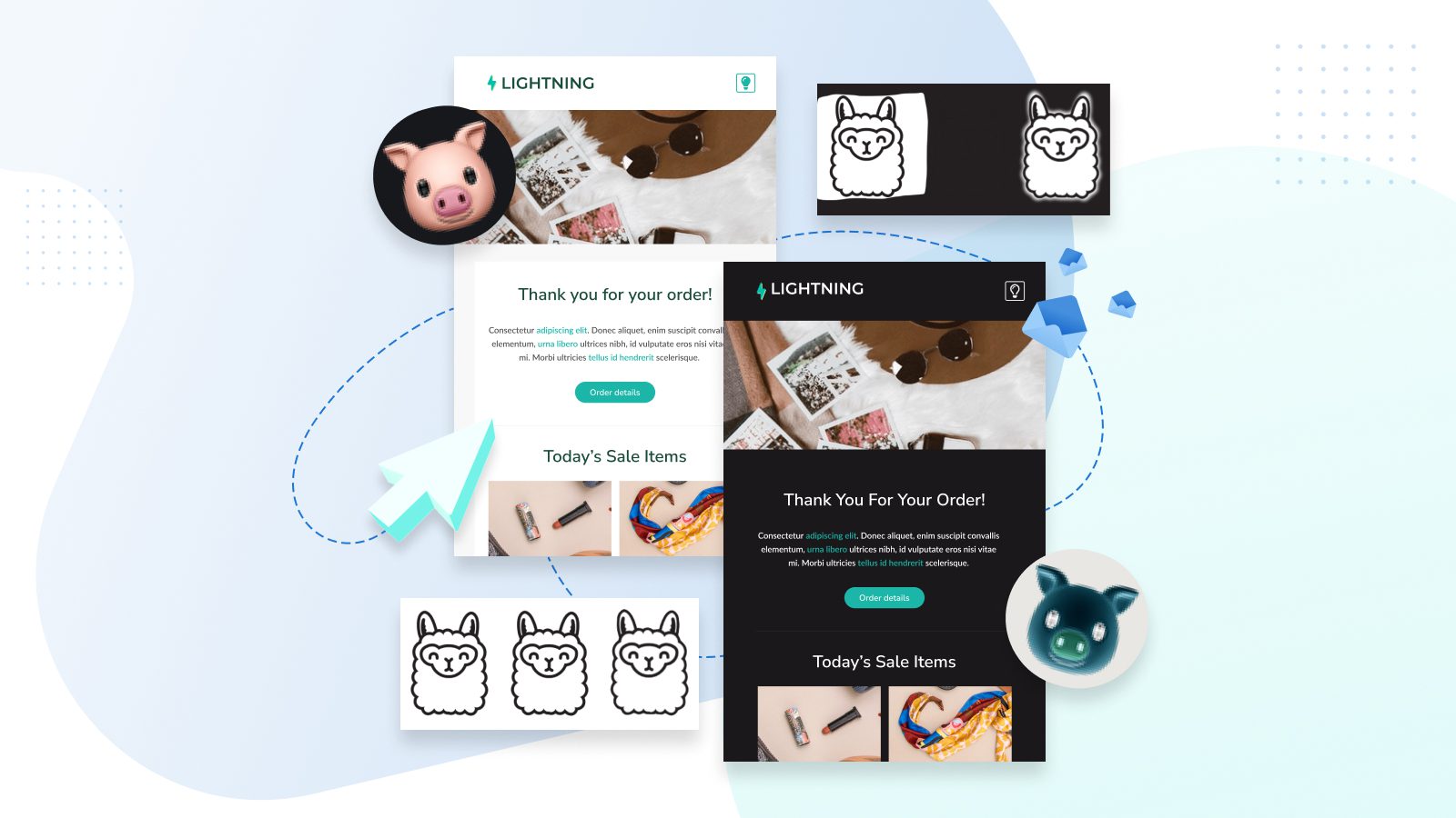
We all have a logo or two in our emails, so how can we make sure they pop on a dark background? My tip is to try adding a border around the logo. Make it the same color as your light mode background and it feels like a surprise treat for your dark mode users.
Alternatively, here are some more options for cool dark mode logo alterations:
- Add a bright outline to the logo text.
- Add a light background shape behind the logo.
- Add a light glow around the logo, like a reverse drop shadow.
2. Social icons — please don’t fade away (also stay above 100-pixel images)
A minimalist icon with a transparent background can fade into a dark background. So I suggest adding a light background or a lighter border to your icons to help them stand out against a dark background.
When choosing your social icons, make sure to keep an eye on which parts are transparent. You can do this by testing your images on a dark background early in the design process.
And remember to keep your icons (actually, any images) above 100px — images under 100px can have their colors inverted in Gmail on Android!

CUTE

SPOOKY (still cute though?)
3. Off white, not pure white
Avoid using pure white with the hex code #FFFFFF, especially for text or background colors.
I’ve found some email clients target this hex code directly, which can lead to all manner of strange results. Stick with #FEFFFF instead. It doesn’t make a difference to our eyes, but it will prevent email clients from messing with your whites and altering your designs!
4. Transparent image backgrounds
You might not notice what’s going on in the background of an image. But once the background color changes, all your sharp edges or strange crops can be revealed.
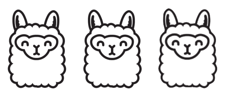
Watch out for the opposite issue as well, where more than you had realized turns out to be transparent! Here’s an example of this concept with llamas, my personal favorite members of the camelid family.
Light Mode 🙂 🙂 🙂

All these llamas look the same on a white background. Scroll down to see which ones are a bit too transparent, have a sloppy cropped background, or have a cute glow…
Dark Mode 😬 😵 🙂

Don’t be middle llama!
Try using a transparent background to keep the same aesthetic, or add a little spice for dark mode with a fancy glow.(I added this fancy glow using Canva!)
Once again: Test your images on a dark background early to avoid surprises and late-stage redesigns.
5. Roll with it
Managing dark mode is a matter of perspective and planning, rather than some quick tricks and tips. Embrace the fact that your email designs may change in dark mode, and you’ll have a much easier time of things. You might even enjoy delighting dark mode users along the way.
As a dark mode user, I know I’m used to seeing strange and broken content in emails, so it doesn’t take much to pull away from the pack and stand out in the inbox. With a little forethought, you can ensure all your subscribers have a positive experience.
Incorporate dark mode into your email design process by:
- Testing images on dark backgrounds.
- Fine-tuning potential color choices to find the ones that will invert or can be muted without breaking readability.
– Bonus tip: Use a tool like Litmus (which is built right into Dyspatch!) or Email on Acid to test a couple of color variations in dark mode. I recommend testing Outlook’s dark mode and Gmail on the iPhone’s dark mode, as these clients can act up the most. - Focus on clean contrast and readability instead of RGB perfection.
Join the dark side of email design
Test out dark mode in your email design phase, and then keep testing it along the way.
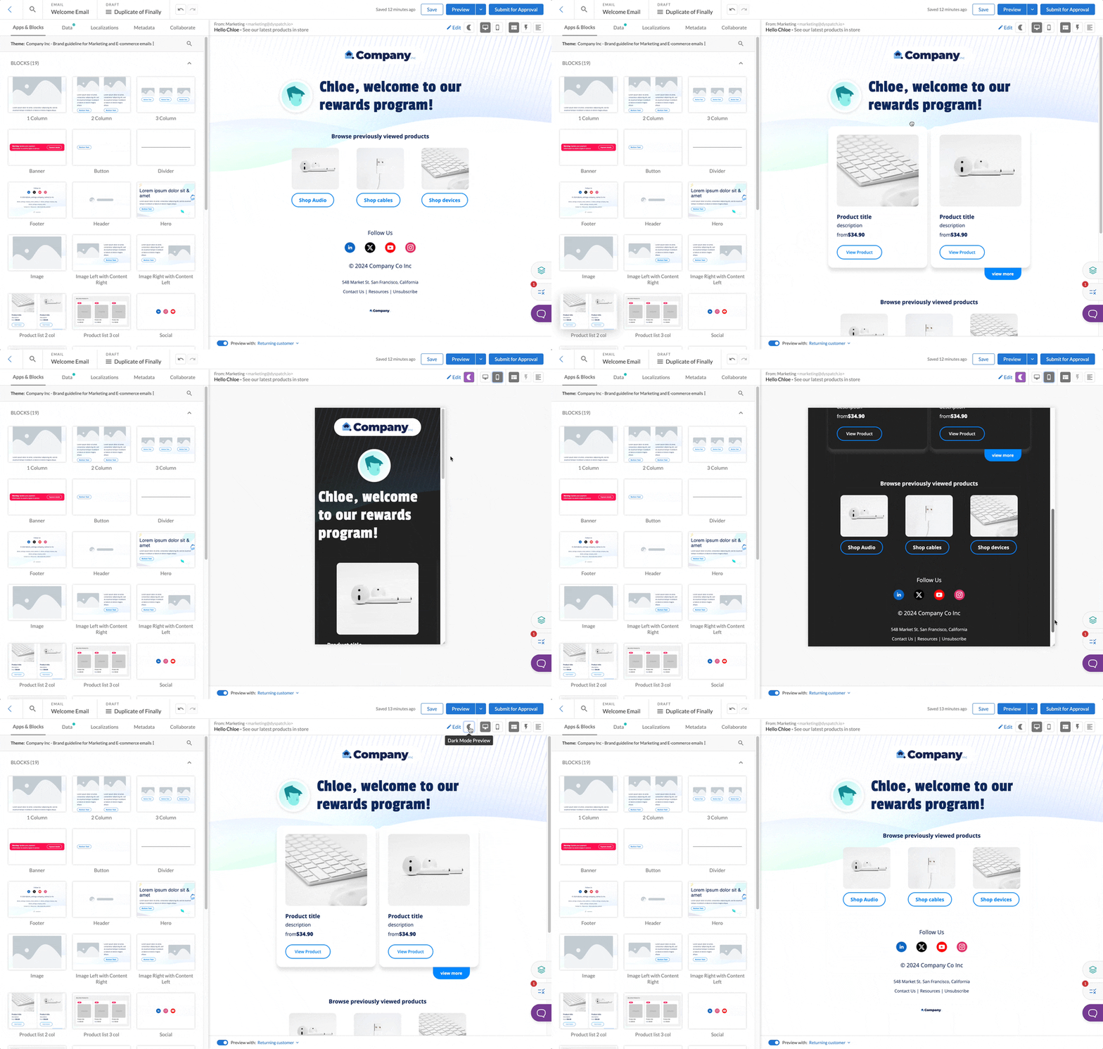
You don’t have to wait to have a fully coded email. In fact, you’ll do less back-tracking if you consider dark mode from the get go. Try inverting your potential color selections, or drop an image asset onto a dark background.
And don’t forget to avoid using pure white #FFFFFF!
Questions about any of these tips? Hit the chat button in the bottom right corner of your screen, or shoot me your Qs here, and be sure to read our in-depth breakdown of email accessibility with our post: Email Accessibility 101: The Ultimate Guide.
Read more about dark mode styling in our Dyspatch documentation: Targeting Dark Mode in Emails.

