Can you believe that 347.3 billion emails were sent and received every day in 2023? That’s a 4.3% increase from 2022 when the number of emails sent and received per day registered at 333.2 billion.
It’s hard to wrap your head around a number like that. And it goes to show the law of email still applies…
The law is simple: Every year, companies send more email. In 2025, the number of emails sent and received every day is predicted to be 361.6 billion. This means every year, it gets harder to stand out in the inbox. So what can you do to rise above the rest and win the attention of your subscribers?
Email expert and conversion copywriter Liz Willits, Dyspatch CEO Matt Harris, and ZeroBounce COO Brian Minick tackled this problem in our recent webinar. Drawing on decades of email expertise, they shared five strategies to help you move your engagement metrics up and to the right.
Read on for a recap of the event and answers to attendee questions, including the ones we couldn’t quite get to live!
5 Ways to Catapult Email Engagement in 2023
1. Growth loops
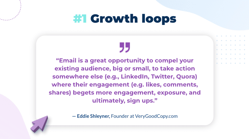
Growth loops refers to a model where you leverage your current users to create new users. It’s a more sustainable way of achieving growth than the typical top-down funnel where you’re basically paying for each new user.
For example, Eddie Shleyner of VeryGoodCopy.com creates an email growth loop by publishing a micro-article on his site, re-publishing a version of the article in a LinkedIn post, then sending out the article in a newsletter and asking for engagement on his LinkedIn post.
When his newsletter audience engages with the post on LinkedIn, their connections are notified, creating more engagement, more traffic to his website and more subscribers — and that ultimately adds to the audience he can leverage in future posts. So it’s a virtuous circle.
You can build growth loops right into your product with tactics like referral programs, user-generated content, team invitations, and more. Watch the full webinar for a more in-depth explanation of this concept.
2. Social proof
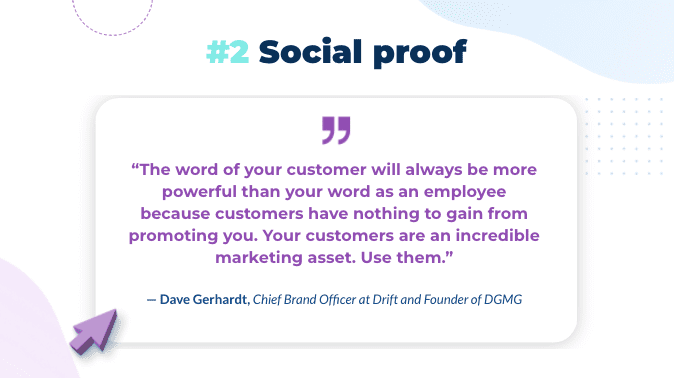
Social proof was first explained in the 1980s by psychologist Robert Cialdini. (If you haven’t read his book Influence: The Psychology of Persuasion, I highly recommend it!) Here’s the simple explanation for this concept: When we’re uncertain about a decision or how to behave, we look to those around us for guidance.
Which makes social proof a powerful marketing tool. Folks want assurance that buying an item or using a service is the right decision. If you can provide assurances and earn someone’s trust, they’ll buy. And you can do just that by baking social proof into your emails.
There are many ways to do this. Some are obvious, like highlighting customer reviews and featuring expert endorsements. Some are a little more subtle, like partnering with trusted brands and adding accomplishments to email signatures. For 10 ideas and three gorgeous examples (you guessed it!), check out the full webinar.
3. Modular email design
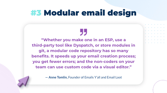
Modular email design involves dividing templates up into pre-coded, independent parts (AKA modules or blocks). Think lego blocks for your email templates. Then, you can reuse and rearrange these modules to create new emails, without starting from scratch.
Modular email design helps improve engagement in several ways. For one, it makes it easy to maintain consistent branding, which has been shown to increase engagement and revenue by 33%. For two, it helps you move faster and gives you more freedom to try engagement techniques, like personalization and AMP for Email.
Speaking of which…
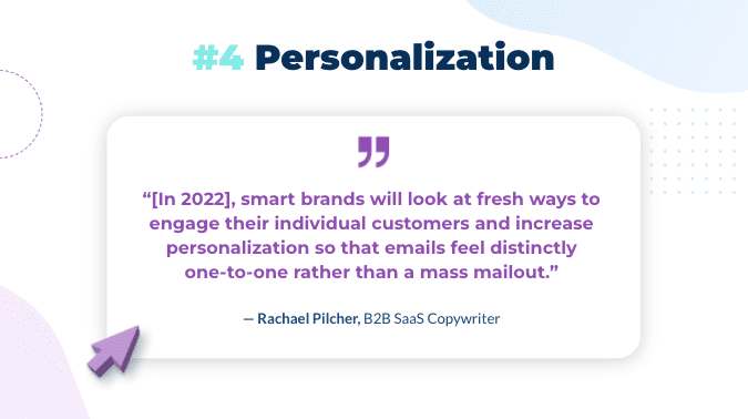
4. Personalization
Personalization is not a new topic. But it’s been re-emerging as especially crucial in a remote-first world. Companies are turning to email more and more, but that also means more competition in the inbox. (Remember the law of email?)
Of course, to personalize your emails, you first need to gather data about your subscribers.
The best way to get this data? Just ask! Ask in your welcome email or in your onboarding email series, so you can start personalizing your emails right out of the gate.
But it’s never too late to ask either. If you don’t have enough information about your existing subscribers, you can easily start gathering it by adding a callout to the occasional campaign. You can link that callout to a landing page with a form or fun quiz.
(Now, with AMP for Email, you could gather this information directly from an email — instead of having to set up a landing page and send subscribers there. I’ll get to AMP in more detail in a sec.)
There are loads of ways to personalize your emails, like segmenting your newsletter by subscriber interest, personalizing by location, celebrating important dates, following up after key actions… the list goes on. (And yes, to see the full list, I’ll direct you to the webinar recording!)
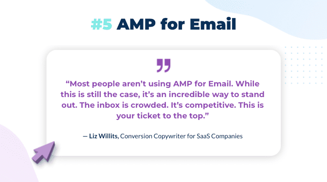
5. AMP for Email
AMP emails are live and interactive.
AMP emails update every time a subscriber opens the email. Think of a cart reminder email. If a customer adds another item to their cart, it’s possible for the email you sent yesterday to update and add the new item.
Interactive because readers can take action, right from an AMP email. Like that cart reminder email. They can add that extra item to their cart, right from their inbox. This is a big upgrade to the user experience and it’s a way to stand out in increasingly crowded inboxes.
And this example is just a well-known AMP use case. There are truly endless possibilities. For example, you can send interactive surveys, embed a product review or NPS form in an email, leverage a calendar booking app, and even play games in your inbox.
Intrigued? This white paper covers everything you need to know about AMP for Email.
Bonus
- Relevance
Again, not a new concept in digital marketing but one of the more important for a reason. Making sure the content of your emails is relevant and valuable to your audience, and that it addresses their specific needs or interests, means that they’re more likely to open your email the next time they read your name in the from box and builds your brand.
Key takeaways
- Flip your thinking from funnels to growth loops. Ask yourself: How can I make this email into a loop?
- Add social proof to your emails to engage and persuade your audience.
- Consider implementing modular email design for brand consistency and maximum efficiency.
- Leverage user data to delight your subscribers with personalized emails. Don’t have data? Ask for it!
- Position yourself as a leader and bring action into the inbox with AMP for Email.
Q&A
I haven’t seen this in my work with SaaS companies. Now, the way you set up the growth loop and the way the email is triggered is important, so that you’re not overdoing it. You should follow email automation best practices, so your emails get sent at the right time and you’re never spamming your subscribers.
I’ve worked with quite a few startups who don’t have social proof. And one of the things I would recommend is putting together a beta group of your first few customers and interviewing them. You can even compensate them for their time or give them free product in exchange.
Let’s say you only have three customers. Ask them if you can interview them, get quotes, get a case study… you don’t need to have a ton of customers to start collecting social proof. You just need to be bold in asking your customers for it.
To add to that, when you’re an early stage startup, you can think about generating social proof in the context of a growth loop. Creating a meetup for people who are passionate about the space you’re working in — and then inviting those people as experts to give you feedback — is a really good way to kickstart community and start generating social proof.
For examples of great emails, you can’t beat ReallyGoodEmails.com. For tools and platforms, Email Resources is a great site curated by Parcel. And just to name drop a little, the Dyspatch blog shares excellent articles on email marketing every week. Last but not least, I recommend joining the #emailgeeks Slack channel. It’s an amazing community and a great place to get started.
I’m biased here, but I would say no. IMHO every email should be built using a modular design system. The really quick reasons why: (1) you’ll be able to build emails faster, even if it’s a prospecting email, and (2) a modular system ensures every email is going to look great.
With modular design, the entire premise is to build your modules once and ensure they’re breakproof (i.e. they’ll look great on mobile, desktop, and everything else). Then, when you build emails with them, you don’t have to go back and go through all those challenges again.
That’s a benefit for both customer and prospect emails — it’s even more important for prospects you might argue. To me, modular design is a philosophy for how to approach email marketing. It’s not focused on one group or another. It’s for everybody.
As a copywriter, I’m a little biased here… I don’t think AI can come close to the real deal! That said, for scaling something very time-consuming, like personalized outreach, I can see how a tool such as Smartwriter would be, well, a smart thing to try. I’ve never tried this platform myself, but I would recommend trialing the platform and seeing what kind of results you get. With the caveat that it’s hard to replace a real human touch.
Not to sound like a broken record, but a modular email design system can help with personalization quite a bit.
If you choose a system that supports personalization like Dyspatch, you can build out modules with merge tags and conditionals baked right in. Then, you can swap those modules in and out for different campaigns. This can help you be extremely effective with a low long-term engineering commitment.
Combined with a platform like Iterable that leverages AI to automate tasks, like A/B testing and sending, you can create a powerful personalization engine.
AMP emails can be viewed in Gmail, Yahoo (including AOL), Mail.ru, and FairEmail. For those using an unsupported client, they would see an HTML fallback layer of the email, so they would still have a good user experience. For more information on AMP email compatibility, check out this blog.
As mentioned, in clients that don’t support AMP emails, subscribers will see an HTML fallback version of the email. This ensures a positive experience all around. Dyspatch actually creates an HTML fallback layer for you automatically, so this doesn’t have to require extra work either.
Our white paper, Everything You Need to Know About AMP for Email, is a great place to start. We also have an extensive AMP for Email blog series with loads of examples, use cases, and case studies.
There are certainly ways to engage consumers while abiding by privacy laws, although it can make personalization tricky. I would recommend doing some social listening or even sending a survey out to your subscribers to see what kind of content they want. You may not be able to personalize your content, but you can make sure it’s hyper relevant to your subscribers.
Interactive email might also be a good option here. Taking a step back from AMP for Email, you can also add interactive content to your templates, like carousels, gifs, and videos. Check out this article by Matt for more email engagement strategy ideas.
Start by first sending all of your transactional emails and build a reputation that way. Sending transactional emails is an easy to boost your deliverability because people want them (think receipts, account sign ups, thank you letters, forgot password, your order has shipped etc.).
These emails are almost always clicked and opened. The engagement from those will boost your credibility. Also, if they land in spam and the user clicks 'not spam', it will help the ISP or mail provider know that you wanted those emails. These systems are smart, they are using behavior from one use to predict others. If enough people pull emails out of spam, the ISP will just inbox it instead since it thinks it made an algorithm mistake. Now, you have a reputation.
Also, do not send too many emails at once. Don't purchase a list and send a campaign to one million recipients when you haven’t even sent a campaign yet. You're asking for a lot of trouble: No one knows who you are, and in the spam filter world, this will classify you as a spammer.
And make sure you’re validating and cleaning the emails you receive — not only when you get them, but ongoing as well. Hard bounces can kill your deliverability. Anything over a two percent hard bounce rate will start to give you issues. Clean your database every six months.
One last tip is to make unsubscribing easy. Don't try to outsmart your user. If they want to unsubscribe, let them! It's actually considered engagement since they clicked your email and went to a website for the actual unsubscribe to take place.
Lastly, patience… reputation is not built overnight, but it is the holy grail of email marketing. What good are your marketing emails, if they’re in the spam folder. Chat with the team at zerobounce.net for more help!
Oh, that’s tough. There are so many companies sending exceptional emails these days. A few of my favorites include Spotify, Headspace, and AirBnB. Beyond these brands and sifting through your own inbox, I always recommend ReallyGoodEmails.com for design inspiration. Emaillove, Milled, and Dribbble are great resources for design inspo, too. And if you’re looking for email design tips, check out this piece by Liz and this one by Matt!
I think this depends on your audience — just like using plain text works for some people, GIFS or memes may work for you. It's worth experimenting with. We have a good piece on GIFs vs. videos that goes through some considerations for using this type of media as well as examples.
Okay, now I’m really starting to sound like a broken record, but… modular email design. With this type of design system, your email modules are pre-coded. Part of this initial setup should include testing for responsiveness. That means, every module you use is “pre-approved” so to speak. And any email you build will be responsive and render well in all inboxes. This makes it easy to design emails quickly and saves you time on troubleshooting.
Of course, you should also be testing your emails prior to sending them. But you shouldn’t have to do it manually — your email platform should automate this. For example, Dyspatch comes with built-in Litmus testing, so you can preview your templates across email clients, devices, and even in dark mode. Though Dyspatch templates are responsive by default, previewing them is still a good idea, so you can make sure your formatting works on different screen sizes (i.e. check that your headline isn’t too long or that CTA button copy doesn’t wrap on iPhone6).
For the full rundown on how to boost your email engagement in 2022, watch the webinar for yourself!
