While they’re not as flashy as marketing emails, transactional emails play a critical role in the overall customer experience.
These emails are sent to customers at major milestones in the customer journey, so they can make a strong impression on the customer — for better or worse. Good transaction emails can encourage customers to grow their relationship with your brand. Bad transaction emails can end the relationship altogether.
In this article, we’ll look at five common types of transactional emails, and how AMP for Email can radically improve them.
Welcome Email
Welcome emails are sent to customers after they’ve registered for your email list, signed up for a product demo or requested a sales call. The primary goal of a welcome email is to guide customers to the next step in the sales journey.
For example, this email from LUSH encourages customers to browse their online store, by featuring a curated selection of popular products:
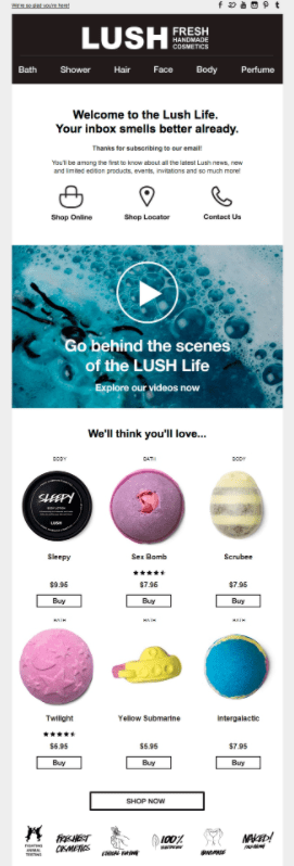
From the subscriber’s viewpoint, the value of this email depends on the relevance of the featured products. If they see something they really like, they can simply click the “Buy” button to enter the checkout process on the LUSH website. Essentially, the entire discovery process takes place in the email and the subscriber is converted directly into a paying customer.
But this doesn’t happen very often. Often, the subscriber is intrigued by a product but needs to learn more before making a purchase. This requires them to click through to the website and read the product page.
Or they may not be interested in any of the selected products, and would have to click the “Shop Now” button to check out the rest of the catalog. Clickthrough rates would be much lower for these customers, as there is no compelling or specific reason for them to take action right away.
The AMP for Email Upgrade
With AMP, welcome emails can provide a more dynamic experience that adapts to the customer’s unique preferences.
Instead of having a small handful of featured products, the email can offer a much wider range of products in a carousel format. The featured product selection can also change over time as new products are added to the store, or certain items go out of stock. This ensures that the selection will always be timely and relevant.
Additionally, more of the shopping experience can be included in the email. Clicking on a product image could open a drop-down with a detailed product description and additional color choices. This would take up too much space in a regular email, and is only practical with AMP’s interactive layout features.
The email can even include an interactive shopping cart, so the customer can add as many of the featured products as they want, then click through directly to checkout. This streamlines the discovery process and can greatly increase average order volume.
Order Update Email
Good order confirmation emails are critical to a positive buying experience. When customers purchase physical products online, they want to know exactly when those products will arrive, and be updated on every step in the process.
Typically, there are at least three key emails to send:
- Order Confirmation: Includes confirmation that the customer’s payment details have been accepted, and that the item is still in stock.
- Shipping Confirmation: Lists the date the item was shipped, and provides shipment tracking details.
- Delivery Confirmation: Notifies the customer that the shipment has arrived at their designated pickup location, whether that’s their home or the nearest physical store.
Each of these updates provides important information and can’t be omitted from the process. But at the same time, sending multiple emails for a single order adds quite a bit of complexity, and can quickly clog up the customer’s inbox.
In particular, the shipping confirmation email often presents a clunky experience. Since most ecommerce brands use a third-party fulfilment service, this email typically includes a confirmation code and link to the fulfilment company’s website. Here’s an example from Allbirds, that links to the DPD site:
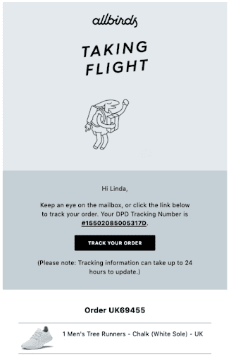
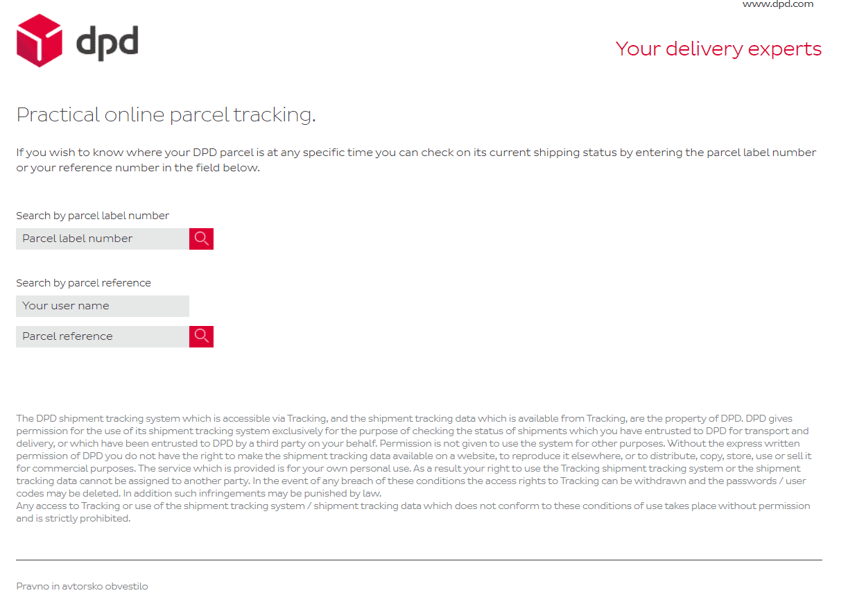
The branding on these two websites is clearly completely different, and presents a disjointed buying experience. It would be easy for less tech-savvy customers to be confused when they’re sent to a third-party site with no obvious connection to Allbirds. It also doesn’t help that most fulfilment providers don’t prioritize a user-friendly experience, as they are not primarily consumer-facing companies.
The AMP for Email Upgrade
AMP allows ecommerce brands to radically simplify their order update emails.
Instead of sending multiple emails, brands can send a single email that updates itself over time, and always reflects the latest order status. This gives customers an easy reference point to stay up to date, without having to sift through their inbox for the right notification.
And instead of requiring the customer to visit a third-party fulfilment site, AMP can also present the latest shipment status in the email itself. This can be supplemented with automatic updates to the estimated delivery date to account for shipping delays. Since unexpectedly late shipments are a common customer pain point in ecommerce, this functionality can add a lot of value to the customer experience.
Onboarding Email
Onboarding emails can make or break the new user experience. After a lead has registered for an account, downloaded your app or purchased your product, they often need help to get the most value from your solution. That’s where a great onboarding experience can really make a difference to user retention.
Take this email from Moz:
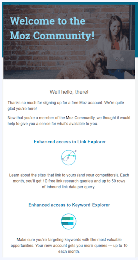
Registering for an account is only the first step. Since Moz offers a number of different SEO tools, it’s important that the user is introduced to all of them, so that they can get the most out of their membership. And this email does a pretty good job of doing that.
At the same time, this example also illustrates the limitations of static onboarding emails. You can point users in the right direction, but they ultimately still have to click through to your website and figure out how to use the recommended tools. Not an insurmountable challenge, but certainly a barrier to the new user experience.
And if there are multiple suggestions in your onboarding email, many users will just complete one or two of them and neglect the others. In a sense, this might be an even worse outcome, as the user would only be seeing a small part of what your solution offers, but assume that they’ve experienced the full thing and discount its value.
The AMP for Email Upgrade
The great thing about AMP is that it enables onboarding steps to be completed within the email itself. For example, the email can include forms for filling in a user profile or selecting setup options, which can then be updated on your website or software. So by the time the user logs in to your platform, most of the tedious administrative tasks would already be completed, and they can start using the solution right away.
AMP can also make it much easier to track user progress within the email, ensuring that they don’t miss any critical steps. A simple way to do this would be to check off or grey out steps that have already been completed. Alternatively, for more complex onboarding processes, a real-time progress bar or other visual indicator can be included, as in this email from Treehouse:
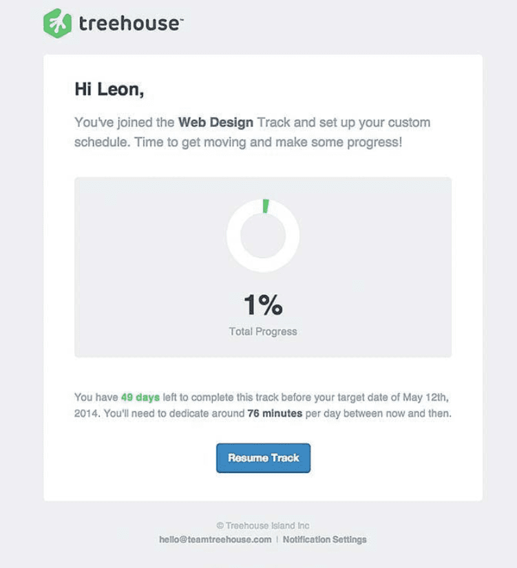
This is not an AMP email, so the progress bar doesn’t update as the user completes more of the course. Since Treehouse courses take many days to complete, sending followup emails with an updated progress bar works reasonably well. But this would not work for a streamlined onboarding process that can be completed in 15 minutes. For these use cases, AMP’s real-time updates are essential.
RSVP Emails
RSVP emails come in multiple flavors, but all of them involve confirming or declining attendance of an event happening at a specific time. Common examples include webinars, trade shows, plane flights and hotel bookings.
Sometimes, RSVP emails can be relatively simple, such as a Zoom invite for a two-person meeting. But often, RSVPs are required for much more complex events that involve many people, and multiple possible attendance dates.
For these events, there are essentially two approaches offered by static emails. The first is to send a link to a calendar that allows people to select the specific date they can attend. This is a inconvenient process that can significantly lower RSVP rates.
The second is to only allow people to RSVP for the earliest date, and send followup emails for later dates. This enables an RSVP in a single click, and can be a good solution for regularly scheduled events, like the following webinar from Republic:
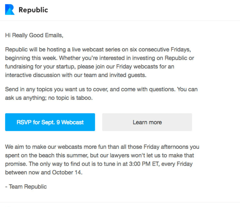
The downside of this format is that people who are only able to attend a later session have to wait for the next email. Not only is this inconvenient, it also increases the chances that they miss the next email and not be able to attend the event at all.
This format also doesn’t work very well for non-recurring or unique events. For example, a trade show may have different working sessions available over several days. It’s impractical for a new email to be sent right before each working session, so the selection needs to be made upfront.
And regardless of which format you take, people will often need to change their chosen dates, which adds even more complexity. This example from Hyatt House illustrates the issue:
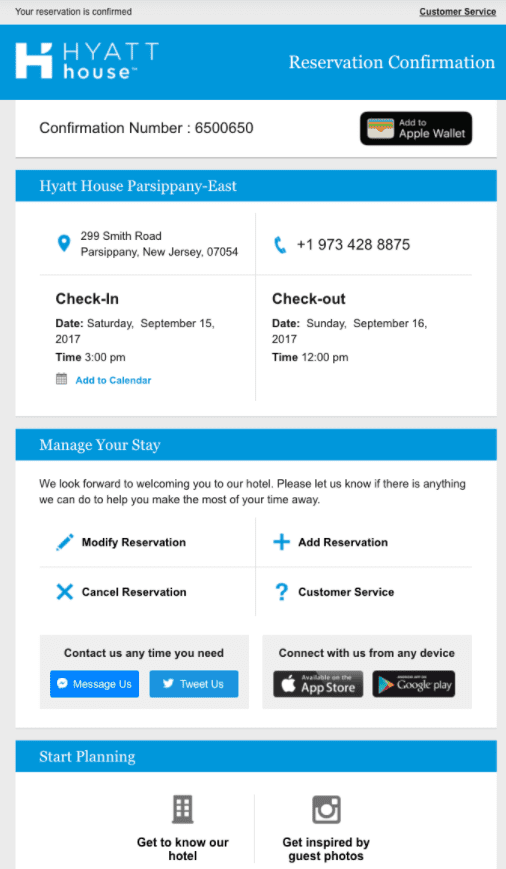
This email is actually quite well-designed, and succinctly captures the key information about the reservation. But when it comes to making changes, there are four separate links that lead to different pages. This isn’t Hyatt House’s fault, simply an inherent limitation of static emails.
The AMP for Email Upgrade
AMP can transform RSVP emails in two important ways.
First, it allows you to include a booking calendar in the email itself. This gives you the best of both worlds, by combining date selection with the convenience of a one-click RSVP.
Second, the attendee can receive a single AMP email that keeps track of the latest event information, and also lets them make changes within the email itself. Rather than having to sift through multiple emails or click through to a different page for each type of change, the attendee has a single stop for everything they might need to do before the event.
Review / Share Request
Review and share request emails are often sent out after a new customer has just had a chance to use your product. This is when they’re likely to be most excited about your product, and thus most open to sharing their experience with others.
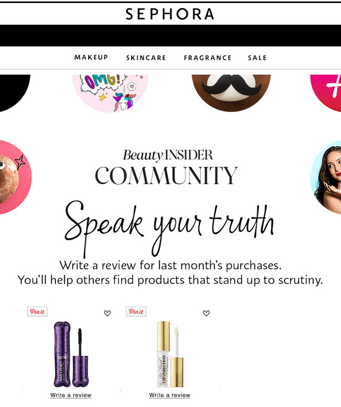
For example, this email from Sephora asks for a review of a product the customer has recently purchased. It also encourages them to pin the product to their Pinterest boards for even more social proof. The email is certainly timely and relevant, but it also requires customers to click through to the Sephora site to do something that doesn’t directly benefit them. This is why only a small percentage of customers contribute reviews, even if they enjoyed the product.
For a better example, check out this share request email from health app Withings:
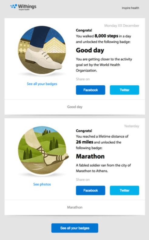
In this case, users are acknowledged for engaging in healthy habits, and encouraged to share their achievements on Facebook and Twitter. Since there’s an actual social incentive, this share request is more compelling than Sephora’s. But the email still requires users to hop on their social media accounts, which is not ideal.
The AMP for Email Upgrade
AMP’s contribution to share and review request emails is simple: it allows the completion of the social action within the email itself.
For example, Sephora could include a dropdown where the user can select the number of stars and a textbox where they can write a quick review. Withings can include a similar dropdown with a ready-made post that users can approve in a single click.
While these might sound like minor changes, social actions like these are heavily influenced by user convenience. The more barriers to compliance you can remove, the higher your conversion rates will be. And AMP is an excellent tool to enable that.
Upgrade Your Transactional Emails With AMP
With Dyspatch’s drag-and-drop AMP email builder, you can easily create user-friendly AMP transactional emails with zero code. Contact us for a free demo today.
