Thanks to everyone who joined us for the second webinar in our 3-part series about Modular Email Design. We’ve really enjoyed the opportunity to discuss emails with all of you. It’s obviously a topic we’re passionate about, and hearing about everyone’s challenges and discoveries helps us all create better, higher performing emails.
I’d like to also give you a short recap here to underscore a few of the key takeaways.
What’s Modular Email Design Again?
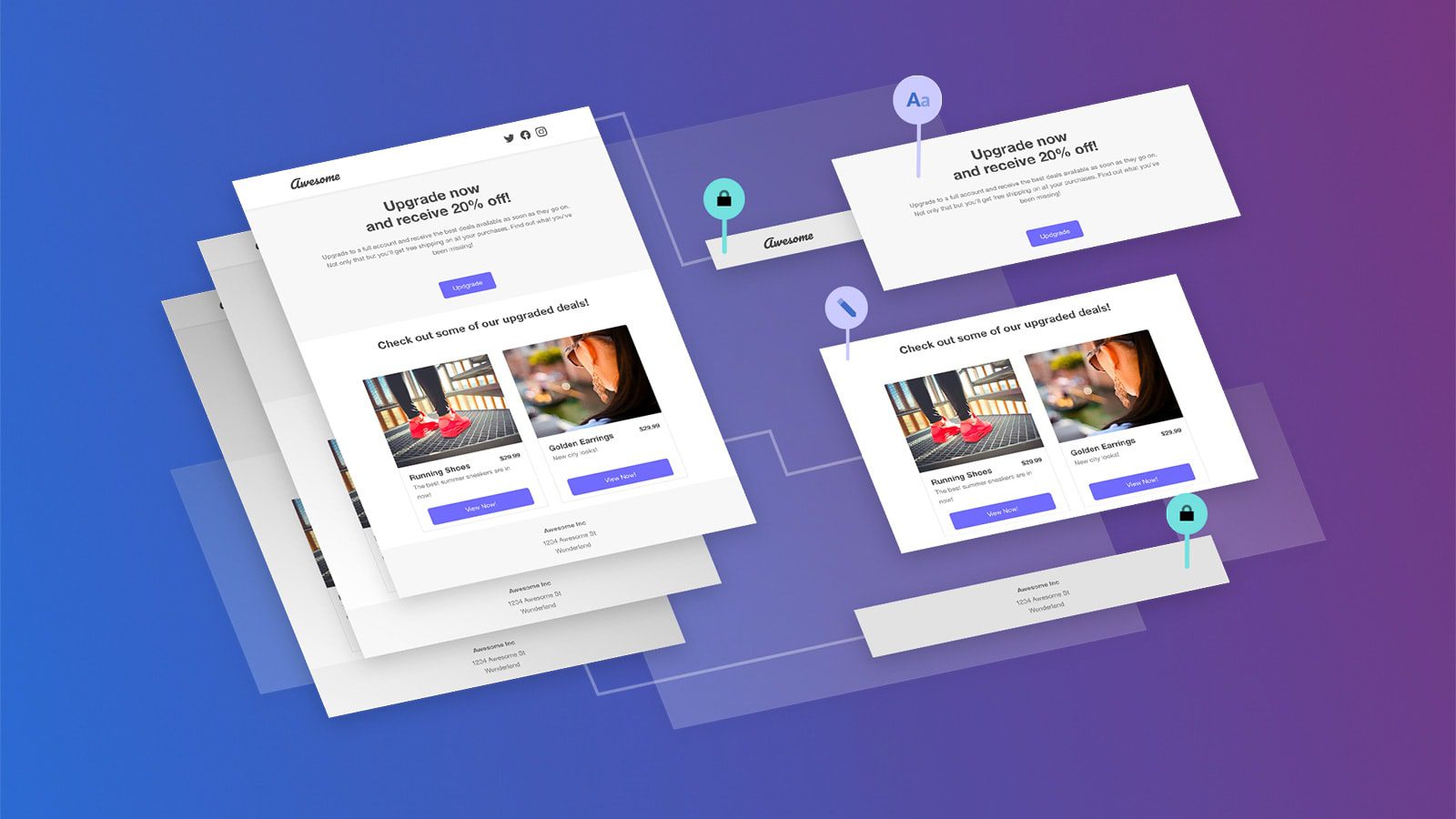
Let’s start with a refresher on Modular Email Design: Modular email design is dividing emails into independent parts that can be easily re-combined to create entirely new emails without starting from scratch. Teams can create and change emails faster by going modular. And we designed Dyspatch to empower teams to make responsive (mobile-friendly), beautiful, and personalized emails that are proven to drive engagement from your customers.
Here are the three topics from the webinar that cover how you can achieve all of the above without writing code, and with full stakeholder consensus.
- Collaboration Tools – How to leverage collaboration tools to create emails faster
- Empowered to Create – How to ensure mobile-friendly, on brand emails to retain your design integrity.
- Approval Workflows – How get changes approved faster by key email stakeholders without sacrificing quality.
Finally, it was important to us to provide examples of measurable results, since proof points from customers means that you don’t just have to take our word for it!
We shared an example from GlobalGiving – GlobalGiving is a nonprofit that connects donors with grassroots projects around the world. The team at GlobalGiving knew that Dyspatch could help them work better and faster, and we delivered. A clear example centers around the hero image they used in many, many templates. Their hero module had text locked on the image. We broke that up to make the text and the image editable – this gave the team a ton more flexibility instead of just a locked hero where they couldn’t easily update the text. The end result is that their team spends less time updating the code in modules, and more time experimenting with CTAs that drive donations.
We hope you found the webinar helpful. Please join us next time in part three of our modular email design series:
And, as always, we’d love to hear from you! Please reach out with any questions.
