Email is one the most powerful forms of digital communication. Whether for marketing or transactional purposes, it is a great way to reach audiences. But if your emails aren’t accessible, you could be leaving some people behind.
Not all recipients experience email in the same way. Building emails with accessibility as a core principle ensures an equitable and inclusive experience for everyone.
Let’s discuss why email accessibility matters, what the best practices are, and how Dyspatch makes email accessibility easy.
Why Email Accessibility Matters
Accessibility ensures that people with disabilities—including those with visual, auditory, cognitive, and motor impairments—can engage with your content effectively. Making emails accessible is not just a best practice; it's a necessity for inclusivity, legal compliance, and better engagement.
Key Reasons to Prioritize Email Accessibility:
- Inclusivity: accessible emails ensure that all users, regardless of ability, can engage with your content.
- Legal Compliance: many regulations, such as the Americans with Disabilities Act (ADA) require digital accessibility.
- Improved User Experience: clear structure, easy navigation, and readable text enhance engagement for all recipients.
- Better Performance: well-structured, accessible emails often see higher open rates, click-through rates, and improved deliverability.
- Brand Reputation: demonstrating inclusivity builds trust and credibility with a diverse audience.
Best Practices for Email Accessibility
Now that we understand why email accessibility matters, let’s talk about how to get it right.
The international standard for accessibility is the Web Content Accessibility Guidelines (WCAG). Developed by the World Wide Web Consortium (W3C) through its Web Accessibility Initiative (WAI), it explains how to make web content more accessible to people with disabilities. WCAG covers websites, applications, and other forms of digital content.
WCAG provides instruction for three levels of compliance:
- Level A – Basic Accessibility
- This is the minimum level of compliance, focusing on the critical barriers that prevent access for users with disabilities.
- Content that fails to meet Level A requirements are typically inaccessible to many users.
- Level AA – Industry Standard Compliance
- The recommended level for legal and industry standards.
- Improves usability and accessibility for a wider range of users, including those with vision impairments, cognitive disabilities, and limited mobility.
- Level AAA – Enhanced Accessibility
- Not required by most regulations.
- The highest level of accessibility compliance, making content usable by nearly all users, including those with severe disabilities.
It’s easy to overthink accessibility, because there’s a lot of information to digest; it can be hard to know where to start! Our comprehensive email accessibility checklist summarizes the important requirements that are relevant to crafting inclusive emails:
Table of Contents
1. Use the Correct Semantic Elements
a. Headings
2. Write Descriptive Copy
3. Improve Readability with Font Styles
4. Design with Appropriate Color Contrast
a. Designing for Dark Mode
5. Link Accessibility – Text, Buttons, Icons
6. Image Accessibility
a. Links Wrapping Images
7. Alt vs Title vs Aria-label – When and How Should You Use Them?
8. Audio and Video in Email
9. Don’t Forget about Plain Text
1. Use the Correct Semantic Elements
The foundation of accessible content is using the correct semantic HTML elements (and using them in the right way). Emails are full of divs, spans, and tables – it’s all part of responsive email design. But when it comes to the specific pieces of content, it’s important to use descriptive elements, such as:
- <h1>, <h2>, <h3>, etc. for headings
- <p> for paragraphs
- <a> for links
- <ul> or <ol> for lists
- <img> for images and icons
Using semantic elements makes content accessible by default. Screen readers can interpret what the content means and accurately assist the user in navigating and understanding it.
a. Headings
When it comes to heading elements (<h1>, <h2>, <h3>, etc.), their role is to break up the content of the page into related “chunks” or themes, like a table of contents in a cookbook. Assistive technology relies on the heading structure to help readers quickly jump from section to section.
| ✔️ | Only one <h1> element is present | The <h1> defines the primary topic of the email. Only one can be present at a time. |
| ✔️ | Heading levels have a logical order | The rest of the titles used in an email are most likely going to be an <h2>. These denote the different “chunks” or themes of the content.An <h3> title is used to denote a sub-topic of the <h2> topic. Emails typically do not contain enough content depth to warrant using <h3> titles, but there are some cases where it applies. |
| ✔️ | Heading levels are not skipped | Don't jump from an <h2> to an <h4>, skipping an <h3> element. This can confuse readers who use assistive technology. |
| ✔️ | Headings are descriptive | Headings must clearly describe the topic or purpose of the content they introduce. |
| ✔️ | Heading levels are used for meaning, not visual size | Headings are always used for semantic meaning – not for styling. A common mistake is to mark a title as an <h3> or <h4> to make it visually smaller; that is not semantically correct, which makes the document less accessible. |
* For emails, it is highly unlikely that you will ever need to use <h4>, <h5>, or <h6>. If an email requires that level of sub-topic nesting… your email has too much content. Consider trimming it down and encouraging readers to navigate to a webpage for further engagement; this also boosts your click-through rate – win-win!
2. Write Descriptive Copy
The combination of using the right semantic HTML, with descriptive copy achieves the bulk of email accessibility goals. Writing descriptive copy within the content, buttons, links, and alternative text all helps make the email experience more inclusive for all.
| ✔️ | Use plain language and avoid figures of speech, jargon, idioms, or complicated metaphors | Users with disabilities that make it difficult to decode words and sentences are likely to have trouble reading and understanding complex text.
Write at around an 8th grade reading level to keep content accessible to the broadest audience. Define jargon and abbreviations immediately before or after the short-hand. |
| ✔️ | Buttons and links are unique and describe their purpose or action | The purpose or action of each button and link should be clear from its text or the surrounding content.
Try to avoid using terms like “Click Here” and “Read More” as these typically do not help a user understand what will happen if they follow the link. |
| ✔️ | All non-text content has text alternatives that serve the same purpose, and provide the same information | Images and multimedia must have alternative text to ensure that it is accessible to screen readers. |
3. Improve Readability with Font Styles
While descriptive content is a critical factor for good email accessibility, ensuring the content is readable brings further inclusivity to your email content.
The WCAG 2.2 specification includes level AAA success criteria, which is above and beyond industry standard. In addition to the guidelines below, we have our own recommendations for typography best practices included below:
| ✔️ | Choose a readable font | San-serif fonts (e.g. Arial, Roboto, Verdana) are generally more accessible than serif fonts for readers with dyslexia or cognitive disabilities.
Avoid decorative or script fonts, as they can be difficult to read. If they are used, include more readable fallback options in the font-family stack. Avoid fonts with ambiguous letter forms, such as where I (uppercase i), l (lowercase L), and 1 (one) look too similar. Dyspatch recommendation: not a part of WCAG 2.2 spec |
| ✔️ | Use a font size of at least 14px for paragraph text | Aim to keep the baseline paragraph font-size around 14px-18px keep the content more easily scannable, reducing eye strain that can occur with reading chunks of content in smaller formatting.
Dyspatch recommendation: not a part of WCAG 2.2 spec |
| ✔️ | Line height is at least 1.5 times the font size | Paragraphs with equal font-size to line-height ratio can be difficult to read for those who have trouble tracking lines of text.
Setting line-height between 1.5 to 2 allows them to start a new line more easily once they have finished the previous one. |
| ✔️ | Paragraph spacing is at least 1.5 times the line height | Scaling the paragraph spacing proportionally to the line-height ensures there will be enough space between the end of a paragraph and the beginning of the following one. |
| ✔️ | Avoid center aligned or justified text | The uneven spacing between words in justified text can cause “rivers” of white space, or words that are spaced too closely together, making it difficult to scan and read.
Stick to left-aligned text for left-to-right (LTR) languages, and right-aligned text for right-to-left (RTL) languages. |
4. Design with Appropriate Color Contrast
We can provide a great visual experience for users through strategic use of color. It’s an important part of making emails align with a brand’s design system. While using color is important for aesthetic appeal and usability, some users have difficulty perceiving color – so it’s important to not let color alone do the heavy lifting for improving visual accessibility.
| ✔️ | Color is not the only way meaning is conveyed | To be inclusive to all users, color must not be the only method used to convey information, indicate an action, or distinguish elements.
There must be an alternative method to understand the content, such as text labels, patterns, or supporting imagery. e.g. if you are using color to distinguish a link within a paragraph, make sure to add another way to identify it, such as underlining or bolding the text. |
| ✔️ | There is a minimum contrast ratio of 4.5:1 between text and its background
Large-scale text, or non-text content must have a contrast ratio of at least 3:1 For advanced compliance, a contrast ratio of at least 7:1 is required |
For all users, adequate contrast between content and its background color is required for good readability.
Many different visual impairments can impact how a reader perceives content, so relying on color alone is not enough. There must be enough light-dark contrast between background and foreground colors to be accessible to everyone. ✅ Example #1: A button with the background-color of #9C58BB and color of #FFFFFF ⬜ has a contrast ratio of 4.63, which passes AA level for any size text, AAA for large text (above 18pt or bold above 14pt). ✅ Example #2: A button with the background-color of #8DEDE8 and color of #0D355E has a contrast ratio of 9.13, which passes AAA level for any size text. ❌ Example #3: A button with the background-color of #9C58BB and color of #0D355E has a contrast ratio of 2.68, which fails to meet the minimum ratio. Success Criteria 1.4.3 – Level AA |
Designing for Dark Mode
Dark mode display is a preferred option for many, as it reduces eye strain. Some email clients will automatically invert colors when a recipient views an email in dark mode. Elements like images and buttons can get lost in a dark background. This is bad news for email accessibility.
In other words, dark mode users may miss your carefully crafted CTAs and beautifully designed graphics altogether. Thankfully, by keeping dark mode in mind when designing your emails, you can avoid these pitfalls.
The same basic color accessibility rules apply here as in light mode – don’t rely solely on color to convey meaning, and ensure the minimum contrast ratios between content and its background are met. Beyond those, we have our own recommendations for dark mode best practices included below:
| ✔️ | Optimize your color palette for dark mode | If your brand guidelines include colors that don’t translate well in dark mode, craft a secondary color palette specifically for dark mode to use on buttons, links, and key graphical elements.
The minimum contrast ratio success criteria still applies. Avoid harsh colors, such as neons, that cause eye strain in dark mode. While you can’t control how email clients display dark mode, you can design with those constraints in mind. |
| ✔️ | Optimize button colors for dark mode | Often buttons are specifically designed with branded colors in mind – and these colors might not do well under inverted circumstances.
Try to select a color that presents well in both light and dark mode. Alternatively, define dark mode specific background and text colors to ensure the experience is just as accessible as light mode. |
| ✔️ | Use off white, not pure white | Avoid using pure white #FFFFFF ⬜, especially for text or background colors.
Some email clients target this hex code directly, which can lead to all manner of strange results. Stick with #FEFFFF instead. It doesn’t make a difference to our eyes, but it will prevent email clients from messing with your whites and altering your designs. |
| ✔️ | Use stylized or transparent backgrounds for images | You might not notice what’s going on in the background of an image, but once the background color changes, all of the sharp edges or strange crops can be revealed. Try using a transparent background to keep the same aesthetic between light and dark mode.
This is also an opportunity to further enhance the dark mode experience. Use a border or background shapes on logos and key graphic elements. Make them the same color as your light mode background and it feels like a surprise treat for your dark mode users. |
Further reading on dark mode in email:
5. Link Accessibility – Text, Buttons, Icons
No matter the kind of link – pure text, part of a button, or a standalone icon – it is simple to follow email accessibility best practices: use descriptive text to help the user understand what it is, and what it does.
| ✔️ | Link text clearly defines its purpose | The link text itself should clearly identify the purpose of the link without requiring additional context from surrounding content.
Assistive technologies can provide users with a list of links for quick navigation, so it’s important that the link text is meaningful to help users decide if they want to follow the link. |
| ✔️ | Avoid generic link text | The purpose or action of each button and link should be clear from its text or the surrounding content.
Try to avoid using terms like “Click Here” and “Read More” as these typically do not help a user understand what will happen if they follow the link. |
6. Image Accessibility
Images typically make up a good chunk of an email. It’s part of making the content engaging, and a great way to represent concepts in a succinct way. However, images on their own, are not accessible elements. To provide an excellent experience for all readers, it’s critical to use appropriate alternative text on every image.
| ✔️ | All images contain alternative text that serve the same purpose, and provide the same information | Images and multimedia must have alternative text to ensure that it is accessible to screen readers.
The alternative text does not have to necessarily describe the image itself, but must convey the same meaning as the image. |
| ✔️ | Avoid using images of text, unless absolutely essential | Unless it is essential to conveying a message, avoid using images of text. Opt for readable text instead as it is the more accessible option to assistive devices.
e.g. Logos that contain text are considered essential, and are therefore allowed when paired with alternative text |
| ✔️ | Decorative images should have empty alternative text, and no title attribute | When images are purely decorative, and do not communicate any relevant context to the content, leave the alternative text attribute empty. |
Further reading on image accessibility best practices:
Links Wrapping Images
If an image is used as a link, make sure the alt text describes the expected action of the link, e.g.:
This helps users who rely on assistive technology understand the context and intention.
7. Alt vs Title vs Aria-label – When and How Should You Use Them?
The alt, title, and aria-label attributes are all available tools for providing additional context, but they have very different purposes, and different levels of support with assistive technology.
a. Alt Attribute
The Alt attribute is the gold standard when it comes to providing context for screen readers and other assistive technologies. It is used for images to help users with visual impairments understand the content of the image.
Screen readers will read out the text in the alt attribute; it’s important that the copy is conveying the same meaning as the image so users aren’t missing context that’s relevant to the email.
| ✔️ | All images contain alternative text in the Alt attribute | Images and multimedia must have alternative text to ensure that it is accessible to screen readers.
The alternative text does not have to necessarily describe the image itself, but must convey the same meaning as the image. |
b. Title Attribute
The Title attribute provides additional information when a user hovers over an element. It’s generally used on links or images to show extra context. While it may be tempting to use the title attribute, it has inconsistent support in both assistive technologies and email clients.
Some screen readers ignore the title; others may include it in certain cases. The title attribute is not accessible through the :focus state, so users who navigate with a keyboard or voice command may miss that information entirely.
Because the attribute is simply not reliable, and we have alternative options that are fully accessible, it is recommended to avoid using title attribute wherever possible.
| ✔️ | Title attribute is used sparingly – and only when the information is not important to all users | Due to inconsistent support across email clients and assistive technologies, choose more accessible options first. Use the title attribute sparingly, as a secondary element.
Do not use titles on links or buttons when the information is important to all users. Instead, opt for more descriptive text in the link or button. Use the alt attribute instead of title for images, as the alt attribute is fully accessible. If you choose to use both, ensure that the title content is different from the alt content, as duplication may be confusing for people who use screen readers. |
Further reading on why the title attribute isn't recommended:
- https://developer.mozilla.org/en-US/docs/Web/HTML/Global_attributes/title#accessibility_concerns
- https://www.24a11y.com/2017/the-trials-and-tribulations-of-the-title-attribute/
- https://developer.paciellogroup.com/blog/2012/01/html5-accessibility-chops-title-attribute-use-and-abuse/
c. Aria-label Attribute
The Aria-label attribute comes from the WAI-ARIA specification; it is not part of core HTML. While the alt attribute is used to make images and media accessible, aria-label can be added to any HTML element.
Aria-label is not visible to the eye; it is only available to screen readers. Not all email clients support ARIA attributes consistently (looking at you, Outlook), and the use of aria-label can even have a negative impact on a user’s experience if used incorrectly.
Semantic HTML elements, like <button> and <a>, have built-in accessibility roles. Screen readers understand them by default. Adding aria-label to these elements can end up overriding the visible content, or confusing users if the visible text and aria-label do not match up.
Some screen readers will ignore the visible text “Dyspatch” and announce “Go to homepage”. Others may announce both the aria-label and the visible text. Keep in mind that all screen readers will read out the href URL – this combination becomes quite lengthy and redundant to the user!
When aria-label is used alongside alt text, screen readers will ignore the aria-label entirely. The alt attribute takes precedence, as it is a core feature of HTML.
Because of conflicts with how screen readers read out content, aria-label is best used when visible text is not available.
| ✔️ | Use aria-label for icon-only links and buttons | Since icons are non-text content, it’s critical to include a way for assistive technologies to recognize it. Use aria-label to describe the action or destination so screen readers announce a meaningful message.
Example: <a href="https://twitter.com" aria-label="Follow us on Twitter"> <img src="twitter-icon.png" alt=""> </a> Note: we leave the image alt text empty because it would be redundant in combination with the aria-label. |
| ✔️ | Use aria-label when an input element does not have a visible label | A form field is where the aria-label shines. Use it to provide an accessible description when an input does not have a visible label.
Example: <input type="email" aria-label="Enter your email address"> |
| ✔️ | Use aria-label to provide more context for tables | If a table header or cell needs additional context that you don’t want to be visually displayed, use aria-label to supplement.
Example: <th aria-label="June-August Summer Events">Events</th> |
8. Audio and Video in Email
Embedding audio and video files in email is a great way to level up the experience and engagement of your email marketing campaigns. Not all email clients support interactive media content; always ensure that there are helpful fallbacks or supplemental resources available to keep the content accessible to everyone.
| ✔️ | A text-based alternative is present | In cases where video or audio formats are simply not accessible to an individual, you must include an alternative way for the reader to understand the information.
This can be done by providing a link to a supporting text document of captions and/or audio description. Place this link immediately before or after the media. |
| ✔️ | Audio controls are available | If media includes audio that automatically plays for more than 3 seconds, there must be a way for users to:
|
| ✔️ | When a video uses speech in the foreground, there is low or no background audio | It’s common for promotional videos to have a voice-over speaker, paired with background music. People who are hard of hearing often have difficulty separating speech from background sound.
If the video contains both foreground and background audio, the background sounds must be around four times quieter (at least 20 decibels lower) than the foreground speech content. |
| ✔️ | Videos are not designed in a way that is known to cause seizures or physical reactions | Certain video effects, such as flashing or strobing, can be physically harmful to some viewers. If such visual effects are in use, they should not flash more than three times in any one second period. |
Further reading on audio and video in email:
9. Don’t Forget About Plain Text
While the WCAG 2.2 specification does not outline criteria exclusively for plain text content, it’s important that HTML emails always have a plain text version. Some screen readers do not support HTML rendering, so the device will look for the plain text version. In other cases, users may simply prefer plain text for better readability or focus.
Plain text emails are typically simplified – stripping out images and their alternative text, unless otherwise essential. Beyond that, the other email accessibility guidelines still apply.
| ✔️ | Plain text version exists | Plain text version exists as a fallback for an HTML email.
Dyspatch recommendation: not a part of WCAG 2.2 spec |
| ✔️ | Plain text content follows the same email accessibility principles | Headings are clear and descriptive.
Success Criteria 2.4.6 – Level AA Links define their purpose or action. Success Criteria 2.4.4. – Level A Reading level is approachable to a broad audience. |
How Dyspatch Makes Email Accessibility Easy
Dyspatch has a powerful no-code email builder that makes not only designing emails easy, but does most of the email accessibility heavy lifting for you automatically. We handle key document settings and accessibility formatting, including:
| ✔️ | Semantic markup is generated | All components and customizable content use the appropriate semantic HTML by default, guaranteeing that titles, paragraphs, buttons, links, and images are accurately marked up.
All you have to do is select the correct heading levels based on the structure of your email. |
| ✔️ | The lang attribute is declared | We automatically set the lang attribute to ensure that screen readers can correctly interpret and pronounce the text content. |
| ✔️ | dir="rtl" is applied for right-to-left languages | Dyspatch supports 200+ locales. We handle the detection of right-to-left languages, and apply the appropriate direction attribute.
This allows assistive technologies to programmatically determine which language is in use, so they can correctly interpret and pronounce the text content. For right-to-left languages, this attribute works in combination with the lang attribute. |
| ✔️ | Tables used for responsive layout design are labelled with role=”presentation” | Tables that are purely decorative, such as those used in creating responsive, multi-column layouts, are labelled with role=”presentation”.
These tables will be ignored by assistive technologies, ensuring that users are navigating straight to meaningful and relevant content. |
| ✔️ | Automatic plain text generation | Dyspatch offers an account setting that admins can enable to automatically generate the plain text version for email content – saving users time when creating email campaigns, and automating a key accessibility best practice.
Dyspatch recommendation: not a part of WCAG 2.2 spec |
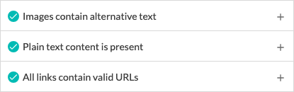
We make testing emails easy in Dyspatch. Our automated QA (Email Guardian) runs emails through industry-standard best practices. It includes key email accessibility checks to ensure that:
- All images contain alternative text descriptions
- Plain text content is present
- All links contain valid URLs
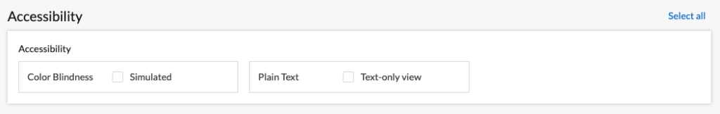
Our integrated device preview testing suite, powered by Litmus, further offers options to see how your emails will change when viewed as plain text or with simulated color blindness:
Conclusion
Not only does email accessibility provide an equitable experience for users with disabilities, it can boost open and click-through rates, and enhance brand reputation by providing a better experience for everyone.
It’s easy to overthink, and going overboard can have more of a negative impact than good. To keep it simple, take a layered approach to implementing email accessibility best practices:
- Start with the correct semantic HTML
- Use clear, descriptive, and approachable copy
- Choose fonts and colors wisely
- Supplement images, graphics, and media with alternative text
- Add aria-label when core HTML can’t do the job alone
Our comprehensive checklist contains everything you need to know for email accessibility. Small changes can make a big difference. By implementing a few key techniques, you can achieve a great email experience for all of your customers!
Need help leveling up your emails? Our team can help.
Get a demo
