Not every email campaign can be your #1 performer, but there are ways to improve low-performing campaigns with a healthy mix of experimentation and email marketing best practices.
Marketers, this is your go-to checklist for digging those underperforming email campaigns out of the gutter and boosting results — fast.
There are five main steps to optimize an email campaign:
- Dig into analytics for insights
- Test new subject lines and preheaders
- Use personalization to increase relevance
- Add interactivity to increase engagement
- Refine email design and content
Keep reading to find out how to apply each strategy to your campaigns.
5 Effective Ways to Optimize Email Campaigns
Let Analytics Data Guide You
It’s always a good idea to start with data. You may uncover something surprising that completely changes your email marketing strategy. At minimum, you’ll get an idea of who’s opening your emails and what actions they’re taking.
For example, say you’re trying to determine why your latest launch campaign has only converted at 1%, well below the general average 6.34% click-to-conversion rate (for e-commerce emails). You open up your analytics and find people were clicking, but not buying. Huh. But then you see it: Your analytics says 78% of your audience opens your email on a mobile device, but the landing page you’re linking to in the email isn’t optimized for mobile. Yikes.
The analytics you’re able to see depends on your email marketing software, but all should offer tracking of:
- Open rate
- Devices (e.g. mobile, desktop, tablet)
- Email clients (e.g. Gmail, Outlook, etc)
- Clickthrough rate (CTR)
- Net subscriber growth (new vs. unsubscribes)
Ideally, your emails should be optimized for displaying across all devices and email clients, but at least ensure they’re optimized for the ones most popular with your audience.
Besides helping spot technical issues, analytics can also tell you what your audience is most interested in. What types of content get the most clicks? The most conversions? The fewest unsubscribes? Use all of this data to guide your email marketing strategy.
Try New Subject Lines (And Preheaders)
Your subject line is the single most important factor determining if people are going to open your email or not. No pressure.
You know what a subject line is, but if you’re unfamiliar with the term “preheader,” it’s the preview text below the subject line.
There are many email best practices you can use to optimize your subject lines, such as:
- Add personalization: Use their first name, birthday, or the name of the product they bought, etc.
- Be specific: Say what your sale is — 15% today only, for example — rather than something generic like, “Savings on now.”
- To emoji or not to emoji? Emojis can help draw attention to your email, but some audiences may see it as immature or too informal. Know thy audience.
- Shorter is better: Email clients will only display 60 characters for a subject line and between 35-140 characters for the preheader. We recommend keeping your preheader to under 60 characters for the best mobile experience. (Dyspatch’s Email Guardrails will warn you if your subject line or preheader are too long, along with other email faux pas.)
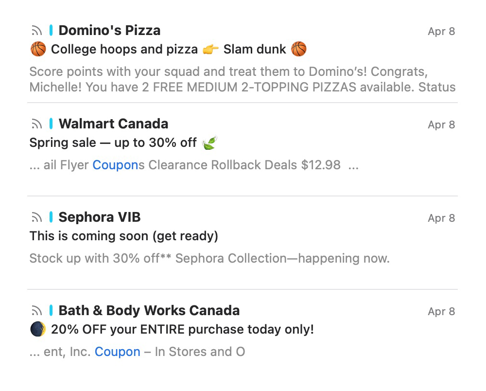
See how the email from Bath & Body Works above stands out from the other promotional emails? The subject line features an emoji, a specific offer (20% off and capitalizing “ENTIRE purchase”), and a sense of urgency (today only).
Use Personalization to Increase Relevance
Email personalization in the early ‘00s used to mean adding someone’s first name into a subject line or body of an email. Cool, but not enough nowadays.
Not convinced? Consider:
- Personalized emails deliver 760% more sales.
- 62% of consumers say they won’t purchase from a brand if they don’t receive a personalized experience.
- 7 in 10 companies around the world are increasing their use of personalized marketing in 2024 and beyond.
- 55% of email marketers are actively looking for more ways to personalize email content in 2024.
A few examples of email personalization include:
- Changing your “From” name to a person or the name of your newsletter (if applicable) vs. your company name to build relationships.
- Personalizing subject lines with more than a first name. Ideas include “Because you bought (X), you might like (Y),” or, “Tips for using your new (Thing They Bought).”
- Using automated trigger emails: if someone has been a member or customer for a year, or if they recently completed a specific workshop or class from you, receiving an email about that class, etc.
- Sending a reminder of items your customer has added to their wishlist or favorites.
- Including relevant personalized account information inside an email so your customer doesn’t have to click. For example, their current loyalty point balance.
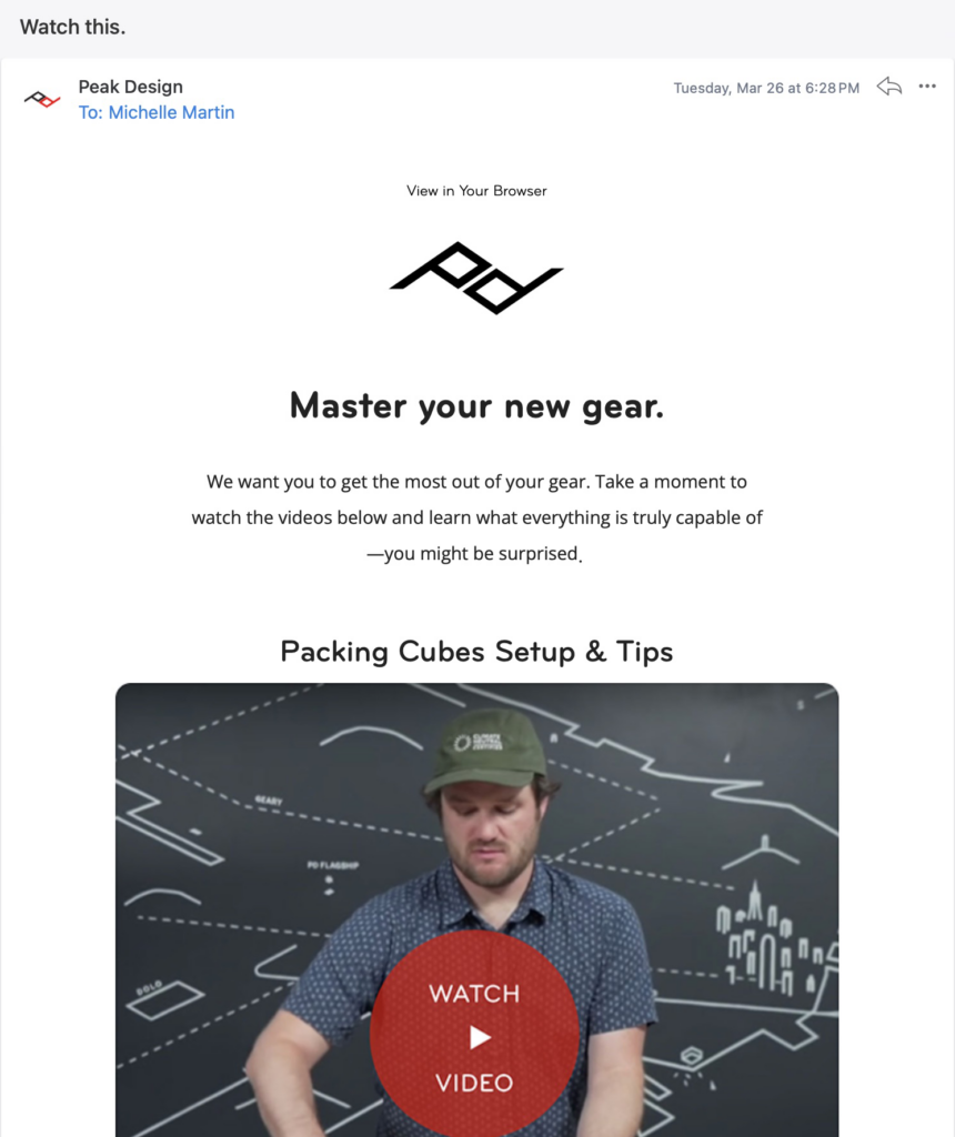
I recently purchased a packing cube set from Peak Design and was delighted by this personalized email I received on the actual delivery date (!). The email links to a video going over how to use the item I bought.
This can cut down the time it takes a customer to figure out how to use your product, as well as remove the frustration of trying to find instructions themselves. Plus, the fact it was tied into the tracking number so that it was timed to arrive on the day I received my order? *Chef’s kiss*
Now that’s an impactful use of personalization.
However, getting the proper data to be able to personalize your emails remains somewhat mysterious for most marketers. Almost half (48%) of marketers say unifying data and avoiding siloed data is a major challenge to personalization.
Enter: Customer Profiles in Dyspatch.
Customer Profiles make it easy for anyone to ramp up email personalization without code or technical knowledge. Using the visual builder, you can set up as many account-level profiles as you want to easily personalize emails for subscribers.
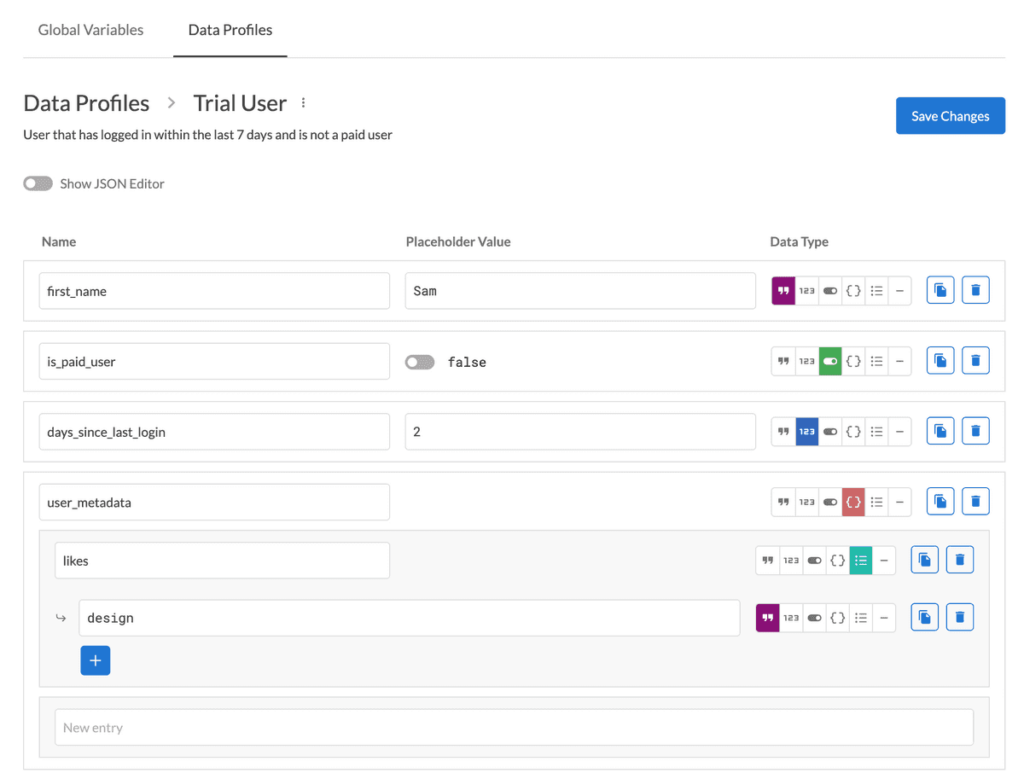
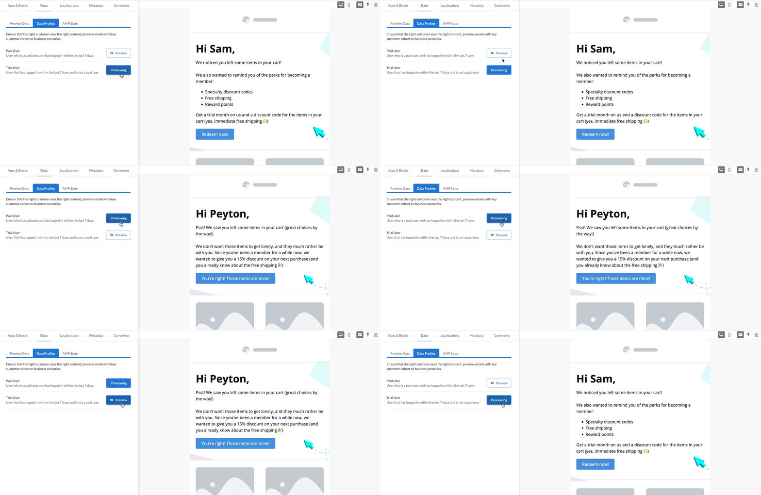
You only have to set up these profiles once and can use them across all your Dyspatch emails. When creating an email campaign, add in dynamic content blocks and preview how they’ll look to subscribers within each Customer Profile — right inside the Dyspatch Email Builder.
For example, customize promotional offers to different loyalty tiers of customers, or suggest different products based on a user’s past history.
Whatever you do, avoid making the mistake of collecting data from users and then not personalizing content for them.
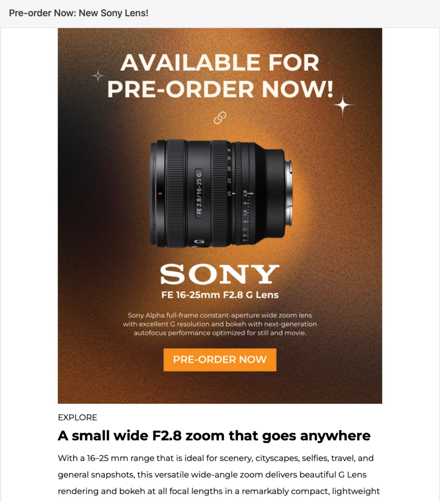
For this camera retailer who will remain nameless (because I do like them!), I filled out a detailed email preferences form when I originally subscribed. It’s a great idea for specialty retailers to have these preference options. Photographers, as an example, invest heavily in their equipment and don’t switch camera brands often (if ever). Therefore, they’re not interested in emails about brands they don’t use (in most cases).
Yet, I still get emails from this brand with very brand-specific content for brands I did not select in my preferences. The email below could be very effective when targeted only to Sony users, but the overall campaign effectiveness can’t accurately be measured if it’s sent to everyone. Plus, I may get irritated if I get too many emails that aren’t relevant to me and unsubscribe.
If you’re going to invest in personalization, see it through.
Add Interactive Email Elements to Increase Engagement
Interactive email content goes beyond personalization to deliver really standout experiences. Because these types of interactive emails are either so informative or entertaining, brands have seen up to 5X more engagement after adding interactive and dynamic content.
An example is a flight check-in email where the gate you need to go to and status is always updated to the correct information every time you open the email. Or an email with a survey you can click and fill out without needing to click anywhere.
You can easily add these advanced features to your emails with Dyspatch’s drag-and-drop Email Builder. Add polls and forms, let customers schedule appointments, or leave product reviews — all right inside their email client without clicking over to a landing page.
Boost engagement with image carousels, live countdowns (coming soon!), and even bring your emails to life with audio. Feature your latest podcast or a special subscribers-only audio message.
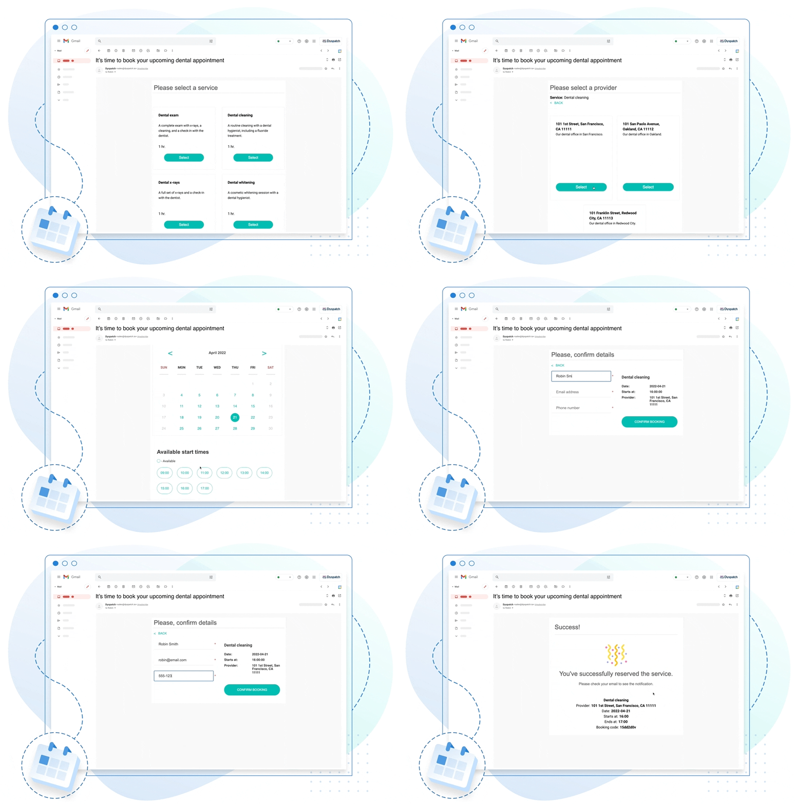
Need ideas of how to make your emails interactive? Try:
- Events and scheduling: Let customers book their regular appointments from their inbox, or offer a one-click RSVP or webinar registration.
- Image carousels: Adding clickable carousels can increase your click-through rate by up to 73%. Plus, it’s a great way to display multiple angles or products within a small space or short email.
- Customer reviews: Ask for a product rating or review for a recent purchase. Having it all happen inside the email increases the response rate because it’s so easy to fill out.
- Gather feedback: Run polls or surveys to gather valuable market research and make your customers feel heard.
- Onboarding: Allow users to set preferences or fill out their profile from an email without needing to sign in.
- Encourage referrals: Offer an incentive for customers to refer their friends, and enable sharing products from the email with their customized referral link.
- Information features: Integrate live-update shipping or order status tracking within the email. Any data point can potentially be integrated to show right inside the email. Your customers will appreciate the quick access to information.
Any of these examples can work in almost all types of emails, from transactional messages like abandoned cart emails to newsletters. Want to make your newsletter more engaging? Break up content sections with a quick poll — your audience will know you care about their opinion and you’ll get valuable insights.
Refine Your Email Design and Content Strategy
Last but not least, it’s worth taking a look at the overall design and content of your emails. Your campaigns don’t need to look the fanciest to be successful but they should follow common email optimization best practices.
Optimize your emails for clarity, click-throughs, and conversions by evaluating the following:
- Header: Can users tell who this is from right away? Is your logo and/or name prominent, but not overpowering?
- Branding: Does the email match your brand identity? Does it use the right colors, fonts, graphic elements, style?
- Voice and tone: Are your emails written in a way that aligns with your brand? With your other content? Does it match what your audience expects (e.g. formal vs. informal, fun vs. serious, etc).
- Calls to action (CTAs): Does your email have at least one clear call to action? Is it big enough and/or easy to tap on mobile?
- Subject line and preheader: As mentioned above, have you A/B tested different subject line styles? Is it under 60 characters for mobile?
- Readability: Is your background color distracting or does it make the copy too hard to read? Is your font size large enough for most people to easily read? Consider using accessible email design strategies.
- Graphics: Are images compressed and optimized for email? Ideally, all images should be in PNG or JPG format and be under 1MB (smaller = better!).
- Layout: Is it easy to scan your email? Are larger copy sections broken up with columns or graphics or other ways to encourage scannability?
- Mobile: Does your email load quickly on mobile? Is it just as easy to read on a phone as it is on a computer screen? Are all the landing pages it links to also optimized for mobile?
- Footer: Have you included your business name and address? Links to an email preferences page and/or unsubscribe link? Add links to popular website pages and your social media profiles too.
Optimizing your email design is easy with Dyspatch’s No-Code Email Builder. Fully drag-and-drop, anyone can create gorgeous emails with advanced interactive and dynamic functionality in no time.
To get nerdy for a moment, the Dyspatch Email Builder uses our own code language — Dyspatch Markup Language (DML) — which converts and exports your email design to HTML designed to work well across all devices.Save emails as templates, reuse content blocks in other campaigns, and export emails created in Dyspatch to send with any ESP.
Check all the new features we’ve added in 2024 and get a free demo of Dyspatch today.
Get a demo
The One Extra Thing to Optimize Your Email Campaigns Is…
Experimentation.
You can create the world’s most beautiful email template, the most mobile-friendly experience ever, and pop CTAs all over… but if your content strategy doesn’t align with your audience’s expectations, you won’t see the results you want.
Spend time figuring out what your audience responds to and wants from you, then create optimized email campaigns to deliver that. Focus on the content and let Dyspatch worry about ensuring every email looks great in inboxes around the world. Get a free demo today!
