First impressions count. This is true of book covers and wine labels — and it’s equally true of emails. Your welcome email is your first and best opportunity to win over new customers, so you want to make it count.
How important is your welcome email? Well, of every email you’ll ever send, it’s the one your customers are most likely to read. Welcome email open rates vary, depending who you ask: Some say over 91%, others say 50%. But everyone agrees their open rate is several times higher than subsequent emails.
That higher open rate translates into higher revenue, with welcome emails generating up to 3.2x as much as other campaigns. It also leads to greater engagement: Customers who open a welcome email read 40% more content over the next 180 days.
What is a welcome email?
A welcome email is the first contact your company has with a new subscriber or customer. Typically, it’s sent after they sign up to your mailing list, or make their first purchase. The welcome message is an opportunity to nurture their new relationship with your brand, and provide information or offers that encourage them to engage further. Below, we’ll talk about different ways you might approach this first conversation.
Are you sweating a little bit reading those numbers? Don’t worry — I’ve put together some best practices to help you make a great first impression. I’ll also go over some of my favorite examples.
5 Welcome Email Best Practices
No two welcome emails are exactly alike. The one you send should be unique to your brand, and tailored to your audience. But the great ones do have a few things in common. After extensive research and a whole lot of inbox investigation, we’ve distilled the science of the welcome email to five best practices:
1. A charming subject line
A welcome email should have a clear, direct subject line. Since it’s your first communication, you don’t want any confusion about who you are or why you’re emailing.
There’s still room to express yourself, particularly if your brand voice is funny or playful. But there’s nothing wrong with keeping your messaging simple: “Welcome! We’re so happy to meet you.” or “Welcome! Open for a special offer…”
Want more guidance? Here are three simple tips for writing a winning email subject line.
2. Impeccable timing
In romance, airports, and welcome emails, timing is everything. In fact, 74% of customers expect to receive a welcome email right away. And since you can automate welcome emails, there’s no reason not to live up to that expectation.
Use automation to send your welcome email immediately after a customer signs up to your email list, or makes their first purchase.
3. A personal touch
Are you collecting names when people sign up to your mailing list? You should be! Emails with personalized subject lines are 26% more likely to be opened. And personalization doesn’t have to stop there: 91% of customers prefer when brands offer tailored recommendations and content.
Intimidated by the science of personalization? Don’t be. We’ve made it easy for you.
4. Thoughtful design
It’s easy to dismiss design as a superficial quality of your emails, less important than the content of your message. But design is about more than just looking nice. A well-designed email is easier to understand, more memorable, and ultimately more compelling.
See what we mean by reading our eight email design principles for higher engagement.
5. A little something extra
Your welcome email is the chance to tell your customer who you are. But it’s also a chance to give them something of value. After all, relationships go both ways.
There are several ways to approach this. You might include a special offer, a selection of your best blog content, or some tips to help them get started with your product. (More on these below!) Including valuable content will make your customer look forward to the next email you send — and the one after that, too.
One last tip: make it easy to opt-out. Some of your recipients will inevitably drop off after that first email, and that’s okay! A smaller list of highly-engaged recipients is better than a large list full of people who hit “delete” when they see your name pop up in their inbox.
Making it simple to unsubscribe is good for your sender reputation, which means your emails will reach the people who want to read them. Better for you, and better for them too!
10 Best Welcome Email Examples and How to Pull Them Off
Now that you’ve got a handle on the basics, let’s get to the good stuff: show and tell! Below, we’ve got 10 examples of effective welcome email campaigns worth studying, and a breakdown of why they work.
1. Introduce yourself
You’ve already piqued your recipient’s interest — enough that they signed up for your emails. Now is the chance to tell them why you’re right for each other.
A welcome email can serve as an introduction to your company mission, values, and purpose. Telling your recipient a bit about your company helps them understand how you can serve their interests.
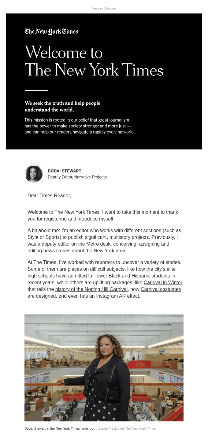
Here’s why this example from the NY Times stands out:
- It’s personal. It’s from an individual editor, written with a distinct voice.
- It’s on brand. As a news outlet, a welcome email full of links and information is just what you expect.
- It’s helpful. The value to the recipient is clear, particularly in the links at the bottom.
4. Share a special offer
Many welcome emails come with an introductory offer or discount code, and with good reason: they work! Forty-eight percent of customers will make a purchase sooner, if they have a discount code, and 41% will look for something to buy just to use one.
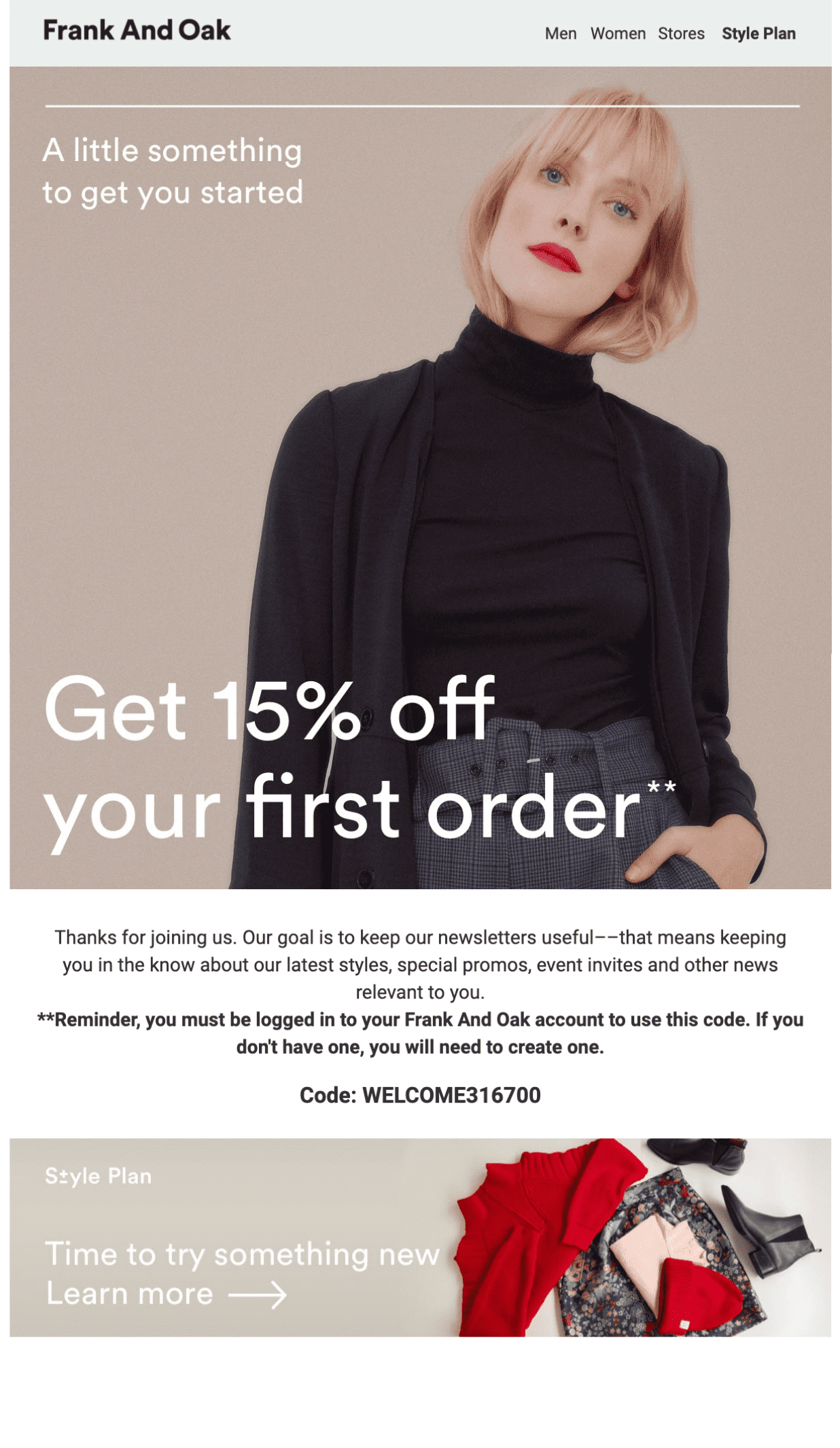
Here’s an email from clothing retailer Frank & Oak to show you how it’s done:
- A simple offer. No confusing restrictions or limitations, just a percentage off your first purchase.
- A sleek design. The editorial look of this email is a perfect fit for an apparel brand.
- A useful resource. The email also includes a link to the Style Plan, a subscription to help new customers discover their fashion preferences.
This welcome email could be right for you if… you want to offer email subscribers great perks right off the batt to win their business — and wow them with your product.
5. Set expectations
Now that your recipients have let you into their inbox, you should let them know what kind of visitor you’ll be. For one thing, how often are you dropping by? Daily, weekly, or only on the full moon? And what kinds of emails are you sending — announcements, offers, or personalized recommendations?
Put it all upfront in your welcome email, like in this example from Blinkist:
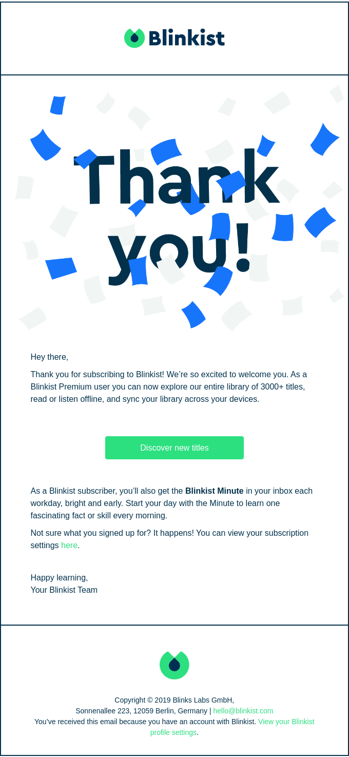
- It’s clear. Recipients know when they’ll be getting emails, and how often.
- It’s helpful. There’s a simple link to customize subscription settings, ensuring recipients get the emails they want.
- It’s appreciative. As I mentioned earlier, it’s always nice to say thank you!
This welcome email could be right for you if… you’ll be sending frequent emails, or different types of emails (like offers and resources).
6. Show off a little
When it comes to making a purchase decision, most people look to others for advice. In fact, the average user reads 10 online reviews before making a purchase. And most customers trust online reviews as much as recommendations from their own friends and family.
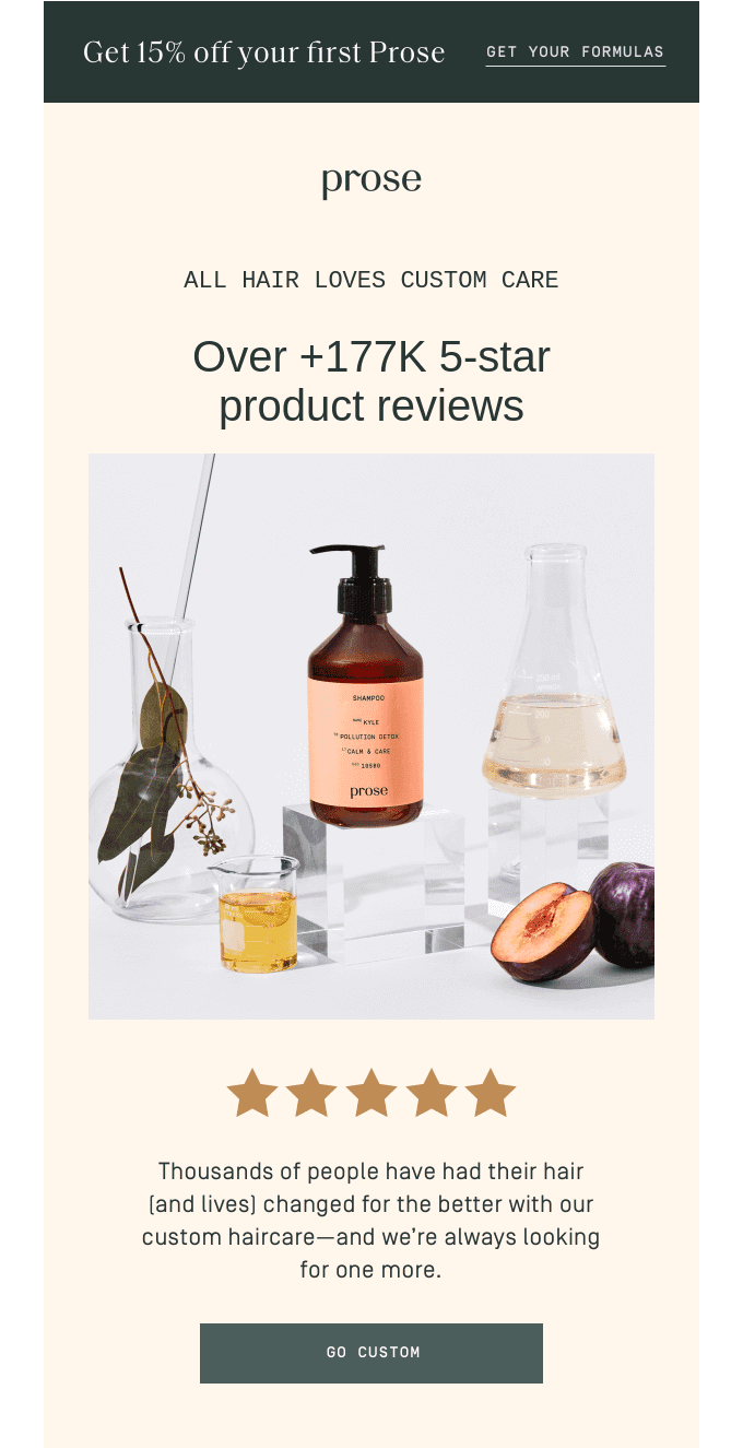
That’s why reviews, testimonials, and ratings make a great center piece for your welcome email. If your customers are happy, let them sing your praises for you! Here’s a stellar example of using social proof from haircare brand Prose:
- It goes big. No humble bragging here: Prose puts their five-star reviews front and center.
- It’s visual. Once again, good design makes an impact. A little visual of five stars and scannable text gets the core message across.
- It’s descriptive. The email includes excerpts of reviews, which emphasize product benefits and experience. Just like a restaurant with luscious descriptions on its menu, descriptive and tactile details make us want the product more.
This welcome email could be right for you if… your customers love your product! If you’re not collecting as much feedback as you’d like, check out these seven strategies to help you get more reviews.
7. Get ‘em onboard
Offering good customer service is essential to your success: 96% of customers will leave if they don’t feel supported. One of the best ways to do that? Help your customers get started with their new product or service right away.
A useful onboarding email should help customers get the most out of their purchase, to ensure they have a positive first experience with you. This can include sharing tutorials, tips or blog posts.
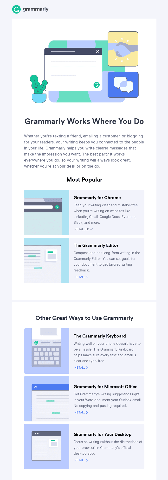
Grammarly, which helps users improve their writing, has a great welcome email. Here’s why:
- It’s well-designed. The graphic layout makes it easy to scan.
- It’s helpful. Right away, you can see how to install Grammarly and where you can use it.
- It emphasizes value. The email ends with a trio of benefits to the user, reminding them of why they signed up.
This welcome email could be right for you if… you want your customers to get the most of your product or service! If you’re offering something that comes with a learning curve, don’t leave your customers to fend for themselves.
8. Say it with a video
Adding a video to your email can increase engagement rates, and convey more than text alone. In fact, at least one researcher believes a single minute of video is worth 1.8 million words. However you quantify them, videos are a fun and appealing way to connect with new customers in your welcome email.
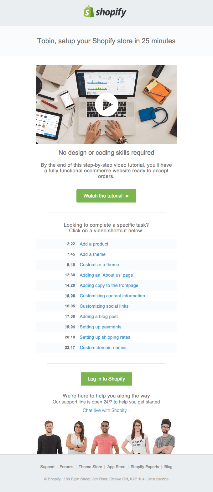
You can share a video greeting, a product demo, or a tutorial to help users get started. That’s the approach Shopify took with their welcome email. Here’s why we like it:
- It’s straightforward. Remember, people appreciate knowing what to expect. Letting people know how long the video is and what it covers is useful intel!
- It’s detailed. There’s a helpful breakdown of each subject covered, with a timestamp. This means users can go back to watch it again to find specific information.
- It’s friendly. Even though the video is utilitarian, there’s still a human element with the customer service support at the bottom. It’s not robotic or stiff.
This welcome email could be right for you if… you want to share detailed information or a longer message! You can cover a long email’s worth of text in a short video, in a much more approachable way. A video can also help humanize your business, by putting faces (and voices) to the brand.
9. Get to know them
That’s right, it’s not all about you. Collecting a few details about your customers in a welcome email can help you make all of your future emails more valuable to them. Armed with this info, you can personalize the email content they receive.
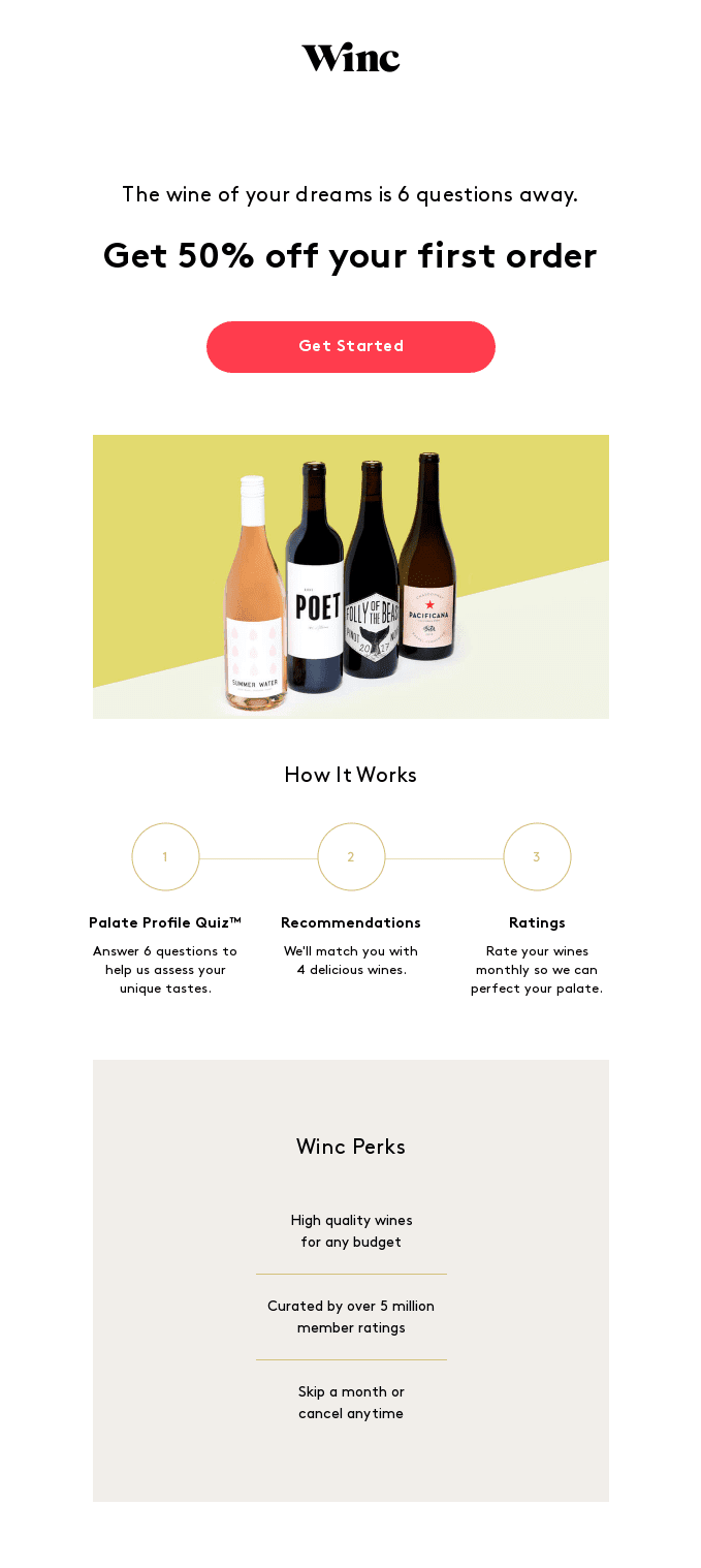
Including a short survey or quiz will also demonstrate you care about your customers as individuals. You’ll build trust and engagement right off the bat. Plus, we all love quizzes. Here’s a welcome email from Winc to show you how it’s done:
- It’s persuasive. The copy is compelling and fun.
- It’s direct. The number of questions, and the purpose behind them, are clearly stated.
- It’s attractive. The design of the email is clean and bright, with a clear CTA right at the top.
This welcome email could be right for you if… you want to engage in segmentation and tailor your emails to each customer — which you should! Whether you start off by collecting customer insights or pick them up along the way, personalizing your emails will pay off.
Pro-tip: With Dyspatch, you can embed a quiz or a survey directly in a welcome email using pre-coded, interactive AMP modules — and boost engagement by up to 500%. Not familiar with AMP? More on this topic next.
10. Make it interactive
A good welcome email will get your recipient to click through to your website, resource, or survey. But a great welcome email will let them do everything right in their inbox by including interactive AMP elements.
AMP stands for “Accelerated Mobile Page,” which is just what it sounds like: a miniature interactive website delivered right to you. It’s game-changing technology that also happens to be a pretty fun change from the usual inbox clutter. With AMP, you can embed forms, slideshows, scheduling tools, and even games — live, dynamic elements that increase click-throughs and conversion rates.
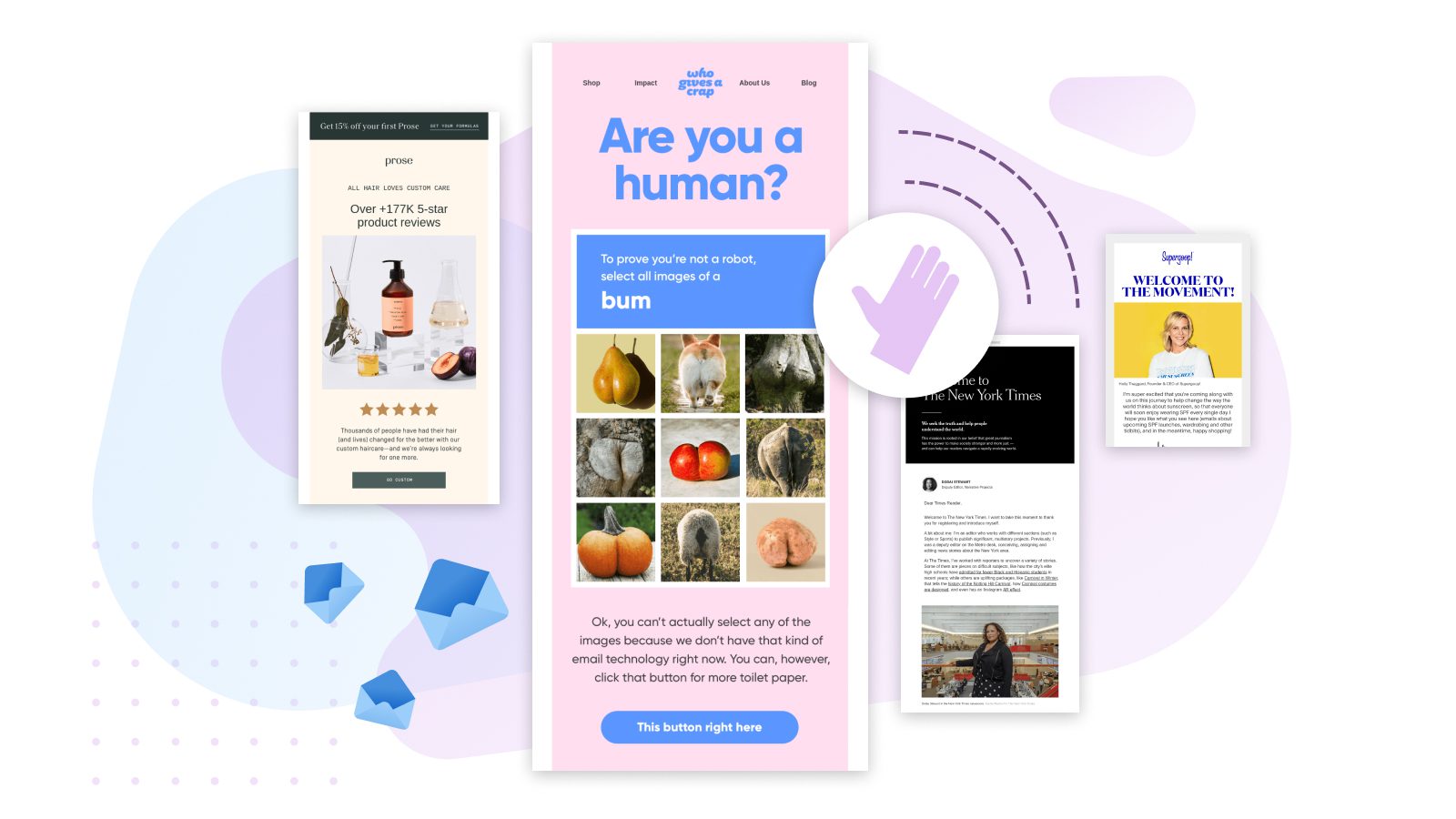
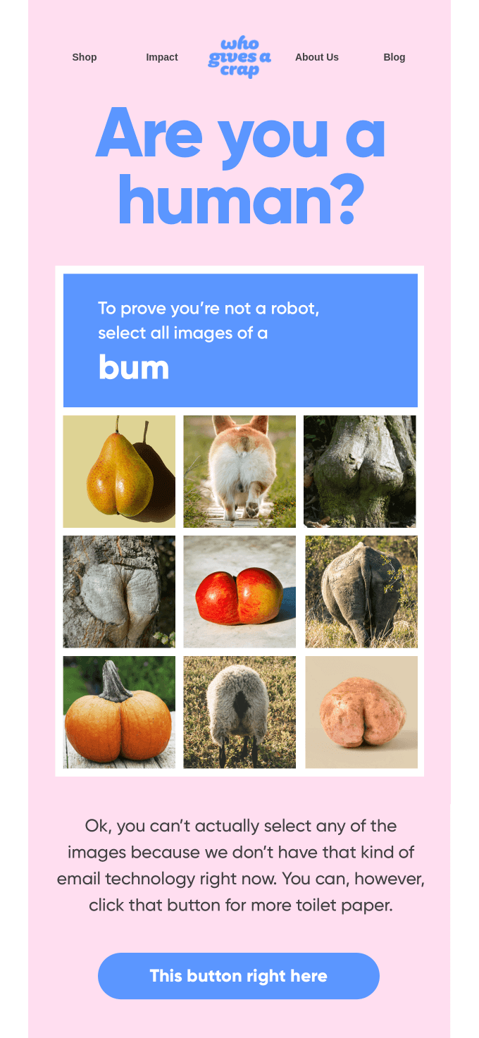
Here’s a pretty funny example from the toilet paper brand (yes, that’s right) Who Gives a Crap. Admit it, this is irresistible:
- It’s (almost) interactive. Okay, you got us. This isn’t an actual AMP email. But they do allude to the tech in their copy. If you could click on the images and discover a live discount code, it would be.
- It’s engaging. Even hinting at a game like this is attention-grabbing! So imagine how engaging it would be if the puzzle did indeed work in the email. You could make it even more engaging by unveiling a discount code after finishing the puzzle. That way, the recipient wouldn’t have to scroll down to find the offer.
- It’s on-brand. They clearly have a strong brand identity. It may not be for everybody, but it’s hard to deny they have personality.
This welcome email could be right for you if… you want to harness the latest interactive email innovations to increase engagement! Explore everything you need to know about AMP for Email right here.
Build Long-Term Loyalty With a Winning Welcome Email
As these 10 examples prove, there are many ways to pull off an effective welcome email.
Whichever style you choose, that first email can make a huge difference when it comes to winning the loyalty of your newest customers or encouraging potential ones to make their first purchase.
So set yourself up for email marketing success by giving subscribers a warm welcome.
Need help getting started? The Dyspatch team has you covered. Book a demo to see how you can create beautiful, engaging templates with our email builder.
