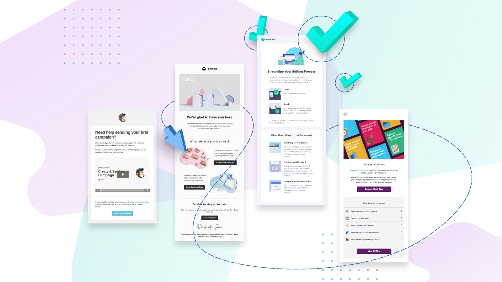
You did it! You got a new user to sign up for your newsletter, download your app, or subscribe to your service. Congratulations.
But now that you’ve won their interest, how do you keep them? A 2018 study found on average, marketers will lose 34% of new subscribers within the first month. There’s no doubt, the first few weeks are critical for turning their initial interest into long-term loyalty.
That’s where an onboarding email sequence comes into play.
Effective onboarding emails will help your customers get the most out of your product by educating them about its features and highlighting its benefits. With an onboarding sequence that anticipates needs and nurtures interest, you can reduce churn and improve long-term retention and loyalty.
Even if you have a strong onboarding email strategy, chances are there’s room to improve. In fact, Wyzowl found 90% of surveyed customers thought companies could do better when it comes to onboarding.
So I’ve broken down the science of a strong sequence — and collected some of my favorite onboarding email examples along the way. Let’s dig in!
Three benefits of onboarding campaigns
As always, a caveat: Not all emails are created equal. Onboarding emails are no exception. I’ll get into what separates effective emails from forgettable ones in a moment…
But for starters, here’s why you need an onboarding email sequence:
1. To reduce churn rate
Acquiring new customers is five to 25 times more expensive than hanging on to the ones you have, so retention should always be a top priority.
Onboarding emails help you do that. You can use them to address the reasons new customers leave. For example, eight in 10 people have deleted an app because they didn’t know how to use it. User onboarding emails provide the product education and insights new customers need, when they need them.
2. To leverage initial engagement
The moment a customer signs up or makes their first purchase, you know you have their attention. This is the perfect time to capitalize on their interest with some excellent email marketing.
Each email in your onboarding sequence is an opportunity to reward new users for their interest. How? By sharing information that will ultimately improve the user experience and encourage regular product use.
It’s the difference between a next-day phone call after a great first date, versus texting someone two weeks later. You’re just not going to get the same enthusiastic response if you’ve been MIA for weeks.
3. To build loyalty
A new customer, by definition, doesn’t know you well yet. Your onboarding sequence can help them deepen their understanding of your company.
Seventy-one percent of customers prefer to shop with brands that align with their values. So beyond helping your customer understand what you do, show them why you do it — that’s the foundation for a lasting customer relationship.
5 best practices for onboarding email sequences
There are many ways to put together a great onboarding sequence, which should be tailored to your customer journey and business goals. But in general, effective onboarding emails have a few things in common.
Here are the key ingredients:
1. Value
First and foremost, your onboarding emails need to be useful. It should be obvious how an email is going to help users, as soon as they open the message. (Boost your open rates by making the benefit clear in your subject lines too!)
I’ve received many customer onboarding emails that just repeat the same talking points about how this product is going to transform my life — and I delete them! Sure, you got me to sign up with your product’s promises. But now, it’s time to show me how your product actually comes through on its promises.
It’s simple: Always focus on customer success. (Of course, this goes for your regular emails too.)
2. Focus
It’s an onboarding sequence for a reason. Each email should have a single, defined purpose. This can be getting users to complete their profile, log in to the app for the first time, or convert to a paid account. Don’t try to accomplish more than one goal with each email. And make sure each goal is connected to a clear, compelling call-to-action (CTA).
This focused approach will also allow you to analyze your onboarding sequence — gather metrics on how each CTA performs. Then, you can identify exactly what’s resonating with your users, and refine your approach to increase conversion rates.
3. Consistency
Your onboarding emails should have a unified look and feel that mirrors your website, product interface, and any other customer touch points. The key here is building familiarity and brand recognition, which are essential to customer loyalty.
It takes five to seven impressions before someone will remember and recognize your brand, so visual consistency in your initial emails really counts. Here are some tips to help you achieve consistent branding across all emails.
This also means each email should be written in your brand voice, no matter how short or factual that email is. You still want it to sound human, and to hold their attention. After all, if your email bores them, they’re likely to skip the next one you send. And the one after that. So brush up on your copywriting best practices, too.
4. Digestibility
Remember, your customer is new! They have a lot to learn about your product. The best way to help them is through informative content that’s easy to understand and absorb.
If you’re creating focused emails, this should come naturally — you already know not to pack too much into a single message. But the design of your email also has a lot to do with it too.
Consider using bullet points and short numbered lists to make each step clear to your user. And dynamic media, like videos or GIFs, can take the place of dense blocks of text. As a bonus, GIFS and videos can increase engagement up to 73%. And 91% of people have watched a video tutorial to learn how to use a product. Clearly, people want this type of content.
5. Personalization
It’s never too early to start personalizing your emails. And your onboarding email sequence is a great way to learn more about your customers. You can use these messages to prompt customers to share their preferences or complete their profiles, and to analyze their patterns of engagement.
Start with what you have: Even personalizing a subject line with your customer’s first name can increase engagement by 30.5%. As they engage with your product, you can also trigger onboarding emails in response to specific actions. This will ensure the onboarding sequence is relevant to their individual user journey, which will keep them from dropping off or hitting unsubscribe partway through.
For instance, you can send them a congratulatory email the first time they complete an action in your app, and prompt them to take the next step. I’ll share more examples of how personalization can enhance your onboarding email sequence in a just a moment.
Examples of great onboarding emails
Now, for the good stuff: A selection of some of my favorite email examples.
Each one illustrates a different type of email that you can use in your sequence. The way you put together your onboarding flow is up to you, and will ultimately depend on what your users want to see.
Consider this the toppings bar for your own delicious onboarding sundae. Grab a spoon and dig in:
The welcome email
Some folks may consider the welcome email separate from the onboarding process, but it’s too valuable not to mention here. It’s your first impression. Your best chance to grab someone’s attention.
Plus, you can use this automated email to begin the onboarding process, like beauty subscription service Ipsy does here:

I love this email, which is surprisingly multifaceted: It’s an order confirmation, a welcome, and an onboarding email all in one! It has a clear CTA button for users who want to learn more, and a simple breakdown of how the service works at the bottom.
But there are many other ways to write a welcome email, and each one is an opportunity to strengthen your relationship with your new user. Find out how to build a winning welcome email right here.
The get to know you email
After you’ve welcomed your new user, you want to get to know them a bit. Your onboarding sequence should invite them to tell you a little about themselves — whether that’s by completing their profile, updating their communication preferences, or sharing their interests.
This achieves two goals: First, it gets your user more invested, because they’ve spent some time setting up their account. And second, it gives you important information about who they are and what they care about, which you can use to personalize future emails.
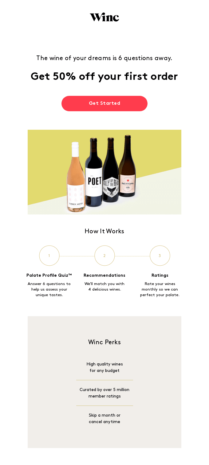
Like this quick quiz from Winc:
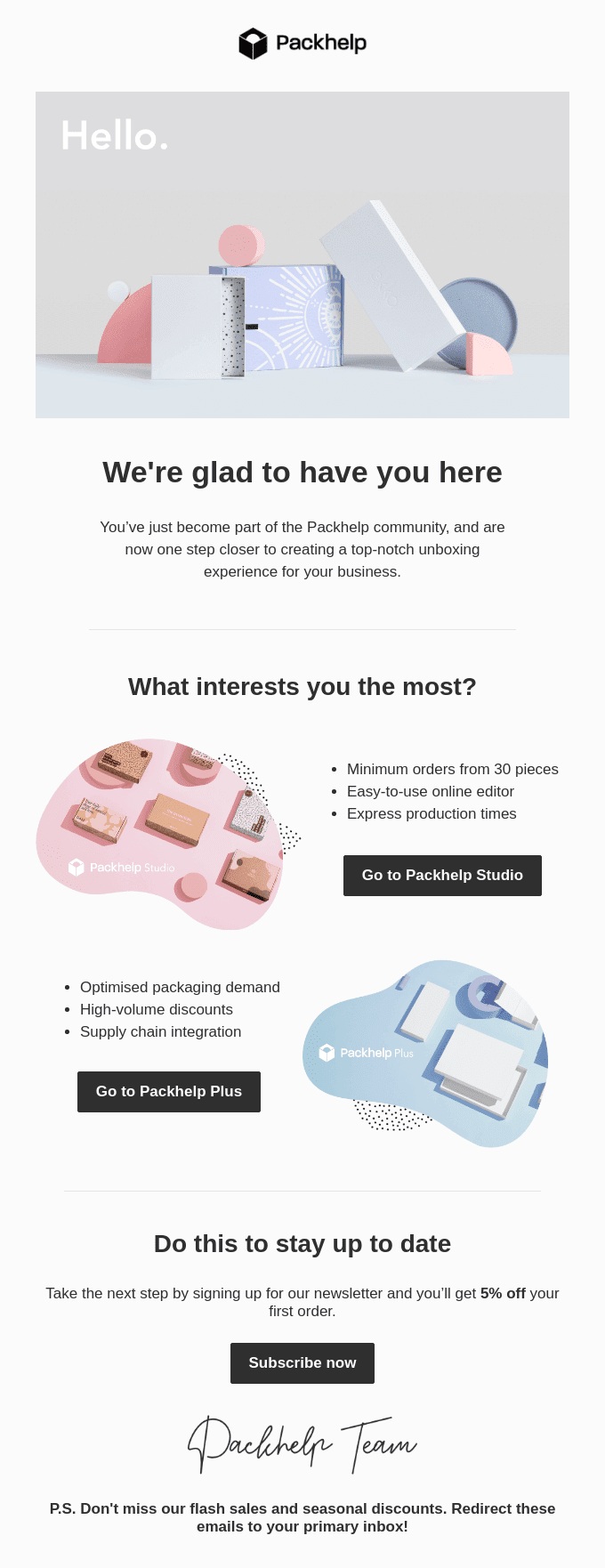
I also like this clean, visual email from Packhelp, a custom packaging service. Their simple onboarding email segments customers into two groups based on their primary interest, which allows them to tailor future communications to each group:
These messages are also ideal AMP for Email use cases. Both examples above require you to click away from the email. But to eliminate the need to click-through and reduce friction, you could bring these actions right into the email.
AMP for Email allows you to embed dynamic forms in your onboarding emails, so your users could rate their preferences or complete their profiles right in the message. The easier the process, the more likely they are to actually do it. Learn more about how AMP for Email can improve your onboarding process here.
The get started email
This one is critical for apps and products, and may be broken out into a series of emails. But the goal here is to help your customer get value from your product right away, so they’re encouraged to keep using it.
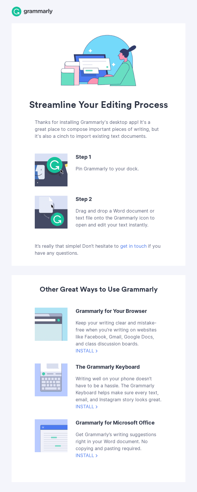
Here’s a great example from Grammarly, with a simple two-step, visual process for how to use their desktop app:
MailChimp sends an email to new users who haven’t sent their first email campaign, featuring a short video to help them get started. I love how short and direct this example is with the video taking center stage:
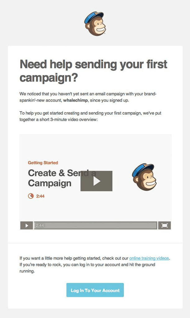
Including the length of the video is also a nice touch: It sets expectations and helps the user know exactly how much time they’re about to invest.
The level up email
Users who engage with your ‘get started’ tips should receive another email that helps them explore more features. This helps them discover and appreciate the benefits of your product, which is key lasting loyalty.
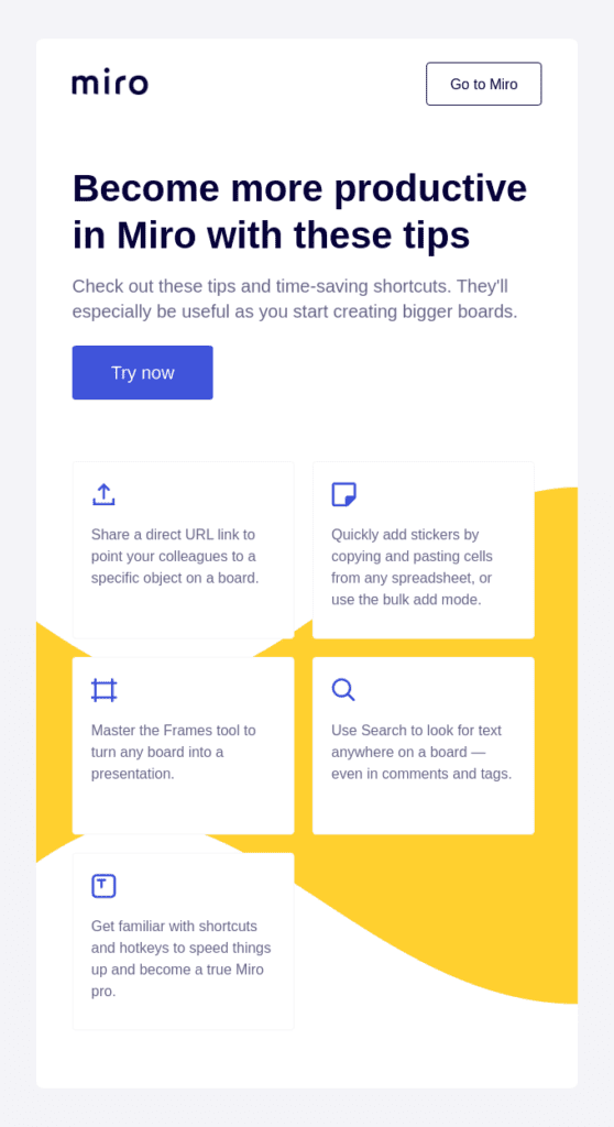
Here’s an example from Miro, which offers five tips to enhance the new user experience:
And here’s a similar email from Slack:
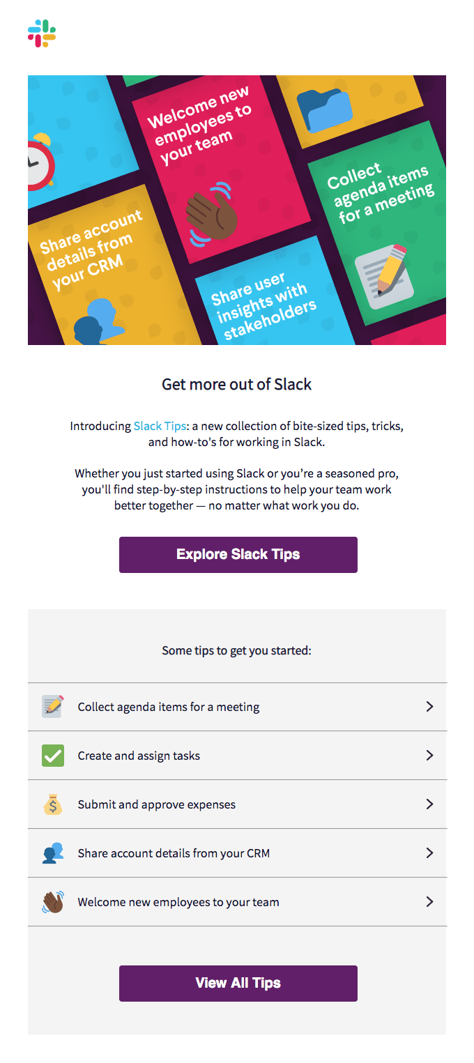
This format works on multiple levels. The quantity of information is just right — enough to ensure your customer will learn something new, but not so much that they’re overwhelmed. And the tip format is ideal because it makes the value of the information clear: Here are ideas that can be immediately put into action.
The free trial email
Do you offer tiered services, or both paid and free versions of your platform? A free trial can help convert new users of your free program into loyal customers of your paid program. Leverage their interest and enthusiasm by showing them just how much more they can get out of your product.
SaaS company, Strava, does a great job of promoting the benefits of their free trial to potential users:
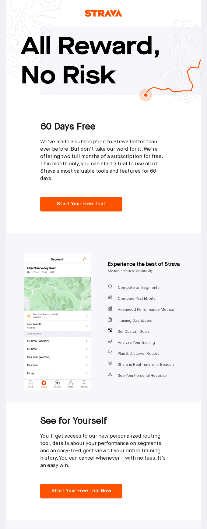
This is another opportunity to integrate AMP for Email (and doubling your conversions!) by streamlining payment processes. If users can upgrade their account or subscribe to a paid plan right in the email, they’re much likelier to take that step.
The reward email
It’s never too early to start building customer loyalty. Offering perks and rewards is another way to demonstrate the benefits of your business. Starbucks is stellar in this regard — their loyalty program generates an incredible 50% of their revenue. And as soon as you join and start using the app, you get offers like this one:
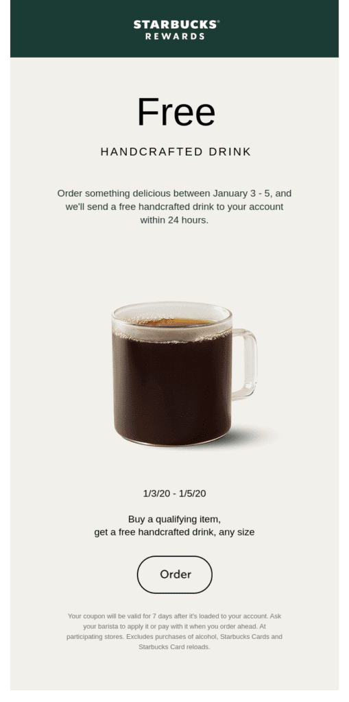
Not every business can win customers with free beverages. But sprinkling in an exclusive offer or benefit to reward your new users and paying customers is a great way to keep them engaged.
The support email
Your onboarding sequence should include support for users who need a little extra help to use your product. If your emails with product benefits, tips, and instructional videos haven’t worked, an offer for one-on-one support might.
A majority of customers (62%, according to Hubspot), want to use email to communicate with customer service teams — that’s a higher percentage than any other communication channel. So make it easy by offering to help right in an email, like Harvest:
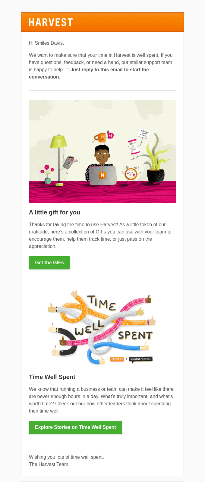
Not every user will need this level of support. (Another reason why your onboarding sequences should be segmented based on user behavior!) But for those who do, this email could be the difference between churning or retaining them.
The extended offer email
Okay, your onboarding sequence is almost complete. You’re retaining more users past that 30-day mark, and they’re accessing the full benefits of your product, and even, recommending it to others. Hooray! But some users are still on the fence…
That’s where an extended trial can come in. Squarespace uses this technique in their ‘free trial ending soon’ email:
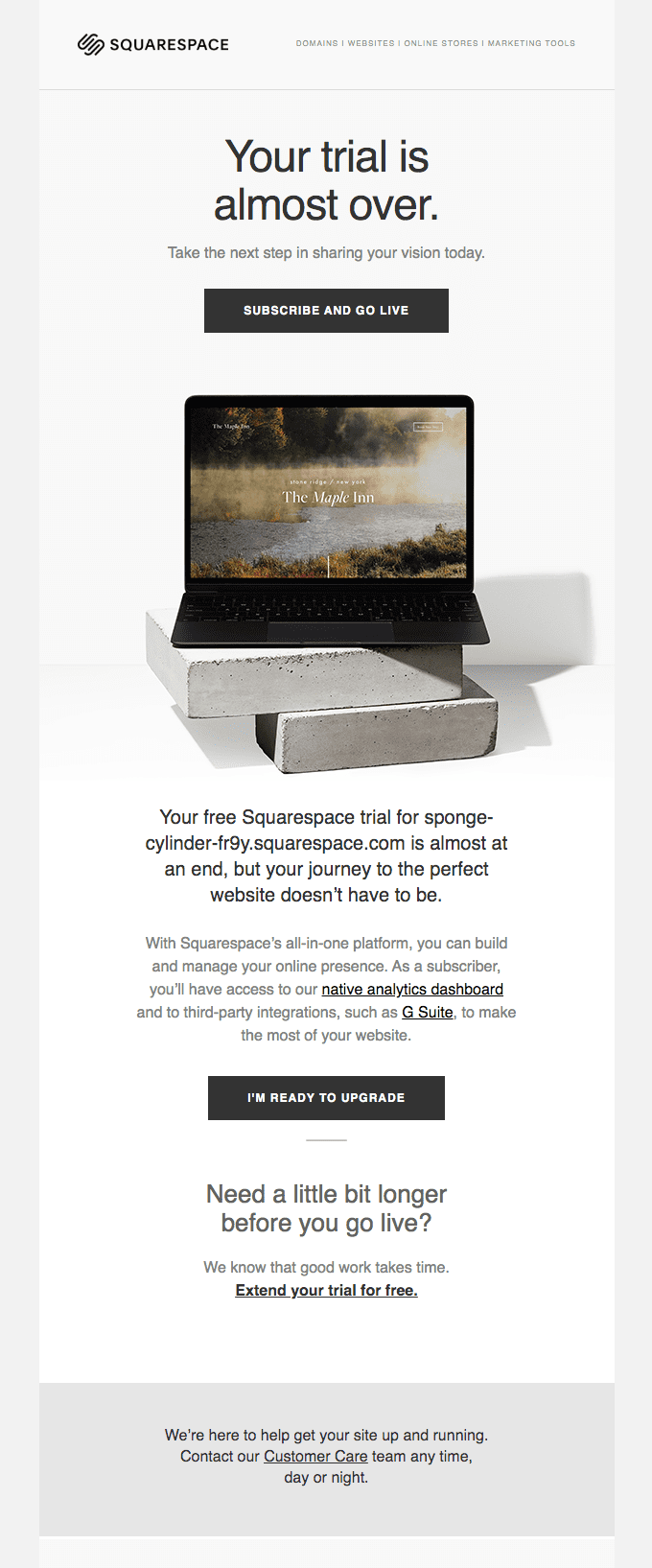
This recommendation comes with a caveat: Don’t extend the trial indefinitely. Otherwise, there’s no incentive to subscribe. And don’t assume the extension itself will persuade them. You need to address any lingering doubts. Follow this extended offer with an offer of one-on-one support to help them overcome their hesitation.
The re-engagement email
Every company experiences some churn. It’s an unfortunate but routine aspect of the customer lifecycle — like taxes and laundry day in day-to-day life.
But not all lapsed users are gone forever. Madkudu found half of conversions happen after a free trial period has ended. Your onboarding sequence has laid the groundwork for product awareness and education, which means these users may well return to your product later.
Squarespace does a good job of not giving up:
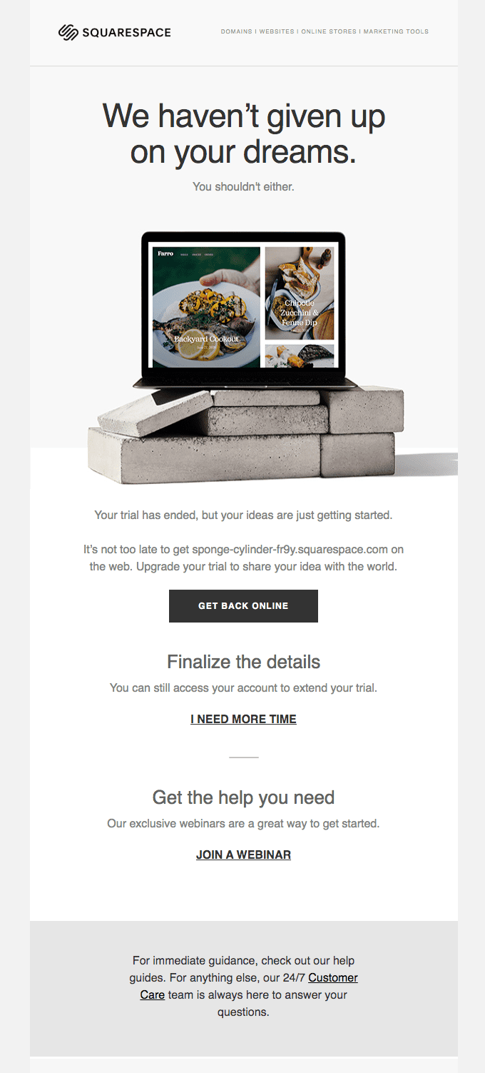
This simple email emphasizes the benefit to the user should they sign up, while also providing a few alternatives: Extend your trial or get help with our exclusive webinars.
The feedback email
The last step in your onboarding sequence should be asking for feedback. Product reviews are incredibly valuable, which is why my colleague shared seven tips for getting more product reviews here.
They’re particularly valuable for users who still aren’t engaging with your product. If you ask, they may be willing to tell you how you can improve. And businesses that are able to resolve issues are 95% more likely to win-back dissatisfied customers in the future.
Here’s a well-written example from Bellroy:

It’s worth noting, feedback opportunities are also appreciated by highly satisfied customers. Why? Because it lets them know you care about what they have to say.
With AMP for Email, you can embed surveys and product review forms right in the message, which allows customers to complete your desired action right away. In fact, one investigation from Email on Acid found interactive surveys led to a 225% increase in responses.
All aboard for an onboarding email sequence
Now you know what it takes to create a winning onboarding sequence. The next step is putting it all together and getting those emails ready to send.
Dyspatch makes it easy to build highly effective onboarding emails (and streamline your workflow in the process!) with our no-code email builder.
And all those ways AMP for Email can improve your onboarding emails? You can make them happen with our library of interactive email apps. Add surveys, product review forms, live commenting, and more to your email templates — and turn your new users into lifelong customers, one great email at a time.
