Sendwithus has a ton of great features and we recently realized that we didn’t have a simple way to show the true awesomeness of our product, so we decided to make a product video.The process of making the video was interesting so we wanted to share with you what we learned along the way.
What We Wanted
A short, public video that explains what Sendwithus does and that integrates well into our website design. We were looking for something in the vein of great startup videos that came before us, like AirBnb, Listia, and PushForPizza.
What We Had
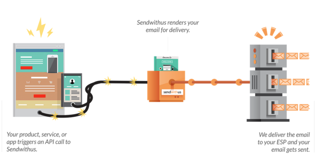
Here are the things we had to start: a month, a small budget, and a few ideas on what the video should look like. We didn’t have the budget to get a production team or six months to make a flawless video. Perhaps more importantly, six months from now our product could look very different from what we showcase today. Using resources we already had, we wanted a professional quality video that would compliment our website and emphasize the solutions we provide. To do this, we had to distill the core offering of sendwithus into a few simple ideas:
- A pretty email template management system that sits on top of your Email Service Provider (ESP).
- A system that can be used by marketers to update and change email content using our dashboard.
- An API that can be used by developers to send email through an ESP.
This process is what we wanted to illustrate with the video.
The “Schedule”
Our planned, one-month breakdown was something like one week for finalizing a script and storyboard, one week for trying out different production tools, and two weeks to produce the final product. Very idealistic.
What actually happened was a few days to write the first script and storyboard, one week to go into production, a couple days of feedback, one more week of rewriting the script and storyboard and then production for the remainder of the time. In retrospect, this seems a little obvious, but here we are.
Getting Started
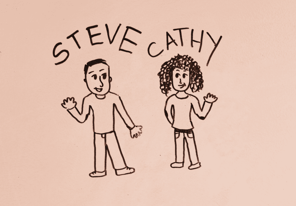
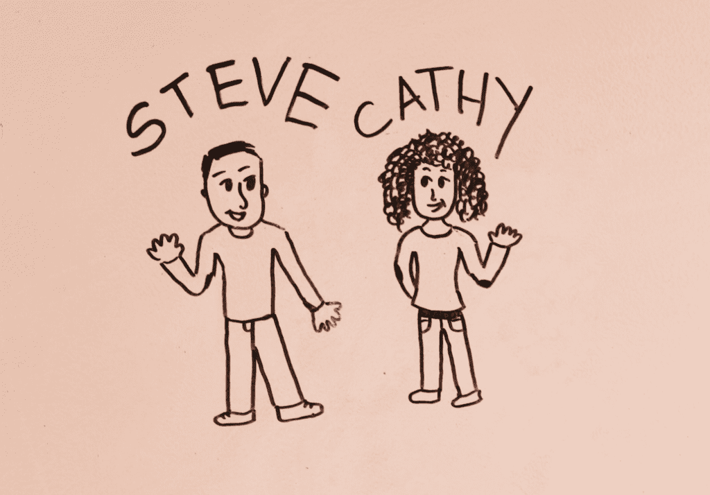
The first stage of planning was to decide on who we were targeting, what features we wanted to highlight, and what format we wanted the video to take. For us, the audience is other businesses who use email as a core component of their products. To plan for our video we storyboarded by hand, wrote out three or four scripts using Celtx and put together a few storyboards before writing the final script. Our first version was about a marketer named Steve and a developer named Cathy, how Steve could use sendwithus to edit email templates and Cathy would use the API to send emails through their ESP, and everyone lives happily ever after. We initially wanted to create a whiteboard style video (like this great one from Patreon). We tried to draw animations to create a stop motion video. The end result? The footage was choppy and comical, so we’re retroactively going to call this a prototype. The process was a lot of fun, but it wasn’t a finished product. This is where we hit our first lesson – deciding on a style isn’t necessarily deciding on what the final product will look like. The rendered quality of the video had a massive glare and the characters were never drawn the same twice. It was really hard to keep the whiteboard animation clean enough so as not to distract from the message.
Also, Steve and Cathy are in nearly every start up video… so we fired them. We rewrote it and kept it simple, focusing on your app and ours and how they work together.
Tools
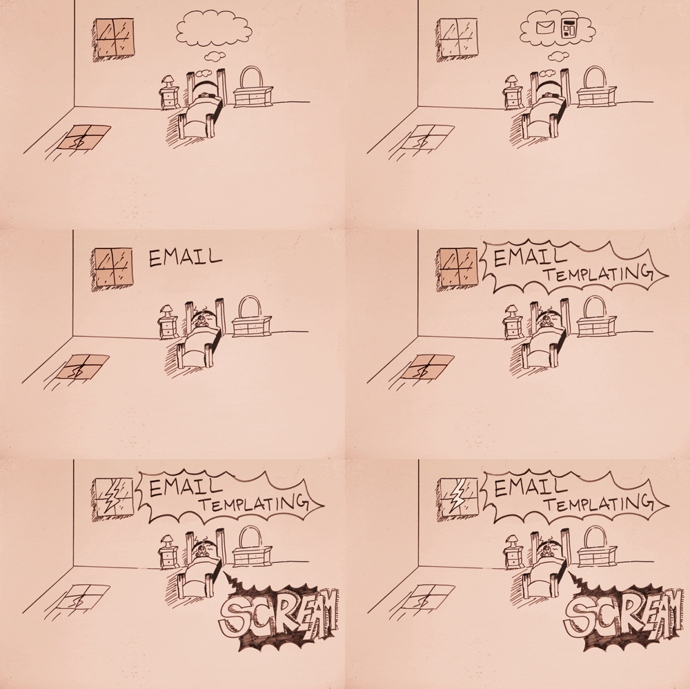
Whether you are creating a live action video or an animation, you need the right tools to get started. From editing software to cameras and sound equipment, choosing the right tools took some time. The first attempt at creating a whiteboard video we used, you guessed it, our office walls. Each frame of our “Steve and Cathy” video was hand drawn and photographed.
The frames were stitched together in Premiere and the end result looked something like this: As you can see the lighting was not great and the final product was going to take more time than we had. We even tried filming real-time whiteboard writing but I won’t subject you to that. We realized we needed a more professional tool. VideoScribe by Sparkol provides a desktop app that lets you create animated whiteboard explainer videos. We also considered two other platforms, GoAnimate which also provides do-it-yourself animated videos with characters and Wideo which was similar to GoAnimate but in beta and had more flat design animations.
| Animation Tool | Price/Month | Pros | Cons |
|---|---|---|---|
| VideoScribe | $29 | Documentation | Didn’t fit our script |
| GoAnimate | $79 | Well used | 3d Cartoons |
| Wideo | $49 | Flat icons | Beta: some features missing |
* Price is based on a monthly plan that could be cancelled and allows a personal watermark In the end, Wideo had images that were similar to ones we were already using on our webpage, they were an easy to use system online at an affordable price. We could import our own email templates to keep the branding consistent.
Side note: Wideo is still in beta so you can’t see the audio tracks while editing the video. To work around this, we just exported our animations in Premiere and edited the audio there.
Wrapping Up
After our video was exported and a soundtrack was chosen it was time to stitch it all together. We used Jamendo (a site for royalty free music) to find an appropriate background track. We tried really hard to not chose chirpy ukulele music (this is way harder than you would expect.) We went with Confident Session by DefectiveContact because it has an upbeat tempo and all-around good vibes. The song you choose sets the tone of the video and helps connects with the audience. It’s also a great opportunity to lend some exposure to all the great artists releasing under Creative Commons licenses! One thing we totally overlooked was how long the voice-over would take. There are several tutorials online on how to create a foam box to speak into with a microphone to mute out ambient sounds. We used a closet. Because, you know, lean. We absconded with the office Yeti Blue USB mic that we use for conferencing, hid away in a closet and got to it. Despite our totally high-end audio production environment, we still had problems getting the vocals to sound clear. To fix that we used Audition to take off the Hard ‘S’ noises – it was surprisingly effective.
Final Product
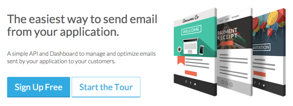
Our final product was something that stylistically extended from our landing page and tour page keeping our design simple and consistent:
Now check out the final product and see what you think!
