“How can I make this email content different on mobile and desktop?”
I get this question from our customers at Dyspatch all the time. At least, I used to!
When you consider 42% of all emails are opened on a mobile device, it makes sense. Brands want to optimize their campaigns for specific screen sizes. After all, if an email is hard to read, 62% of people will just delete it.
But how can you specify what email content to show when a person’s on mobile vs. desktop? With a page and a half of finicky HTML and CSS…
Just kidding. With the Dyspatch Markup Language (DML), you can use dys-mobile and dys-desktop to indicate how your content should display on different devices. So not only are your emails responsive by default with DML, you can go a step further and tailor designs to specific screen sizes. (And yes, we added this feature in response to those customer questions I mentioned!)
I’ll show you how it works in this quick six-minute video:
How to target mobile vs. desktop with your email’s content
1. Using DML to target mobile vs. desktop

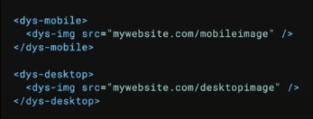
Here’s an example of DML, our proprietary, guaranteed responsive email code. You can see in this example, there’s a dys-mobile tag and a dys-desktop tag in play. You can use these tags when you want something in your email to show on these different screen sizes.
For instance, you might have a big, landscape hero image on desktop, but on mobile, you want to change it out for a nice, square version. With these tags, you can have two different images, and indicate which one will show on mobile and which one will show on desktop.
That’s all it takes! Just a few lines of code.
2. Previewing the results in the visual editor
Make sure you preview and test your email in Dyspatch as well.
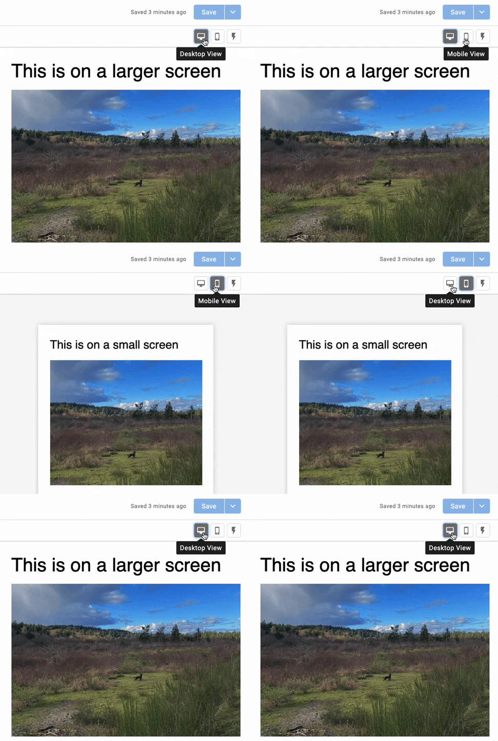
Once you’ve implemented these tags, you can toggle between mobile and desktop resolutions in the block editor or in the visual editor. This is a quick and easy way to check that your updates are working as planned. That you didn’t switch the images by accident, or anything like that.

The last step is to preview your email using Dyspatch’s built-in Litmus testing. With Litmus previews, you can see how your message will look in an actual email client, like Gmail on the iPhone 10. This gives you that extra bit of peace of mind!
3. Some fancy examples

To finish things off, I have a couple insider tips and tricks for you.
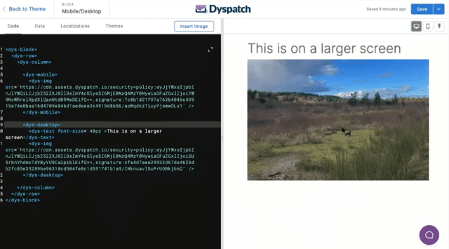
Here’s a simple one column layout, and you can see I have my dys-mobile and dys-desktop tags. The only thing I’ve changed here is the font size. On mobile, the font size is a bit smaller. On desktop, it’s a bit bigger.
I could specify what image to show on mobile vs. desktop here, too. Or, I could make the headline disappear on mobile. Or, add in a divider on desktop.
Basically, instead of an email only being responsive, this system allows you to build specifically for mobile. You can build two views of the same email that are hyper specific and tailored to either screen size.
And it’s super quick. You can do a lot of customization with not a lot of work.
Go beyond responsiveness
With dys-mobile and dys-desktop, you can go beyond responsiveness and tailor your emails for specific screen sizes. You don’t have to use both tags either. You can just use dys-mobile to swap out an image, change a font size, reduce padding, or whatever design tweaks you’re looking to accomplish.
It’s also a good idea to check your analytics to determine what devices your customers are using to engage with your emails. This will give you some quick guidance on whether to focus on mobile vs. desktop.
And don’t forget to test everything! With Dyspatch’s built-in testing, this is a breeze too. You don’t need to send even one broken email. All your emails can be perfect right out of the box.
If you’re curious about dys-desktop and dys-mobile, we have some handy documentation for you right here.
Or, if you prefer to talk it over, we’re just a chat button click or contact form away!
