When we first started Sendwithus we had no idea what we were going to build. We knew that transactional email was a problem worth solving and we were determined to build a great solution.
Our first hurdle was figuring out what potential customers wanted. To find an answer, we ran several “lean” product experiments to identify early adopters and measure what features they wanted most in a transactional email service.
This post revisits one of those early experiments! =]
The “Sendwithus Zero” Experiment
The goal was simple. We wanted to:
a) Gauge interest in a transactional email service
b) Measure what features mattered the most to customers
To accomplish this we decided to build a website that seemingly offered many features and measured which ones customers were most interested in. Once we had an answer, we’d build an MVP focusing on those features. Easy.
This experiment would be the very first iteration of Sendwithus.com, and we lovingly named it “Sendwithus Zero”.
It’s important to note that our goal was not to build a great product – it was to gather information about what a great product might look like. That is why we call Sendwithus Zero an “experiment” and not a “product”. The distinction is important and greatly impacted how we approached the problem.
Development
We decided that our experiment required only two pieces of core functionality: email templates, and an email template editor.
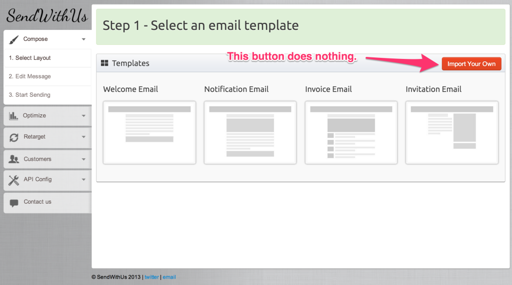
For email templates, ZURB provides great responsive email templates that cover many different use cases – perfect for our experiment. The first page of our experiment would allow users to select one of these templates to edit.
Next, we built an incredibly simple HTML editor using CKEditor and HTML ContentEditable attributes. This took about a day and the result was actually better than we’d expected.
And that was it – the experiment was feature complete. Those two pages covered the core functionality of a transactional email service; that was all we needed for the experiment to be effective.
We bought a bootstrap theme for $18 and the sendwithus.com domain for $10. We used a random font for a logo and hosted the site for free on AWS. Within a few days, our experiment was alive – and it only cost us $28.
Dead End Features
Next, we brainstormed all the features we thought customers might want. We had a lot of ideas – I wish I’d kept a photo of the list.
We then peppered these features throughout the UI as buttons, links, checkboxes – whatever made sense. We made the UI look like it supported all these features.
But here’s the important part – none of those features actually existed; they were all dead ends that did nothing. Nick Kishfy calls these “Buttons to Nowhere” – we call them “dead end features”.
We had so many feature ideas that we added a third page to the experiment.
Interacting with any of the dead-end features would open a dialog that prompted the user to sign up for early beta access.
This was how we collected contact information for our early adopters.
Finally, we connected Google Analytics to everything; every mouse click was tracked. This would hopefully give us a clear picture of what our users were doing inside the experiment.
Results
After six days of planning and building, “Sendwithus Zero” was ready to launch.
We spent the next 24 hours getting as many people as possible to view and interact with the experiment – these were the results:
- Unique Visitors: 803
- Pages/Visit: 3.53
- Early Adopter Signups: 92
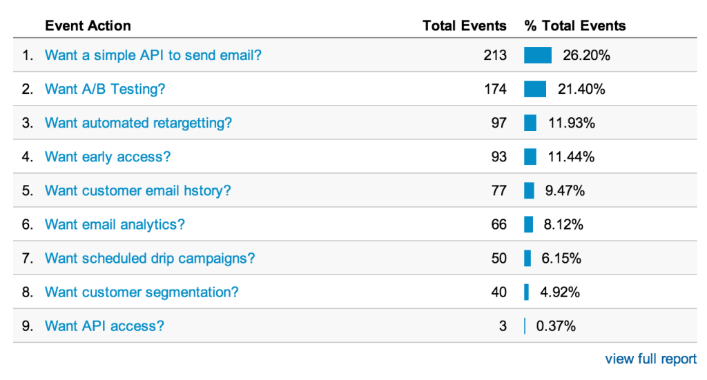
Our dead-end features also produced interesting results.
Conclusion: Potential customers wanted an API to send and A/B Test transactional email templates.
And we had a list of 92 potential early adopters ready to go.
This experiment proved a really effective way to survey our target market, and it took less than a week to build and execute.
Even now, a year later with actual growth, real customers, and a real product, we use similar techniques to measure and validate big product ideas.
Join the discussion on Hacker News


