Several experts predicted plain text would gain popularity as an email trend in 2022. Add to that some oft-cited data about plain text’s engagement excellence, and you might start thinking HTML is on its way out.
But as with many email marketing predictions, it’s not so black and white.
Of course, there are benefits to plain text emails and instances where things are best kept simple. But HTML isn’t going anywhere either. As you’ll see, when — and how — you should use these mediums depends on your audience, message, and objective.
So in this article, I’ll be digging into the benefits of both plain text and HTML emails as well as their respective best practices. I’ve also tapped a few experts to share their words of wisdom on the matter.
But before we get into the good stuff, let’s get clear on some key definitions…
What is a plain text email?
Plain text emails are exactly what they sound like: Emails made up of only plain text.
No frills. No bells and whistles. No fancy fonts, colors, CTA buttons, images, or any other embedded multimedia. Heck, you can’t even include hyperlinks — all external links require a full URL to function. To get a sense of what a plain text message looks like, check out this ToysRUs email below:
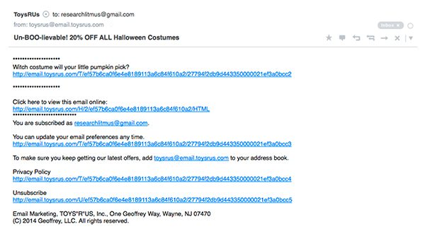
So again, the only thing plain text emails contain is plain ol’ text. Specifically, they use a type of text encoding called ASCII (American Standard Code for Information Interchange), something all email-based exchanges relied on back in the day.
And here’s the thing: ASCII comes devoid of any instructions telling the receiving device how to format a message, meaning senders have no control over the email end product. Consequently, one man’s message in black 12-point Courier typeface could be another man’s indigo 8-point Inconsolata, since the device decides how the font should display rather than the email.
So plain text presents a peculiar challenge: The fact that your copy is the only thing under your control.
Call it an exercise in letting go, I suppose.
What is an HTML email?
HTML emails are what most think of when they picture “email” today, especially branded ones. Simply put, HTML emails contain everything their counterparts cannot: Styling, colors, standout CTAs, images and multimedia content, hyperlinks… you get it.
Short for HyperText Markup Language, HTML is the standard language used to display web pages (although email HTML works a little differently!). And unlike plain text, HTML emails contain information that informs the recipient’s device how to display it.
Obvious examples exist everywhere in marketing campaigns. We’re all used to fancy graphics and bold call-to-actions by now. But did you know most “regular” emails are HTML too?
Though minimally-designed messages with higher text-to-image ratios get labeled “hybrid emails” or even just “plain text”, they’re still HTML-based since they contain formatting instructions.
What I’m trying to say here is, HTML is everywhere.
And with infinitely more avenues for getting creative, it’s no surprise most marketers have gone all-in. But no matter which you choose, there are several distinctions you want to be aware of before pressing send…
What’s the difference between html email and plain text email?
The first difference is obvious: Since HTML emails contain markup code and CSS capabilities, they provide senders with endless styling options and the ability to build off a brand image. Plain text’s ASCII delivery system, on the other hand, means no code, no display instructions, only vibes…
And by that I mean, only text.
Plain text is also universally accessible, whereas HTML is not. It might surprise you that even Gmail didn’t support HTML content until 2016.
But what HTML lacks in accessibility, it makes up for in data. The format permits senders to gain insight on their audience by embedding tracking pixels: Snippets of code that log email open rates, click-throughs, and so on. Unless the majority of your subscribers opted-in to Apple’s recent Mail Privacy Protection Update (and only ever open emails from the app), HTML can help you keep tabs on opens and performance metrics more accurately and more easily than ever.
Do keep in mind that with more functionality and flexibility comes more opportunity for error, and HTML emails can display in frustratingly different ways.
Ever had things look real wacky on your mobile device? Yeah, we’ve all been there.
And unlike plain text, incorrectly formatted code can break an email, leaving behind a jumbled mess rather than your intended message.
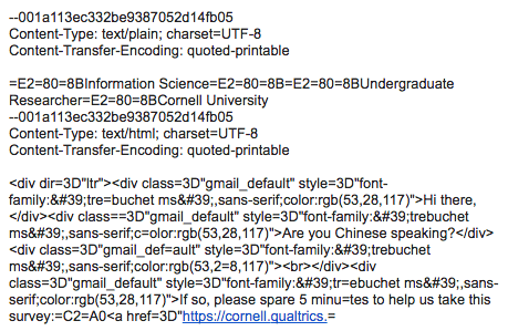
So much for polished and professional, huh?
(Shameless plug: With a modular email creation platform like Dyspatch, you can create and preview responsive HTML emails effortlessly, without any technical skills. Dyspatch’s underlying email code, the Dyspatch Markup Language or DML, is responsive by default. Read: Break-proof.)
Poorly coded HTML emails are also notorious for setting off spam detectors, meaning your carefully considered marketing message might sit sight-unseen in someone’s junk mail.
And the buck don’t stop there! Automatic filtering tools can sort through unreads only to exile some to ‘promotions’, increasing the amount of clicks necessary to view…AKA worse engagement rates for you.
This leads into concerns regarding HTML and deliverability, and the whole argument that plain text is better because it has a “100% deliverability rate”. But that statement is actually a bit misleading — for example, I’ve seen plenty of plain text emails relegated to my spam folder. You can read more about the myth of 100% deliverability here.
Here’s a handy chart for quick comparisons:
HTML vs. plain text email comparison chart
| Email type | Encoding | Display | External links | Graphics | Accessibility | Tracking | Interactivity | Deliverability |
| Plain Text | ASCII | Text only | Full URLs | ASCII art only | Universal | ✘ | ✘ | Depends† |
| HTML | HTML | Text, images, rich media* |
Hyperlinks | ✔️ | Depends^ | ✔️ | ✔️ | Depends‡ |
* Responsivity/legibility depends on code, device type, email client.
^ Dependent on device type, email client.
† Good with strong sender reputation.
‡ Good with strong sender reputation; Poorly coded emails more likely to end up in the spam folder.
Now that we’ve looked at the major technical differences between plain text and HTML emails, let’s explore their benefits.
The benefits of plain text emails vs. HTML emails
Plain text email benefits
Accessibility
There’s no email client in the world that can’t open a plain text email. This is why the format is especially important for users of Internet of Things (IoT) devices (i.e nonstandard objects, such as household items that exchange data via internet connection) and wearable tech, those in low-bandwidth areas, and those who use screen readers — all of whom might not be able to read anything without a plain text version.
Deliverability
Regardless of the controversies over plain text’s “100% deliverability rate”, this format does eliminate the risk of having your CSS stripped by antivirus software, and decreases your chance of being buried in a spam folder or promotions tab.
Intimacy
There is an air of intimacy about plain text, which is why many gravitate towards its barebones nature. After all, plain text emails mirror other kinds of 1:1 conversations already happening in their inboxes. They’re less flashy, less salesy, more intimate.
Ease of use
Just text and no code means less time and resources needed to get your message across, and less opportunity for things to go wrong. Even though you have no control over its styling, you can be sure your email won’t show up completely garbled in someone’s inbox.
Security
Plain text is better when it comes to security issues like viruses and phishing scams, since you can’t embed tracking pixels, hidden links, or images within its content. As all URLs must be written out in full, there’s little room for surprises when clicking through on a link.
Engagement
Remember that oft-cited data I talked about in the intro? If not, here’s the rundown: Less seems to be more. At least, according to two experiments…
Both Marketo and Hubspot found text-based emails (i.e. emails with limited HTML) performed better than HTML emails in terms of engagement. Marketo reported 11% higher click-to-open rates and 8% higher click-through rates, as well as 21% higher unique click to open rates and 17% unique click through rates on an offer link. Hubspot similarly saw open and click-through rates fall as HTML components increased, even though the majority polled said they preferred them.
HTML email benefits
Creative control
“The benefits of HTML emails vs plain text would be that you can artistically mold the email to work almost like a website. This has many advantages, and it’s a great way to showcase products and boost brand recognition.”
— Brian Minick, COO at ZeroBounce
HTML offers everything plain text emails are missing. From layout styles and templating possibilities to diverse color palettes, dynamic content, and embedded multimedia (like GIFs, videos, images, and animations), this format gives you the freedom to outfit your message however you see fit.
Tracking
Metrics and KPIs mean everything to us marketers; it’s how we understand what works (and what doesn’t). HTML emails win big by allowing us to embed hidden snippets of code. These pixels can track the performance of your campaigns via opens (for non iOS15 users), click-throughs, and so on.
Stand out CTAs
HTML makes it easy to attract eyeballs to the places you want people to look, and consequently the links you want them to follow. According to Unbounce’s Conversion Road Trip, having just one standout CTA can boost clicks by 371%, and sales by 1,617%. Button-styled CTAs also perform better than average, and even color can influence your results. So get styling!
Personalization
A report by Campaign Monitor found companies who implement email personalization tactics increase revenue by 760%, and with HTML, you can do this through multimedia and dynamic content. The simplest example is embedding a subscribers’ name by adding a merge tag like {{ contact.firstname }} to the copy. Another common example is including pictures of complementary products in an email, based on purchase history.
Brand consistency
“Accessibility is better with plain text, but HTML offers brands a design-first format where they can really create a specific look/feel for emails.”
— Kaleigh Moore, eCommerce writer
Brand consistency is a top priority for consumers. That’s why a report by Lucid Press found consistently-presented brands were 3.5x more visible to customers, with cross-platform consistency increasing revenue by 10-20%. And with full creative control, you can create a specific look and feel with your emails and stay on-brand with every message.
Engagement
Don’t be turned off by the data on HTML email engagement. While the two aforementioned experiments saw lower performance in comparison with “plain text” (or more simplified HTML) emails, Vero’s analysis of over 5,000 campaigns found emails with images had 42% higher click-through rates. Meanwhile, Martech Advisor found interactive content increased click-to-open rates by 73% on average (with videos increasing it by as much as 300%).
The format’s design potential also makes organic engagement, like shares and forwards, more likely. Plus, being easier on the eyes, HTML elements make your content more digestible and memorable, paving the way for future opportunities to engage.
Interactivity
I know, I just talked about it. But since HTML emails support dynamic and interactive content, it pays to look at how these factors influence returns. And guess what: A 2020 Litmus survey saw dynamic and interactive content increase email ROI by over 100%.
With the future of email marketing set to revolve around interactive AMP for Email content, HTML works to bridge the gap. It provides subscribers with more functionality and possibilities for interaction than plain text ever could.
When to use plain text emails
“I think it really depends on your goal for the email. If you want it to look/feel like its person-to-person, this format makes a lot of sense. For product launches that need to be image-centric, probably not the best option.”
— Kaleigh Moore, eCommerce writer
Plain text does indeed have its time and place, especially when visual appeal doesn’t matter. Let’s take a look at some specific use cases…
For B2B sales outreach
“Plain text emails are much better for replies…[and] the best for prospecting. They seem more personal, and I’m more likely to respond or even give you a ‘no, thanks’ because it seems like you put effort into it.”
— Brian Minick, COO at ZeroBounce
Plain text emails are the superior option for connecting professionally. Since the focus is on establishing an exclusive relationship and building rapport between individuals — not brands — a simplistic, uncluttered format is best.
When additional security considerations apply
If you’re reaching out to someone in an industry that involves lots of sensitive information (like IT or financial services), odds are their email filtering systems are “trigger-happier” than most. Plain text formatting (or rather, the lack of it) can provide you with additional assurance your message will be seen.
When to use HTML emails
For ecommerce and product centric focused emails
“There are some fantastic use cases for HTML emails…a few examples would be product email campaigns for items like clothing, accessories, gear etc. It’s important to have a nice, clean grid and design that incorporates some images and [easy ways] to get more details. Plain text simply wouldn’t cut it. Images are what will make me click if I might buy a product.”
— Brian Minick, COO at ZeroBounce
HTML is the obvious choice for e-commerce businesses and emails showcasing products and their features. Visuals not only let customers know what to expect — they bring them to life. And when paired with eye-catching CTA buttons, they drive email conversions.
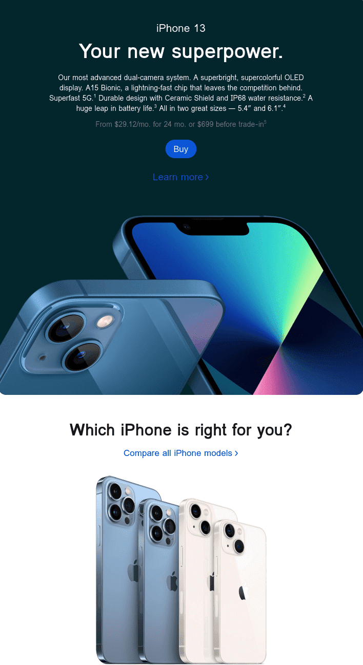
Like in this sleek example from Apple:
For broad interactions and branded content
If you want your message to be recognizably your own, opt for HTML. From attaching your logo and choosing which visuals to display, to applying branded headers and footers with important legal information and links, HTML lets you put your own unique ‘spin’ on nearly anything.
When you want to appeal to emotions
As humans, we don’t just run on facts and figures. And as consumers, we don’t buy off descriptions alone. Emotions outsell logic, every time. Which is where captivating visuals and killer copy come into play— again, the creative control offered by HTML email is essential here.
When you want to measure success
Tracking pixels are your best friend when it comes to understanding subscribers, so HTML is the obvious move. Point blank.
When to use “Hybrid” HTML emails
It’s frustrating to be told you can do one thing or another. But by simplifying things on the HTML front with a “hybrid” (HTML) email, you truly can get the best of both worlds.
When you want brand consistency AND intimacy
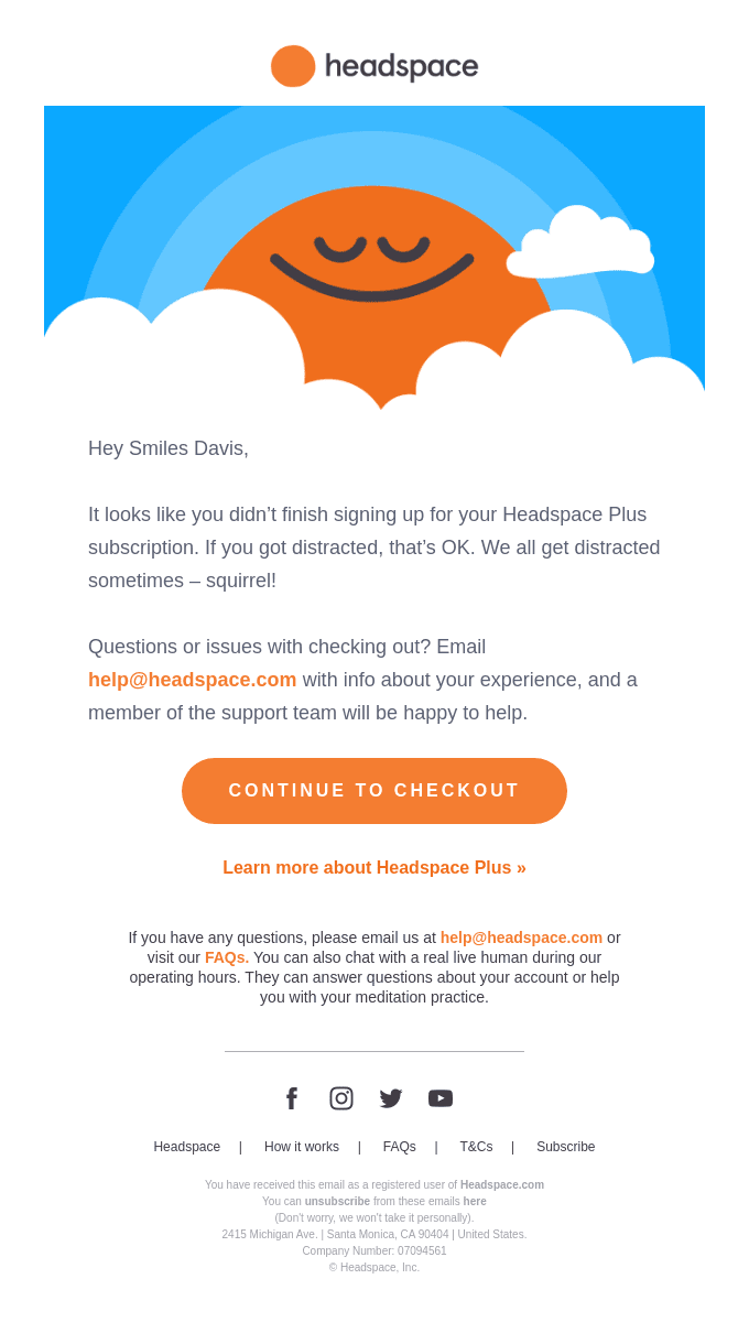
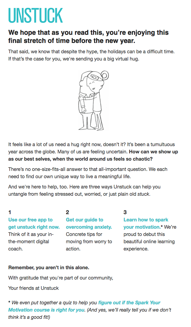
Want to get intimate without completely dropping your brand image? A “hybrid” email can help you do just that: Evoke a 1:1 conversation while sticking to your brand story by adding stuff like useful links, headers and footers, and an email signature.
Ok, none of us want to land in the promotions tab. It just happens. But if you’re really concerned, try reducing the amount of images and other HTML-heavy elements. Then, test, test, and retest.
Pro-tip: Ask your subscribers to drag your email over from the promotions tab to the primary tab in your welcome email. This will ensure your emails always land in the primary tab!
Best practices for plain text and HTML emails
With all this in mind, let’s go over how to put your best foot forward — whether you’re sending a plain text or HTML email.
1. Grow your inbox authority by putting your audience first
“Emails that hit the inbox have one thing in common: A strong sender reputation. And the key to building a strong sender reputation is driving as many positive interactions by recipients (like opens, clicks, replies, starring messages as important and forwarding emails on to friends) as possible, while simultaneously limiting negative reactions such as spam complaints.”
— Lauren Meyer, CMO at SocketLabs
No matter which format you choose, it pays dividends to consider your audience’s needs first. By simply asking yourself what subscribers stand to gain from your email campaign — and then delivering on those promises — you’ll bolster your deliverability and your bottom line.
This also means prioritizing readability and scannability. Don’t put off readers by sending walls of plain text with no whitespace, or drowning them in image-overloaded emails resulting in the dreaded endless scroll.
Trust me, nobody wins with these types of emails.
2. Include a plain text version of your email
However you style things, be sure to include a plain text version of your HTML email. Beyond driving engagement by improving accessibility and deliverability (since HTML emails without a plain text version are a red flag for spam filters), giving subscribers options shows you’re prioritizing their needs.
Sound like a lot of extra work? No sweat! Dyspatch’s no-code, drag-and-drop email builder automatically generates a plain text version of your HTML that you can preview and adjust accordingly.
Easy, meet peasy.
3. Quality check, preview and test your HTML emails
Nobody wants fudged up code or quirky display issues. Save yourself the hassle (and the lost rev!), quality check your work, and never send another broken email again by testing your emails with software that shows how things will look on every screen.
Dyspatch, for example, comes with integrated Litmus testing, so you can preview content effortlessly across 100+ email clients, devices, and even in dark mode.
The answer to the HTML vs. plain text email question? Let your audience guide you…
“Consider how you can provide your email audience with the best experience possible: One that matches the type of content you’ll be sending and inspires recipients to engage. If they’re happy with what you’re sending, you should have no problem…regardless of whether you choose plain text, HTML, or both.”
— Lauren Meyer, CMO at SocketLabs
And the winner is…
Just kidding. If you’ve stuck with me so far, you’ll know by now there’s no ‘winner takes all’ in this scenario. When it comes down to it, your verdict on the age-old plain text vs. HTML email debate really depends on what you’re doing, and who you’re doing it for.
And another thing — every audience and business is different! What works for one company might not work for another, so it always pays to do some good ol’ fashion A/B testing.
You are your own best judge, and there’s no one better than your own audience to let you know what your audience wants.
