Why you should rethink your email strategy
In the last 20 years, the human attention span has decreased by a third, and is now a mere eight seconds long. The attention span of a goldfish (nine whole seconds) is now something to aspire to. With that in mind, it’s more important than ever to send emails that make a strong impression.
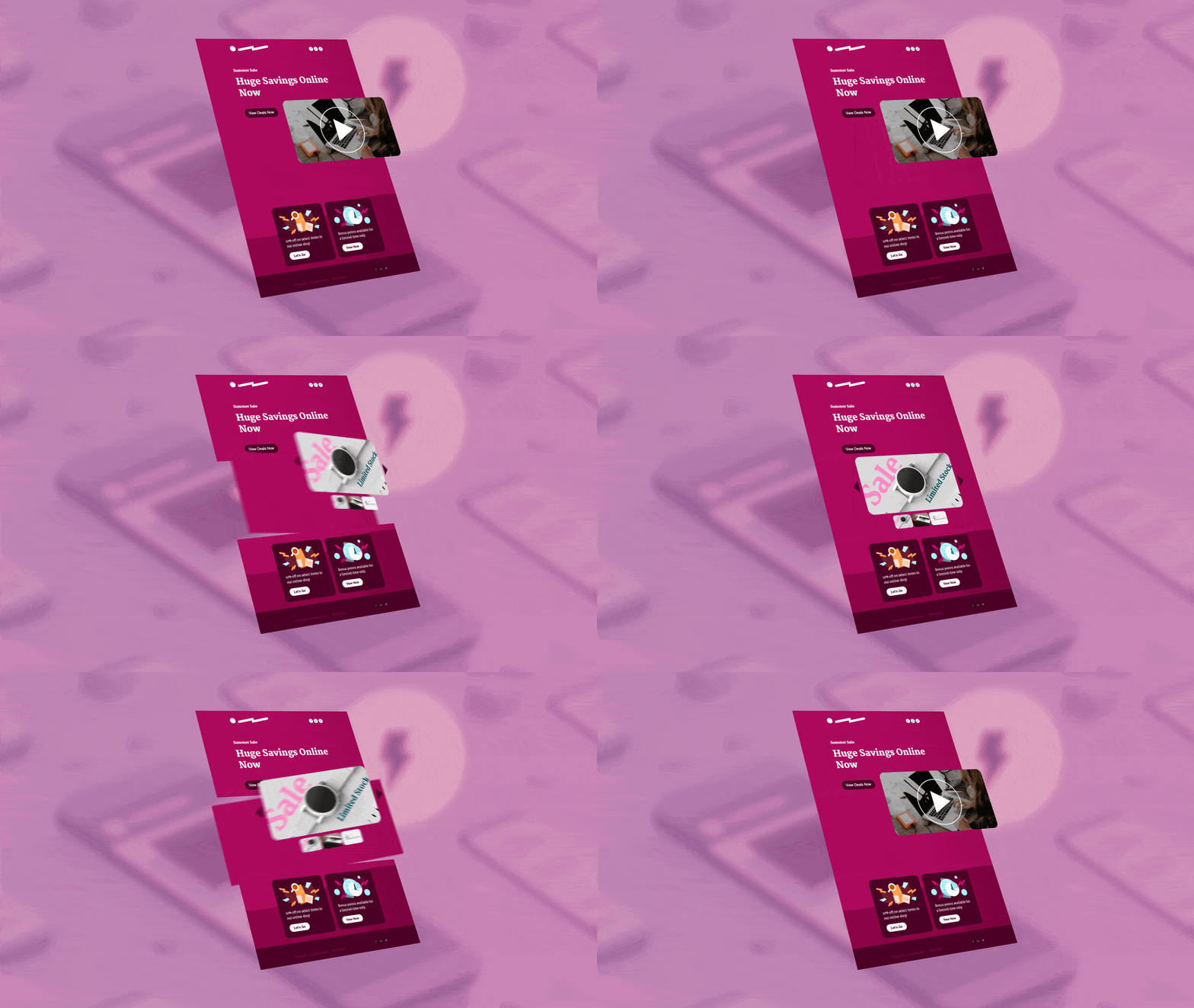
The key to standing out? Interactive emails, which engage customers with dynamic elements like videos, image carousels, fillable forms, and GIFs embedded right in the message. These immersive email campaigns offer all the functionality of a webpage, right in your inbox.
Thanks to the growing popularity of Google’s AMP Email, support for interactive elements is rapidly increasing among email providers and devices. That means there’s no time like the present to explore how interactive content can enhance your marketing efforts.
The benefits of interactive emails
Interactive emails can be flashy and fun, but that’s not why you should be sending them. The simple reason is that your customers prefer them: interactive elements like videos increase engagement rates by up to 300%. If that number doesn’t convince you, we’ve got a few more compelling reasons to make the leap:
- More delight. You don’t want your messages to feel rote or routine. Unexpected and fun elements like quizzes, GIFs or videos are a pleasant surprise, and will motivate your customers to click when they see your emails in their inbox.
- Improved accessibility. One in 40 people has a visual impairment. Interactive elements such as adjustable text sizes, rollover effects, and ALT tags ensure every customer can fully appreciate your content.
- Increased conversions. Instead of clicking through to a webpage, users can complete actions right in the email, like RSVPing to an event or booking an appointment. That ease and immediacy is why interactive emails generate twice as many conversions as static ones.
- Streamlined efforts. You can save the effort of building a landing page for each email campaign, since the email can provide all the same functionality in one place.
- Code-free simplicity. Crafting an interactive email used to be a labour-intensive process of coding and testing, but now platforms like our Dyspatch Email Builder offer pre-built content blocks, easy collaboration tools, and built-in testing.
- Deeper analytics. Go beyond the standard views and clicks to get a fuller picture of engagement. Using tracking pixels to see which interactive features users are activating will help you fine-tune your marketing efforts and ultimately increase your ROI.
Examples of companies sending great interactive emails
There are nearly infinite ways to use interactive emails, and what makes sense for your company will depend on your audience. For inspiration, here are just a few companies who have knocked our socks off with their creative emails:
1. Netflix’s personalized recommendations
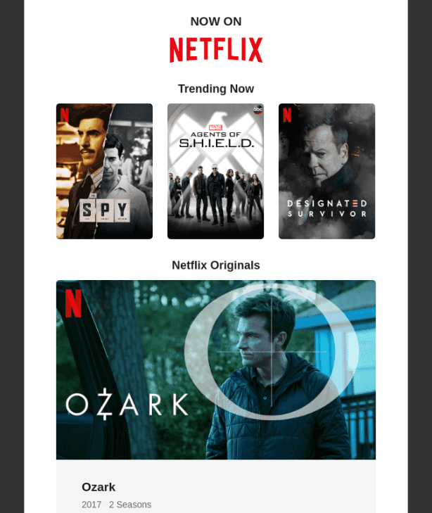
When winning over (or winning back) a customer, personalization is key: 91% of people prefer brands who provide personalized offers or details in their emails.
Netflix understands this, which is why they send thoughtful and effective emails that re-engage lapsed viewers with tailored recommendations. Users can add suggestions to their Netflix queue right in the email, for speedy viewing later.
2. Pinterest’s suggested pins
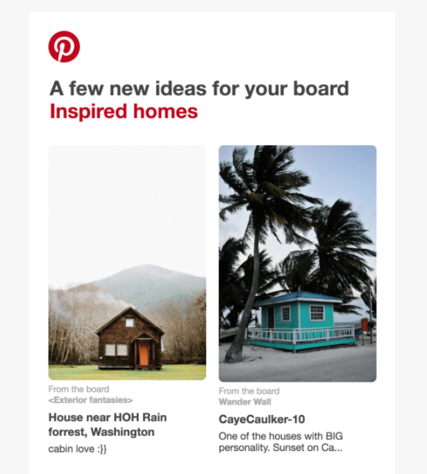
Pinterest is the fourth most-popular social media platform in the US, and has doubled their user base since 2016. This growth is the result of savvy marketing efforts, including strategic email engagement.
Pinterest uses interactive messages to send personalized suggestions to users, who can save Pins and follow topics right in their emails instead of clicking into the site or app. These features increase user engagement, as well as gather immediate feedback from users on their recommendations, which allows them to refine their personalization efforts.
3. Bose’s mystery promotion
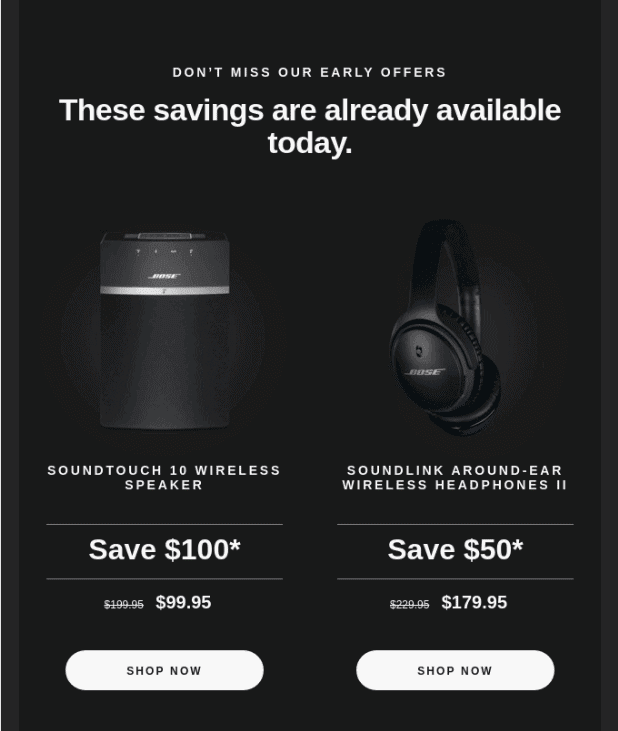
Promotional offers are a great way to reward loyal shoppers, and win back the affections of lapsed customers. And sure, you can just put the offer right in the subject line— but isn’t a little mystery more exciting?
In lieu of an upfront Black Friday discount, Bose invited users to scratch and reveal the offer. It piques interest in a memorable fashion, while saving users the effort of clicking through to a landing page, an extra step that leads to drop-offs and disruption.
Another reason we love this clean, streamlined email? It looks just as sharp on a mobile device. More than half of all emails are opened on mobile, so interactive email templates that are optimized for smaller screens are key to a seamless user experience.
4. GoDaddy’s site builder quiz
Domain hosting platform GoDaddy used interactive elements to bolster a highly effective email campaign, encouraging inactive customers with unused domains to choose a site builder.
The simple, interactive quiz gathered customer data for the suggestions in subsequent emails, resulting in a 58% open rate for the third and final email offering a promotion on the recommended site builder.
5. TOM’s product demo
Product demos are an incredibly effective tool for driving purchases: 76% of shoppers are more likely to buy a product after seeing a demo. Fortunately, interactive emails let you show off product features right in the email.
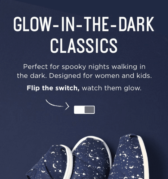
TOM’s embedded a product demo to great effect, introducing their new glow-in-the-dark kids shoes with an interactive switch that allows users to “turn off the lights.”
This interactive feature highlights the unique quality of their shoes, while adding a fun feature to play with.
6. Glossier’s mesmerizing GIF
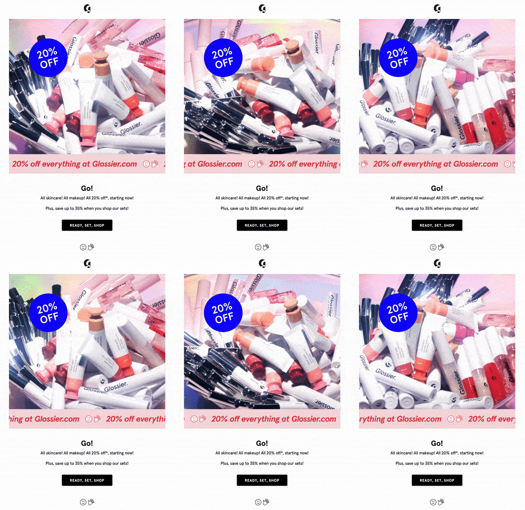
Sometimes the most effective emails are the simplest. Beauty brand Glossier excels at catchy, Millennial-friendly marketing, like in this minimal promotional offer enhanced by a colourful and enticing GIF.
Visual elements like these aren’t just cute — a majority of younger users prefer them to words for communicating thoughts and ideas, and find them helpful for clarifying content or tone. If you have a diverse, international audience, the universal language of images can be especially helpful.
In one hypnotic GIF, Glossier showcases their products and clearly announces the offer. It’s crisp, concise and extremely clickable: a winning combination.
Ready to start crafting interactive emails? Check out the Dyspatch email builder for easy, collaborative interactive templates in a simple and streamlined platform.
