Referral programs don’t seem to suffer the same overcrowding effects as most other messaging. Giving a user multiple opportunities (within reason) to like, share, review, or refer others can only ever increase engagement.
Of course, user engagement can drop-off over time, but this effect holds out longer than you expect and probably a lot longer than it should. That’s why we should always be experimenting.
Referral Prompts are Additive
This was the first of the three cardinal lessons of a referral program I picked up in conversation with Ivan Kirigin – who you may know from his work on the Dropbox referral program – while we were working on the latest chapter of our “How to Send Email Like a Startup” guide.
What does that mean? Mostly, it means that you can drop in little plugs for your referral program – or just nudges to share – in lots of different places. Sometimes they need some convincing that you’re worth sharing, sometimes you just need to catch them at the right time.
Look For Easy Wins
With all the articles out there on all the advanced methods you can employ to make your emails and referral programs work at optimal efficiency, it’s easy to get overwhelmed. This is especially true for early-stage businesses without a lot of people-hours available.
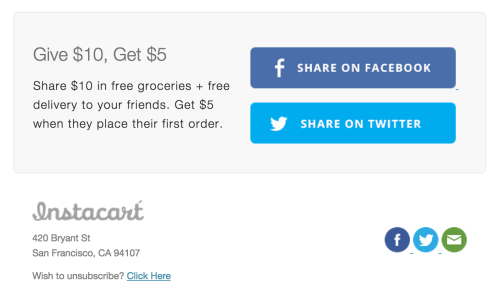
I recently received a great example from Instacart. They pop this banner at the bottom of all of their marketing emails. What’s that you say? Why yes, you’re absolutely right – they should put it in their transactional emails, too.
This goes back to lesson 1: these simple little shoutouts add up over time. They don’t have to be fancy – if you have a graphic, just slap it on and move on with your life. You can revisit it later to dig in on testing and optimizing; for the moment, though, this is a great start.
Get the Timing Right
As a customer spends more and more time with your product, they are more likely to be able to give more in-depth feedback to you and more appropriate referrals to their network. That doesn’t mean your referral program should ignore new users, but as a customer’s buy-in grows, so can the demands of your referral program.
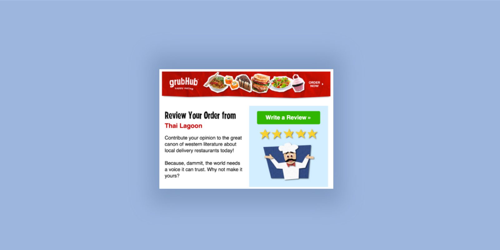
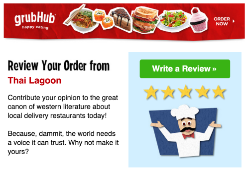
A great example of this is sending review prompts. Grubhub does an excellent job of timing their order review emails.
GrubHub sends some fantastic emails. For the example above, I ordered some Thai food for dinner and received this prompt to review it the following afternoon. One thing this screen-cap doesn’t show is the totally straight-forward subject line: “How Was Your Order From Thai Lagoon?” They don’t try and trick you into opening the email.
The cool thing about that flow is that it’s gently funneling you into a share by leading with something that improves your own experience and the experience of other users of the app, then closes with a quick “share this review.” Once you’ve completed writing a thoughtful review, sharing is actually a much simpler request, by comparison.


