As an email company, we know all too well the perils of a fractured and inconsistent identity between your product styling and your email design. Email is your primary means of communication with your customers and should reinforce how they see your product. Leaving it as an afterthought can greatly deteriorate your customers’ experience.
Sendwithus’s goal is to make that process easier for transactional emails, but were we leading by example? What did our own emails look like?
There was no consistency to our emails and this was something we needed to change. The following outlines the steps we took to improve our customers’ experience throughout the email process.
Auditing
The first step was to take inventory of the current state of our own email stack. Using our template dashboard made this easier as we could manage and edit all of our email templates to the desired design, and deploy all at once. We also triggered each email as a new signup to give us a first-hand account of what a customer would experience when interacting with sendwithus.
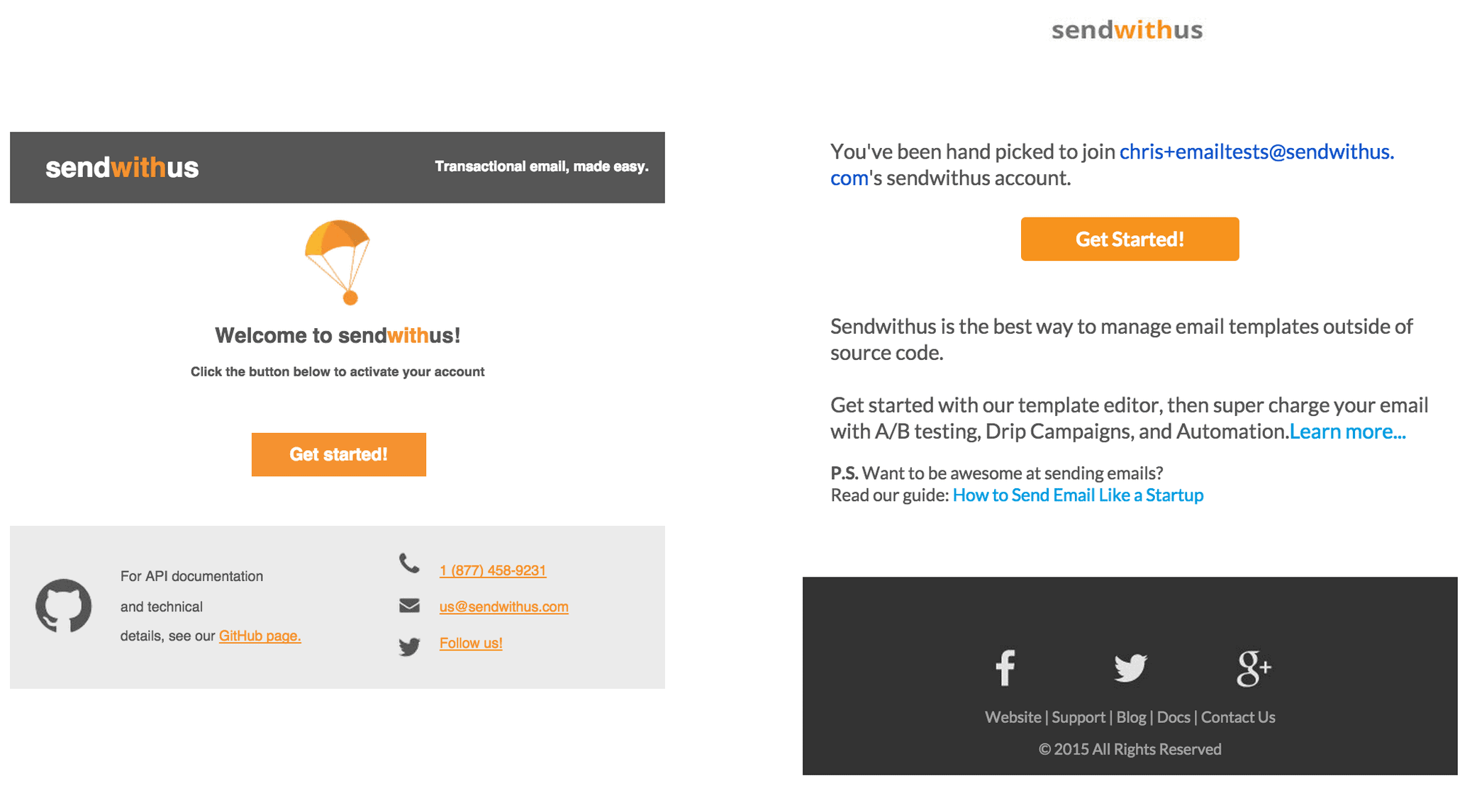
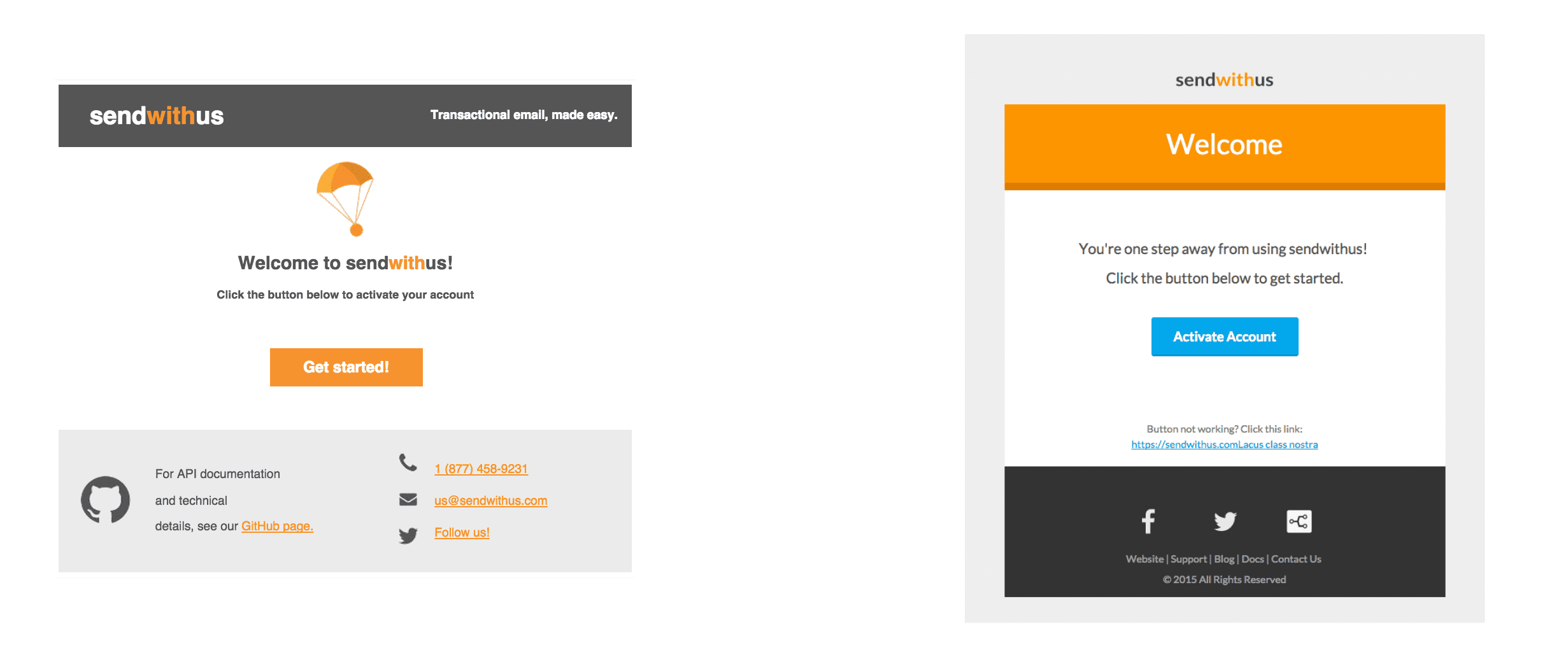
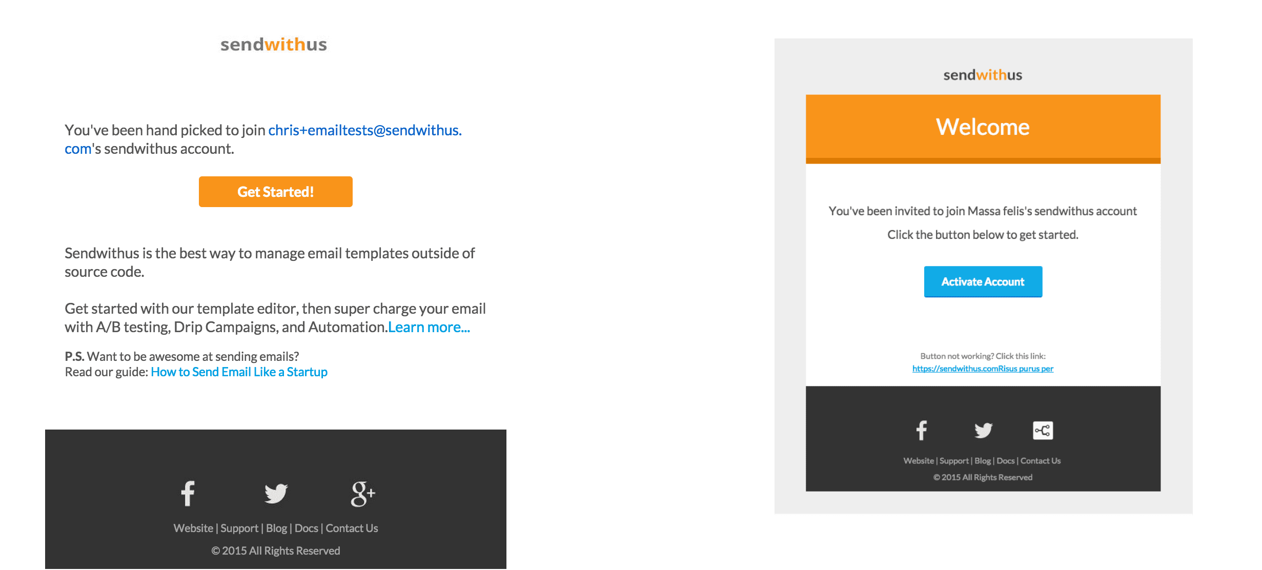
Going through each email, we listed what we liked and didn’t like, and what we thought was missing. The biggest problem, as mentioned before, was the inconsistency between each one of our transactional emails. When comparing two of our emails side-by-side, we wouldn’t fault you for thinking they had been sent from two different companies.
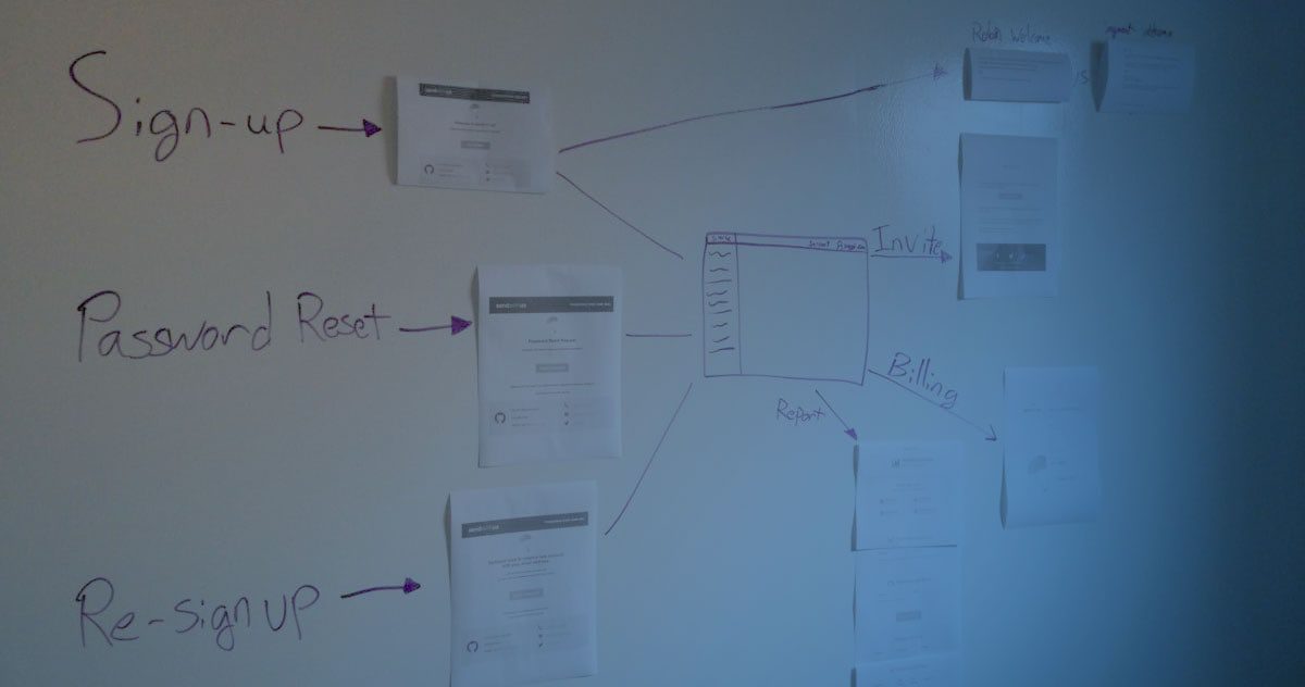
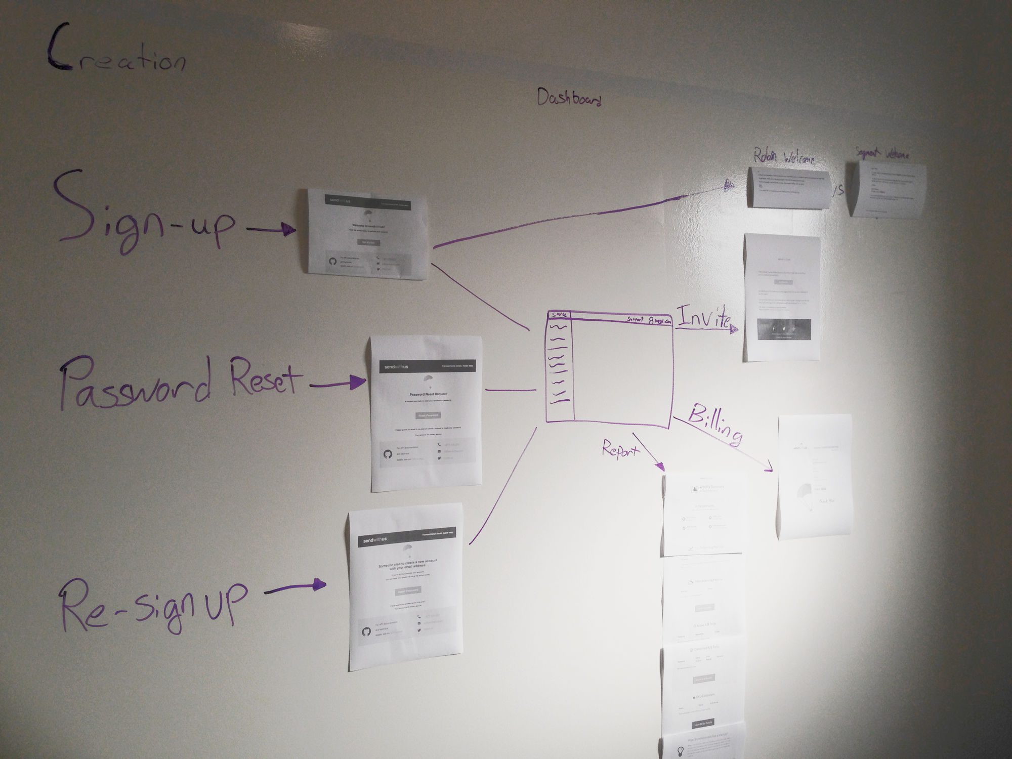
To get a bigger picture… we made a big picture.
We laid out a flow chart of all the emails we send out, allowing us to view each trigger point for every event when interacting with sendwithus.
Researching
Having completed our audit, it was clear we needed a redesign. But before jumping the gun, we had to research how the transactional emails we were using were commonly being designed. We looked at the frequent trends that a few companies were using, and analyzed what we thought they were doing well, and what could we do to complement what we had to offer.
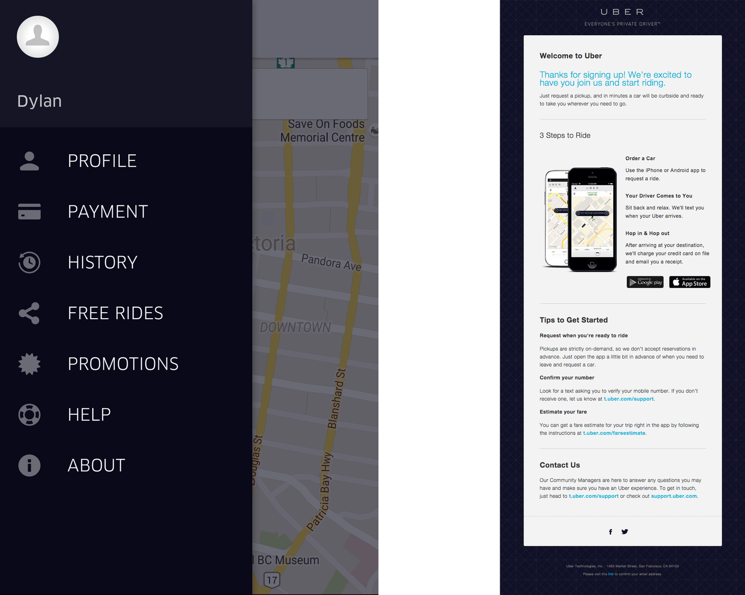
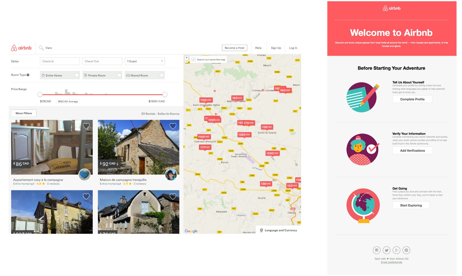
During our research, we found that most well designed emails tended to mimic the theme and colour palette of the website they were being sent from. A couple of good examples are Uber and Airbnb.
Criteria for Research:
- Did the email represent the company well?
- What colours schemes or layout were they using?
- What kinds of tone were they using? Did this represent the company?
- How were they presenting their links (including social media)?
One thing that stuck out during our research was that many companies used plain text email for their password reset emails. This is a lost opportunity to engage with your customer to reinforce your brand.
Redesign
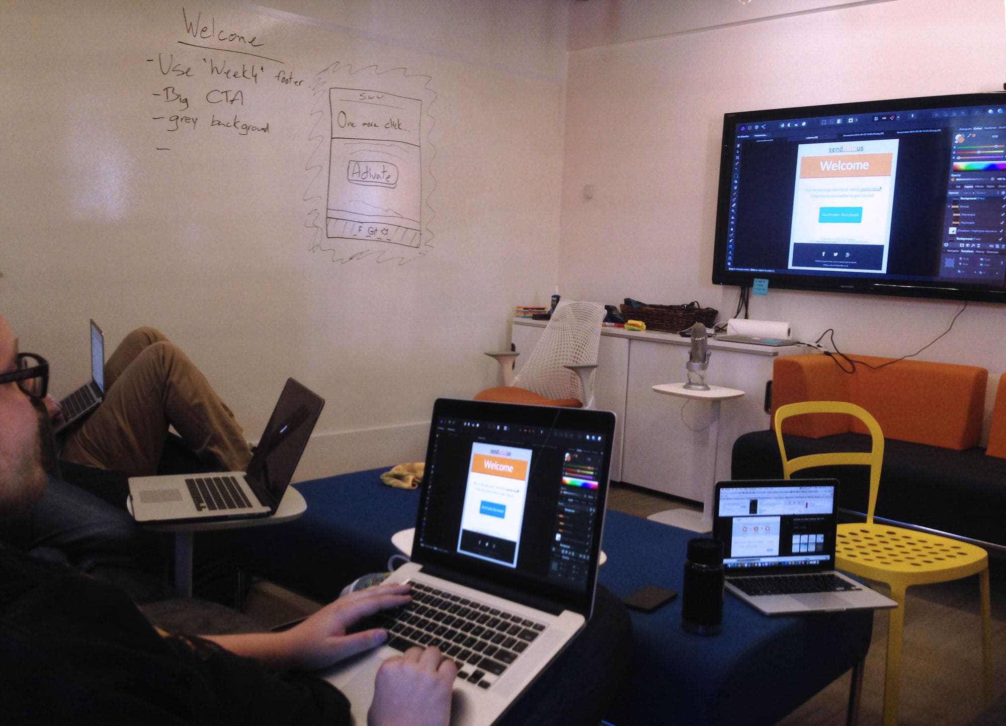
After discussing our research, we began redesigning our new emails. During the audit phase, we decided that one of our footers from our original designs worked well, and this allowed to spend more time on designing the rest of the email, by only altering the footer slightly.
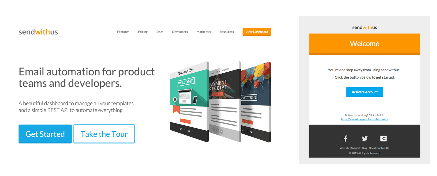
We wanted a strong representation of our Sendwithus orange, and we did this by incorporating it into the header. We felt that adding a background was a subtle change to emphasize the content of the email, and that sort of detail worked perfectly when we finished the design.
Once we were satisfied with our design, we went into production.
Production
Using Sendwithus’ advanced features like Snippets and Jinja Macros, we created a base template to use for all our transactional email. This also provided us with the ability to update the base template once, and have the changes propagate across all of our emails automatically.
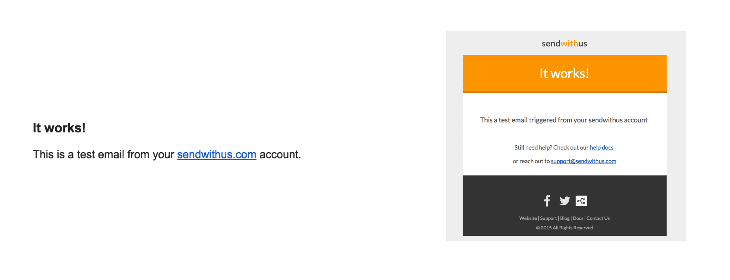
Here is a good comparison of the changes we made.
| Before | After |
Conclusion
In the past, each of our emails were made at a different time, by a different person, for a different purpose, with no style guide to ensure consistency. This was an oversight on our end, and to rectify this problem we included snippets into the process of building new emails.
By using snippets, and having all emails built off of a single base template, we can make sure that changes in the future will affect the other emails being sent, allowing us to keep them consistent.
Result:
Overall, the estimated time spent on each cycle are as follows:
- Auditing – 4 hours
- Researching – 4 hours
- Design – 2 hours
- Production – 6 hours
Completing the overhaul allows future emails we design to have a consistent look, by using the base template we created. This drastically reduces the time spent creating and designing new emails, thus allowing us to focus on the content of the email, and less on design.
