Figma Live Embed for Dyspatch
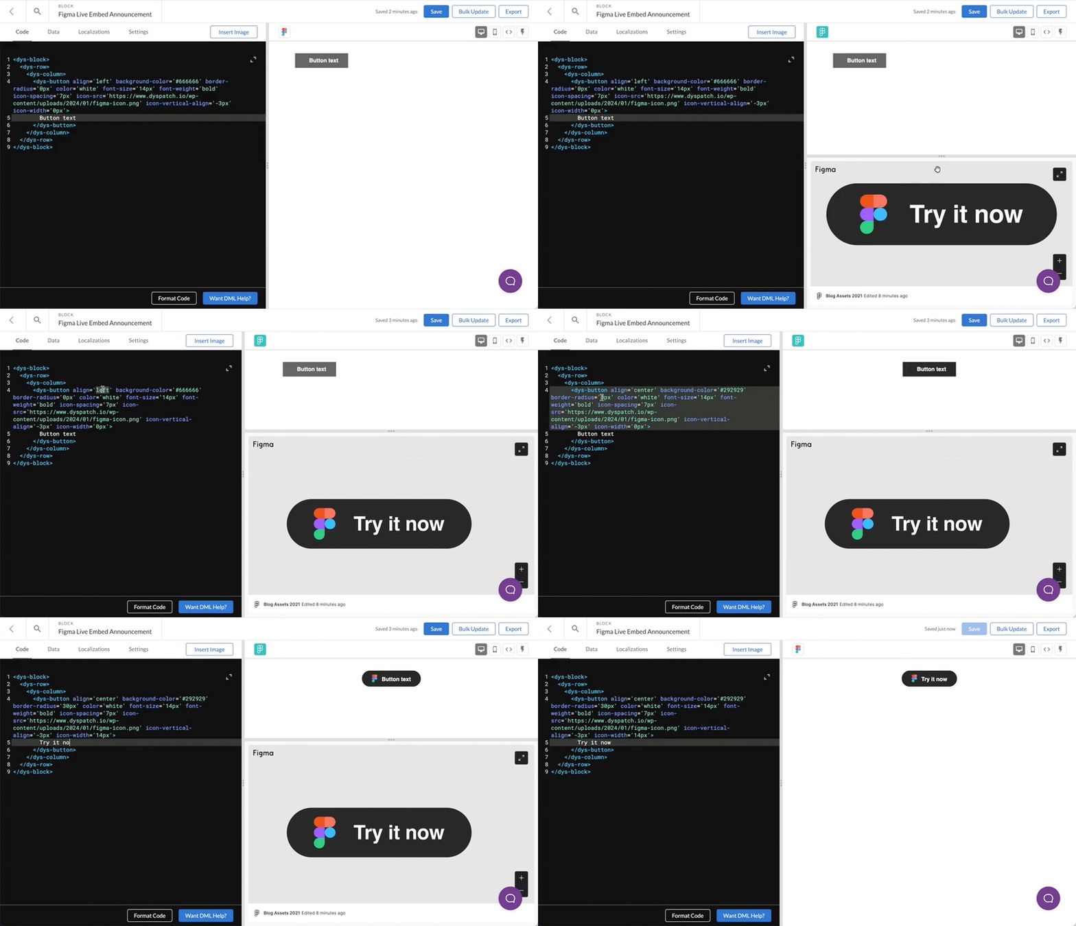
We are excited to announce a powerful new integration for designers and developers who use Dyspatch: Figma live embed. This feature transforms your email design workflow, fostering real-time collaboration and streamlining processes for swift email production and seamless collaboration.
With the Figma integration in Dyspatch, your team will be empowered to create, iterate, and finalize email designs in real-time within the Dyspatch email production platform. Coupled with our Dyspatch email builder design system community files, your email production time will be vastly reduced, as you’ll eliminate the need for time-consuming back-and-forth communication between teams.
Your design team will find reassurance in knowing that once they hand over their email designs, developers will be implementing the latest iterations of their mockups when building, testing, and localizing emails. Ensure Dyspatch themes and blocks stay in sync with your Figma design files; link to a specific Figma document, frame, or component.
The Dyspatch Figma live embed feature will also translate into a significant boost in speed for email developers. By eliminating the need to juggle multiple windows or tabs during the email creation process, developers can now implement email designs with ease and minimal context switching between Figma and Dyspatch – all visual components will be in right where you need them, in Dyspatch.
This integration between Figma and Dyspatch is available to all teams in Dyspatch starting in January 2024. Contact us to see the magic!
Learn more about our suite of tools for email designers here
Figma Email Design System community files
Email marketing is the cornerstone of any business’s digital marketing strategy. It allows you to promote products, services, and drive conversions. However, creating high-quality email templates and campaigns can be a time consuming process. Using Dyspatch’s Figma email design template can help you create your email templates in just a few minutes, saving you time and increasing your productivity.
Using Dyspatch’s Figma email design system, you can create Marketing and transactional emails using a core set of 17 fully customizable email modules. You can drag and drop these modules to create beautiful HTML marketing templates that align with your brand identity, then sync them to your email sending platforms, be it transactional (Sendgrid, Sparkpost, or Mailgun) or Marketing (SFMC, Pardot, or Marketo).
Building your email template theme
Building an email template theme is an important part of designing your email templates. This is where you will set your brand colors and element styles. Start by customizing your components in the Figma design library, and these changes will be reflected in the block library. You can change your button colors and padding, customize your header and paragraph typography.
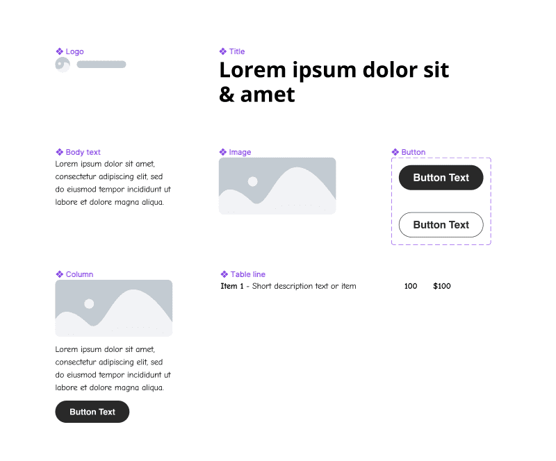 The core elements of your email design system
When you import this into Dyspatch, you can easily customize your theme and ensure brand consistency across all of your email templates. You can set your colors, paragraph and title styles, button styles, background image and colors at the theme level and update it any time you have a change in your brand guidelines.
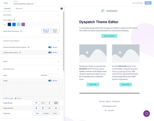 The Dyspatch theme editor
When using the Dyspatch email design system, your key components will translate to the theme designer which controls the overall look and feel of your email templates. The standard set of blocks will include:
- 1 column - simple one column layout with image text and CTA
- 2 column - a two column layout that stacks on mobile
- 3 column - a three column layout that stacks on mobile
- Hero block - headlines, text and a button all on an easily customizable image based background
- Button - a single CTA button that you can change the alignment of
- Content | Image - a two column side by side text and an image
- Divider - create a visual separation in your email
- Image - Simple image block, shrinks to 100% on mobile
- Image | Content - a two column side by side image and text
- Invoice table - lay out purchase information, great for transactional emails
- Carousel - an email friendly interactive carousel block used to display an image gallery
Brand elements - these will be usually be used once per email
- Logo
- Footer
- Social links
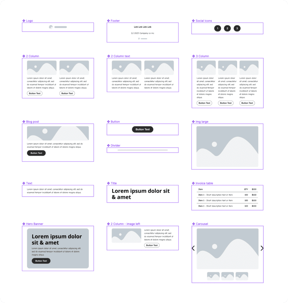 The Dyspatch email design system block library
Crafting a solid email theme is a crucial step in the design process where you set the groundwork for brand colors and element styles. Customization starts in Figma's design library, and changes are reflected in the subsequent block library in Dyspatch. You can tweak details like button colors, padding, header and paragraph fonts. When you integrate this theme into Dyspatch, you can effortlessly fine-tune and maintain consistent branding across diverse email templates. Theme-level customization covers colors, paragraph and title styles, button properties, background visuals, and colors, making updates in line with changing brand guidelines a breeze.
Considerations in email design
When designing your emails it’s important to take into consideration some key elements to make sure your emails are accessible and will render properly on your audience’s devices.
Mobile first design
Depending on your core audience, there’s a good chance that a significant portion of your opens will come from mobile devices. But by using dyspatch, you’re already there: Dyspatch is built to be responsive and mobile friendly out of the box. When you create templates in the Dyspatch email builder, they’re mobile-friendly and responsive by default. It’s all thanks to the Dyspatch Markup Language (DML). Think of it as our “secret sauce” for responsive emails that never break. In case you missed it, we have a fully comprehensive guide on designing emails to be fully responsive here.
Dark mode
To design your email for dark mode, prioritizing using css over background images when implementing your email theme will help it convert more seamlessly when it’s automatically inverted. Using our in-app Litmus email testing you can quickly preview how your email design will convert to dark mode in Gmail, Apple mail, and Outlook. For more information check out our helpful video on 5 unique dark mode email tips.
Retina images
When exporting your images for email, it’s important to take modern technology into account. Images displayed on devices with higher density screens will look blurry when viewed. But because we’re working with email here, it’s also important to take file size into account. There’s a chance that your emails will be viewed on slower or unstable mobile connections, so every kilobyte will matter and first impressions will be pivotal to your communication. Hard edged graphical elements like logos and icons should be exported as .png’s at 2x resolution to prevent blurriness, and more information dense files such as photography can typically be exported at their native resolution as a .jpg to save on file size.
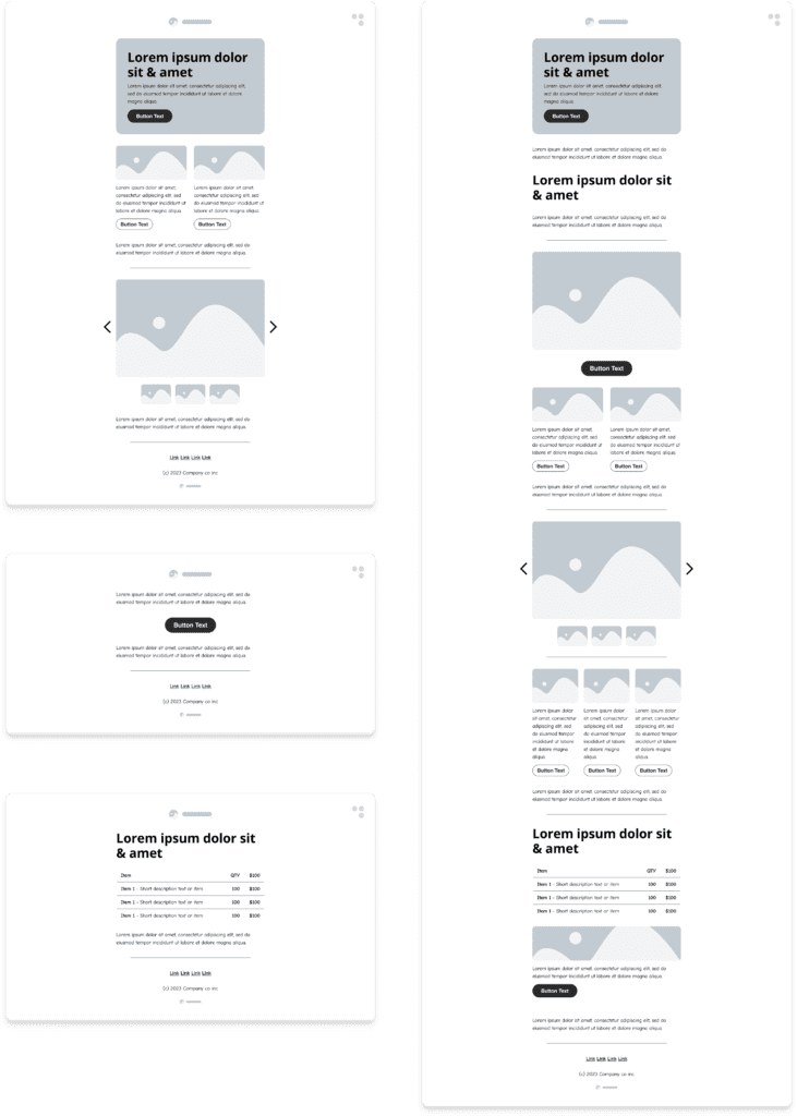 Sample email layouts built using the core components
Design modern emails with Dyspatch’s Figma email design system
In email marketing where every interaction counts, Dyspatch's approach not only simplifies the email design process but makes it accessible for less technical email designers. The combination of efficiency, creativity, and strategic brand representation promises not only time savings but should also have a profound impact on customer engagement. With Dyspatch's Figma email design system at your disposal, your email templates will not only deliver messages but also convey the essence of your brand, leaving an indelible mark on your audience. Get a demo today to find out how Dyspatch can help you create your own bespoke email design system.
Get a demo
