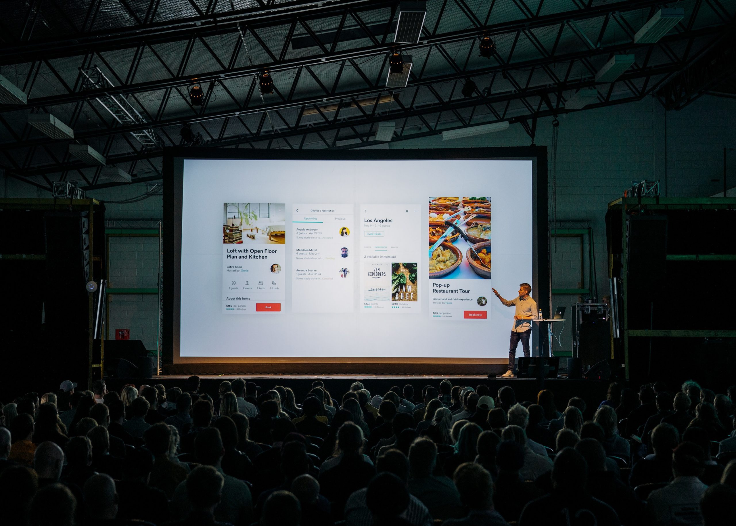
When Sendwithus asked me to represent the team at the first Email Design Conference in London, I jumped at the opportunity. I thought I would maybe learn a thing or two, and at least get a trip out of it. Was I ever wrong.
The conference was a whirlwind of talented presenter after talented presenter. A positive vibe permeated the conference center. There were endless networking opportunities with great people. As I furiously took down my notes, I noticed these top trends woven through the presentations:
1. Responsive Design
This is an industry buzzword and needs clarification. Responsive design can be thought of as responding to characteristics of the user’s environment. Usually, this means the design is created to self-adjust based on screen size. For instance, on mobile phones, your buttons and text may display larger, for better usability. Smaller screen sizes also suggest changes to navigation bars and multi-column layouts using this technique. Convert these elements instead to large, touchable (minimum 44 by 44px) interface items and single-column layouts whenever possible.
More signals can be used for responsive design, such as device capabilities, time of day, and user location. Even with the impressive technology available to us today, we still can’t measure and respond to every signal in an email marketing channel. However, the conference convinced me there are smart people working on that problem. As an example, Elliot Ross and Justine Jordan noted the use of a server backend to deliver custom-generated images to users based on their location and current weather conditions.
2. A/B Testing
By dividing up your users and sending alternate designs to each group, important information can be uncovered about their behaviour and preferences. Tests can be carried out on details as small as the font size of the footer or as large as a complete redesign of the email. The Obama campaign for re-election stood out in the examples presented: their email testing process was estimated to have accounted for $200 million out of the $500 million that they made from their email marketing campaign. One method they found successful was creating so-called “Frankenstein” emails – parts of good-performing emails stitched together to create the ultimate emails for conversions.
3. User Experience
The fact that a user is on your list today does not mean you can just send them anything. In order to prevent them from clicking the unsubscribe link tomorrow, marketing teams need to consistently provide value. This means taking the experience of the entire interaction into account. For example, when would your users find the highest value in a video newsletter? Ericsson reports that with 62% of consumers use social media while watching TV. It’s likely your users would also consume other forms of video during their TV time, since it’s not as disruptive to their activities.
As a team, Sendwithus keeps up with developments in all three of these areas. Our transactional email system allows marketers to make changes and A/B test their ideas, as well as providing pre-made responsive templates. We work to test and improve the experience across Litmus’s range of clients.
