Welcome to our monthly Email Hall of Fame, highlighting some the best and worst transactional and triggered emails.
We hope you enjoy them — and learn from them — as much as we do.
Hall of Fame:

Who:
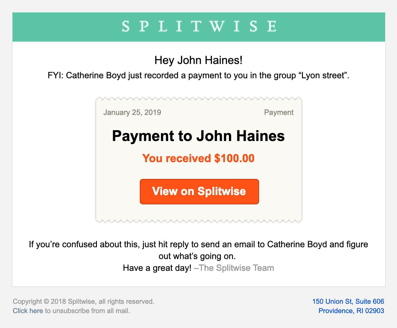
Splitwise, the app for friends and roommates to track and split rent, bills, travel expenses, and more
What’s Good:
This is a great example of a clear, straightforward payment notification. It includes who paid, how much they paid, and what group they paid in (helpful for people splitting expenses with multiple groups). The email includes everything the user needs to know, with nothing unnecessary to clutter things up.
What’s Exceptional:
You know how we go on about how horrible ‘no reply’ transactional emails are? Waxing poetic about the importance of the user being able to hit ‘reply’ to get answers from a real person? Well, Splitwise takes that to the next level — hitting ‘reply’ on this email won’t just reach a real person, it will reach the very person who made the payment. No need to hunt down an email address or sign in to the app to send a message. We think that’s a pretty darned exceptional customer experience.

Who:
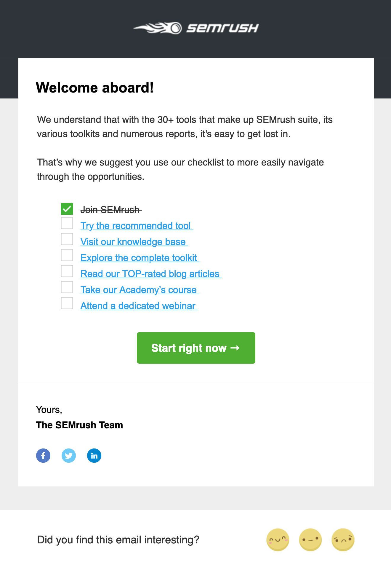
SEMrush, the online visibility and marketing analytics software
What’s Good:
We love a good onboarding email and we especially love a good onboarding checklist. The variety of tools an SEMrush subscription offers (over 30 and counting) can feel more than a bit overwhelming to a new user. This onboarding checklist provides a set of logical (and manageable) steps to get started.
What’s Exceptional:
Ignoring the awkwardly worded copy and focusing just on the checklist, it’s a near-perfect list that provides a great balance between links to get started using the actual tools and links to information and education to give the new user some direction. And bonus points for the option to provide feedback directly from within the email.

Who:
YogaGlo, the online yoga platform
What’s Good:
This is the welcome email YogaGlo sent to customers upon downloading the app and signing up for a free trial. The email is fun, straightforward, and perhaps most importantly for a yoga app, unintimidating. The graphic images appeal to beginners while the photos appeal to more advanced yogis, and the primary CTA — [Take your first class] — is exactly what a new user, of any level, is most likely to want to do first.
The secondary CTAs could probably have waited for a subsequent email, or those links could be made available upon signing in, but at least they’re unobtrusive.
What’s Exceptional:
Those cartoon-like graphics are awesome. As any beginner walking into a yoga studio for the first time will tell you, yoga can be pretty intimidating for newcomers. But those graphics make yoga feel fun and accessible to anyone.
(There is, however, some bad news: YogaGlo is now Glo and their welcome email has changed. And not for the better. You might just see it in a future Hall of Shame. Sigh.)
