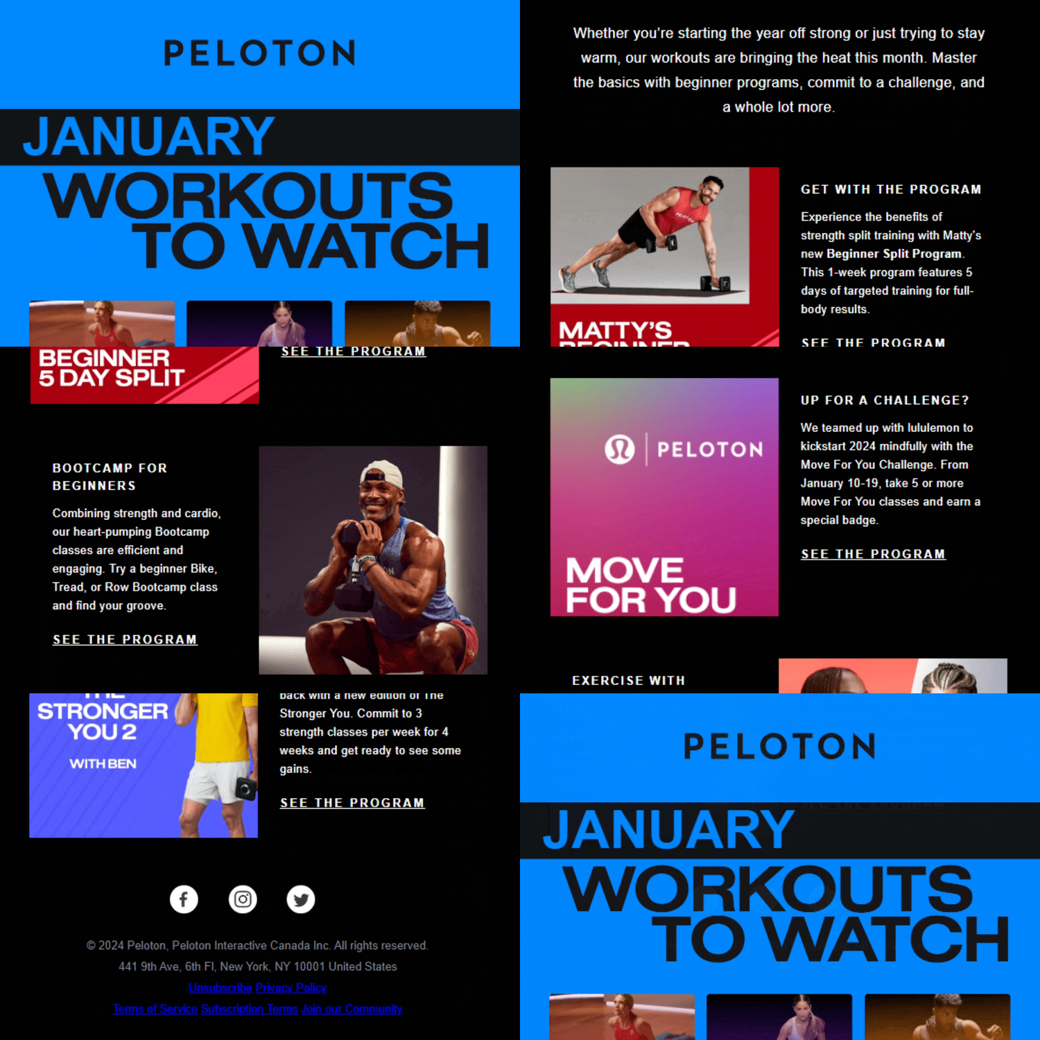
Peloton’s January newsletter of “Workouts to Watch”
Peloton is an amazing brand that matches a premium product, a lifestyle aesthetic, and a community all in one. A large differentiator of Peloton is the exhaustive selection of live and recorded classes that are available on the platform. With all this content, keeping users aware of new programs, new instructors, and highlights is a challenge. Hence where this newsletter “Workouts to Watch” comes into play.
After receiving this email, I just knew we HAD to rebuild it in Dyspatch. This email features a unique Hero that leverages contrasting background colors and “netflix” style video cards – this look is both eye-catching and pulls on an interface we’re all very familiar with nowadays. I’m going to document the process, share what we loved about the design, and what we think anyone implementing a similar email might want to improve.
It all starts with a theme
When you’re going from a static email design to a full modular design, the first step is to build out your theme – including your fonts, your brand guidelines colors, padding etc.
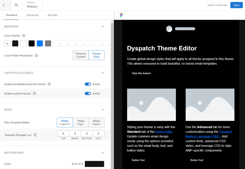
The Peloton Theme in Dyspatch
In this Peloton email, we make note that they are using a standard 600px wide email, with a dark grey (#131416) full-width background. The main text is a distinctive white (#FFFFFF) text on a black background (#000000). For the logo and hero section, Peloton is using their distinctive brand blue (#007CFF) and their word mark. The fonts are Roboto with a Helvetica fallback. Lovely. And there’s a generous left/right padding of 40px on all the content.
One thing to note with Peloton is their very specific use of letter spacing and line height to create a highly recognizable visual effect.
Breaking it down / Building Blocks
Once we have our theme built out, our next step is to break down our email into distinct blocks. First up is the header, which includes the logo and wordmark. We’re using Peloton’s wordmark with an extra branded blue background:

After that we have the most visually striking component in this email, the hero.

Static Images vs Dynamic Blocks
Peloton is using a single static image for this entire hero. This is common in the world of email marketing, and if you’re working with a design team that can quickly create these assets, it makes email sends a breeze. There are some major downsides to this design though. First, you’re highly reliant on that design team being available to give you email-ready designs every day. That’s a pretty big limiting factor for many teams.
Second, it limits (but doesn’t make it impossible!) your ability to link out to distinct content or track what is best performing. In this hero, I love the “Netflix” style cards for different workouts, but unfortunately, they all link to the same place. As a marketer, that means you’re not getting rich analytics on which content you’re sending out is the most important to your readers.
Finally, full image blocks suffer when viewed on mobile, which in this day and age, every email is going to be read on.
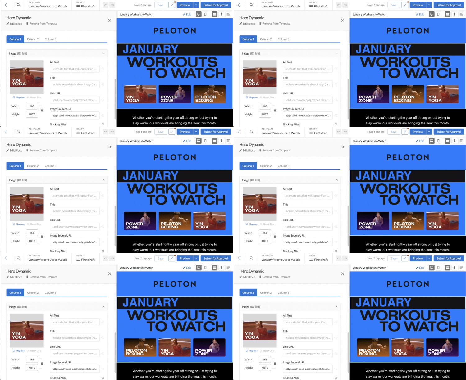
Dynamic Hero in Dyspatch
In rebuilding this module, what we did is make every component dynamic, so they could be updated in place without going through a designer. Want to swap out Yin Yoga for Power Vinyasa? Just update a single image. Going to reuse parts of this email for February’s send? No need to go back to a designer. An added benefit here is that Dyspatch will guarantee this 🤣new module is mobile-friendly from the get go. Winner winner chicken dinner, as the kids say.
Building the Body (of the email)
The body of Peloton’s email is alternating between left and right image and text combinations. These are really quick to setup in Dyspatch and make reusable components that can be used in any email.
One of the issues email marketers face is that when this left/right swap design is viewed on mobile, it often stacks in an unflattering way – image, text, text, image – eroding the designer’s intended layout. By using Dyspatch’s responsive features, these two modules are actually the same, just with the direction swapped. The mobile view then stacks perfectly:
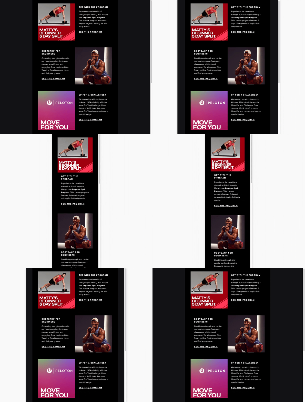
Building out the remainder of this email is quite simple: dropping in our images, heading, text, and links at the bottom.

To wrap up, we have Peloton’s footer. I love the use of a full width, full black block here. It gives the reader a clear visual reminder that “this is the end”. The generous padding with subtle monochrome social icons adds to this effect.
All in all, this is a 10/10 email from Peloton, with some great and subtle design elements that don’t distract from the ultimately great content.
