Change an email’s theme on the fly
It’s now easier than ever to swap a theme on an email, with two new methods available.
Swap the theme directly in the email builder: the theme name has been updated to include an options menu. Now, in addition to the quick link to jump to the theme editor, there is an action to “Change Theme”.

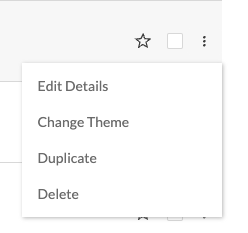
You can also switch the theme on an individual email from the workspaces page. On the specific email you want to update, click the 3 dots option menu in the row, and select the “Change Theme” action.
Note: as we’ve also recently launched the ability to assign themes to specific workspaces, the themes available to swap with will respect those admin settings.
UX delights
We’ve updated a few key touch points within the app to make your experience that much more enjoyable, including:
Assign a block to themes
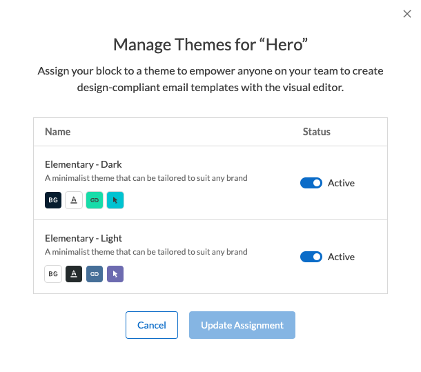
The theme assignment modal for blocks has been overhauled. Remember how you have to remember what your themes are called to apply new themes to the blocks? I sure can’t remember all of those names! The modal has been updated to display all available themes, all the time, along with their assignment status (active, inactive). Easily toggle themes on and off with the status switcher.
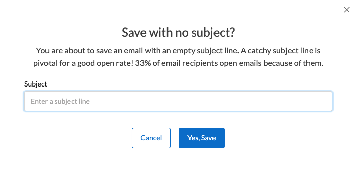
Saving without a subject line
Saving an email with an empty subject line used to trigger an “you sure you want to do that?” warning, that would require a few clicks to close the modal, re-open the subject line editor, update the subject line, and re-save the email. We’ve updated the warning modal with a new input field, so you can add the forgotten subject line right there.
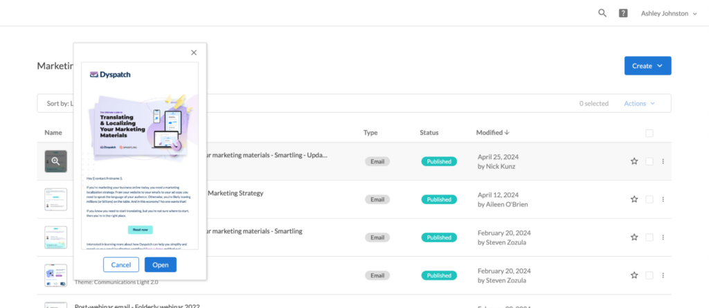
Previewing published emails
For published emails, the thumbnail preview gives you a glimpse into how the approved version looks. To take a closer look, you’d historically have to open up the email to see the full view. Now, you can click on the thumbnail to open up an expanded preview.
The commenting features we’ve all been dreaming of
Our commenting workflow in the email builder has undergone a serious upgrade. Collaborating with your teammates is now much much easier.
See feedback while editing
You can now see feedback from your team while you are updating a block’s content. No more flipping back and forth between tabs to double-check feedback!
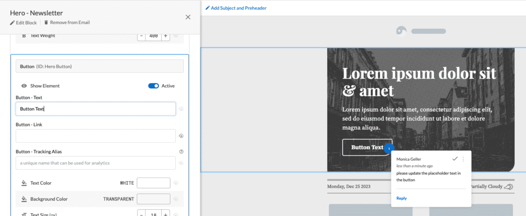
On the “Collaborate” tab, there is a new toggle beside the feed filters. Flip this to on, and all annotation pins for open comments will remain visible as you navigate to other sections of the builder.

There is a second toggle to “Show Comments”, which is always available in the toolbar at the bottom of the email preview area. For folks who like to keyboard, we’ve introduced a new shortcut option; use Shift+C to toggle the annotation pins on and off at will.

Mentioning teammates
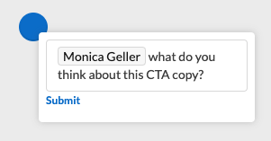
We’ve included a bit of a sneaky upgrade – @mention. When leaving a comment on an email, you can now specifically @mention one of your teammates within that workspace. They will receive an email notification.
Dark Mode testing, in-real-time
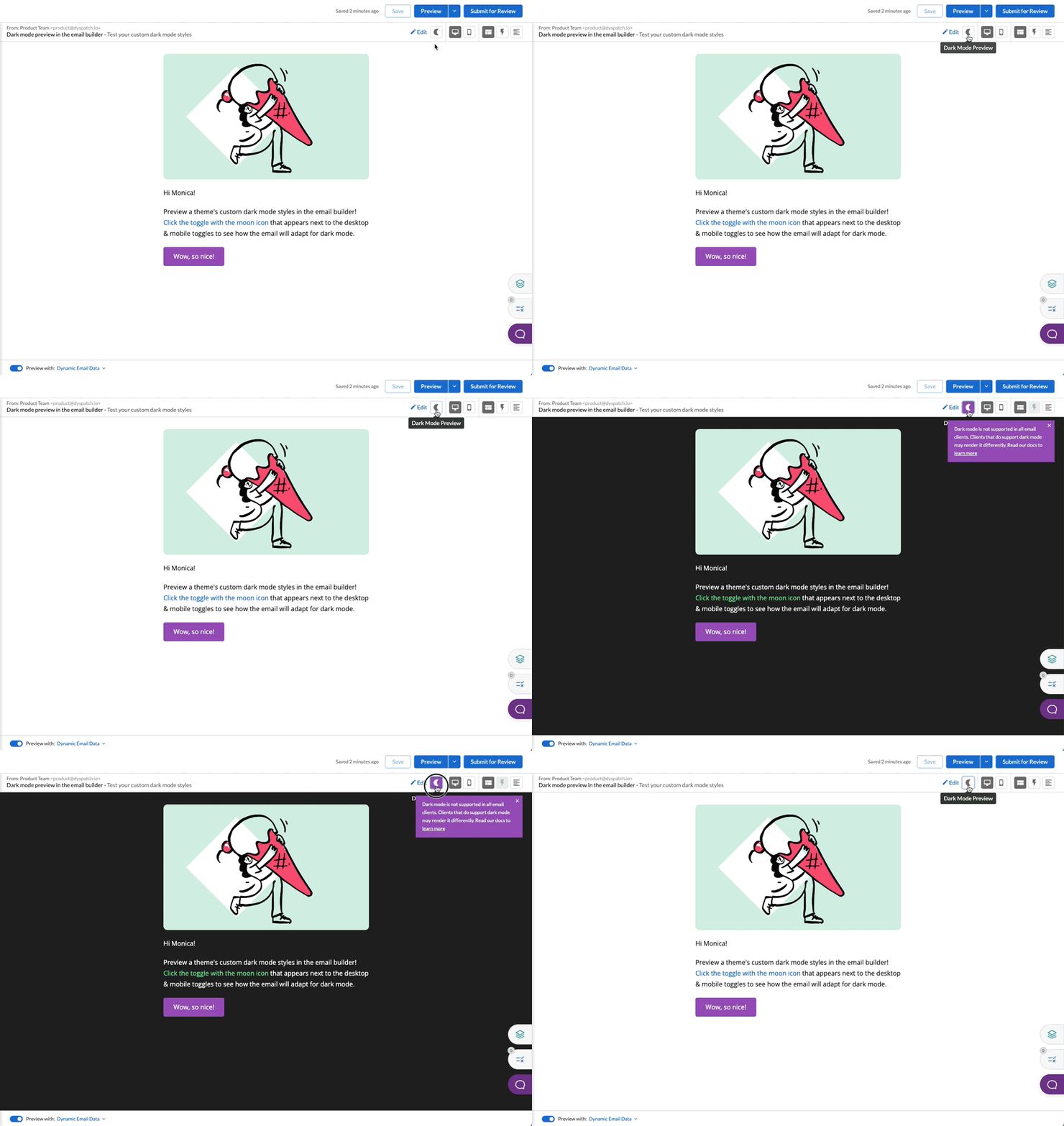
Both the email builder and theme editor have a new dark mode toggle. This will render the content with any dark mode styles that have been applied in the theme editor’s “Advanced” tab.
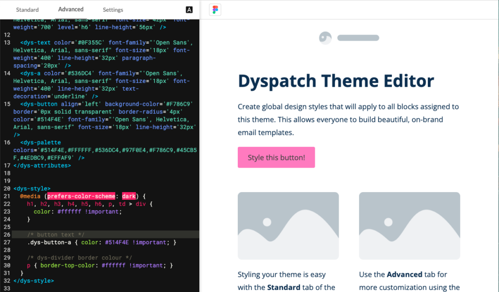
This preview works great for a quick confidence check on how your theme or email will look in dark mode, and will help you get ahead of any contrast or display issues.
Because email clients render dark mode differently from each other, we recommend continuing to device test emails to be confident about the final output. With our built-in Litmus device testing, we currently offer 27 dark mode options to test with.
Drafts are easier to manage
The drafts page in the email builder has received many small upgrades to make it easier to search and maintain the draft history, including:
- Sorting options are available to quickly find a draft amongst many
- Last modified date displays an exact date, vs an approximation
- Draft actions are now visible all the time
We now visually display the workflow stages that a draft must go through as part of the approval workflow. We’ve improved clarity about which stage each draft is currently in, and what’s left to do to get that draft to production. This applies to both single- and two-step approval workflows.
Single-step approval workflow

Two-step approval workflow

Email builder bits-n’-bobs
We’re always striving to improve the email building experience, from micro-interactions to advanced testing and compliance tools. Some new changes you’ll notice in your journeys:
The “From” metadata now displays above the subject line preview, showing sender name and sender email address. Never forget to fill it out again, and double-check that the email will be sent from the correct company address.

Our automated QA tool, Email Guardrails, has been grouped together with the email layers panel, above our live chat customer support. This includes a count of the number of warnings that are left to address, so you know at a glance what’s left to resolve.

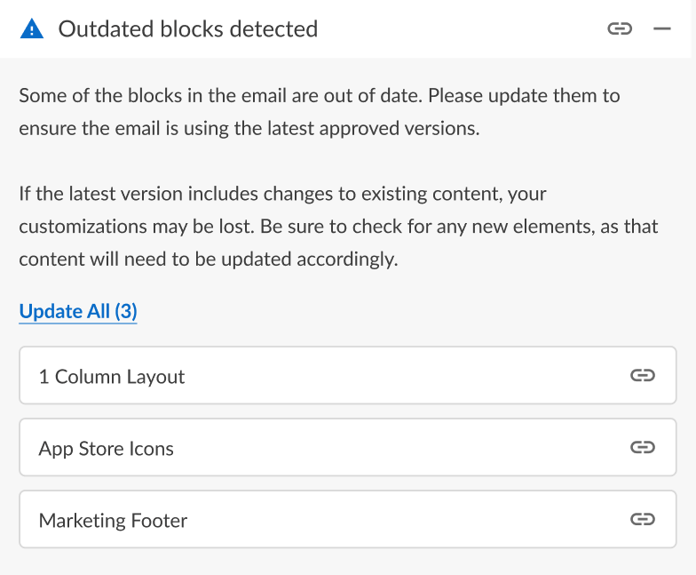
We’ve added a new rule to our automated QA warning list. We will now display a warning to highlight if any blocks in your email have a newer version to update to. Keep your blocks up-to-date with the current block version, to ensure the email is always using the latest approved design. You will be able to update all applicable blocks at once, or navigate to each block specifically to update one-by-one.
