Creating a Pre-Order Campaign that Doesn't Suck
Pre-Orders are hard, make the email part easy.
Introduction
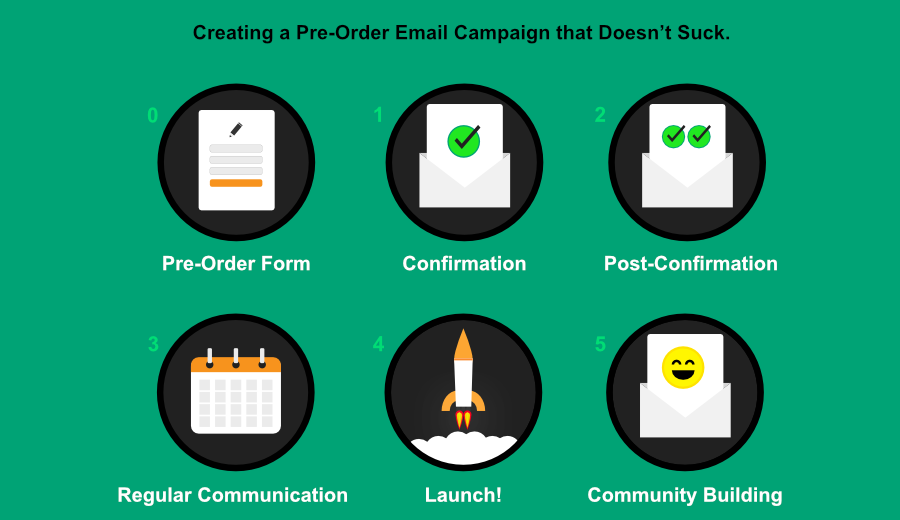 Taking pre-orders for a Kickstarter, crowdfunding, or even a SaaS beta can seem deceptively easy. What’s so difficult about collecting a few email addresses, and then letting folks know when your product is ready? Oh boy.
Like many people, I’m fascinated by the crowdfunding journey: starting with an idea, building prototypes, sourcing materials, and eventually, shipping can be incredibly exciting for everyone involved. As a founder of a SaaS email company, I also know quite a bit about running pre-order campaigns, both through our own experimentation, and by talking with several Y Combinator founders and other large companies who are running their own pre-order campaigns.
Founders and marketers often fall into the same trap; when they initially start accepting pre-orders, their plan is to gauge interest, get a big list of signups, and then email them all once the product is ready. As a result, I’m asked the following question far too often:
We had over 1,000,000 pre-order signups 8 months ago and now we’re ready to launch. How do we email everyone, not have it go to spam, and get 100% of them to convert to paid?
Unfortunately, it doesn’t exactly work like that.
In reality, building a strong rapport with your pre-order community will make the final announcement deliverable (ie: not be flagged as spam), and will lead to a much higher conversion rate. It makes sense that your average consumer is more likely to buy something they’ve been following for weeks or months, rather than a product they forgot about a year ago and may not even receive the announcement email. The most important part of your pre-order campaign is to understand that people sign up to be part of the journey.
So without further ado, here’s my guide to having an amazing pre-order email campaign.
High Level Strategy (tl;dr)
Accepting pre-orders is not about collecting email addresses and then sending one email to everyone when your product is ready. People are forgetful, email deliverability is a real problem, and providing an email address to a pre-order form is only a moderate signal of purchase intent.
This guide will help you nurture your pre-order signups, build your email reputation, drive more conversions on launch, and ultimately build a long term community. Let’s get into it.
Sidebar: for more information about deliverability and why building an email reputation matters, see Appendix E(mail).
Step 0: Have a Great Pre-Order Form

The key to having a great pre-order form is setting customer expectations. What kind of expectations do you want to set? An ideal pre-order form establishes an expected frequency of messaging. It’s bad form (pun intended) to promise an email when the product is ready, and then send an unexpected monthly email.
Since it’s crucial to your product’s success that you keep up regular communication (see TL;DR goals above), an easy way to set expectations is to invite your pre-customers to opt-in for regular updates on the progress of your product.
A simple example of this is a checkbox and message reading:
We’ll send you an email as soon as AwesomeProduct is ready to ship. If you’d like to receive exclusive monthly updates on our progress, including pre-production photos and tech insights, click the box below.
Here’s an example from an awesome pre-order product called Superbook that doesn’t do this:
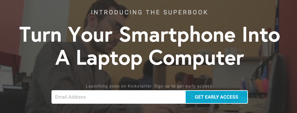
This opt-in is the first step in what’s called a "Double Opt-in” process. Double Opt-in is an industry standard for email collection and, even though your inner conversion monkey might complain about drop off, it exists to protect your reputation. Click the link above to find out why, or trust me and let’s move on to what happens when someone completes the form.
Step 1: Immediately Send a Confirmation Email
 The first step of Double Opt-in was having your pre-customer click a checkbox saying they wanted regular communication from you. Immediately after this, you want to send a confirmation email that is going to have a giant button, link, or call to action that asks your pre-customer to confirm again that they want to be receiving your emails. Going forward, you’ll only want to email those who clicked this second confirmation link, regardless of their expressed interest in your update emails.
This confirmation email is also a great opportunity to re-establish value with your pre-customers. Below is an amazing confirmation email from BETCHES -- a news aggregator with attitude (“Brutally Honest News, Gossip, & Advice for Young Women”). One of the amazing things about this email is how it conveys the value of subscribing just through the header image and branding (“THE ‘SUP”). While this isn’t a confirmation email for a pre-order campaign, it is a perfect example of establishing value.
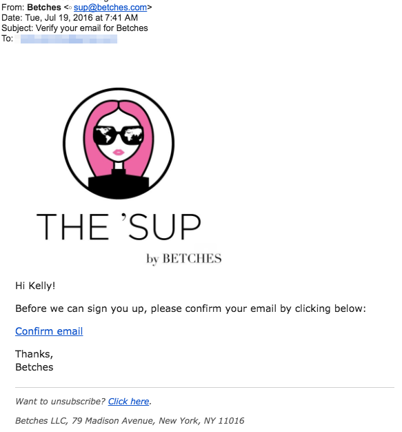
BETCHES Confirmation Email
This BETCHES email isn’t perfect though. The primary call to action, in this case, “Confirm email”, could be buttonized, as well as include a full-text link as a backup. It also doesn’t set any expectations around frequency.
Here’s the confirmation email I received after signing up for the Superbook pre-order:
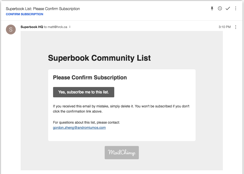
Superbook Confirmation Email
Unlike the Betches email, the Superbook email doesn’t match any of the pre-order form branding or messaging. In fact, the form that I completed had promised I was going to “Get Early Access”, but this email is confirming my subscription to the “Superbook Community List”. That doesn’t match my expectations at all.
Next up is not just matching expectations, but setting expectations for the future messaging. We talked about how important this was on the signup form, and it’s important to carry this message through to the confirmation email and reinforce exactly what I’m signing up to be a part of. Here’s an example of text that does exactly that:
Out of respect for your inbox we’ll try to only email you once a month with an insider's look into our progress.
The final (and most important) piece of the confirmation email is to re-state your value prop, or remind your pre-customer why they signed up in the first place. This is the most important part of the confirmation email, and it doesn’t need to be complicated. For Superbook, it could be just copying the title from their homepage into the email:
Turn Your Android Smartphone Into A Laptop Computer
Pre-order confirmation emails should be very simple and styled to match your brand. You want to make sure your primary call to action (confirmation!) remains the focus.
Here’s a great example from our Open Source Email Templates, emphasizing how simple these emails can be. Also, who can refuse a cute robot?
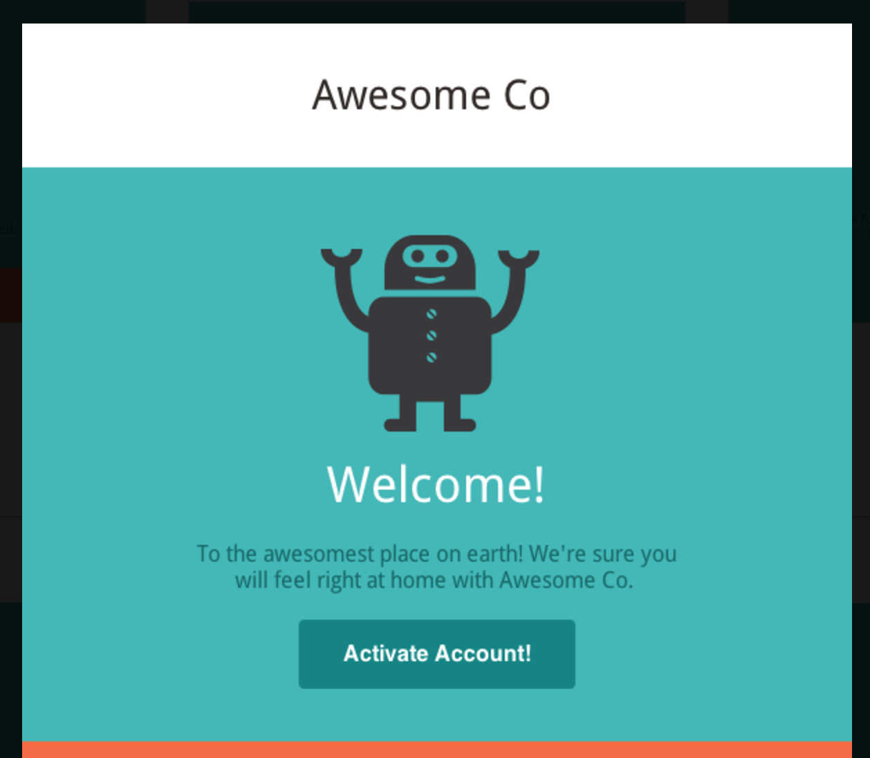 You can check out all the Open Source Email Templates or go direct to the happy robot
Step 2: Pre-customer Acquired!
 Awesome, so you’ve finished your double opt-in and have officially acquired a pre-customer (I’ve coined the term “pre-customer” for this post and I’m just going to run with it unless it gets cut in editing). When your pre-customer clicks on the confirmation button in Step 1, they’re going to be taken to a landing page of your choice. Much like the confirmation email you sent, it’s important to reinforce value, frequency, and branding on this page.
The post confirmation page may not have an obvious call to action like the confirmation email. According to Dave McClure’s (in)famous Pirate Metrics, this is the perfect time to ask your pre-customer for a referral.
Post confirmation should involve a web page and a follow-up email. Below are copies of Superbook’s post-confirmation landing page and email. In this case, Superbook does a great job of asking for referrals, both via Twitter and email. Providing tweet suggestions is really great, and can be even more powerful in conjunction with other social proof. One suggestion would be a link to “see what other people are saying about @getsuperbook”.
A good reason to send a post-confirmation email is that it’s your first chance to share something special with your pre-customer. This could be an Instagram photo of your production environment or an exclusive short video showing a prototype. Remember why people sign up for pre-orders in the first place -- to be a part of the journeyin creating it. Take as many opportunities as possible to share the pain and pleasure of bringing your product to life.
Looking at the BETCHES confirmation page, it’s clear that their goal is to drive referrals. What’s interesting is they also offer something exclusive, a $10 discount on the service FabFitFun.com.
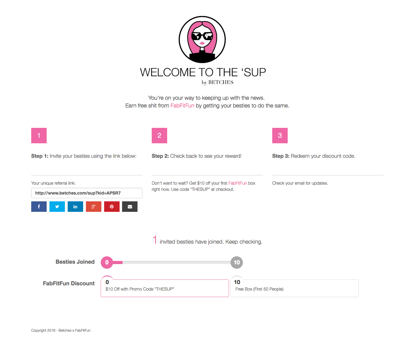
BETCHES post-confirmation landing page
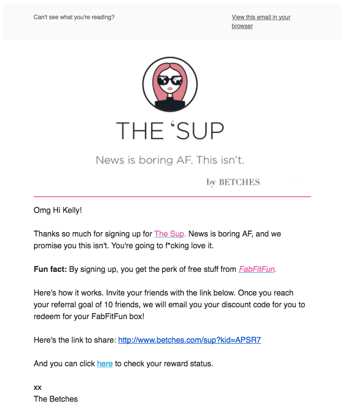
BETCHES also sends a post-confirmation email (below), which starts by reiterating the value of subscription: “News is boring AF. This isn’t.” After that the email re-introduces their referral program and the offer from FabFitFun. I’ve included a screenshot of the bottom half of the email as well because it’s an example of taking a “boring footer” and making it awesome. Included is another referral ask, sans promotions, and then social call to actions with some fun on-brand messaging: “FOLLOW BETCHES EVERYWHERE BECAUSE YOU LOVE US. K BYE.”
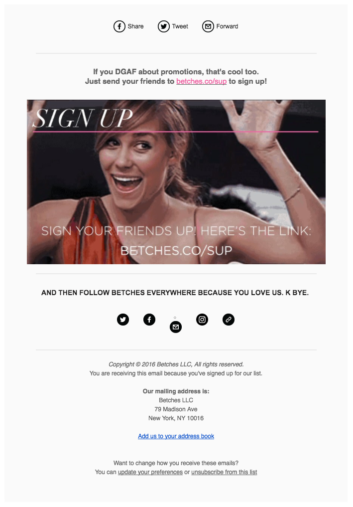
If every email footer was this amazing I could quit email a happy person.
Below are examples of the Superbook post confirmation landing page and email -- notably both lacking continuity in messaging and value statements from the initial landing page. The Superbook team does do a great job of including pre-built tweets (something BETCHES could learn from).
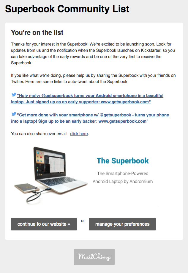
The Superbook confirmation landing page (hosted by Mailchimp)
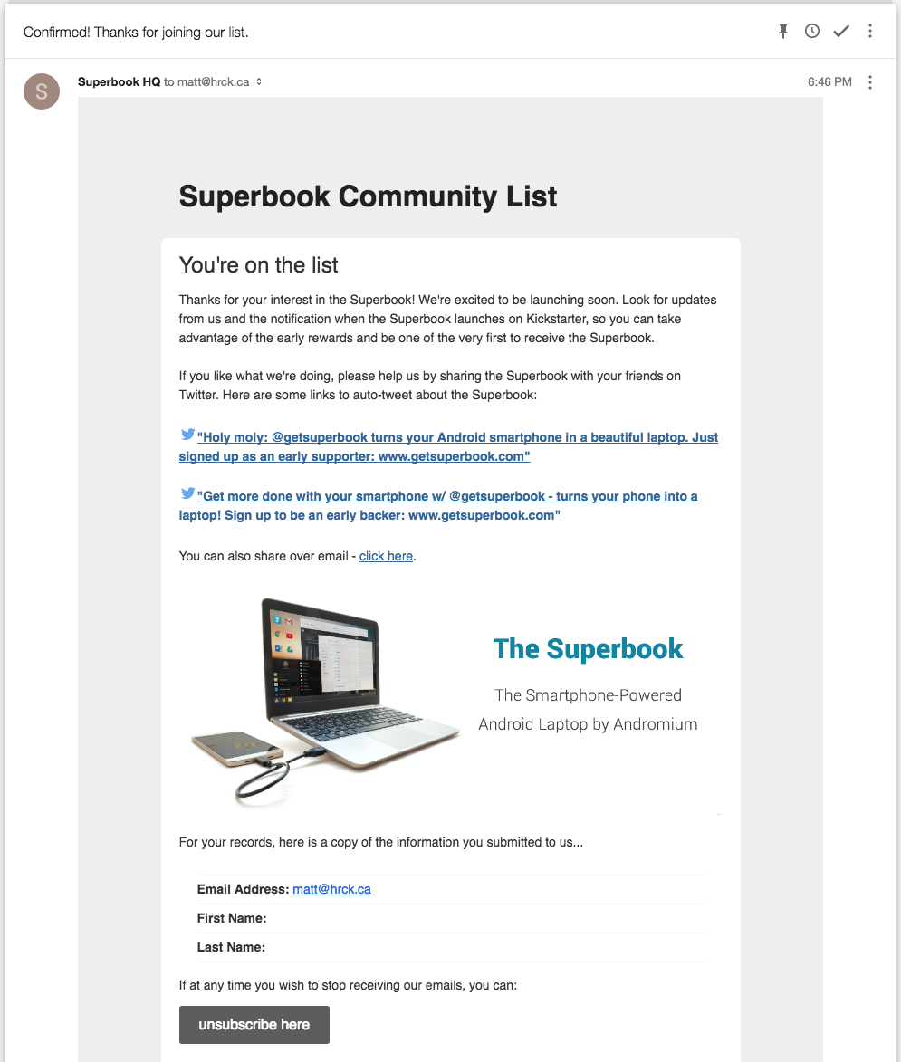
Final confirmation email that I’m now on the list. What list? I’m not really sure.
Step 3: Regular Communication
 In steps #0 - #2, you set expectations and committed to involving pre-customers in the journey of bringing your product to life. Now it’s time to deliver on this promise. At this point you should have a polished value prop that is easy to include in each email, likely alongside your logo or branding.
The focus of these communications is sharing something cool about the development of your product. This can be as simple as a behind the scenes photo or a wireframe mockup, or a more in-depth blog post about your product’s progress. This should be the focus of each update, and it should be fun and interesting. If you commit to monthly updates, spend at least one full day per month ensuring these updates are great. If you commit to weekly updates, it’s even more important that these updates shine as you risk overloading people and having them unsubscribe.
A secondary goal to sharing your journey is asking your pre-customers for a referral. This can be as simple as asking them to share their enthusiasm on social media (pre-built tweets are table stakes here), prompting for an email share, or nudging your pre-customer to a social channel (Instagram or Facebook). I want to overemphasize that your primary goal is to share your journey with a pre-customer. Building excitement is paramount to delivering on the promise of your campaign, and will do a far better job of creating goodwill than optimizing your email for a tweet. A happy pre-order customer will naturally want to share, whereas an annoyed one will unsubscribe and never complete their purchase on launch.
Finally, candid updates are a good opportunity to let your pre-customers know about any setbacks you encounter. Crowdfunding campaigns often run into setbacks, so often that savvy customers tend to expect delays. If you haven’t been keeping up regular communications with your pre-customers, an email out of the blue announcing a setback is going to leave a sour taste. Contrast that with an expected update that announces some unforeseen setback and a new timeline. Put yourself in the pre-customer's shoes, which would you rather receive? This is another reason why promising and delivering updates on a set schedule is so important.
I’ve pulled some of the best pre-order update emails I’ve found, each annotated with notes on what made them awesome. Enjoy.
Example Update Emails - Click to make these bigger
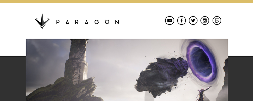
This update from Paragon is great because it uses artwork to re-establish value and sets clear expectations.
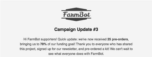
Farmbots maintains clean branding and uses imagery effectively as well. The "meat" of the update is contained at the very top, which is great.
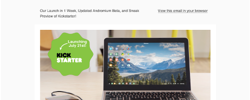
Superbook overcomes their initial confirmation emails with some of the best updates we've seen. There's a theme here of using an image to convey value. The Superbook team also does a great job of establishing timelines for their upcoming Kickstarter campaign.

KitTea Cafe might seem like an odd addition to their list, but their update to crowdfunders clearly articulates their value ("San Francisco's first cat cafe!") in the preheader.
Step 4: Launching
 After several months of hard work (and hopefully no delays), you’re getting close to your launch date. It’s time to shift gears and focus on the immediacy of your launch. If you have any surprises for your pre-customers, such as extra capabilities of your product, now is a great time to start alluding to them, promising something extra on launch day. Your primary goal in the weeks leading up to launch is to build excitement and ask your pre-customers for help spreading the word and attracting more pre-orders.
Depending on your pre-customer demographics, you can consider increasing the frequency of emails in this period, being careful to not annoy anyone right before launch. It would be a shame to spend months building excitement in someone only to have them un-subscribe and miss your launch because of an over-aggressive email schedule. If you do decide to increase frequency, perhaps from once a month to once a week, definitely let your pre-customers know before it happens.
We’re just one month away from launching AwesomeProduct and we couldn’t be more excited. You can expect weekly updates from our team as we ramp up to launch, it’ll be worth it 🙂
The email you’re going to send on launch day deserves extra attention. Spend some time the week beforehand making sure it’s ready to send, with a special emphasis on making sure all the links work (bonus points for doing email client/device testing). There is nothing more gut-wrenching than building up all this excitement, pressing send to your entire pre-customer list, and then realizing the email template is broken.
The goal of your launch email is straightforward -- the journey is over, turn those pre-customers into fully paid customers. You can include referrals in this email as well (social call to actions), but you may be better served by leaving those to a follow-up email. Much like your first email to pre-customers, which we sent in Step #1, keep this email simple and on point and on-brand.
Step 5: Community Building
 If you thought your pre-order campaign ended with your product launch, think again. First, not everyone that signed up to pre-order will actually convert on launch. Build a separate drip campaign for these people, over an appropriate amount of time (4 weeks maximum, you don’t want to overstay your email welcome). In this campaign, you should use each additional email to reinforce the value of your product and then include social proof from other pre-customers who converted. This is a good time to use tweets from supporters or include stats about how the pre-order campaign has performed. If you want some inspiration for building out this drip campaign you can check out the relevant chapter from our guide, "How to Send Email Like a Startup".
Your campaign doesn't end with your launch.
Once your pre-customers convert into real customers (yay!), you want to invite them to join you on the next stage of your journey. Your new goal is to create a long term community of supporters (aka “friends of AwesomeProduct”).
Many companies just automatically subscribe all their pre-customers onto this new mailing list, but I highlyrecommend you don’t. Your pre-customers signed up for something well-defined; joining you on your journey of taking your product from an idea to something real. It’s important to give them the option of continuing to receive your emails, out of respect for their inbox.
Below is an example of a company that didn’t do this, and you can immediately see why this is undesirable. The purple bar shows the pre-order campaign with regular updates (Steps 1-3). In orange is the launch announcement (Step #4). Post-launch (Step #5), the company starts emailing from a different domain, with sporadic frequency and without asking permission first.
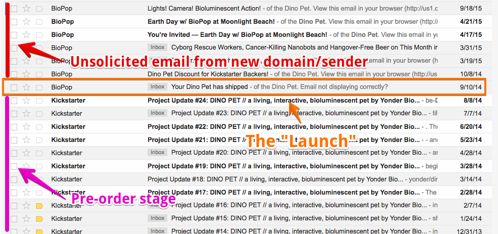
In the words of Yoda, this a community does not make.
I hope you now have the confidence to run your pre-order campaign and see success. If you’re uncertain about any parts, reach out over email (matt@sendwithus.com) or twitter (@mrmch) and I’d be happy to take a quick look.
Appendix (E)mail Reputation
- You must send from a domain you own and set up DKIM/SPF
- Have an unsubscribe link in every email
- Inbox providers look for consistent streams of email with good engagement rates
- Sudden bursts of emails to millions of people tend to look like spam
- Short URL services look like spam
- Too many images and not enough text looks like spam
- Using a “from” address that doesn’t match your domain looks like spam
For further reading I’d suggest the “Ultimate Guide to Deliverability”, by ReturnPath.com