Dyspatch
Release Notes
Revision History, Enhanced Guardrails and More!
Revision History in Block Builder
Dyspatch Developers and Admins can now access a block’s version history directly in the Block Editor. With this improvement, you can:
- View visual and code-based history for each block, including its localizations
- Restore to a block’s previous version as needed
- Rename key milestones for reference and better tracking

Archived Content
The Archived Content page is now live for all enterprise customers. Admins can view and restore previously archived content for:
- Templates
- Blocks
- Themes
In App Updates & Improvements
- Guardrails: The threshold for warning that your email may be clipped by Gmail has been lowered to <80kb (from previous limit) to account for additional code that may be inserted by email service providers.
- Webhooks: A test button has been added to the Dyspatch admin that will allow users to manually validate their webhook connections.
- Template Variables: Easily retrieve your variables on a per email basis with the new “Copy to Clipboard” button in the data tab of the email builder.
- SMS: Users can now send SMS and Voice template previews pre-filled with selected customer profiles for easy testing.
Dyspatch Markup Language (DML) Improvements
- Dynamic Year Display: Use @{|year} to automatically show the current year in all templates upon export.
- Character Limits: Set maximum character counts on dys-text, dys-title, dys-button and other elements.
- Dys Image Alignment: Alignment & full-width on mobile options have been added to dys-img editable styles.
- Dys Button: Full-width has been added as a toggleable style on Dys Buttons to enable 100% width for buttons in the Email Builder.
Account Settings Updates
A new toggle in the admin portal is available to help streamline template management. It can be used to prevent:
- Duplicate template names
- Duplicate draft names within templates
This keeps your organization’s file naming consistent and organized.
New: Automatic Image Optimization
We’ve introduced automatic image optimization to our image library that has been designed to improve email performance and overall user experience.
When uploading new assets our real-time optimization will help to automatically reduce file sizes, while maintaining image quality. This will help speed up your email delivery, minimizing email load times in a market where every second counts.

While building your email or SMS marketing messages, oversized images will be automatically optimized to provide quicker loading times for your end users. For advanced users who want full control over their optimization, this can be bypassed by using the ‘upload unoptimized’ option in the image library.

Key Benefits
- Improved Email Deliverability: Smaller image sizes mean faster email loading and happier customers.
- Cost Efficiency: Reduced asset storage and transmission costs.
- Enhanced User Experience: Streamlined email creation process eliminating the need to rely on outside help to optimize your images.
Expanded Integrations & Email Previews
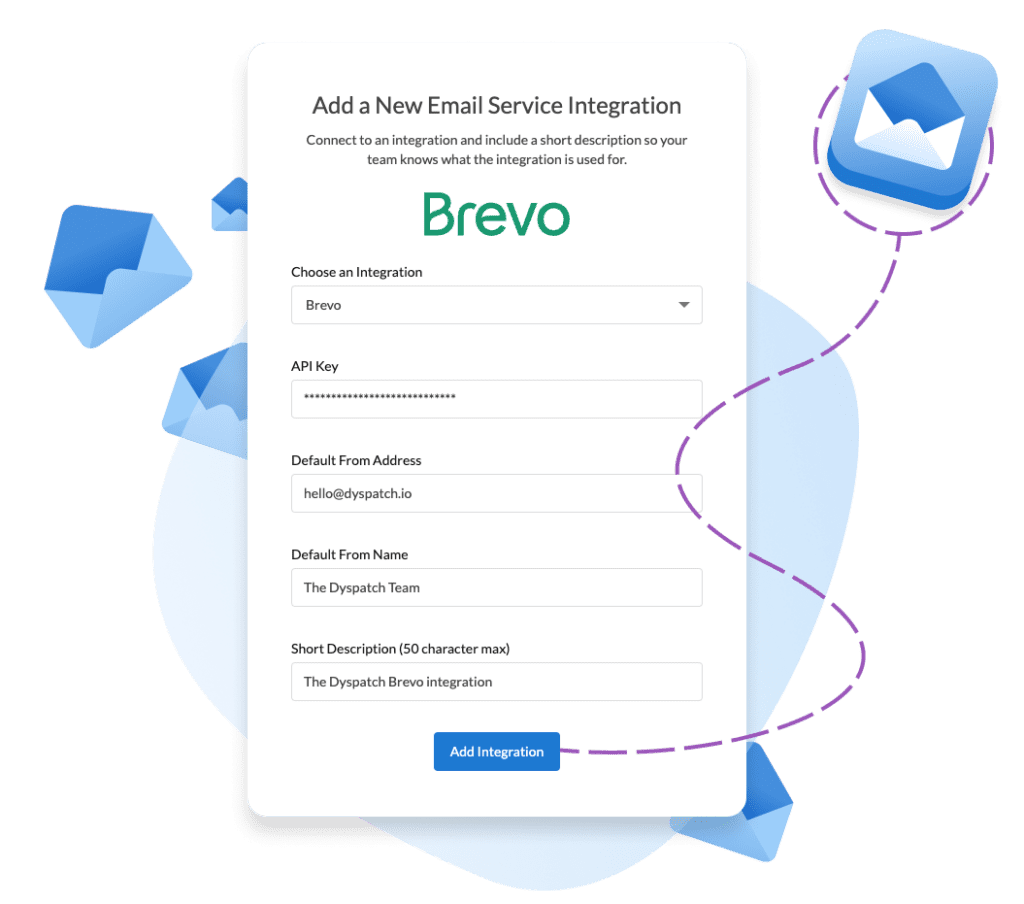
Expanded Brevo integration with localizations support
Our Brevo integration has been updated to add full localization support. Emails designed with Dyspatch will export to Brevo as a single template with conditional logic, allowing you to manage multiple language versions efficiently within one template.

This added functionality will reduce clutter in your Brevo account and allow Dyspatch to remain the source of truth for your communications and collaboration.
Preview customer profiles before generating Litmus device tests

Dyspatch users will now see a preview of the email they are editing when selecting a customer profile in the litmus preview flow. This will help the user with additional context so they know they’re testing the right profile before sending their email off to Litmus for device testing via our direct integration.
Skip approval has moved!
Skip approval has been relocated; it is now a dropdown option on the “Submit for Approval” button to reduce clicks and streamline the workflow for smaller teams and power users. Users who have publishing access on a workspace can see this feature.

For users who are not admins, the skip option will not be visible if the workspace has assigned approvers. Admins will still always be able to access this feature.
Introducing an Account Settings page

A new “Account Settings” page has been added to our admin dashboard! We’ve consolidated controls for workflow features that existed across various admin pages into a single page for easier management:
- Generate plain text for emails: Automatically generate the plain text version for email content.
- Allow export before publishing: Email can be exported to your connected integrations before it has been published.
- Enable approval step before localizations: Email content and design must be approved before the content can be localized.
Other tweaks & adjustments
- The ‘block layers’ panel has been updated to always be visible, regardless of your email status.
- Dys-wrapper element support has been added to the advanced theme tab, so it can be styled with advanced customization.
Draft Workflow API Enhancements
New API capabilities have been added for improved draft management. Webhooks will continue to fire for draft submissions, but have now been expanded to also cover Approvals and Rejections. These updates will provide enhanced flexibility for your draft review processes, offering more control over approvals and enabling more comprehensive draft management.
![]()
Reject Draft
- Added a new endpoint to reject a draft for further edits
- Support for a comment to be added to a rejection
Approve Draft
- Introduced an endpoint for partial approval
- Does not finalize draft if other approvers are pending
- Automatically adds an “API user” as an approver
- Support for a comment to be added to a submission
Approve Draft For All
- New endpoint to approve and publish a draft immediately
- Bypasses standard approval workflows
- Support for a comment to be added to a submission
For more information please see our API documentation.
Expedite Email Creation with Blueprints
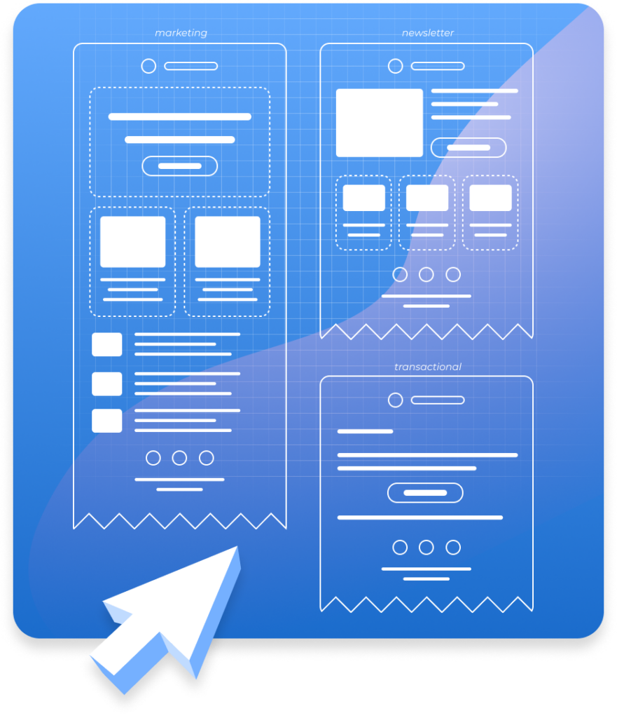
Designed to streamline and simplify email production for your organization, users can now create fully tested, on-brand emails in just moments by utilizing pre-approved design Blueprints. Blueprints are templates that eliminate the need to create emails from scratch.

With Blueprints, designers can set and maintain brand standards for common email layouts (transactional, promotional, newsletters), and marketers can quickly generate professional emails without starting from scratch. This ensures that every email contains all of the necessary features and components for sending: from legal footers to CTA buttons, they’re all in the Blueprint.
Read more:
Organize your customer profiles with folders and workspace permissions
Enterprise teams who are using customer profiles to test their emails with real data and use cases can now logically organize their customer profiles into folders, allowing them to more easily locate and test specific Customer Profiles in Dyspatch when creating new emails.

Additionally, Customer Profiles can now be locked to workspaces. This applies workspace permissions to the profiles, which will eliminate the need to navigate through inapplicable profiles during testing. Marketing teams can focus on marketing-specific profiles while transactional emails will have access to the transactional email Customer Profiles, creating a more efficient and focused workflow for all users.
Functionality updates:
- Handlebars.java has been updated to Support standard AND/OR Conditional helpers
- Editable border styles have been added to image editable Styles including support for border colors
What else is new?
Introducing Scribe AI: Revolutionizing Email Creation in Dyspatch
We are thrilled to release Scribe AI, a major improvement to Dyspatch that delivers on our mission to empower anyone on your team to craft innovative, high-performing email campaigns – whether you’re … More info about Introducing Scribe AI: Revolutionizing Email Creation in Dyspatch
UX Sprint 2024 Release Notes
Change an email’s theme on the fly It’s now easier than ever to swap a theme on an email, with two new methods available. Swap the theme directly in the email builder: the theme name has been … More info about UX Sprint 2024 Release Notes
Build & manage your SMS marketing campaigns
Using our SMS builder, non-technical users can create data driven, personalized SMS marketing messages at lightning speed. Dyspatch is the platform to centralize your email and SMS communications: … More info about Build & manage your SMS marketing campaigns